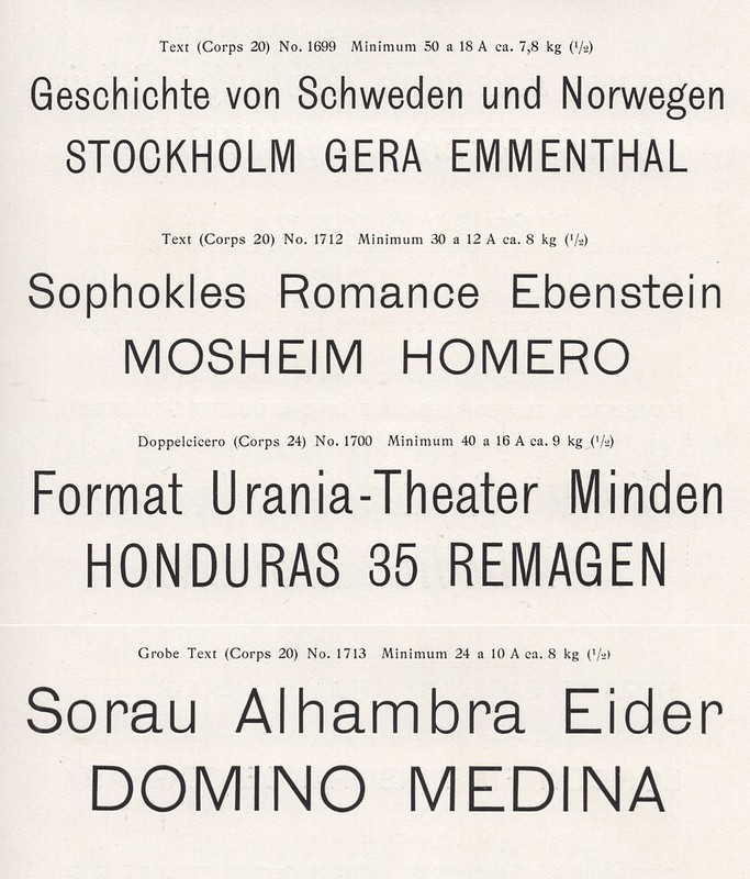
Above, I have reproduced a two-line specimen showing the largest size of the Lapidar-Schriften from a scan of E.J. Genzsch GmbH’s 1902 catalog.
Whenever a designer speaks to me about this site, they’ll invariably say, “you need to have some shorter posts, too.” My last entry was a 3,300-word update on my ongoing research project to catalog all the sans serif typefaces sold in Germany during the nineteenth century. In August, I published a 4,700-word essay documenting the spread of a single type design through the German-speaking typefoundry network: a heavy sans originally named Zeitungs-Grotesk. Since then, I have prepared an essay of similar length on a nineteenth-century italic sans, but I have been wary of finishing. We’ve been on lockdown in Germany since November, and there are still images and information I’d like to pull out into that article from various libraries. Yet, these are all closed.
Recently, a type designer wrote to ask if I could provide him with some information about Genzsch & Heyse’s Lapidar. There is not much about the Lapidar typeface to be found online; Fonts In Use reports that Fabian Harb has designed an unreleased revival for Dinamo, but I am not able to even find a sample of that work-in-progress on the Dinamo site. Fonts In Use also has an entry for Genzsch & Heyse‘s original Lapidar, and there is a nice showing in this specimen on Letterform Archive’s Online Archive. Below is the historical information I pulled together as an answer to that inquiry.
A typical nineteenth-century development process: majuscules first, minuscules later
In terms of a proper type-design, Lapidar only had a single weight. Lapidar was created by the Genzsch & Heyse typefoundry in Hamburg. The foundry indicated in its specimens that they had registered the typeface for a design patent. I suspect that this is an honest statement of fact, although I have not yet been able to find a report of the typeface’s filing with the Hamburg Muster-Register in the Deutsche Reichsanzeiger newspaper, which is where I search for typeface design patent-registration notifications. Unfortunately, I have not found more information about the typeface itself in primary or secondary sources recounting Genzsch & Heyse’s history.
Two of Lapidar-Versalien’s ten sizes: 16 and 20pt. Scan from E.J. Genzsch GmbH’s 1902 catalog. The eccentric Q is perhaps the most unusual indicator of the Lapidar-Versalien design. Click here to see the full-page showing all ten sizes.
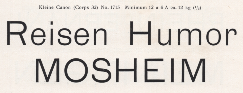
According to the Genzsch & Heyse PDF that Hans Reichardt and Otmar Hoefer published on the Klingspor Museum website, Lapidar was produced before 1895. However, the first version of the Lapidar design probably hit the market in 1874. The typeface was originally created as a caps-only design named Lapidar-Versalien. The January 1875 issue of the German printing journal Archiv für Buchdruckerkunst und verwandte Geschäftszweige showed all ten sizes of the typeface on columns 17 and 18. In Didot points, those sizes were 6, 8, 10, 12, 14, 16, 20 [smaller on the body], 20 [bigger on the body], 28, and 32. Although I do not know when Genzsch & Heyse added lowercase letters to the design, I suspect that the oldest specimen showing them may have been printed in 1895, as Reichardt is a very thorough source.
Both 20pt sizes of Genzsch & Heyse’s Lapidar-Schriften, including the lowercase letters that were probably added to the design before 1895. The top sample is a smaller-on-the-body version, the bottom a bigger-on-the-body casting. Scan from the E.J. Genzsch GmbH’s 1902 catalog. To see all ten sizes of the typeface, including both its capitals and lowercase letters, click here and here.
The Lapidar design is unique but not novel
In the twenty-first century, I suspect that designers get interested in Lapidar because it looks like Akzidenz-Grotesk – a typeface released slightly later by Bauer & Co. and the H. Berthold AG – but is clearly not Akzidenz-Grotesk. This means that designers looking to create a corporate identity solution that seems like it is made with Akzidenz-Grotesk but isn’t could work with a revived Lapidar instead.
Some lowercase letters in Genzsch & Heyse’s Lapidar-Schriften are similar to Caslons Doric, No. 4. That typeface, in turn, has recently been revived by Commercial Classics as Caslon Doric. Caslon’s Doric, No. 4 was sold in Germany under a different name by the Flinsch foundry in Frankfurt am Main. Flinsch also created a similar typeface whose’s design was similar to Doric, No. 4, but lighter. Flinsch called it Breite magere Grotesk. The Lapidar-Schriften r is the letter most-closely related to those designs.
Comparison of five sans serifs with similarly-shaped letterforms. The top row shows the 28pt size of Caslon’s Doric, No. 4, from a 1915 Flinsch catalog, when Flinsch was selling the Caslon design under the name Akzidenz-Grotesk. The second row shows the 28pt size of Flinsch’s Breite magere Grotesk, from a specimen it printed in 1884. The third row shows Benjamin Krebs Nachfolger‘s Breite magere Steinschrift, from its 1899 catalog. The typeface in the fourth row is Bauer & Co./H. Berthold AG’s Akzidenz-Grotesk’s 28pt size, from an undated Ferd. Theinhardt GmbH foundry specimen sheet printed after Berthold had taken the Theinhardt business over. The fifth row shows Genzsch & Heyse’s big-on-the-body 20pt size of the Lapidar-Schriften from E.J. Genzsch GmbH’s 1902 catalog [click to enlarge].
Another design that the Lapidar-Schriften remind me of is Breite magere Steinschrift, from Benjamin Krebs Nachfolger – a typefoundry that, like Flinsch, was also based in Frankfurt. Lapidar-Schriften’s capital letters are similar to Akzidenz-Grotesk, especially the G. In many of its original metal sizes, Akzidenz-Grotesk’s G had a very long crossbar. Lapidar-Schriften’s capitals and especially its bizarre numerals remind me of a typeface that the J.M. Huck & Comp./Aktiengesellschaft für Schriftgießerei und Maschinenbau from Offenbach am Main sold as Breite Grotesque. I think that this Offenbach foundry may have created that design itself, but I am not yet entirely certain of this.
Unlike the previous typeface-comparison image, this one is a Photoshop trick. The top two of the six rows above show the 12pt size of Genzsch & Heyse’s Lapidar-Schriften. Note the eccentric forms of the 3 and the 5. The bottom four rows show the 20pt and the 32pt sizes of J.M. Huck & Comp.’s Breite Grotesque. I reduced those types so that they would have cap-heights similar to the 12pt Lapidar-Schriften because neither the Lapidar-Schriften nor the Breite Grotesque specimens I had access to showed the numerals in other sizes. The 3 and the 5 from Huck & Comp.’s Breite Grotesque are more bizarre-looking than Lapidar-Schriften’s. This has to do with optical sizes, however. On Lapidar-Schriften specimens I don’t have the publication rights to, the larger-sized fonts (e.g., 20pt) contain numerals whose forms are just as ornamental as the Breite Grotesque examples reproduced above. In fact, the capital letters and numerals from the Breite Grotesque that Huck & Co. sold may be exact duplicates of Lapidar-Versalien. This would make the lowercase letters of Breite Grotesque and the Lapidar-Schriften half-siblings. Or something like that. Two sets of lowercase letters designed to match the same capitals/numerals. Indeed, another two typefaces sold in early-twentieth-century Germany look as if they recycle Lapidar-Versalien’s capitals as well: Julius Klinkhardt’s Breite moderne Grotesk and a typeface the Bauer’sche Gießerei sold as Breite magere Grotesk.
Lapidar had alternate lowercase letters of questionable design quality
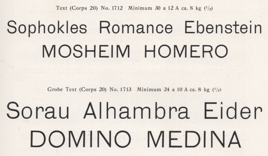
In the Lapidar-Schriften’s smaller sizes, my 1902 E.J. Genzsch GmbH catalog shows two different versions of the lowercase e. One version is just like the only version I’ve seen in specimens of the larger sizes: the e has a horizontal crossbar. But in the first line of the previous image, as well as in the first line of the sample below, you can see a second version of the e with a diagonal crossbar. This alternate e does not look like it is an excellently thought-through form. In fact, it almost looks like a wrong-font e, the shape is a bit sloped to the right, almost like what one might suspect from an italic. I would even assume that this was a composition mistake if the alternate e weren’t so systematically used for settings in the 6, 8, 10, 12 and 14pt sizes of the Lapidar-Schriften in Genzsch’s 1902 catalog. In those settings, one line of text always shows the alternate e, while another shows the standard form. This Letterform Archive specimen has the diagonal e in the 24pt size as well, so it may well be that the alternate was available for every font of the typeface.
Two lines from the 14pt size of the Lapidar-Schriften in the E.J. Genzsch GmbH’s 1902 type specimen catalog. The top line of this sample shows an alternate version of the lowercase e, which features a diagonal crossbar. The bottom has four e’s featuring horizontal crossbars. That horizontal-crossbar e seems to be the version printed the most often for larger point sizes in specimens, but the sort may have been available in every size.
The Enge Lapidar-Schriften are unrelated and not from Hamburg
Genzsch & Heyse had another typeface that bore the Lapidar name: a compressed typeface named the Enge Lapidar-Schriften. Nevertheless, the Enge Lapidar-Schriften are not a true narrower take on the Lapidar-Schriften. The Enge Lapidar-Schriften did not originate at Genzsch & Heyse. Instead, it is Genzsch & Heyse’s casting of an 1875 release from the J.H. Rust & Co. typefoundry of Offenbach am Main and Vienna. Rust & Co. called their typeface Moderne schlanke Grotesque. Several typefaces in the German-language typefoundry network carried Rust & Co.’s Moderne schlanke Grotesque design, each under a different name. Rust & Co. seems to have been a typefoundry that willingly sold strikes or matrices of its designs to other foundries. Whether Genzsch & Heyse’s Enge Lapidar-Schriften were cast from matrices that the foundry purchased from Rust & Co., or whether Genzsch & Heyse copied its Enge Lapidar-Schriften matrices through illicit electrotyping means is a question that could only be answered definitively by the business records of either the Rust & Co. or Genzsch & Heyse foundry. Sadly, neither company’s records of that kind are extant – as far as I know, anyway.
Above, the 32pt size of Genzsch & Heyse’s Enge Lapidar-Schriften, a design that originated in or before 1875. The typeface was first published by the J.H. Rust & Co. typefoundry of Offenbach am Main and Vienna, who called it Moderne schlanke Grotesque. Scan from the E.J. Genzsch GmbH’s 1902 catalog. Click here to see the full-page.
Iduna: another condensed, which is a bit closer than the Enge Lapidar-Schriften
Genzsch & Heyse published a condensed typeface named Iduna in 1893. While this isn’t a condensed version of Lapidar, it is closed to Lapidar in its design than the Enge Lapidar-Schriften are. The above image compares the 20 and 24pt sizes of Iduna with the two 20pt sizes of the Lapidar-Schriften. Iduna is very similar, in terms of its design, to Miller & Richard’s Sans-Serif, No. 1. That, in turn seems like a condensed version of Miller & Richard’s Grotesque, No. 1. While Miller & Richard’s Grotesk, No. 1 was carried by several German typefoundries from the early 1880s onward, Genzsch & Heyse did not have that design in its product range. I’ve placed a full-page specimen of Iduna over on Flickr. While I mentioned above that I haven’t been able to find notice of Lapidar’s design-patent registration, Iduna’s 1893 registration is recorded here. Perhaps the similarities between Iduna and Miller & Richard’s Sans-Serif, No. 1 will be the subject of a future short-post.