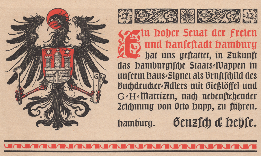
Above: For Genzsch & Heyse’s 70th anniversary in 1903, the Hamburg Senate allowed the foundry to incorporate the city’s coat-of-arms into their signet. Scan of part of page 2 from the Hamburger Kalender für das Buchgewerbe 1904.
Preface
In the type community today, we take certain things for granted, including the ready-availability of knowledge and information, the ease with which we are in contact with each other electronically, and how often we can all see each other in person. At least until 2020, there were multiple international type conferences every year. I could meet-up with staff from Adobe’s type team for a chat or a drink at ATypI and TypeCon. Maybe even at RoboThon in The Hague, too. Some members of our predecessor community one hundred twenty years ago enjoyed similar privileges, but I suspect this only applied to those at the very top of the industry. I look at the history of the German typefoundry network. It was common for foundry owners to have had direct, personal experience working in other foundries abroad back then – even for Europeans to spend time in America – especially if these owners inherited their positions from their fathers. Parents used the network to help groom their children, exposing them to new experiences, foreign technological advances and other business practices.
While the ownership class kept in contact through personal relations, that era’s type designers kept themselves pretty up-to-date about what their colleagues in other cities and countries were doing by reading the trade media. They may have also had some ability to travel internationally, but they would probably have not been able to take advantage of this as much as foundry owners could have.
I suspect that the average type designer in 2020 reads other type designers’ tweets far more regularly than a punchcutter in 1900 would have flipped through weekly issues of the Journal für Buchdruckerkunst, Schriftgießerei und die verwandten Fächer. The publications that type designers long ago would have read were just as available for working typesetters, typefounders, printers and punchcutters. Indeed, it was exactly for those workers’ continuing education that the journals were printed. Nevertheless, it is hard to grasp how much information common workers regularly consumed. That group of men and women would have had even less of the economic resources necessary to travel. Their professional networks, inasmuch as they had them, would likely have been local. They may have regular attended meetings of their city’s Typographische Gesellschaft, for instance.[1]
You probably came here to read about typefaces
This 4,200-word post is the second in a two-part series on the history of the Genzsch & Heyse typefoundry in Hamburg through 1908. The starting point for these is a small book the firm published for its 75th anniversary, Chronik der Schriftgießerei von Genzsch & Heyse in Hamburg, 1833–1908. My first post built off of the company’s 1883 employee list, as presented in that book. Everyone working at the company in 1907 was listed as well.

If designers today think about work produced by Genzsch & Heyse between 1883 and 1908, they are most likely to remember the foundry’s type designs. The most successful typefaces the foundry published in that quarter-century must have been Heinz König’s Römische Antiqua (1888), Otto Hupp’s Neudeutsch (1899), and Friedrich Bauer’s Nordische Antiqua (1907), re-released as Genzsch-Antiqua in 1910.[2] Especially in the latter years of this period, Hupp’s typefaces, ornaments and general illustrations dominated Genzsch & Heyse’s corporate identity.[3] Nevertheless, the foundry published a great many more new typefaces in those twenty-five years. The company’s new products included several sans serif typefaces, including a heavy design called Blockschrift that was similar to Schelter & Giesecke’s Breite halbfette Grotesk. Before the First World War, I suspect that sans serifs were not very important to Genzsch & Heyse’s business, since the foundry’s publications do not devote much relative space to them. Genzsch & Heyse also sold several typefaces that originated at foundries abroad. The most prominent example must be the G. Peignot et fils’s Grasset typeface, commissioned by Georges Peignot from Eugène Grasset and cut by Eugène Parmentier.
Above: Reproduction of an unspecified size of Genzsch-Antiqua. From Philip Bertheau (ed.): Buchdruckschriften im 20. Jahrhundert – Atlas zur Geschichte der Schrift, ausgewählt und kommentiert von Philipp Bertheau unter Mitarbeit von Eva Hanebutt-Benz und Hans Reichardt (1995), plate 105
Part of why I look into the makeup of typefoundry workforces is that I want to try and determine who was responsible for creating their products. Like the Blockschrift I mentioned above, many of Genzsch & Heyse’s typefaces are not attributed to any specific designers. Aside from those from König, Hupp and Bauer, Genzsch & Heyse engaged other artists and designers to create designs for a few typefaces, including the Kinder-Alphabete cut by Adolf Closs in Stuttgart (1878), the Hammonia-Einfassungen designed by Leonard Hellmuth (1889), the Pompadour ornaments designed by Ferdinand Mahl (1892), the Pionier display typeface drawn by E. Eickhoff (1893), or a series of later typefaces published by 1914 including Carl Otto Czeschka’s Czeschka-Antiqua, Franz Paul Glass’s Glass-Antiqua and Hugo Steiner-Prag’s Steiner-Prag-Schrift. Most of the remaining products must have been designed in house. Who exactly was responsible for that work? Was it the employees in the engraving department? Unfortunately, none of the workers in the employee list below is described as an artist, draftsperson or calligrapher.
When it comes to the era covered in this post, people today seem to like Friedrich Bauer and his typefaces most of all. For instance, Michael Wörgötter and the Munich-based Lazydogs Typefoundry just completed a new digital revival of Genzsch-Antiqua; the original typeface has already been revived several times. When a later typeface of Bauer’s design named the Friedrich-Bauer-Grotesk was revived in 2014 by Felix Bonge and Thomas Ackermann as FF Bauer Grotesk, Ferdinand Ulrich wrote a masterful blog post for the old FontShop site about it (Friedrich-Bauer-Grotesk was originally produced by a different Hamburg typefoundry: J.D. Trennert & Sohn).
The German standard baseline
Within the German typefounding and printing industry network circa 1907, Genzsch & Heyse was almost certainly not best-known for the design of its typefaces, but for its role in advancing industry technology by introducing a nationwide type-design and production norm. In today’s digital typesetting environment, we take it for granted that, no matter what we do to type in a word-processing program, the letters in a document’s lines of text will all sit on top of common baselines. If we switch fonts mid-word or mid-line, the letters in both the first font and the second font will share the same baseline. Enlarging or reducing the size of a part of the text on a line will not affect those letters’ positions relative to the baseline, either. The idea for a standard baseline originated in the United States, where it had been introduced in the early 1890s at the Inland Type Foundry of St. Louis.
In my last post, I mentioned that Emil Julius Genzsch (1842–1907) had taken over direction of Genzsch & Heyse from his father Johann August Genzsch (1800–1869) in 1866. Emil Julius Genzsch had two sons, both of whom also entered the family firm. These men are both mentioned at the top of the list below. One of them, Hermann Johannes Genzsch (1874–1948) spent part of the early 1890s working at the Inland Type Foundry. When he returned to Hamburg, he brought an enthusiasm for their “Standard Line” with him. Between 1899 and 1903, Genzsch & Heyse developed their own standard baseline, which they initially called their Universal-Schriftlinie. Based on their proposal, all German typefoundries then adopted it as a national norm. The Normal-Schriftlinie was thus introduced in 1905.[4]
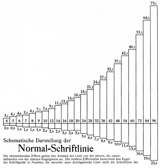
Above: Chart showing the position of the baseline in fonts of type cast from 4 through 96pt according to the German Normal-Schriftline instituted in 1905. The numbers at the top of each bar give the number of points of space above the baseline for each size; the numbers beneath the bars give the size available for descenders. From a Genzsch & Heyse supplement bundled into Ludwig Volkmann’s (ed.) Das moderne Buch (1910).
By instituting this norm, German typefoundries continued a trend that had begun in the 1870s, when they universally adopted the Didot system and a common height-to-paper measurement. All German typefaces being produced with a standard baseline enabled printers to mix typefaces from various typefoundries in a line of text more easily. Just as a standard baseline allowed for fonts of multiple designs to easily be combined, it also allowed for different sizes of type to be used on the same line systematically.
By 1905, all German types and spacing material were delineated in Didot points. To mix 9-point and 12-point type in the same line, a compositor would put one point of spacing material below the 9-point letters, and two points above them. The baselines of both sizes would then be aligned. Charts prepared by Genzsch & Heyse show that multiple point sizes retained common descender values; for instance, 7, 8, and 9-point types all had descenders of the same real length, namely 1.9 points (0,6669 millimetres). This had a visible effect on the design of the letters in those sizes; a roman descender that appeared to be balanced with the rest of the letters in a 7-point lowercase-letter alphabet might not look as visually balanced in the 9-point version. At the time when Genzsch & Heyse pioneered their standard baseline, more than half of all material printed in Germany was still set in blackletter type.[5] While roman typefaces often included ascenders and descenders with generous amounts of space around them, those letter-parts played a much less significant role in blackletter designs. Printers wanted to be able to easily mix blackletter and roman type on the same line; the decisions about the placement of the baseline in most type sizes were more advantageous to blackletter designs than to roman ones.[6]
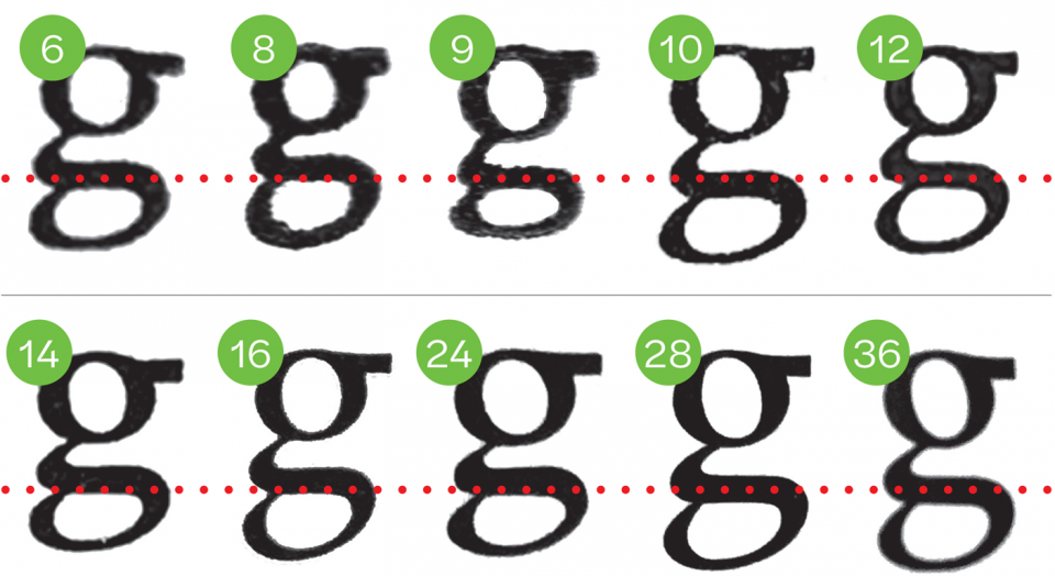
Above: The lowercase g of Nordische Antiqua/Genzsch-Antiqua’s sizes from 6 through 36pt, scaled to a common x-height. The dotted red line represents the position of the baseline in each size. Note how the position of the horizontal stroke at the top of the lower bowl varies in relation to the baseline from size to size.
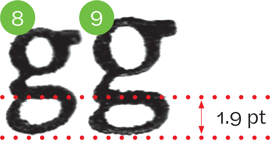
Above: The lowercase g from Nordische Antiqua/Genzsch-Antiqua’s 8pt and 9pt sizes. The German standard baseline called for these two sizes to have descenders of the exact same height (1.9pt). In Nordische Antiqua/Genzsch-Antiqua, this was solved by designing the lower half of the g so that its relationship to the top half was harmonious in the 8pt size, but visible too small in 9pt.
At the 2017 edition of the Kerning conference in Faenza, I gave a talk about the introduction of the standard baseline, in the context of the introduction of other industrial standardization norms in Germany typefounding. You can watch a video of that here (skip ahead to 22:20 if you are just interested in this).
Pantographs
A standard baseline was not the only “American” typefounding method that Hermann Johannes Genzsch helped institute at Genzsch & Heyse. In the specimen book for his revival of Genzsch Antiqua, Michael Wörgötter writes that Genzsch & Heyse installed a matrix-engraving machine in 1900.[7] This would have been a pantograph based on models Genzsch had seen in the United States. Other German foundries were introducing pantographic engraving methods around this time, although it is difficult to say with certainty how common pantographs were in Germany before the Second World War. My hypothesis is that, by the late 1920s, some foundries like Berthold were likely using them for all their typefaces, while others like Klingspor hardly relied on them at all, and in general their adoption was less thorough than you might think if American and British type-makers were your ‘baseline’ for how typefaces were made.
Even though Genzsch & Heyse had a matrix-engraving machine in 1900, Friedrich Bauer’s text on the design and production of Nordische Antiqua/Genzsch-Antiqua – whose fonts began to be published in 1907 – does not mention matrix engraving at all.[8] According to his description, steel punches were cut for type sizes smaller than 12pt. For sizes larger than 12 pt, soft-metal patrices were cut instead; those characters’ matrices were then made via electrotyping instead of by striking punches into copper. It is imaginable that some of the patrices could have been engraved with a pantographic punchcutting machine; such machines were in-use at Berthold in the 1930s, as can be seen in this video. As for the introduction of pantographic methods of one kind or another, I think that J.G. Schelter & Giesecke in Leipzig using them to some effect in the early-1890s. The Emil Gursch foundry in Berlin starting building pantograph-engraving machines around 1900, and H. Berthold AG in Berlin bought its first such machines from them in 1910 (Gursch’s factory was just down the street from Berthold’s). D. Stempel AG probably started engraving punches with pantographs around 1905, when they began producing matrices for Mergenthaler Linotype machines.
What do the changes since 1883 mean?
In 1907, the most obvious difference at Genzsch & Heyse was that the foundry was more than three times larger than it had been 1883. The chief business of a typefoundry was to cast individual metal letters that would be packaged together as fonts and sold to printers. In 1883, Genzsch & Heyse employed twenty men to cast type, not including assistants and apprentices. By 1907, that number had more than doubled. I count forty-six men who were probably casting type that year. It is also important to remember that between 1883 and 1907, the efficiency of typecasting machines also improved; twenty workers would have been able to cast more sorts per day in 1907 than they could have twenty-five years earlier.
By 1907, Genzsch & Heyse had added several departments that had not been part of the company in 1883. For instance, the employee list below includes the names of representatives of the firm in other cities. Most of these cities were abroad, and these persons and companies would have been responsible for making sales of Genzsch & Heyse’s typefaces to printers in their networks. Whereas the punchcutter Albert Anklam was the only engraver mentioned on Genzsch & Heyse’s 1883 employee list, by 1907 the company had an entire engraving department with more than a dozen workers in it, as well as a second department responsible for the firm’s electrotyping needs.
Above: The back of my copy the Hamburger Kalender für das Buchgewerbe 1904, printed in Genzsch & Heyse’s Haus-Buckdruckerei in 1903. You can flip through the whole thing on the Letterform Archive’s website.
By 1907, Genzsch & Heyse had established an internal printing office. This was a common decision made by larger German foundries in the 1890s and early 1900s. Having your own printing office allowed foundries to have complete control over type-specimen production, but it also probably allowed the foundry to iterate its specimens more quickly, possibly leading to better-designed documents than could have been provided by external printing offices. It may be difficult to imagine today, but before Genzsch & Heyse had an internal printing office, all of its specimens and advertisements would have had to have been printed externally. That means that Genzsch & Heyse staff would have had to compose and lock up all type samples internally, and then transport those to a printer, or they would have had to ship all their types to a printing house, who would have composed and printed specimens on their behalf.
Finally, there is the gender makeup of the company’s workforce. In Genzsch & Heyse’s 1883 employee list, all sixty-eight people named were men. By 1907, at least forty-five women worked at the foundry. They appear grouped across five areas of the foundry’s business:
- Four women worked in accounting and dispatch, where they probably would have been engaged in bookkeeping work, as well as writing correspondence and managing the shipment of orders.
- Two women worked in the in-house printing office, redistributing type after it was finished being printed from.
- All of the type-sorting employees in the company store room were women.
- All of the type-sorting employees in the typecasting division were women.
- Most of the employees working in the department for milling and kerning were women

Above: A double-portrait of Hermann Johannes Genzsch (left) and Friedrich August Genzsch (right). From Chronik der Schriftgießerei von Genzsch & Heyse in Hamburg, 1833–1908, page 65.
Geschäftsinhaber [company owners]
- Friedrich August Genzsch
- Hermann Johannes Genzsch
Kontor und Expedition [accounting and dispatch]
- Gustav Günther, Prokurist [company officer]
- Eduard Dierks
- Adolf Silchmüller
- Johann Rütze
- Wilhelm Hirschhausen
- Hermann Timm
- Wilhelm Paschen
- Ernst Hirschhausen
- Wilhelm Amlung
- Betty Nielsen
- Angela Gerdes
- Henrietta Schulze
- Elsa Gebhardt
- Barthold Irgang, Hausmeister [custodian]
Kontorboten [I don’t have a solid translation for this; maybe “office messengers”]
- Martin Bubach
- Artur Nicolaisen
Vertreter [representatives]
- Robert Neeff, Elberfeld
- Fritz Heidrich, Hamburg
- Felix Smalian, Berlin
- Curt Berndt, Leipzig
- Hagen & Bove, Export-Vertreter Hamburg
- J.C. Pundsack, Barcelona
- Olaf Gulowsen, Christiania [Oslo]
- Einar Voigt, Kopenhagen
- C.F. Strömbäck, Stockholm
- Henrik Oosterink, Arnheim
- Fedi Procopé & Co., Helsingfors
- C. Manderbach & Co., São Paulo
- Lüer & Paye, Santiago de Chile u. Valparaiso
Maschinenbau-Anstalt [machine shop]
- Emil Gentzsch, Maschinenmeister [master machinist; Gentzsch had been with the company for more than 25 years]
- Max Gentzsch, Techniker [technician]
Maschinenbauer und Mechaniker [machinist and mechanics]
- Karl Fink [25+ years at G&H by 1907]
- Johann Gätgens [25+ years at G&H by 1907]
- Karl Hansen [25+ years at G&H by 1907]
- Karl Gätgens
- O. Tausendfreund
- Hermann Mertz
- Heinrich Bubach
- Willi Gergs
- Wilh. Böttcher
- Franz Timm
- Adolf Seichter
Other machine shop employees
- Heinrich Rönnpage, Heizer [furnace operator]
- Wilhelm Wümmerling, Schmelzer [smelter]
Gravieranstalt [engraving department]
- Paul Steuer, Stempelschneider und Abteilungsvorsteher [punchcutter and department manager]
- Heinrich Schmidt (zur Vertretung), Stempelschneider [deputy manager, punchcutter]
Stempelschneider und Graveure [punchcutters and engravers]
- Emil Busch
- H. Hanewacker
- Rudolf Greve
- Georg Schlacht
- Robert Kreisig
- Fritz Poller
- Paul Krätke
- Josef Bendorf
- Robert Arnold
- Hans Körner, Lehrling [apprentice]
Other engraving department employees
- Werner Schrepel
- Julius Schoof
Schriftgießerei [typefoundry]
- Friedrich Brügmann, Oberfakor [chief foreman]
- Theodor Mertz, Faktor [foreman; Mertz had been with the company for more than 50 years]
- Hermann Suhling, Faktor [foreman; Suhling had been with the company for more than 25 years]
- Richard Schottke, Matrizenverwalter [keeper of the matrices]
Schriftgießer [type casters] with more than 25 years of experience at the firm
- Theodor Küchler
- Friedr. Küchler
- Wilhelm Hackert
- Julius Looß
- Josef Rieß
- Wilhelm Zahn
- Friedrich Mentel
- Otto Schröder
- Gustav Ralf
- Henry Roß
- Karl Schröder
- John Vermehren
- Ernst Rose
- Ludwig Locke, Invalide [Locke had been with the company for more than 50 years, but by 1907 he was an “invalid;” he must have been at least 64 that year]
Younger Schriftgießer [type casters]
- Cäsar Hirte
- Adolf Schlegel
- Ernst Börnchen
- Arthur Glober
- August Siemers
- Friedr. Preußen
- Karl Zifka
- Alb. Hermann
- Wilhelm Kaiser
- Friedr. Lottmann
- August Peters
- Relix Braemer
- Theodor Krabs
- Hermann Fischer
- Emil Tellkamp
- Friedrich Ide
- Gustav Winkler
- Alfred Seidel
- Wilh. Hansmann
- Wilhelm Willmer
- Gustav Stoldt
- Otto Strüfing
- Max Heinmöller
- Ludwig Roß
- August Dötze
- Heinrich Schmid
- O. Kampfhenkel
- Joh. Wiesmeier
- Heinr. Emmerich
Fertigmacher, Höhehobler, Kontrolleure [type finishers, type planers, quality controllers]
- Ferd. Schmid
- Otto Bechert
- Hermann Steffen
- Karl Seegers
- Felix Bauer
- Max Neumann
- Hartwig Helfrich
- Adolf Biermann, Invalide [Biermann had been with the company for more than 25 years, and was an invalid by 1907]
Schriftgießerei-Lehrlinge [typecasting apprentices]
- Heinrich Feuß
- L. Teckenburg
- Ludwig Reinhart
- Max Sachau
- Emil Schlegel
- Richard Schulz
- Karl Behrens
- Otto Gaßmann
- Konr. Steenbock
- Friedr. Wuppermann
- Alfons Kämmerer
Matrizen-Werkstätte [matrix workshops]
- Otto Suhling, Galvanoplastiker, Abteilungsvorsteher [electrotyper and department manager; by 1907, Suhling had been with the company for more than 25 years]
Justierer [matrix justifiers]
- Karl Suhling
- Max Schnädelbach
- Friedrich Brügmann
- Oskar Bekker
Hülfsarbeiter [assistants]
- Max Tauck
- Amandus Knauer
- Walter Gellert
- Richard Volquarts
Galvanoplastik (electrotyping)
- Hermann Buchhardt, Abteilungsvorsteher [department manager]
- Josef Fjeldberg
- Otto Heitzmann
- Wilhelm Noodt
- Karl Rump
Lehrlinge [apprentices]
- Hans Krauel
- Bruno Lempke
Stereotypie [stereotyping]
- Hermann Hansmann, Stereotypeur [stereotypist, had been with the company for more than 25 years by 1907]
Haus-Buchdruckerei [in-house printing office]
- Friedrich Bauer, Abteilungsvorsteher [department manager]
- August Lange
- Lorenz Ketelstein
- Hermann Goedtke
- Theodor Hellmann
- Karl Vockert
- Karl Schirm
- Albert Steenbock, Schriftsetzer-Lehrling [typesetting apprentice]
- Wilhelm Becker, Buchbinder [book binder]
- Bianca Holm, Anlegerin [type redistributor]
- Minna Wachs, Anlegerin
Lager [Storeroom]
- Rudolf Calosso, Lagermeister [keeper of the storeroom, had been with the company for more than 25 years by 1907]
- Heinrich Braasch
- Theodor Calosso
Teilerinnen [type distributors, feminine plural noun]
- Sophie Behn
- Elisabeth Reinhart
- Adele Sperling
- Frieda Sanck
- Elisabeth Balzer
- Ida Griese
- Hewdig Kämmerer
- Fernande Stehr
Hülfspersonal der Gießerei [typecasting assistants]
Teilerinnen
- Marie Scharff
- Elisabeth Blaffert
- Paula Gropp
- Helene Lehmann
- Emma Schröter
- Auguste Beyn
- Martha Müller
- Henny Schröter
- Marie Specht
- Bertha Losch
- Elsa Wagner
- Elsa Sorgenfrei
- Bertha Schröder
- Paula Heitmann
- Käthe Ratzka
- Marie Keller
Abteilung für Fräsen, Unterschneiden etc.: [department for milling and kerning, etc.]
- E. Zimmermann [had been with the company for more than 25 years by 1907]
- Amalie Böttcher
- Marg. Breuchel
- Marie Spahn [had been with the company for more than 25 years by 1907]
- M. Lüttjohaann
- Elisabeth Fraantz
- Maarg. Dotter
- Hedw. Eichbladt
- Amanda Loth
- Anna Schweder
- Wilh. Jirjahlke
- Ida Friedrich
- Minna Mahnke
- Anna Passel
- Alwine Wichert
- Ekse Böttcher
- Henny Lüthcke
The Genzsch departure from Genzsch & Heyse
The beginning of the employee list above presents Friedrich August Genzsch and Hermann Johannes Genzsch as the two owners of the company. These men were Emil Julius Genzsch’s children, and the third generation of Genzsch family members to run Genzsch & Heyse. Friedrich August Genzsch retired from the firm’s active direction in 1909, although he remained a silent co-owner of the foundry for some time.[9] A joint stock company called the Genzsch & Heyse AG was organised in 1913 and Hermann Johannes Genzsch was named as its director.[10] He seems to have been pushed into retirement by the board of directors at the end of September 1933, not as a result of the new National Socialist power-holders in Germany but as a reaction to Genzsch & Heyse’s inability to regain financial stability after the onset of the worldwide depression. However, he was able to stay with the company through a seat on its board.[11]
In this way, the direction of the foundry passed out of the Genzsch family altogether. Although Hermann Johannes Genzsch had two children of his own, the Staatsarchiv Hamburg states that they had no interest in typefoundry management. The eldest of Hermann Johannes Genzsch’s children was Dr. Hans Albrecht Genzsch, a historian who died as a soldier in the Second World War. His sister Lotte Genzsch (1907–2003) was a photographer.[12] Thanks to her, the Genzsch family papers were donated to the city archive for posterity in 1991. The Genzsch & Heyse foundry was destroyed in a 1943 bombing raid on Hamburg. The company rebuilt after the war and continued to cast type until the early 1960s, before switching over to sign-engraving entirely. That post-war factory building is still standing in Hamburg today. Hermann Johannes Genzsch died in 1948
In this series’ first post, I mentioned that, after Johann Georg Heyse’s death in 1849, no members of the Heyse family had ownership in the foundry.
Notes
- The Typographische Gesellschaft München, founded in 1890, is still active today. The organization does not have a continuous history per se; it was dissolved in 1933 and reestablished in 1949. In the nineteenth century, Typographische Gesellschaften were founded in many other German cities: Cologne (1873), Leipzig (1877), Berlin (1879), Stuttgart (1881) and Brzeg (1882). See Hundert Jahre Typographische Gesellschaft München (1990), p. 14. Hamburg also had a Typographische Gesellschaft by 1908, but I do not know when it was established.
- Genzsch & Heyse published the Nordische Antiqua/Genzsch-Antiqua typeface around the same time as Chronik der Schriftgießerei von Genzsch & Heyse in Hamburg, 1833–1908, the short seventy-fifth anniversary book I mention above. The typeface was designed by Friedrich Bauer, and Bauer probably wrote this commemorative book, too. He almost certainly would have supervised its printing. The book is composed entirely with that typeface. According to Philip Bertheau (ed.): Buchdruckschriften im 20. Jahrhundert – Atlas zur Geschichte der Schrift, ausgewählt und kommentiert von Philipp Bertheau unter Mitarbeit von Eva Hanebutt-Benz und Hans Reichardt (1995), plate 22, Genzsch & Heyse released the typeface as Nordische Antiqua and Kursiv (as well as all-caps titling faces) in 1907. Bold and Bold Italic fonts followed in 1908, with a Condensed Bold published in 1909. Black and Condensed Black came out in 1910, but in that year the foundry also changed the typeface’s name to Genzsch-Antiqua. Genzsch & Heyse sold a great deal of type to printers in Scandinavian countries and the impetus for designing Nordische Antiqua/Genzsch-Antiqua came from Sweden, where the typeface was distributed as Nordisk Antikva; see Michael Wörgötter’s Genzsch Antiqua redesigned. Eine Schrift zwischen den Zeiten (2019), p. 87
- The prevailing “Otto Hupp look” at Genzsch & Heyse may have been something that Friedrich Bauer – who was with the company from 1898 until 1913, eventually running its printing department – was likely responsible for changing. No doubt he may have been aided in reducing the role Otto Hupp’s designs played in Genzsch & Heyse’s identity by Hupp’s switching foundry allegiances in 1904, when he began to be represented by the Klingspor brothers instead.
- The process by which Genzsch & Heyse convinced all involved parties to adopt a standard baseline was not straightforward. The details of the negotiations are recounted in Klaus-Peter Gerlach’s Geschichte der Hamburgischen Schriftgießereien: J.D. Trennert & Sohn, Genzsch & Heyse, J. John Söhne (1995) p. 115–139
- According to Hermann Smalian, an 1881 study prepared by Carl Berendt Lorck for the Börsenblatt für den deutschen Buchhandel revealed that forty per cent of books printed “for academic subjects, with the exception of theology” had been composed in Fraktur type. Sixty per cent were in roman. When it came to “general instructional texts, popular texts, as well as business and commercial literature,” seventy-nine per cent of books were composed with Fraktur; see Hermann Smalian: »Die deutsche Buchschrift der Zukunft«. In: Deutscher Buchgewerbeverein (ed.): Archiv für Buchgewerbe. Vol. 37, no. 6 (June 1900), p. 194–195. Albert Kapr’s Fraktur: Form und Geschichte der gebrochenen Schriften (1993) provides the following breakdown for publishing in 1928: 56.8% of books printed in Germany that year were set in Fraktur type, with 43.2% composed in roman. The ratio for newspapers was 59.8% to 40.2% Fraktur to roman; see Kapr, p. 78
- See Walter Wilkes: »Einführung«. In Bertheau (ed.), p. xii. Although I have not yet come across any statements from German type designers either in the decade before the First World War or in the decades thereafter expressing displeasure with the standard baseline, Jan Middendorp recounts the displeasure expressed by two Dutch designers about it: Sjoerd Hendrik de Roos and Sem Hartz; see Jan Middendorp. Dutch Type (2004), p. 42–43
- Wörgötter, p. 49
- See the abridged edition of Friedrich Bauer’s »Wie eine Druckschrift entsteht« in Ibid., p. 25–42
- Gerlach, p. 136
- Ibid., p, 139
- Ibid., p. 150–151
- See, for instance this photo of Lotte Genzsch’s, surely taken at the Genzsch & Heyse foundry – and probably for the Genzsch & Heyse foundry, too, as part of their marketing for the Johannes-Type designed Johannes Schulz.