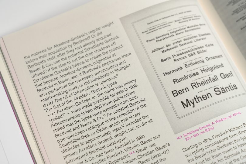
Above. part of a spread from Footnotes C. Footnotes is a typographic journal published in Geneva. Its most recent issue includes my article “The godfather: retracing the origins of Akzidenz-Grotesk.” In the photograph above, you can see an 1896 specimen of Schattierte Grotesk typeface, which the Bauer & Co. type foundry at Stuttgart published the year before. The Berlin type foundry H. Berthold AG acquired Bauer & Co. in 1897. Schattierte Grotesk is the parent design from which Akzidenz-Grotesk was derived. The Royal-Grotesk typeface was then derived from Akzidenz-Grotesk, not the other way around.
Last year, I retooled a few pages of my dissertation to deliver an article on the origins of the Akzidenz-Grotesk typeface to Footnotes. If you’ve been following my blog posts this year, you’ll have noticed that I have posted a flurry of articles that touch on the history of the H. Berthold AG and Ferd. Theinhardt type foundries, as well as on the histories of the Akzidenz-Grotesk and Royal-Grotesk typefaces here on this blog. I wrote each of these posts as something like a “warm up” before Footnotes published my article. In retrospect, you could call my hobby blogging something of a Theinhardtpalooza.
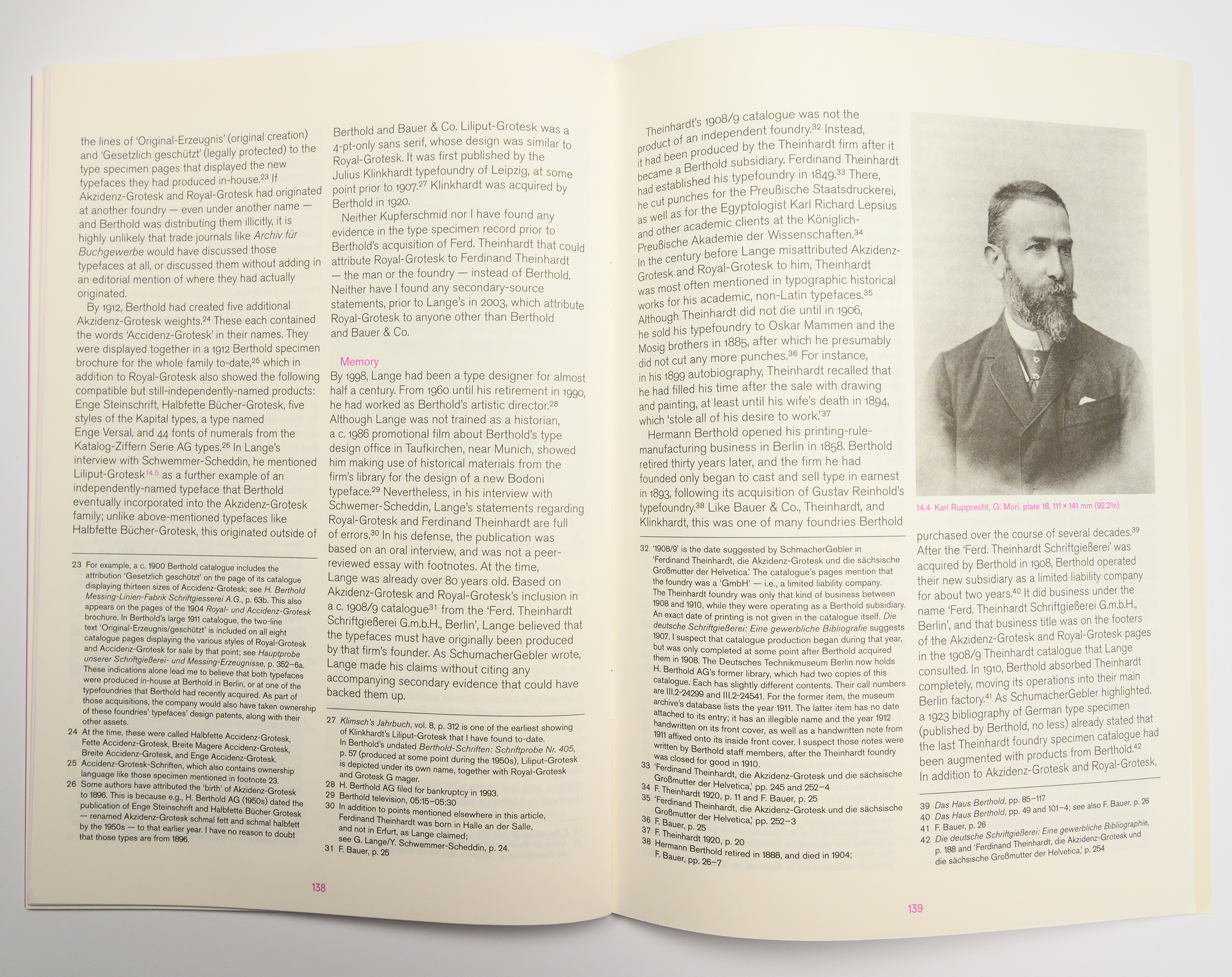
Photo of one of the spreads from my Footnotes C article on the origins of Akzidenz-Grotesk, click to enlarge. Like the other two photos in the post, this photograph is from Nadya Kuzmina. On the spread, you can see a portrait of Karl Rupprecht – one of two cofounders of the Bauer & Co. type foundry in Stuttgart. By the time of the foundry’s acquisition by Berthold, Rupprecht was likely the sole owner of Bauer & Co., and he may have helped engineer the sale. Rupprecht was then one of Berthold’s company directors for a few years, before leaving type founding for a time in 1901. In 1907, he purchased the Heinrich Hoffmeister type foundry at Leipzig in 1907. That business was itself acquired by D. Stempel AG in 1918.
Over the keyword Theinhardt, you can directly pull up a page with links to all of my articles on these subjects. I know, I know … it is a bit backward to tag a series of articles circling around the history of the iconic Akzidenz-Grotesk and Royal-Grotesk typefaces with the keyword “Theinhardt” when neither Ferdinand Theinhardt the punchcutter nor Ferd. Theinhardt the type foundry had anything to do with either of those typefaces. But if it will encourage other websites to change their attribution information – there was no Royal-Grotesk cut by Ferdinand Theinhardt for the Royal Prussian Academy of Sciences in 1880 – it is the least I can do.
Here are direct links to those Theinhardt-tagged blog posts:
- German, Swiss, and Austrian typefaces named Royal or Akzidenz
- J.H. Bachmann’s three favorite punchcutters (1869)
- The Academy of Sciences of the USSR’s hieroglyphs font (1928)
- Berlin locations of the old Ferd. Theinhardt foundry
- Another word on Accidenz-Grotesk and Royal-Grotesk’s appearances in Theinhardt specimens
If you can’t get enough of the subject, have a look at the videos of these presentations:
- Ante desinatores: Die Verbreitung einzelner serifenlosen Schriften durch das deutschsprachige Schriftgießereigewerbe im 19. Jahrhundert
- German sans serif typefaces from the 19th century
- Should every foundry have its own sans serif?
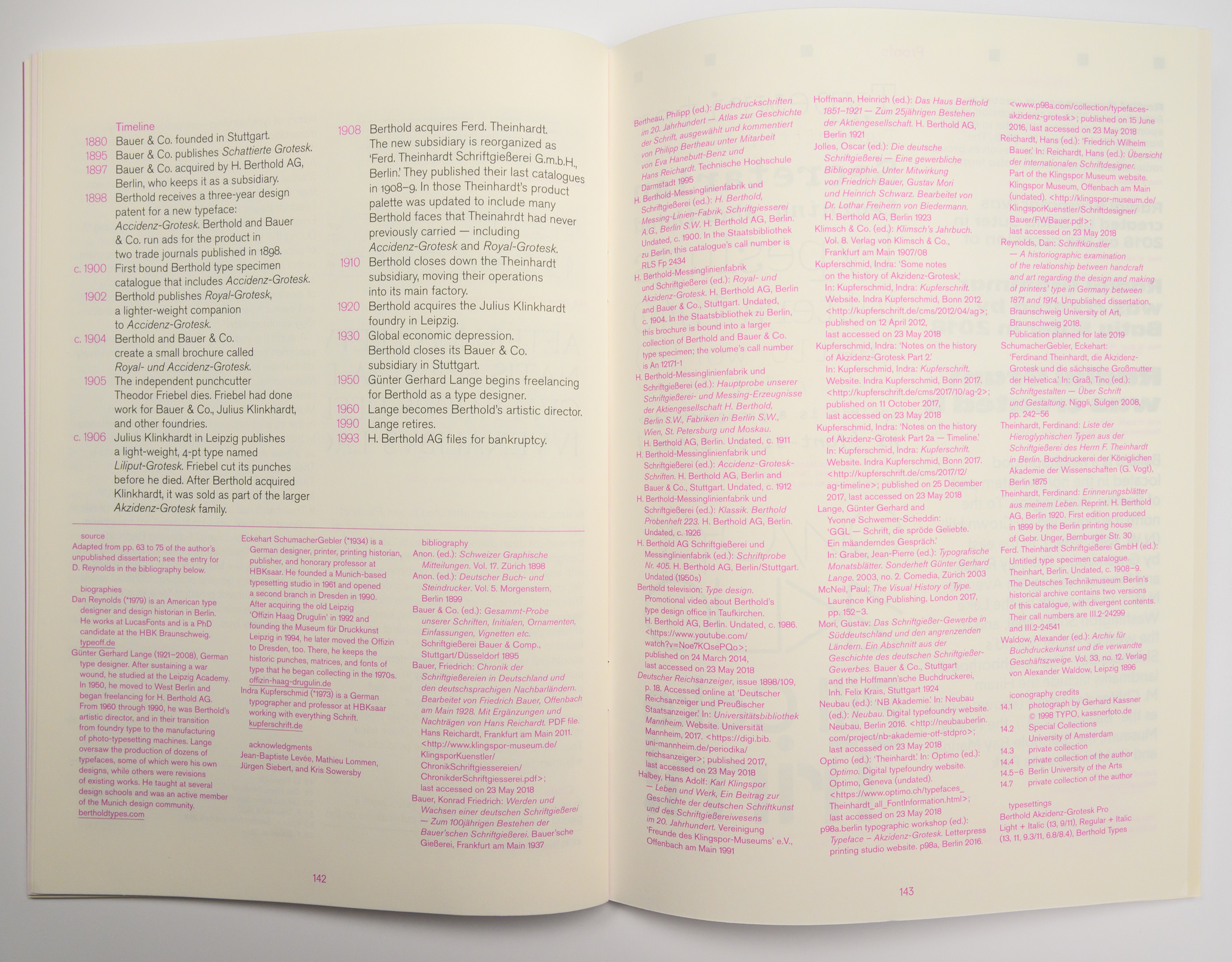
Although I’m not the biggest fan of timelines, I like how this one came out. A photo of the article’s final spread, which also has my bibliography, is pictured above (click to enlarge). Most of the magenta-colored text lists bibliographic entries. I might have compiled a slightly longer than average bibliography for a text of this article’s length, but what else should you expect in a publication called Footnotes?! The rarer type specimen entries include call numbers for their copies I consulted in Berlin libraries and museums.
The article isn’t perfect, which is entirely my fault. I kept rephrasing certain passages and making new additions, even a half a year or more after the text had already been laid out in the magazine. In the process, I broke things. At least one sentence is missing a period, and I think the first “Wilhelm” is misspelled on all but one or two occasions. While I hope you won’t notice, I know that you will – details are important. Please forgive me. I hope you enjoy the article anyway.
A note about Liliput-Grotesk
While it is just a small point in the article, I’m glad to have been able to include an attribution for the punchcutter who cut Liliput-Grotesk. I stumbled across this information myself, but soon saw – no surprise there! – that this was something Hans Reichardt had already tabulated in his records. That makes it all the more disheartening to read sources like this one incorrectly attribute it to Ferdinand Theinhardt.
Even though it is one of the smaller parts of the greater Akzidenz-Grotesk family. Liliput-Grotesk was a light sans serif cut by Theodor Friebel in a 4-pt size only. I don’t know when he performed the work, but he died in 1905. The Julius Klinkhardt type foundry at Leipzig published the typeface about year later. Berthold acquired Klinkhardt after the First World War, and they eventually marketed Liliput-Grotesk as an addition to Royal-Grotesk (renamed magere Akzidenz-Grotesk, or Akzidenz-Grotesk Light, around the 1950s), as Berthold never cut a Royal-Grotesk size that small.