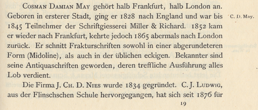
Above is a scan showing Carl B. Lorck’s entry on the punchcutter C. D. May in his 1883 Handbuch der Geschichte der Buchdruckerkunst.[1] I don’t think that Lorck’s attribution of a rounded-style Fraktur (called a Midoline here) to C. D. May implies that May was the punchcutter behind any or all of the typefaces named Midolline/Midoline, which I describe in this other post. Instead, I think that Lorck was implying that May cut some kind of hybrid-style typeface, in addition to more “standard” Fraktur and roman types.
J. H. Bachmann’s favorites
J. H. Bachmann (1821–1876) was a Prussian printer and author of texts for workers in the printing industry. In an 1869 article on Fraktur type in the Journal für Buchdruckerkunst, Schriftgießerei und die verwandten Fächer, Bachmann claimed that the Berlin punchcutter Ferdinand Theinhardt cut the best Fraktur typefaces.[2] He singled out two other punchcutters for their work in other genres: Heinrich Ehlert for his border-setting fonts and Cosman Damian May for his romans:
Daß der Fractur ein recht gefälliger Schnitt zu geben ist, ohne ihren Charakter dabei zu schädigen, hat der Stempelschneider Ferd. Theinhardt in Berlin zur Genüge bewiesen. Seine Fracturschriften haben ein echt deutsches Gepräge ohne alle fremde Beimischung und stehen, was Correctheit und Eleganz anbelangt anbelangt, keiner anderen Fractur nach. Wie nun fast jeder Künstler seine besondere Specialität hat, in welcher er besonders Tüchtiges leistet, z. B. Heinrich Ehlert in Berlin in Einfassungen aller Art, der verstorbene May in Antiquaschriften (durch seinen langen Aufenthalt in England besonders darin geschult), so dürfte auch Ferd. Theinhardt als einer der tüchtigsten Fracturschneider zu nennen sein.
My translation: That Fraktur can be given a rather pleasing look without its character being damaged has been amply proven by the punchcutter Ferd. Theinhardt in Berlin. His Fraktur typefaces have a real German feeling, without any foreign-ness having been mixed in. As far as correctness and elegance are concerned, they are not surpassed by any other Frakturs. Since almost every artist has their own specialty area where they are particularly efficient, Heinrich Ehlert of Berlin should also be mentioned as an example, for his border-printing fonts. Also [Cosman Damian] May, recently deceased, for his roman typefaces (perfected especially by his having worked for many years in England). In this way, Ferd. Theinhardt may be considered one of the best cutters of Fraktur.
Which punchcutter made the best sans-serif type?
Bachmann does not mention which punchcutter was responsible for his favorite sans-serif types. Strictly speaking, sans serif typefaces are just a sub-category within the overarching Antiqua, or roman style. Nevertheless, when Bachmann singled out Cosman Damian May’s Antiquaschriften, I suspect he only had serif examples in mind – possibly italics as well. May cut those types in the “modern” styles, which could variously be described they Didone or Scotch, etc. In 1869, sans serif typefaces were not yet a particularly important element within German printing. And the sans-serif fonts available only lent themselves to display use.
Nevertheless, if I were to retroactively tinker with Bachmann’s list, I would add Johann Christian Bauer (1802–1867), who established what eventually became known as the Bauer’sche Gießerei in Frankfurt am Main. Like May, Bauer had also worked in Britain for several years. Also like May, Bauer had passed away before Bachmann wrote this article.
Two sans serif typefaces from Johann Christian Bauer: Neueste schmale Grotesque and Halbfette Grotesque Modern. Scanned from Werden und Wachsen einer deutschen Schriftgießerei, which gives the date of 1859 for both designs.[3] I think that the top design was only published in 1865, however.[4]
Bauer cut types in different styles: roman, blackletter, italic, display, etc. He also cut two text-sized sans serif designs, each in a small range of sizes. Although they were just a drop in the bucket when compared with the entirely of his oeuvre, having been the designer-punchcutter behind two sans serif families seems enough for me to assume that, in the mid 1860s, he was somewhat “ahead at the races.”
Cosman Damian May
10-point May-Antiqua from the 1953 VEB Offizin Haag-Drugulin printing house’s type specimen catalogue.[5] Although May was a part owner of two foundries in Britain during his time there, he didn’t operated a typefoundry during the years he worked in Germany. Instead, he sold strikes (duplicate matrices) of the punches for his typefaces to various German foundries. Those foundries then gave the typefaces generic, descriptive names. Punchcutter attributions were not common in their catalogues. The roman above is attributed a May in the Haag-Drugulin printing office’s 1953 catalogue. Nevertheless, I do not currently know if this is a roman cut by our May from this post, or by his son. According to James Mosley, the Drugulin typefoundry, acquired by Stempel in 1919, had romans from May in its inventory – presumably from Cosman Damian May, I’d say.[6] So it is conceivable that this font’s attribution is accurate. Indra Kupferschmid has told me on multiple occasions, however, that Haag-Drugulin’s catalogues are not entirely reliable. So there you go.
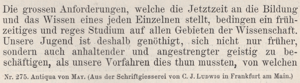
A similar serif face attributed to May or his son, sold by the C.J. Ludwig typefoundry in Frankfurt am Main (later Ludwig & Mayer). From Faulmann’s Illustrirte Geschichte der Buchdruckerkunst.[7]
Especially in comparison with Theinhardt and Johann Christian Bauer, I have found little information about May and his work (whether more information is available in German about May or Ehlert is a toss up). Below, I have translated May’s entire entry in Friedrich Bauer’s 1928 Chronik der Schriftgießereien in Deutschland und den deutschsprachigen Nachbarländern.[8] Based on the information you can read there, it seems that May is more of a figure in Britain’s type founding history than Germany’s. I urge British researchers to uncover and present whatever they can about him.
Friedrich Bauer’s text mentions several Fraktur types. Aside from the May-Antiqua shown above, I’ve seen the May name attached to several Fraktur faces in late 19th and early 20th century type specimen catalogues. Although Bachmann singled out May for his romans, Theinhardt for his Frakturs, and Ehlert for his border-printing elements, each of those men cut all three of those typographic varieties. Anyway, here is Friedrich Bauer’s summary:
Born in 1807 at Frankfurt am Main, Cosman Damian May was one of the most famous punchcutters of his time. In 1852, he settled in Frankfurt [again], establishing himself as an independent punchcutter.
Like Johann Christian Bauer and A. Gerlach, C.D. May was originally a locksmith. He was trained in punchcutting by Andreas Schneider, who was the first punchcutter at the Dresler foundry [note: I’m not sure if this statement implied that Schneider was then the Dresler’s chief punchcutter, or the first punchcutter that foundry employed; both could be true]. May went to England in 1828, where he worked for several years at Watts in London, and then for Stephenson, Blake & Co. in Sheffield and Miller & Richard in Edinburgh; at the latter company, he was also a partner, and gained high recognition. He became a partner of Alex. Wilson & Son in London, too. Following that business’s dissolution, he freelanced in England and the German-speaking countries bordering Germany from 1845 until 1852 before returning to Frankfurt, where he cut many good Fraktur and roman typefaces until 1863. Strikes of these typefaces were purchased by most typefoundries. Cotta’s publishing house in Stuttgart acquired the punches of a small bourgeois-sized [9 pt] Fraktur to compose their editions of the classics [Klassikerausgaben].
Multiple orders for titling types [Titelschriften] brought May back to London in 1863, where he died on 21 July 1865. His son F. F. May was also a punchcutter, who continued to run his father’s business in London. He sold several strikes made by his father – as well as himself – to German typefoundries. Many of those types are still being cast.
A notice of F. F. May’s sale of strikes appeared in the January 1867 issue of Archiv für Buchdruckerkunst.[9] The 1926 Handbuch der Schriftarten, compiled by Email Wetzig and published by the Seemann-Verlag includes four typefaces from J. John Söhne in Hamburg that were attributed to F. F. May: Antiqua VI, Antiqua VII, Antiqua VIII, and Fraktur I. The Antiquas were all cast in text sizes only. The Fraktur design was a bit more versatile, being sold in sizes ranging from 6 through 28 pt.
Who was J. H. Bachmann?
According to Carl Berendt Lorck’s Handbuch der Geschichte der Buchdruckerkunst, J .H. Bachmann was originally from Stralsund, on the Baltic sea coast.[10] As a young man, he worked for eight years at the university printing office in Kiev – then part of the Russian Empire. From 1850 through 1860, Bachmann worked for Johann Heinrich Meyer in Braunschweig. Meyer had founded the Journal für Buchdruckerkunst in 1834, and Lorck reported that Bachmann began his trade writing while he was in Meyer’s printing house.
At some point after 1860, Bachmann came to the Haenel/Gronau printing house in Berlin, where he worked as a Faktor (foreman) in the printing office. The Haenel/Gronau operation had an in-house punchcuttery and typefoundry, and Bachmann wrote a book explaining the typefounding processes: Die Schriftgießerei. Published in 1867, you can read an excellently digitised copy of it online now, which includes all of the book’s illustrations.
I mention Bachmann’s employment at Haenel/Gronau because – wouldn’t you know it – two of his three “favorite” punchcutters were Haenel alumni. Theinhardt had worked for Haenel in the 1840s, before setting up his own Berlin typefoundry in 1849. Ehlert left the company in 1858. I don’t know when Ehlert started at Haenel’s, but in my talk at ATypI 2018, I speculated as to whether he might have the punchcutter behind the foundry’s circa 1851 trendsetting Midolline typeface.
I need more information about Heinrich Ehlert
Aside from the basic details that appear for Ehlert in Friedrich Bauer’s Chronik, I have found a few announcements and specimen sheets in trade journals, from the foundry he eventually started. There are also records of two US patent applications he filed for fonts of border-printing elements. Let me know if you have found more!
Printed sources
- Carl Berendt Lorck: Handbuch der Geschichte der Buchdruckerkunst, vol. 2. Verlag von J.J. Weber, Leipzig 1883, p. 289. 1988 facsimile edition, Zentral Antiquariat der DDR.
- J. H. Bachmann: »Die Fractur«. In: Journal für Buchdruckerkunst, Schriftgießerei und die verwandten Fächer, vol. 36, no. 42 (10 November 1869). Verlag von Johann Heinrich Meyer, Braunschweig 1869, col. 413–415, here col. 413
- Konrad Friedrich Bauer: Werden und Wachsen einer deutschen Schriftgießerei. Zum hundertjährigen Bestehen der Bauerschen Gießerei. Bauer’sche Gießerei, Frankfurt am Main 1937, p. 26
- Johann Christian Bauer: »Neue schmale halbfette Grotesque modern«, specimen of four sizes of the typeface. In: Journal für Buchdruckerkunst, Schriftgießerei und die verwandte Fächer, vol. 32, no. 4 (1 February 1865). Verlag von Johann Heinrich Meyer, Braunschweig 1865, col. 27
- VEB Offizin Haag-Drugulin (ed.): Die Schriftproben. VEB Offizin Haag-Drugulin, Leipzig 1953, p. 211
- James Mosley, A Dictionary of Punchcutters. James Mosley, London. Undated, p. 41
- Karl Faulmann: Illustrirte Geschichte der Buchdruckerkunst mit besonderer Berücksichtigung ihrer technischen Entwicklung bis zur Gegenwart. A. Hartlebens Verlag, Vienna/Pest/Leipzig 1882, p. 701
- Friedrich Bauer: Chronik der Schriftgießereien in Deutschland und den deutschsprachigen Nachbarländern. Bearbeitet von Friedrich Bauer, Offenbach am Main 1928. Mit Ergänzungen und Nachträgen von Hans Reichardt. PDF file. Hans Reichardt, Frankfurt am Main 2011, p. 59–60 [link]
- Alexander Waldow (ed.): Archiv für Buchdruckerkunst und verwandte Geschäftszweige, vol. 4, no. 1 (January 1867). Verlag von Alexander Waldow, Leipzig 1867, col. 35
- Lorck, p. 285