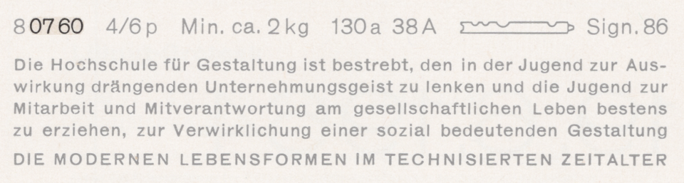
Above, I have reproduced a specimen of Akzidenz-Grotesk’s regular weight showing its 4pt size on a 6pt body. That is taken from a scan of page 58 from the undated H. Berthold AG Hauptprobe Nr. 470, probably printed at some point during the 1960s. I’ve highlighted the last four digits of its product number: 0760. This post is about that number and the rest of the product numbers in the Azidenz-Grotesk family.
These days, the former H. Berthold AG company library is held in the Historical Archive at the Stiftung Deutsches Technikmuseum Berlin; in their catalog, these items are grouped into the Sammlung Möllenstädt. The museum’s Historical Archive also acquired Günter Gerhard Lange’s personal library. For decades, Lange was Berthold’s artistic director. Beginning in the 1950s, he designed several extensions and revisions to Akzidenz-Grotesk.
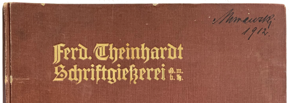
Between the Sammlung Möllenstädt and the Sammlung Günter Gerhard Lange, the Deutsches Technikmuseum has three undated catalogs from the Ferdinand Theinhardt foundry. Each has a different number of what had probably once been loose specimen sheets. Those had been printed over an unknown range of times and then bound together later. Some were printed before H. Berthold AG acquired the foundry in 1908, but many were printed afterward. The catalogs with the shelf numbers III.2-24299 and III.2-24541 are in the Sammlung Möllenstädt. Until about 1993, they had been part of Berthold’s company specimen library.
In 1910, Berthold moved the Ferd. Theinhardt Schriftgießerei, G.m.b.H. from its location in Schöneberg into its main factory building in Kreuzberg. The Theinhardt brand continued to cast and sell fonts of type until the 1930s. These catalogs must have been working documents for the staff fulfilling Theinhardt-customer orders inside the Berthold foundry. The bindings on each are different, although one has the same binding as III.2-36223 – a catalog Günter Gerhard Lange probably bought on the rare books market. All three have been digitized. You see them via the above links.
Which side of the 1908-divide the individual sheets inside the catalogs were printed during is clear when you read the exact wording of the foundry’s name, as it was printed on each page’s footer. After Berthold acquired the Theinhardt foundry, they legally reorganized it as a wholly-owned limited liability company. That new company had the name Ferd. Theinhardt Schriftgießerei G.m.b.H., Berlin and pages that would have been printed after the acquisition have this printed on their footers. Pre-acquisition pages’ footers read just Ferd. Theinhardt, Schriftgießerei, Berlin.
I suspect that the appearances of Accidenz-Grotesk and Royal-Grotesk in these three catalogs explain Günter Gerhard Lange’s late-career (1998) attribution of those typefaces to the punchcutter Ferdinand Theinhardt. In Eckehart SchumacherGebler’s 2007/2008 refutation of that attribution, he suggests that Lange was not aware that many of the pages in these catalogs had been printed after the Theinhardt acquisition by Berthold. Lange had proposed that the typefaces entered the Berthold product palette through Berthold’s acquisition of that firm. Instead, the typefaces entered the Theinhardt foundry after Berthold acquired that firm and began allowing them to sell Berthold products.
I bet you want to see images
You can see photographs of the Accidenz-Grotesk and Royal-Grotesk pages from these catalogs in chapter 3 of my dissertation, which is available as a PDF-download on Academia.edu. I also discussed the topics addressed in this post in 2019 lectures at TypeParis and the Sans Everything 2 conference in Amiens. Videos of each talk are also watchable online via the above links. You can also check out the more image-heavy history of Akzidenz-Grotesk’s origins I wrote for the Klim Type Foundry.
The two catalogs from the Sammlung Möllenstädt have intriguing notations handwritten onto them/inside of them. For instance, on the front cover of III.2-24299, someone wrote two lines of text in the top-right corner in ink. The first line seems to be a last name beginning with the letter M, but the handwriting is too illegible for me to decipher (I even showed it to two friends much more fluent in Kurrent than I am, but no dice so far). The second line reads “1912.”
As I mentioned above, catalog number III.2-24299 has the same binding as III.2-36223. The Deutsche Nationalbibliothek in Leipzig has a Theinhardt catalog with this binding as well.
The other catalog
The first sheet of catalog III.2-24541 has a stamp in its top-right corner reading “Theinhardt” and the handwritten title Handprobe Kontor Theinhardt. There is also a multi-part handwritten note on the reverse of the first page, pictured below. This addresses the relative availability of stocks of Theinhardt fonts vis-à-vis what the other Berthold foundries had for sale. Since the note mentions Gursch and Böttger, it was probably written in the 1920s or 1930s. After the First World War, Berthold acquired even more type foundries, including Emil Gursch’s in Berlin and Gottfried Böttger’s in Leipzig.
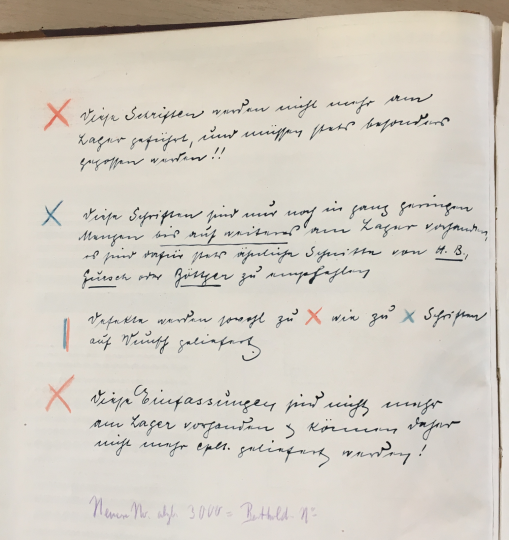
I initially transcribed the top four parts of this sheet rather badly – but then, dear reader, Florian Hardwig filled in the gaps:
❌ Diese Schriften werden nicht mehr am Lager geführt, und müssen stets besonders gegossen werden!!
✖️ Diese Schriften sind nur noch in ganz geringen Mengen bis auf weiteres am Lager vorhanden, es sind dafür stets […] Schriften von H. B., Gursch oder Böttger zu empfehlen.
⏸️ Defekte werden sowohl zu ❌ wie zu ✖️ Schriften auf Wunsch geliefert.
❌ Diese Einfassungen sind nicht mehr am Lager vorhanden [und] können daher nicht mehr cplt. [complett] geliefert werden!
The last line on the sheet – written at a different time in light purple-colored pencil – is more difficult to decipher but it reads »Neuere Nr. abzh. 3000 = Berthold-No.« (the abbreviated word »abzh.« must stand for »abziehen«). My translation: newer numbers subtracted by 3000 = Berthold numbers.
I made a spreadsheet to visualize this
In the chart below, I list all sizes of Accidenz-Grotesk/Akzidenz-Grotesk, grouped by style – including Royal-Grotesk – that H. Berthold AG in Berlin/Bauer & Co. in Stuttgart sold before circa 1914. In the middle column, you can see the product numbers that Berthold and Bauer & Co. then used for these fonts. In the right-hand column, you can see the product numbers these fonts had in the three Ferd. Theinhardt Schriftgießerei G.m.b.H., Berlin catalogs in the Technikmuseum’s Historical Archive. In every single instance, the Theinhardt number is the Berthold number, plus 3000. Like the other typefaces that originated at H. Berthold AG and Bauer & Co. in Stuttgart, and which Ferd. Theinhardt Schriftgießerei G.m.b.H., Berlin began selling after 1908, the fonts’ product numbers rely on those their mother company used for denoting them.
At some point during or after the First World War, H. Berthold AG introduced a new product-numbering system. In that new system, the Accidenz/Akzidenz-Grotesk series’s range of products had the number 80,000 added to them, meaning that the family’s regular weight ran from number 80,760 to 80,772 instead of from just 760 to 772, and Royal-Grotesk ran from 81,377 to 81,386 instead of from 1377 to 1386, etc. Those newer and longer numerical designations were retained throughout the foundry-type era, so even after Berthold renamed Royal-Grotesk to Akzidenz-Grotesk mager (Akzidenz-Grotesk Light), its individual sizes kept the same product numbers.
About type foundry product numbers
Now I am going to back up, and write a little more generally: Long ago, when type foundries would add a new product to their offerings, that product often got a distinct number. That product number would have been used to keep orders straight. If a type foundry had a roman face in a particular design in eight sizes, each of those sizes would have their own numbers. Those would be different from the sizes of the typeface’s companion bold weight. I don’t know which type foundry was the first in German-speaking Europe to number its products, but by the 1860s, several foundries were already doing so. A printer would place orders by product number – they might not want all eight sizes of a specific typeface. And the numbers would have been even more helpful when a printer ordered fresh sorts of type they already had. Maybe the 12-sorts were still fine, but the 10-pt ones needed be to replaced.
Product numbers were often kept the same, even when a foundry changed ownership. Just because there was a new name on the specimen sheet was no reason to create confusions with customers.
While I suspect that every foundry eventually had an internal font numbering system, not everyone was numbering their products in their type specimens, even by the 1890s. For instance, the Bauer & Co. foundry in Stuttgart and Düsseldorf did not include product numbers for most of its types on their specimens, but H. Berthold AG of Berlin did. When Berthold acquired Bauer & Co. in 1897, Bauer & Co. seems to have adopted Berthold’s product numbering system, as specimens printed by each foundry after the acquisition present all products as being available from both brands.
There are some exceptions, but numbering systems were usually chronological. A foundry’s oldest products might only have two-digit numbers (10, 11, 12, etc.), while by the early twentieth century, it was no longer uncommon to find catalogs with five-digit product numbers in them. Many foundries’ catalogs are filled with three-digit numbers, sometimes four, depending on the size of their palette.
Numbers crop up in other business communication, too, aside from just sales. Many design patent notifications just name a foundry, a product number range, and a date – no “typeface” name or style designation (sans, script, initials, etc.). When selling matrices to each other, foundries also relied on product numbers – these were shorter to write on order forms, invoices and accounting books than »Korpus breite englische Antiqua, II. Garnitur« (i.e., 10-pt extended English serif, 2nd option). An acquaintance of mine sold an account book from the A. Lange & Co. foundry is St. Petersburg, Russia to the Technikmuseum in 2020. It records purchases and sales for the years 1907–1910. In this handwritten ledger, it is clear that Lange bought a lot of matrices. Sometimes, the particular foundry – often German – that they purchased the matrices from is listed, together with product names. More often, the ledger only records a range of product numbers and doesn’t state which foundry the purchase was made from. That is quite frustrating. Perhaps I will write more about this someday.