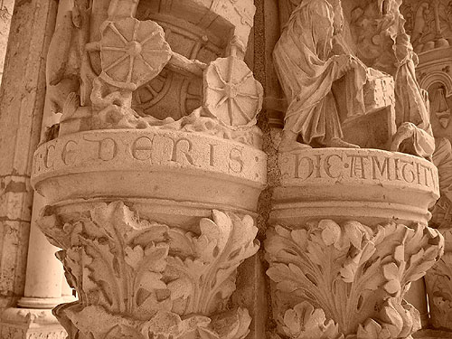
A few days ago, while I was still in France, I came back to Chartres Cathedral for the first time in over a decade. This time, I was looking for lettering. While I didn’t see much, there was a series of dazzling little pedestal inscriptions on the North Portal. Like captions in a book, these texts describe the sculptural scenes above them. I suspect that these letters were carved during the 1200s. Their style is similar to the all-caps lombardic alphabets that would develop in later centuries.
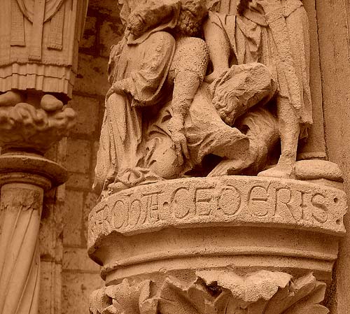
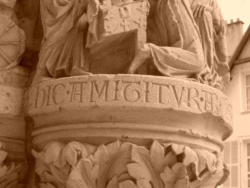
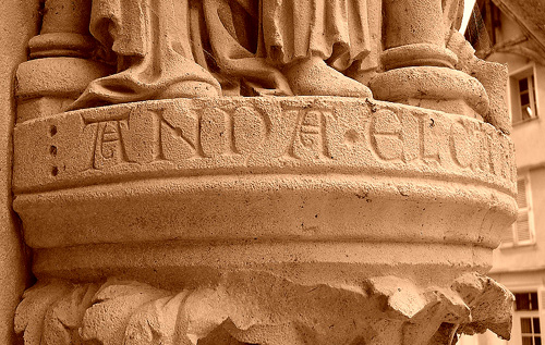
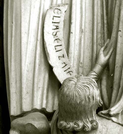
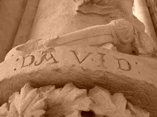
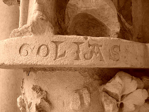
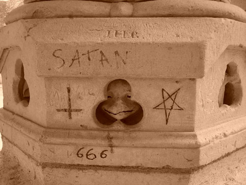
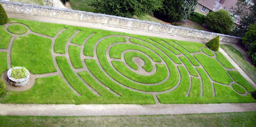
Behind the cathedral is a steep drop, east of which is a series of gardens. It seems that Chartres has a few crop circles, as well as medieval churches. This one is probably inspired by the labyrinth inside the cathedral. Great letter C, in any case.
Comments
8 responses to “Lombardic Lettering at Chartres”
Schöne Typospuren, die ihr da gefunden habt. Mit wecher filigranen Mühe man seinerzeit die Buchstaben in den Stein gehauen hat ist schon wirklich beeindruckend.
Das stimmt. Allerdings ist es immer noch atemberauschend, wie fast jede Ära die Schrift in Stein sehen wollte, von Rom bis zur heute.
this is stunning indeed, amazingly beautiful!
i wonder if the different designs of the letters N or T have diferent meenings.
I doubt that their meaning is different. Rather, this alteration seems to be just about creating better word forms.
perhaps it is another form of pronunciation (i.e. accent)? Just a thought -haven’t really looked into it to support my comment.
Liz, I’ve heard other people suggest that, too. At the ATypI conference in St. Petersburg a few weeks ago, Gerard Unger gave a presentation about Romanesque lettering (which predates these forms a little bit). Since Romanesque inscriptions are full of alternate letterforms, I seem to recall him mentioning that he asked a few mediaevalists if these could indication pronunciation somehow, and I believe that he then related that they do not.
It is possible to date these inscriptions, as the sculpture of Chartres has been dated.
These are Gothic letterforms, and the term Lombardic is incorrect. Like there Romanesque predecessors Gothic craftsmen loved alternative letterforms and to apply these randomly. Pronounciation has nothing to do with it. Moreover, it is not known what Latin, as spoken by the Romans, sounded like.
Dear Geard,
Thank you for this comment! I guess that I called them “lombardic” since they resemble the sort of lettering that later is added to printed books, or cast in type and referred to as lombardic caps. But applying this to Gothic stone carving is anachronistic.
Cheers,
Dan