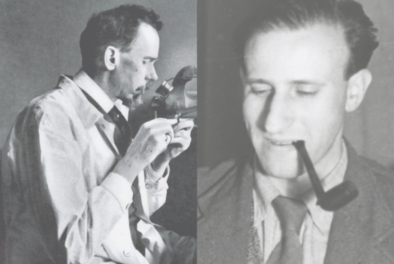
Above left: Rudolf Koch cutting a punch, photographed in the Gebr. Klingspor typefoundry of Offenbach am Main, circa 1931. Above right: Berthold Wolpe as young man while drawing. That photograph is presumably also from the 1930s.

Text from a poster for an Munich exhibition of work from the Offenbacher Werkstatt. Originally written out by Berthold Wolpe with a broad-nib. Above, I have re-set it with fonts from the Albertus Nova and Sachsenwald families.
Born in 1905, Berthold Wolpe grew up as part of a jewish family in Offenbach am Main. When he was just 17, he met Rudolf Koch. At that time, Koch was one of the leading type designers, calligraphers, and lettering teachers in Germany; he had lived and worked in Offenbach since 1906. After finishing his secondary-school education, Wolpe apprenticed as a bronze caster and – like Koch himself had done decades earlier – as a metal chaser. He would later supplement his skill-set by training as a goldsmith. During his apprentice years Wolpe was a pupil in the lettering classes Rudolf Koch organised at Offenbach’s Technische Lehranstalten, a local arts and crafts school that would later become the HfG Offenbach. In 1929, Wolpe became Koch’s teaching assistant; he also taught calligraphy at the Kunstschule Frankfurt (today: the Städelschule). Koch invited Wolpe to become a member of the Offenbacher Werkstatt, an informal group usually comprised of about six of Koch’s pupils. In the school building’s attic, they carried out lettering projects under Koch’s instruction; several of Wolpe’s well-known metalworks and tapestries date from this period.
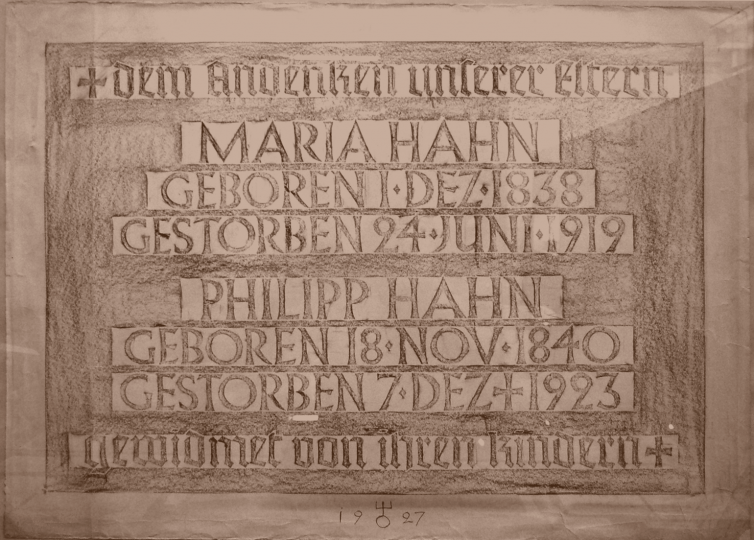
Rubbing of an inscription. Bronze tablet from 1927, designed and produced by Berthold Wolpe. The letters that he used a very similar to those found in his later Albertus and Sachsenwald-Gotisch typefaces. On a trip to England in 1932, Wolpe visited Stanley Morison, who commissioned him to design the typeface that would later be released as Albertus – thanks to this work and others like it.
After 1933, the situation for Wolpe in Germany became very difficult. Although Koch lobbied the new powers-that-be on Wolpe’s behalf, he died prematurely in 1934. In 1935, Wolpe lost not only his teaching positions, but he was also forbidden to pursue any more work as a designer at all. Thanks to his contacts in England, he was able to emigrate there, together with his mother and sister; a step that may have saved their lives. Until Wolpe’s death 1989, he would primarily live and work in London. Wolpe is best known for the book covers he designed for publishers like the Fanfare Press and Faber & Faber; indeed, he worked at the later publishing house for more than 30 years.

Three typefaces from the new Wolpe Collection. Top: Wolpe Fanfare, with Inline, followed by Wolpe Tempest and Wolpe Pegasus. All of the typefaces in the Wolpe Collection were developed by Toshi Omagari, a type designer at Monotype. While he undertook this work, he was able to consult original drawings for the typefaces that are stored at the Type Archive in London.
After his arrival in England, much of Wolpe’s time was initially devoted to type design. Within his first few years there, Monotype published his Albertus typeface. He received further assignments, both from Monotype as well as from publishers. Those typefaces have recently been digitally reinterpreted by Toshi Omagari, a London-based font designer at Monotype. The new Wolpe Collection isn’t the first time that Omagari has revived typefaces from the 1930s; in 2013, his Metro Nova was published, a faithful revival of the Metro types, originally designed by William Addison Dwiggins for Mergenthaler Linotype in Brooklyn during the late ’20s and early ’30s.

Albertus Nova has a multiple alternate glyphs and supports for the Greek and Cyrillic scripts. In the above text, you can see alternate versions of the “A” (with bars), “E” (rounded left-hand side), “M” (strokes that descend all the way to the baseline) and “W” (with overlaps).
The underlying design of the first typeface in the Wolpe Collection is already known to many readers: Albertus Nova is a reinterpretation of Albertus, one of the most widely-used display typefaces of the last century (and not only in Great Britain). Unfortunately, it was less common for designers during the 1930s and ’40s to mix several weights of the same typeface family into one design; the different weights of Albertus do not really match each other, in terms of their letter proportions. Since it is now standard to work with multiple members of a typeface family, the original Albertus probably gets less use today that its design deserves. Omagari’s Albertus Nova family offers five matching weights, which will hopefully act as an incentive for today’s designers.

Above: The Regular weight from the Wolpe Pegasus family, including its small caps and oldstyle figures. Wolpe Pegasus is Omagari’s revival of Pegasus, another typeface that Wolpe designed for Monotype before the outbreak of the Second World War. Unlike Albertus, Pegasus is only known to a small circle of typophiles – in part because of a version that Matthew Carter drew in 1980. Unfortunately, the outbreak of the war prevented much of a marketing campaign for Pegasus, through which it might have achieved recognition on a scale similar to what Albertus had enjoyed. The design is available once again, now in a more versatile format than ever before.

Wolpe Tempest also includes multiple alternates. Above, you can see special versions of the “E,” “S,” “Ü,” and “W.” All of the fonts in the Wolpe Collection also include a capital Eszett, like the one that you can see above in Wolpe Fanfare.
Wolpe Fanfare and Wolpe Tempest are both based on older typefaces that themselves were inspired by the lettering styles Wolpe repeatedly used in his book cover designs. Both typefaces are caps-only, but like Albertus Nova, Omagari extended Wolpe Fanfare and Wolpe Tempest to include Greek and Cyrillic support. As is the case with the numerous alternatives in Albertus Nova, more information about the origins of these two typefaces may be found in greater detail elsewhere, so I will not go into them in this post; see this page for more information about Wolpe Fanfare and this one for Wolpe Tempest.

Formally, Sachsenwald bears similarity to several German blackletter types from the 1930s; for a long time, typefaces in this style were viewed unfavourably. Typographers like Jan Tschichold and Albert Kapr, who had also suffered from Nazi persecution, even damned them outright. While many typefaces of this variety really were published between 1933 and 1935, the most-recent research into their design highlights that some of them were already in development during the late 1920s. In light of this, they perhaps deserve to be reevaluated; certainly Wolpe’s designing with this style is an argument against the idea that the forms themselves contain a specific ideology.
The last typeface in the Wolpe Collection – Sachsenwald – is a modernised textura design. Compared with designs of this variety, the appearance of the Sachsenwald typeface is more like that of broad-nib written text; its letters’ diagonals are slightly convex, for example. Wolpe must have been inspired by the Offenbach typeface, one of the later typefaces designed by his former mentor Rudolf Koch. Offenbach is also a modernised textura, with a written character.
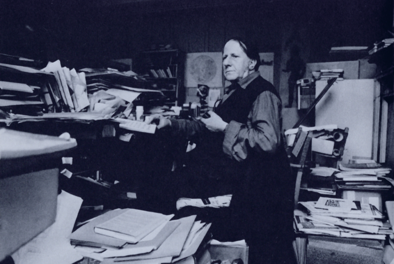
Berthold Wolpe in his office. The photograph was taken by Geoffrey Ireland; it is reproduced in the catalogue for Wolpe’s V&A exhibition. See Berthold Wolpe: A Retrospective Survey. London: Victoria & Albert Museum and Faber & Faber (1980).
Wolpe enjoyed a successful career in England, and he become an integral part of his new home’s typographic community. All of street signs in the City of London borough, for instance, are set in the Albertus typeface. He readily shared his knowledge with others – almost no British book on typographic history published between the 1950s and 1980s lacks a mention to Wolpe in its acknowledgments. In 1980, the Victoria & Albert Museum mounted a retrospective exhibition of his work. Niether did he lack for official honours; in 1983, for instance, Wolpe was made an Officer of the Order of the British Empire.
This article was originally published in a German-language version – which I also wrote – by Monotype on 4 October 2017; see http://www.monotype.com/de/aktuell/artikel/von-offenbach-nach-london-berthold-wolpes-monotype-schriften-und-die-neue-berthold-wolpe-collection/. Back in 2006, I blogged about Berthold Wolpe’s work twice. You can read those old posts here and here.