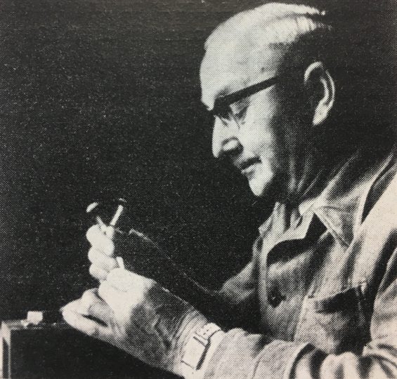
The portrait of Otto Erler reproduced above shows him at work, perhaps inside the HGB Leipzig. It accompanied his obituary. The photograph is credited to “Jonsong, Leipzig” and appeared alongside Albert Kapr’s “Personelle Nachrichten – Meister Erler verstorben” in Papier und Druck (issue 11, 1965, p. 87).
This pot is a 2,700-word article on the Leipzig punchcutter Otto Erler (1890–1965), whose career began before the First Word War and lasted all the way through to his death. For decades, he ran the punchcutting department at Schelter & Giesecke, one of the largest twentieth-century German typefoundries – and probably one of the world’s largest, too. German punchcutters are woefully under-written about; this article does little to change that, but I hope it serves as a good start. Erler was a committed Communist, and he was instrumental after 1945 in the establishment of VEB Typoart Dresden, the state-owned typefoundry of the former East Germany. Read all the way to the end of this post to learn about Erler’s post-retirement work at the HGB Leipzig, a German art and design academy still in operation today.
Another twentieth-century punchcutter
John A. Lane’s excellent 1991 article “Twentieth-Century Punchcutters” includes short profiles of several individuals who worked as such – or who at least cut punches for a font of type – between 1900 and 1990.[1] He covers Harry Carter, Matthew Carter, Henk Drost, Gustav Eichenauer, George Friend, Louis Gauthier, Victor Hammer, Louis Hoell, Paul Koch, Rudolf Koch, Charles Malin, R. Hunter Middleton, Stan Nelson, Christian Paput, Charles Plumet, Edward Prince, Paul Helmuth Rädisch, August Rosenberger, and Edmund Thiele. Despite the number of individuals included, Lane’s text does not address every significant typographic punchcutter of the century. He does not include Egon Graf, for example, who cut many of Georg Trump’s typefaces. While Lane does mention Otto Erler in passing, he is not given a multi-page profile. Erler’s career was as long, or longer, as those of the other individuals Lane profiled. Yet much of it unfolded behind the Iron Curtain. Presumably written while Socialist regimes across Eastern Europe were collapsing, Lane may not have had much concrete information about Erler at his disposal. Otto Erler was a punchcutter and the head of the engraving department at the large typefoundry of Schelter & Giesecke in Leipzig, and then at VEB Polygraph and VEB Typoart, from the 1920s through the 1950s.
Erler’s career overlaps with Paul Helmuth Rädisch’s almost exactly: Rädisch, born in Leipzig a year after Erler, began his engraving apprenticeship at Paul Schwieger’s punchcuttery around the same time that Erler’s own apprenticeship (at another firm) would have started. While Erler would more-or-less remain in Leipzig, Rädisch spent most of his life and career in the Netherlands, at Enschedé in Haarlem. Both men retired in 1957. Rädisch is well known among type designers and typographers for having cut the punches for Jan van Krimpen’s typefaces. I believe that Erler’s collaboration with e.g., Herbert Thannhaeuser and Albert Kapr should be discussed to the same degree. I have assembled some notes about Erler’s career here.
A chronicle of Erler’s professional experiences
Born on 8 November 1890, Otto Erler lived to be 74, dying on 21 September 1965.[2] He spent most of his life in Leipzig, where he both was born and died. According to Albert Kapr’s 1965 obituary for Erler,[3] as well as information in the 2010 book One Century of Type and Teaching Typefaces in Leipzig, a basic chronology of Erler’s work experience would look something like this:
- 1905–1909 Apprenticeship as a punchcutter in a small Leipzig firm (name not mentioned) [Kapr 1965]
- 1909–1911 Evening pupil at the Königliche Akademie für graphische Künste und Buchgewerbe Leipzig [Blume/Smeijers 2010]
- 1909–1914 Punchcutter at Friedrich Kröpsch, Leipzig [Blume/Smeijers 2010][4]
- 1910–1933(?) Member of the Verband der Deutschen Buchdrucker [union of German printers], and later a member of their typefounding board, and chairman of their punchcutter section [Kapr 1965]
- 1914–1918 Military service?
- 1919–1921 Filmgießer, AGFA Wölfen [Blume/Smeijers 2010]. It is not yet clear to me what this job would have entailed, exactly.
- 1921 Punchcutter and department manager at the Brüder Butter typefoundry in Dresden [Blume/Smeijers 2010]
- 1921–1933 Punchcutter and department manager at the Schelter & Giesecke typefoundry in Leipzig [Blume/Smeijers 2010]
- 1926 Joined the German Communist Party (KPD) [Kapr 1965]
- 1927–1933 Chairman of the Workers’ Council at Schelter & Giesecke in Leipzig [Kapr 1965]
- 1933–1934 Year of unemployment following the Nazi seizure of power [Kapr 1965]
- 1934–1946 Punchcutter and department manager at the Schelter & Giesecke typefoundry in Leipzig [Blume/Smeijers 2010]
- 1946–1952 Department manager at the VEB Polygraph’s Leipzig location [Blume/Smeijers 2010]
- 1952–1957 Department manager at VEB Typoart’s Leipzig location [Blume/Smeijers 2010]
- c.1953 Typoart publishes the Erler-Versalien typeface, designed by Herbert Thannhaeuser and cut by Otto Erler himself
- 1957–1965 Punchcutter, Institut für Buchgestaltung at the HGB Leipzig [Blume/Smeijers 2010]
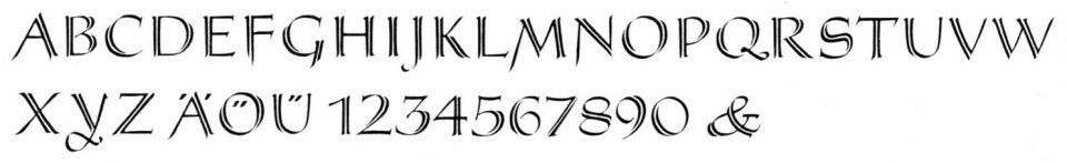
The Erler-Versalien typeface, cut by Otto Erler according to a design from Herbert Thannhaeuser. Reproduced from Albert Kapr: Schriftkunst: Geschichte, Anatomie und Schönheit der lateinischen Buchstaben. Verlag der Kunst, Dresden 1971. Page 386.
The Erler-Versalien typeface
According to Typoart’s 1988 chronicle, the Erler-Versalien – or “Erler Titling” – was published in December 1956.[5] More likely, this typeface came onto the market in 1952 or 1953. Erler had engraved steel punches for at least one size of this product by hand; photographs of five of the steel punches accompany a 1955 issue of the East German Papier und Druck magazine.[6] The design of the Erler-Versalien came from Herbert Thannhaeuser, who was then Typoart’s artistic director. In 1952 issues of Papier und Druck, the Erler-Versalien were presented as a titling face that Thannhaeuser designed to accompany his Meister-Antiqua, Meister-Kursiv, and Meister-Ornamente types.
On the back of an undated, 10-page Typoart specimen brochure printed at some point in the early 1950s, an illustration of Erler at work on the Erler-Versalien was featured. The text underneath the illustration reads: “Master Erler at work on a new titling face, all of whose sizes will be hand cut, following drawings from Herbert Thannhaeuser. Handcutting is the given method for preserving the individual life of a beautiful form, that makes the drawing so appealing. We consider it our task to cultivate the craftsmanship of manual punchcutting and to put it to the service of graphic arts.”[7] The illustrated portrait also accompanies a 1960 article by Thannhaeuser, entitled “Lob des Schriftschneiders” [in praise of the punchcutter], which appeared in the magazine Papier und Druck, and which is reproduced below.[8]
As far as I know, Typoart’s naming of a typeface after its (still-living) punchcutter, rather than its designer, was unique in twentieth-century German typefounding. Gebr. Klingspor, for instance, never published an “Eichenauer-Fraktur,” nor the Bauersche Gießerei a “Hoell-Antiqua.” Even Hermann Zapf, who often praised the D. Stempel AG punchcutter August Rosenberger – the man who had cut most of his early work – never published a typeface that was named in his honour. I suspect that the Erler-Versalien were named after Erler because Typoart’s long-time punchcutter was nearing retirement, and this was seen as a nice gesture. Indeed, something similar happened a half-century later at Linotype, when they published a digital typeface named Linotype Gianotten in 1999.[9] Because of his status as a skilled industrial worker, and his prior membership in the German Communist Party, Otto Erler had been involved in the direction of Typoart and its predecessor companies since the Soviet takeover of what eventually became the German Democratic Republic (GDR) after the end of the Second World War. He must have been exactly the kind of individual that the young GDR wanted to celebrate. In other words, aside from the collegiality of naming a typeface after Erler, Typoart would also likely have had ideological motivations to do so.
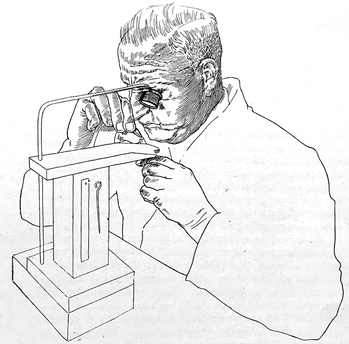
Photograph of an illustrated portrait of Erler at work. Reproduced from from Herbert Thannhaeuser: “Lob des Stempelschneiders.” In: Papier und Druck, Fachteil Typografie, Heft 11, 1960, p. 251.
Otto Erler and the establishment of VEB Typoart Dresden
Otto Erler was mentioned several times in Typoart’s 1988 chronicle, Die Entwicklung des Betriebes Typoart in Fakten und Daten 1945–1985. I have translated each of the four instances into English below:
- In 1945, “a tripartite council [was] formed with Comrade Burkhardt (KPD), Comrade Erler (KPD) and Comrade Giert (OdF). Under its direction, the changeover from armaments production (aircraft parts) was implemented, as well as the reintegration of the typefounders [Schriftgießer] and punchcutters [Schriftgraveure] who had been conscripted. The representative of the bank, a Mr. Breier, wanted to split the company up. The typefoundry should begin production again, while the machine factory should be shut down. In the process, the Workers’ Council was reconfigured. It was now made up of Comrade Burkhardt, chairman (KPD), Comrade Erler (KPD), Comrade Köter (KPD), Comrade Meyer (SPD), Comrade Bogen (SPD), and Comrade Jan (SPD). Its work consisted of controlling the observance of SMAD orders, including production, the political-ideological work during the process of reconstruction, questions regarding the appointment of master workers, etc. These comrades were also at the heart of staff-member recruitment into the two workers’ parties.”[10]
- “Following a referendum on the expropriation of the war and Nazi criminals, Schelter & Giesecke Leipzig was taken over by the state government of Saxony in January 1946 as a C-operation. It became the VEB Buchdruckmaschinenwerk [people’s own printing-machine manufacturing company]. First company director: Comrade Härtel. The takeover of the business took place one year after the murder of Comrade Kresse. This comrade, a trained printer, was a member of the resistance group Schumann/Schwarz/Zipperer. In his honour, a commemorative plaque is solemnly inaugurated in the staircase of the company office building. The SMAD actively supports material provisioning. The delivery of printing equipment to the Soviet Union continues into the 1950s. The financial profit from the typefoundry and number-factory departments are used to reconstruction the machine factory and the manufacturing of Windsbraut high-speed presses and Phönix platen presses. In the area of type engraving, the text typefaces Liberta, Technotyp and Meister-Antiqua were successfully developed under the direction of Comrade Erler, although the longtime type designer Herbert Thannhaeuser had ended his work because of fee disputes.”[11]
- In April 1951, the VEB Schriftguss Dresden and the typefoundry department of the VEB Buchdruckmaschinenwerk in Leipzig were merged. Erler was the head of the engraving department and the deputy director of the Leipzig plant. That had “88 workers with a yearly production volume of 100 tons of printers’ type, including spacing material.”[12]
- The combined firm was renamed “VEB TYPOART – Drucktypen, Matrizen, Messinglinien” [printers’ types, matrices, and brass rules] in October 1951. Herbert Thannhaeser must have settled his fee disputes by that time, as he is named as the firm’s artistic director.[13]
Erler’s post-retirement work at the Leipzig Academy
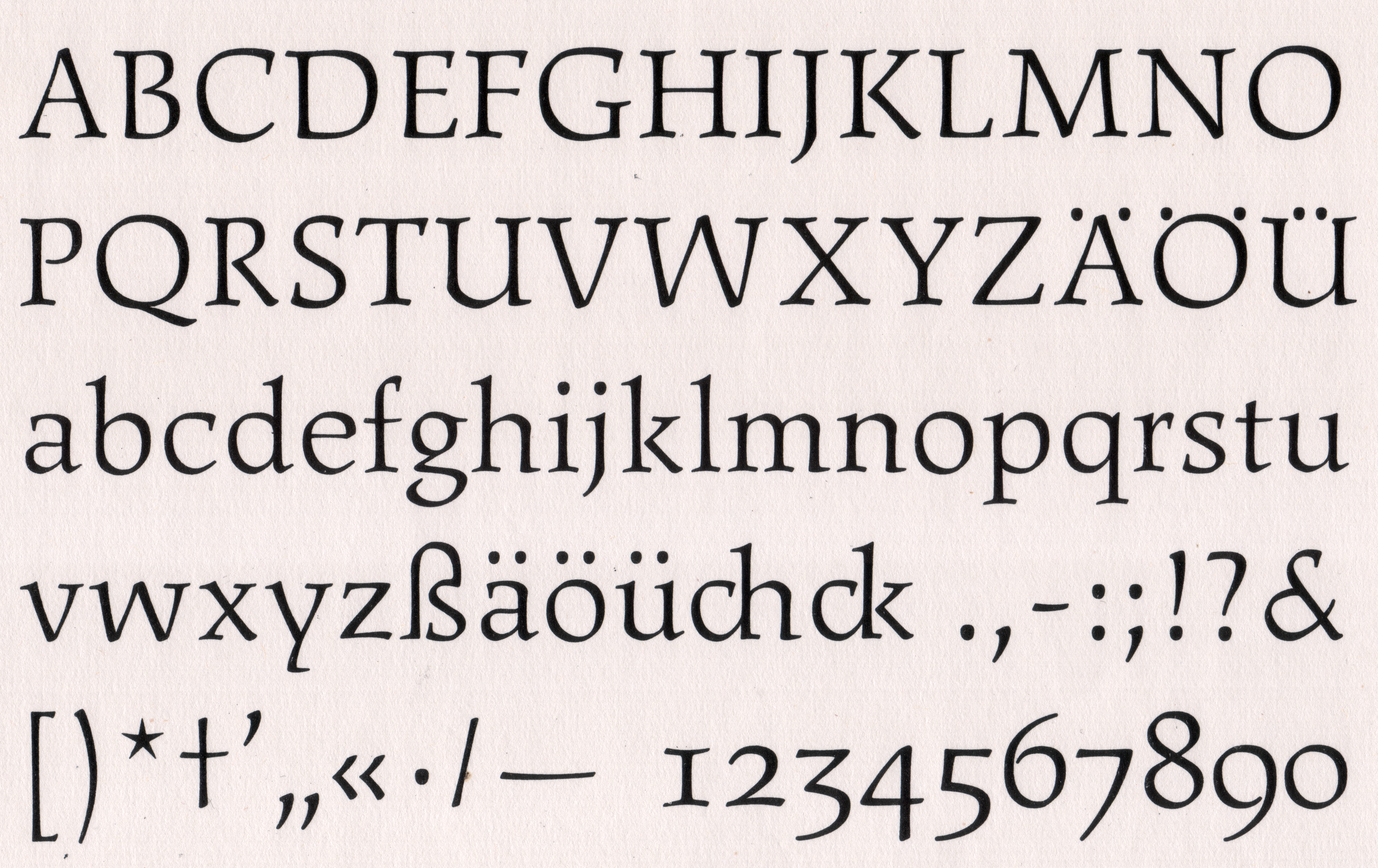
One size of the Freundschafts-Antiqua typeface, designed by Yu Bing-nan and cut by Otto Erler at the HGB Leipzig. Reproduced from Leipziger Schriftblätter: Studienbeispiele des Fachgebietes Schrift der Hochschule für Grafik und Buchkunst Leipzig. HGB Leipzig 1977.
As the head of several typefoundry punchcutting departments, Erler would very likely have been involved in the training of punchcutting apprentices. In his obituary for Erler, Kapr wrote that “a considerable number of young punchcutters were trained by a specialist who was almost second to none in all of Germany. And what not only his apprentices, but all colleagues, co-workers and students could learn from him, was his professional enthusiasm and his love of work, which brought him the highest satisfaction.”[14]
In their 2010 history of type design education at the Leipzig Academy, Julia Blume and Fred Smeijers write that, in the 1950s, “the [Institut für Buchgestaltung] turned into a typography laboratory; a change of direction which could only be realised through the active involvement of Otto Erler, who put his skills as a punchcutter into the service of the Academy from 1957, when he retired from Typoart, until the mid-1960s [when he died]. With his help, at least one set of templates of a new typeface in one or two sizes could be realised as prototypes and test printed each year. [In 1962] Kapr described the details of Erler’s contribution as follows: ‘He devotes circa 40% of his work capacity to the Chinese student Yu Bing-nan, who is developing a new typeface from the People’s Republic of China. About 10% of his capacity goes to the support of students working on new typefaces: the research student Heinz Schumann, Volkmar Brandt, who is preparing his diploma, and Hildegard Korger. The remainder of his time is used to assist in the typeface designs of Professor Kapr and the Academy graduate Gert Wunderlich, whose designs had been given awards in the recent competition and are now being prepared for typesetting by the department.’”[15]
A statement about Erler’s role at the HGB on the next page of One Century of Type and Teaching Typefaces in Leipzig, on the other hand, is not entirely accurate (in my opinion). When Blume and Smeijers write that, “in collaboration with Erler, the entire process from the early design stages to the trial cuts became understandable for the students,”[16] I believe that they are correct. Nevertheless, the following statement that this “was perhaps the first time ever that the knowledge of new typefaces was taught to such a degree at an Art Academy, since type foundries had previously treated their specialist experience in the field of typeface manufacturing mostly as trade secrets” cannot be true.[17] At the Leipzig Academy itself, the engraver Georg Schiller had taught from 1905 until 1920; from 1910, he was their professor for Stempelschnitt, Graveur und Prägedruck [punchcutting, engraving, and embossing]. According to Schiller himself, typographic punchcutting was one of the four areas of his instruction there.[18] In London, the punchcutter Edward Prince regularly taught a “continuing education” punchcutting course at the Central School from September 1914 until some point in 1920, when he became too ill to continue (he died in 1923).[19] Erler was not teaching typographic punchcutting to HGB students, as Prince had done in London, or Schiller may have done – to a certain extent, at least – in Leipzig. Erler’s collaboration with HGB students, graduates, and teachers was surely helpful to their understanding of type design and type production, and while it must have helped them prepare better designs, punchcutting as a professional activity was not taught by Erler at the Academy, but was rather something for apprentice workers to learn.[20] Nevertheless, Erler’s engagement at the HGB was quite unique. It allowed the typefaces designed there to be realised as actual fonts of printing types, in what was likely the first time anywhere in a higher-education setting that this had happened.
Sources
- Lane, John A.: “Twentieth-Century Punchcutters.” In: Matrix 11, 1991. Pages 7–23
- Blume, Julia and Fred Smeijers: One Century of Type and Teaching Typefaces in Leipzig. Institut für Buchkunst Leipzig 2010. Page 248
- Kapr, Albert: “Personelle Nachrichten – Meister Erler verstorben.” In: Papier und Druck, Heft 11, 1965, p. 87
- Friedrich Kröpsch was an engraver who presumably operated a small independent punchcuttery. In 1910, the Leipzig address book listed the following information for him: “Kröpsch, Friedrich, Graveur, Lindenau, Henricistr. 34 I. E. (Tel. 7563).” See the Leipziger Adreßbuch 1910. August Scherl, Deutsche Adreßbuch-Gesellschaft mbh, Leipzig. Page 440
- SED-Grundorganisation Typoart, Dresden (ed.): Die Entwicklung des Betriebes Typoart in Fakten und Daten 1945–1985. Herausgegeben aus Anlaß des 40. Jahrestages der Überführung des Betriebes in Volkseigentum am 1. Juli 1988. Typoart, Dresden 1988. Page 34
- Papier und Druck – Fachzeitschrift für die grafische und die Papierverarbeitende Industrie, Fachteil Typografie, Heft 3, 1955. Photographs of steel punches for the letters C, G, H, N and O are reproduced on pages 41 and 43. A photograph of a drawing by Thannhaeuser for the typeface’s design – with corrections painted onto it – is reproduced on page 37.
- VEB Typoart Dresden: VEB Typoart Dresden. Drucktypen, Matrizen, Messinglinien. Typoart, Dresden (undated). This same illustration and text appear on the last page of a VEB Typoart Dresden specimen bound into a 1952 issue of Papier und Druck, as well as on page 51 of the 1952 “Typografie und Gebrauchsgrafik” section of Papier und Druck, and elsewhere in 1952 issues of that magazine, too.
- Thannhaeuser, Herbert: “Lob des Stempelschneiders.” In: Papier und Druck, Fachteil Typografie, Heft 11, 1960, p. 251
- Named after Henk Gianotten, Linotype Gianotten was designed by Antonio Pace, and is based on the work of the eighteenth and early-nineteenth century Italian punchcutter Giambattista Bodoni (1740–1813); see “Linotype Gianotten.” In: Linotype.com, https://www.linotype.com/1046/linotype-gianotten-family.html, no date of publication, last accessed on 7 April 2018
- Die Entwicklung des Betriebes Typoart in Fakten und Daten, p. 11
- Ibid., p. 13
- Ibid., p. 27
- Ibid., p. 28
- Kapr 1965
- One Century of Type and Teaching Typefaces in Leipzig, p. 44
- Ibid., p. 46
- Ibid.
- Schiller, Georg: “Der Stempelschnitt und Prägedruck als selbständiger Druck- und Prägeplatten-Erschaffer und als Helfer des Schriftgießers, Setzers und Buchbinders.” In: Akademie für Graphische Künste und Buchgewerbe zu Leipzig (ed.): Die Technischen Kurse der Vorschule der Königlichen Akademie für graphische Künste und Buchgewerbe zu Leipzig. Herausgegeben von der Akademie gelegentlich des internationalen Kongresses für Kunstunterricht in Dresden. Akademie für graphische Künste und Buchgewerbe Leipzig 1912. Page 13
- Avis, Frederick Compton: Edward Philip Prince. F.C. Avis, London 1967. Pages 63–67
- See Monique Dickmanns’s interview with Peter Simon, who worked as a punchcutter at VEB Typoart from 1957 through 1967. In: Dickmanns, Monique: Leipziger Kegel – Zur Entwicklung der Schriftgießereien in Leipzig. (Self-published), HGB Leipzig 2013. Pages 142–147