From the Linotype website: Morris Sans™ is a newly revised and extended version of a small geometric family of typefaces originally produced by Morris Fuller Benton in 1930 for ATF. His initial design consisted of an alphabet of squared capital letters with a unique twist that characterized its appearance: corners with rounded exteriors and right-angle interiors. The types were intended for use in the fine print found on business cards, banking or financial forms, and contracts. But over the ensuing decades, this design became a popular element in all sorts of design environments, and several foundries revived the typeface in digital form. Since digital fonts are bicameral, with slots for both upper and lowercase letters, new cuts of the type opted filled the lowercase slots with small caps.
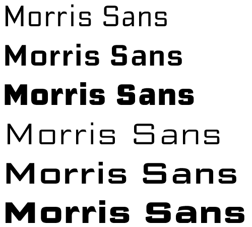
In 2006, Linotype commissioned its own version of the typeface – an extension for 21st century use. Under the advisement of Linotype’s type director Akira Kobayashi, Dan Reynolds redrew the uppercase and added an original lowercase for the first time. Additionally, a number of extras were brought into the fonts, including six figure styles (tabular and proportional lining figures, tabular and proportional oldstyle figures, and special tabular and proportional “small cap” figures).
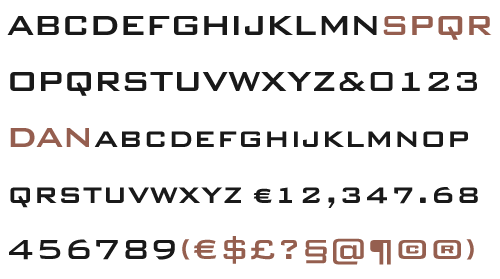
Small caps, which have become an iconic element over time, are accessible in each font as an OpenType feature. To differentiate this version from the original, Linotype’s new family is named Morris Sans, in honor of Morris Fuller Benton.
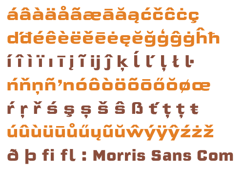
All fonts in the Morris Sans family are OpenType Com fonts; they include a character set capable of setting 48 European languages that employ the Roman alphabet, including all Central and Eastern Europe languages, those from the Baltics, and Turkish. This glyph coverage extends to the small caps as well.
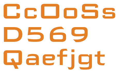
Morris Sans is a wide typeface, especially in its regular widths; the condensed faces set a more conventional line of text. The new lowercase letters are less geometric than the uppercase, except for those that share the same basic forms (e.g., c, o, and s). Instead of following this geometric trend, the new lowercase tends to strengthen the humanist elements that were present in several characters from the original type, including the uppercase D and the figures 5, 6, and 9. Morris Sans also sports a number of glyphic flares, like the stroke found on the original uppercase Q.
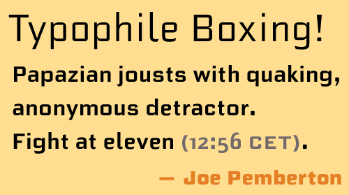
Morris Sans is a clean, modern design best suited for headlines, advertising, posters, expressive signage (especially on storefronts), and corporate identity work.
Links
Morris Sans family at Linotype.com
Morris Sans Light PDF
Morris Sans Medium PDF
Morris Sans Heavy PDF
Morris Sans Light Condensed PDF
Morris Sans Medium Condensed PDF
Morris Sans Heavy Condensed PDF
Comments
12 responses to “Morris Sans released”
Ich gratuliere zur Neuinterpretation: großartig! Der erste Grund, einen Beitrag auf http://www.100besteschriften.de zu aktualisieren: http://www.100besteschriften.de/74_Bank+Gothic.html#a74
Gratulation!
Jetzt hat die Bank Gothic endlich das, was ich immer an ihr vermisst habe: Charakter. Toll, Dan!
Danke, danke, danke! Jetzt muß ich an die Arbeit gehen; ich werde mal sehen, ob ich einige Anwender überzeugen kann, eine Font-Wechsel zu machen…
Congratulations, Dan. It’s wonderful. Drop your Bank Gothics and go Morris!
Thanks. I’ve gotta see if this goes on the list of Linotype’s fonts that FontShop et al resell.
[…] Endlich hat die Bank Gothic das, was ich schon immer an ihr vermisst habe: Kleinbuchstaben und Charakter. Zu verdanken ist dies dem Organisator des Offenbacher »Original-Typostammtisches« Dan Reynolds, der Morris Fuller Bentons 77 Jahre alte Schrift neu interpretierte und sie heuer als Morris Sans bei Linotype vorstellte. Unter den Augen von Type Director Akira Kobayashi zeichnete er außerdem Lining, Oldstyle und Small Cap Figures, jeweils als Tabellenziffer- und Proportionalvariante. Die neuen Minuskeln sind weniger geometrisch als die Versalien, was dem Font eine erfrischende Würze verleiht. Sämtliche üblichen Sprachräume wurden selbstverständlich ins Open-Type-Format gepackt, drunter geht es ja auch gar nicht mehr. Glückwunsch, Dan, und viel Erfolg für deine Morris Sans. Ich bin gespannt, wann ich sie das erste Mal in freier Wildbahn antreffe. […]
[…] Mehr Infos zu Morris Sans findet ihr direkt bei Dans TypeOff-Blog und wer mehr von Dans Typedesign sehen möchte kann seinen Workshop auf den Tagen der Typografie im Juni besuchen. […]
[…] (-) (z. B. Deutsche Bahn) 07. Font-Systeme (-) (BMF Elettriche) 08. Klassiker erweitern (6) (z. B. Morris Sans) 09. Foto-Font (-) (www.photofont.com) 10. Versal-ß (-) (Versales ß rückt […]
[…] Morris Sans […]
[…] Morris Sans […]
[…] Morris Sans […]