Introduction
Graphic design and printing has engaged with geometric letters for at least a century. Designers pride themselves on their ability to create complex systems from simple elements, and the alphabet is no exception. By repeating a series of basic shapes, all of the forms of our writing system may be easily recreated, or at least approximated. This article will highlight a few—but not all—prominent examples.
Type and lettering at the Bauhaus
The starting point for many investigations into this theme is work from the Bauhaus.[1] However, the role that Bauhaus designers played in the popularization of geometric letter styles is minimal, and their role in the development of geometric typefaces is tangential. Some contemporary designers may assume that typefaces were developed at the Bauhaus, but this is not the case. While a number of letter drawing experiments were undertaken there, no typefaces were created.[2] During the 1920s and 30s, typecasting was still an industrial activity. Fonts were produced, sold, and distributed by large companies with hundreds of employees working in factory settings. The Bauhaus did not have the facilities to accommodate this sort of activity.
Of the Bauhäusler, Josef Albers, Herbert Bayer, and Joost Schmidt were most associated with letter design. Albers’s was able to commercialize his stencil experiments; his Kombinationschrift was released as a series of patterns for glass makers. Herbert Bayer, who left his teaching post at the Bauhaus in 1928, published a typeface named Bayer-Type through the Berthold type foundry in the 1930s. His drawings for the Universal-Alfabet, first published in Offset in 1926, have often since been reproduced. These drawings would go on to inspire later typeface designs in later decades, most notably the 1975 ITC Bauhaus family drawn by Ed Benguiat and Victor Caruso in New York (figure 1). Beginning in 1925, Joost Schmidt—who drew several of the iconic 1923 Weimar Bauhaus exhibition posters—began teaching a class for Schrift. The best-possible English-language translation for this is probably “lettering.” It was the first course of its kind at the school, but was not a very significant part of the curriculum. Students in the Vorkurs, or foundation, received two hours of Schrift instruction per week, for two semesters.
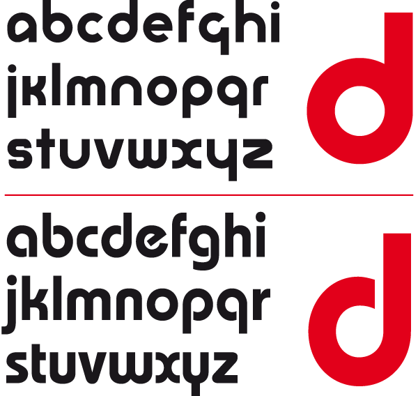
Figure 1: Universal-Alfabet vs. ITC Bauhaus. Above, P22 Bayer Universal. This 1997 digital font approximates letters drawn by Herbert Bayer at the Bauhaus, c. 1926. Below, ITC Bauhaus Demi, first released in 1975. This is a more stylized typeface, less tightly based on Bayer’s drawings. Note the gaps in the letters a, b, d, e, g, p, and q. ITC Bauhaus also includes uppercase letters (not pictured).
Some of the type and lettering being designed elsewhere
Looking to the German typefounding industry proves more fruitful for those searching for authentic geometric type created during the 1920s. A number of typefaces were created in succession that would became popular at the time, and are still in use today. The first of these is Erbar (figure 2), which may be the “John the Baptist” of the geometric sans serif genre; Erbar had a successful release, but this only prepared the way for the typeface that followed it: Futura (figure 3). Much has been written about Futura, so I do not need to go further into the topic in this article.[3] While Futura is the most successful of all the geometric sans faces, a rival design was released at roughly the same time, Rudolf Koch’s Kabel (c. 1927). More idiosyncratic than either Erbar or Futura, Kabel also found some degree of success, and is also my personal favorite of the three (figure 4).
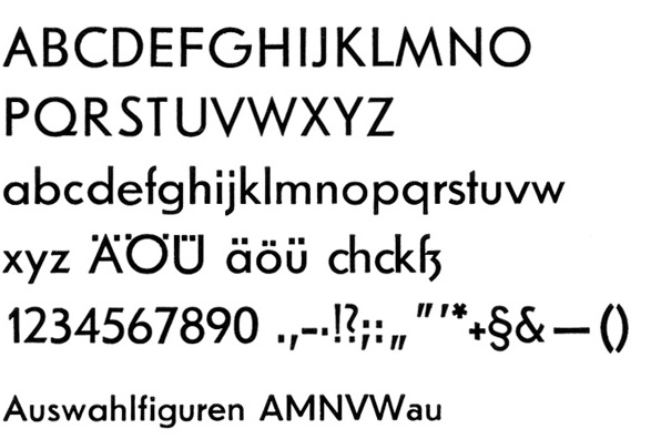
Figure 2: Scan from an undated, post-1963 Ludwig & Mayer catalog showing Erbar Kräftig. The alternate lowercase a was original design for that letter. Kabel’s a has a similar form (fig. 7). By the 1960s, when this sample was printed, the foundry had substituted in a single-storey a as the default, making the typeface appear more similar to Futura (fig. 3). Erbar was designed by Jakob Erbar, and was first released by the Frankfurt-based Ludwig & Mayer type foundry in 1926.
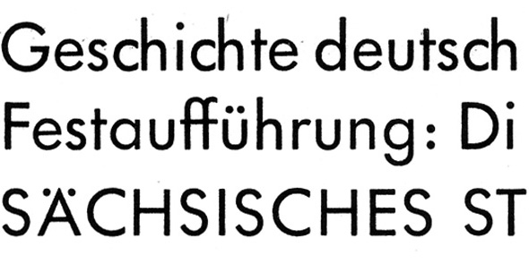
Figure 3: Scan from a 1930s Bauer catalog showing Futura Buch. Futura was designed by Paul Renner, and was first released by the Frankfurt-based Bauer type foundry in 1928.

Figure 4: Scan from an undated Klingspor catalog showing Leichte Kabel. Image shown at actual size. Kabel was designed by Rudolf Koch, and was first released by the Offenbach-based Klingspor type foundry. The Light weight pictured above debuted in 1927.
Along a visual spectrum, this trio of 1920s German sans serifs lies at quite a distance from Bayer’s Universal-Alfabet drawings. Intended to be legible in text sizes, they were marketed as all-around jobbing typefaces that general printers should purchase. To find a commercial typeface created during the 1920s bearing a closer relationship with the Bauhaus lettering experiments, one must look to France. In 1929, the Parisian Deberny et Peignot foundry released A.M. Cassandre’s Bifur, an ingenious, slightly impractical design that would not turn a profit.[4] On one level, Bifur and the Universal-Alfabet have little to do with each other. Bifur is caps-only, whereas Bayer favored reducing the Latin script to lowercase or unicase letters (figure 5). In hindsight, however, both the Universal-Alfabet and Bifur can be seen as display letter experiments pay tribute to the idea of a geometrical structure behind a unicameral alphabet.
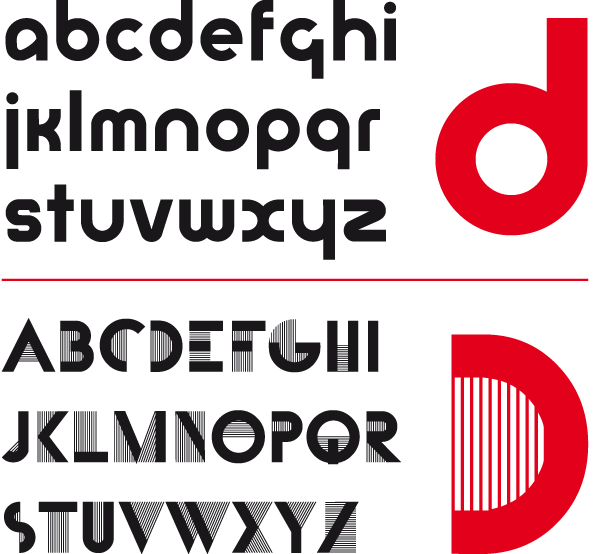
Figure 5: Universal-Alfabet vs. Bifur. Above, P22 Bayer Universal. This 1997 digital font approximates letters drawn by Herbert Bayer at the Bauhaus, c. 1926. Below, P22 Bifur, a 2004 digitization of A.M. Cassandre’s original. P22 also added lowercase letters to the design (not pictured). Cassandre’s Bifur was released by the Paris-based Deberny et Peignot type foundry in 1929.
1970s geometric typefaces from the International Typeface Corporation
Although the story of geometric type continued into the 1930s, the next significant chapter of their development to be examined here began in 1970, at a time when type itself was beginning to disappear. By this time, foundries were switching their release of new faces from lead type or machine matrices to phototype solutions. Whereas type had previous been rearrangeable pieces of metal—truly something physical—phototype fonts were small designs living inside some sort of chemical–mechanical system, usually as a series of negatives. Many of the most popular phototype-era typefaces were not directly designed by the foundries themselves, but licensed artwork from the International Typeface Corporation in New York.
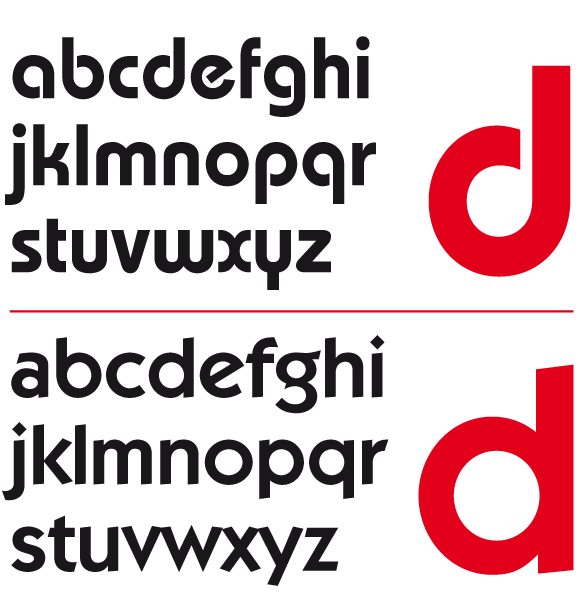
Figure 6: ITC Bauhaus and ITC Kabel. Above, ITC Bauhaus Demi; this 1975 family is a stylized typeface loosely based on Bayer’s drawings for the Universal-Alfabet (see fig. 1). Below, ITC Kabel Demi; ITC Kabel was released in 1976 as a revival of Rudolf Koch’s Kabel, although the family was adapted to fit the demands of the advertising market of the time (compare with fig. 4 and fig. 7).
ITC’s library would eventually include several geometric typeface designs. Although the first—Herb Lubalin and Tom Carnase’s ITC Avant Garde Gothic—was in the vein of Futura, the most relevant for our discussion are ITC Bauhaus and ITC Kabel, from 1975 and 1976 (figure 6).
Despite its influence, ITC Bauhaus is not a literal adaptation of Bayer’s Universal-Alfabet drawing into type. First, the form of ITC Bauhaus’s lowercase a is very different. Then there are the gaps present in ITC Bauhaus’s b, e, g, p, and q. Additionally, ITC Bauhaus includes capital letters, which Bayer avoided during some of his Bauhaus years. However, it is easy to forget that many iconic Bauhaus pieces did employ capital letters—even all-caps text—including a Schmidt’s poster for the 1923 Weimar Bauhaus exhibition and even the very letters on the side of the Dessau school building. Finally, it should be noted that ITC Bauhaus could be considered a better piece of design than Bayer’s Universal-Alfabet drawings, because it is a functioning typeface that has proved its use for decades; the Universal-Alfabet is artwork on paper.
Other phototype setters, as well as other sorts of type manufacturers like Letraset, would create countless geometric experiments over time, long before digital type became popular. This sort of activity continued even into the 1990s.
Figure 7: Kabel vs. ITC Kabel. Above, a scan from an undated Klingspor catalog showing 16pt Norm Kabel. Below, a 1976 Linotype catalog showing ITC Kabel Book, also at 16pt. Note the difference between the two designs’ x-heights.
Neville Brody, and interest in 1920s lettering during the 1980s
Designers searching for a 1980s-style may consider Neville Brody and his magazine work in Britain. At that time, he created a number of lettering experiments employed in his work. In 1990, Linotype released three commercial typefaces designed by Brody: Arcadia, Industria, and Insignia (figure 8). These typefaces do seem to share a certain stylistic vein with some 1920s German lettering styles, but they were never marketed as specific revivals in the way that ITC Bauhaus pays tribute to Bayer, for instance.
![Arcadia, Industria [& Inline], Insignia](http://www.typeoff.de/wp-images/some-thoughts-on-geometric-type/linotype-brody-fonts.png)
Figure 8: Three 1990 Linotype releases from Neville Brody—Arcadia, Industria (including the Inline version), and Insignia.
Some digital typefaces from the 1990s
During the 1990s, more geometric type styles would be released, including Emigre’s Base 9, Base 12, and Base Monospace (1995–1997). In 1997, Linotype released three symbol fonts that were only collections of geometric shapes, not even letters at all: Linotype Circles, Linotype Squares, and Linotype Triangles. Perhaps this was a more mainstream adaptation of Gerard Unger’s Decoder, a font he designed for FUSE in 1992. Decoder includes no letters either, but rather a number of shapes that may be resized and combined to form any letter. Even Decoder seems to partake in ideas that have long been in the designers’ milieu; at the Bauhaus, Josef Albers experimented with stencil letters created out of a series of repeated, repositioned shapes as well.
Some digital typefaces from after 1999
By the 21st century, the combination of cheap font design tools like FontLab and easy-to-join sales platforms like MyFonts.com had led to an explosion of the number of fonts that graphic designers could license. Today, 1,969 fonts on MyFonts.com are tagged with the keyword “geometric.”[5] Since geometric styles remain popular, one may attempt to predict which specific examples will help define the graphic landscape of the near future.
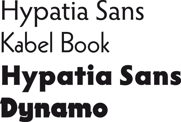
Figure 9: From top to bottom, Hypatia Sans Regular (default characters), Linotype’s digital Kabel Book, Hypatia Sans Black (with alternates from stylistic set 2), and the CompuGraphic digitization of Dynamo. Thomas Phinney’s Hypatia Sans, which was designed for Adobe, is a new geometric sans that references some of the best of the classic forms that this genre has to offer.
Perhaps it is best to differentiate between text and display typefaces. For text, the choice must fall to Hypatia Sans, designed by Thomas Phinney for Adobe. Hypatia Sans is a large family, which for a time was bundled with specific Adobe products. Interesting to note are what may be seen as homages to Kabel and Dynamo in certain letterforms (figure 9). In terms of display faces, very little comes close to the scope of Dessau, from Gábor Kóthay for Fountain. The Dessau family includes 11 separate fonts, and references at least four styles of lettering popularized in Bauhaus artwork. In this regard, it reminds of ITC Bauhaus. Yet the Dessau family’s letter palette is more diverse, even though some of it bases itself more literally on 1920s examples.
More reading
An earlier version of this article was published in the seventh issue of the German magazine Slanted, under the title, “Geometric type and where it comes from.” Since then, due to discussion on Indra Kupferschmid’s “True Type of the Bauhaus” article at Fonts in Use, I have found and read a copy of Hans Peter Willberg’s 1969 article, »Schrift im Bauhaus/Die Futura von Paul Renner«.
Readers looking for a connection between Futura and the Bauhaus may find a tenuous one in Ferdinand Kramer. Kramer was a Bauhaus student for six months, in 1919. In 1925, while a student at the Städel-Schule in Frankfurt, he drew an alphabet of capital letters that bears much resemblance to Futura. Paul Renner was a teacher at the school at the time.
Bibliography
- Christopher Burke, Paul Renner: the art of typography. London: Hyphen Press (1998).
- Indra Kupferschmid, “True Type of the Bauhaus,” http://www.fontsinuse.com. Accessed on August 21, 2011. [Link]
- Charles C. Leonard, Paul Renner and Futura: The Effects of Culture, Technology, and Social Continuity on the Design of Type for Printing. Georgia State University: MA Thesis (2006). Accessed on August 21, 2011. [Link]
- Jan Tschichold, “Elementar Typographie,” Typographische Mitteilungen. Special issue. Berlin: Verlag des Bildungverbandes der deutschen Buchdrucker (1925).
- Hans Peter Willberg, »Schrift im Bauhaus/Die Futura von Paul Renner«, Monographien und Materialien zur Buchkunst. Band 2. Neu-Isenburg: Verlag Wolfgang Tiessen (1969).
- “A history of Deberny et Peignot,” Rochester Institute of Technology website. Accessed on August 21, 2011. [link]
Footnotes
- The Bauhaus was an early 20th century German design school founded in Weimar, which later moved to Dessau and Berlin before closing in 1933.
- The Bauhaus posters and use of typography in printed items—such as the Bauhaus Books series—were avant garde. This work was considered new, and was documented in external sources, such as Jan Tschichold’s »Elementar Typographie«, Typographische Mitteilungen. Berlin: Verlag des Bildungverbandes der deutschen Buchdrucker. Special issue (1925).
- For more information about Paul Renner and Futura, the author recommends Christopher Burke’s Paul Renner: the art of typography. London: Hyphen Press (1998).
- http://amgweb.rit.edu/dphist1.htm, accessed on August 21, 2011. [link]
- http://new.myfonts.com/tags/geometric/, accessed on August 21, 2011. [link]