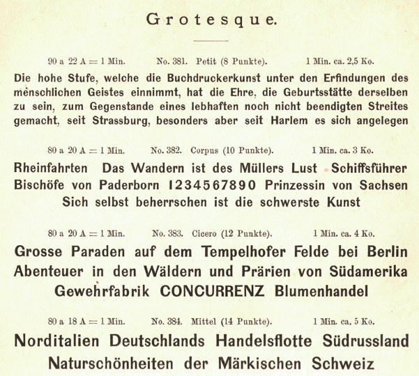
Four sizes of a Grotesque are reproduced above from the Berlin-based Wilhelm Gronau typefoundry’s 1891 catalogue. The foundry began carrying this typeface at the end of the 1850s, while the business was named after Eduard Haenel. An identical product – potentially even the source of these letters’ matrices – was sold by the Dresler foundry in Frankfurt, as can be seen on a supplement to an 1858 issue of Journal für Buchdruckerkunst, Schriftgießerei und die verwandten Fächer. Fonts of that design were carried by more foundries during the second half of the nineteenth and early twentieth centuries, too. Those foundries may have acquired their matrices from the same source Haenel did. Typefaces with very similar designs to this one were cut by Friedrich Wilhelm Bauer and his father Johann Christian Bauer, who each supplied specimens to the Journal in 1858 and 1859, respectively. Grotesque is just one of the German sans serif typefaces I’ve focused on as part of the ongoing research I describe below.
As I mentioned in an introductory post on this topic last year, I’ve been busy with a specific research topic. Recently, I filed a report on its progress, which I’m happy to also post here. Perhaps it may be of some interest for readers. I initially asked myself how many sans serifs were available from German-speaking foundries during the nineteenth century. Of the typefaces found in the catalogues of various foundries, how many designs were original to each one?
This is a long post. At a little over 3,700 words, it might take more than 20 minutes to read. I’ve included several images, most of which have rather long-winded captions, where I’ve added extra details and even a few links. On the plus side, this text has zero footnotes.
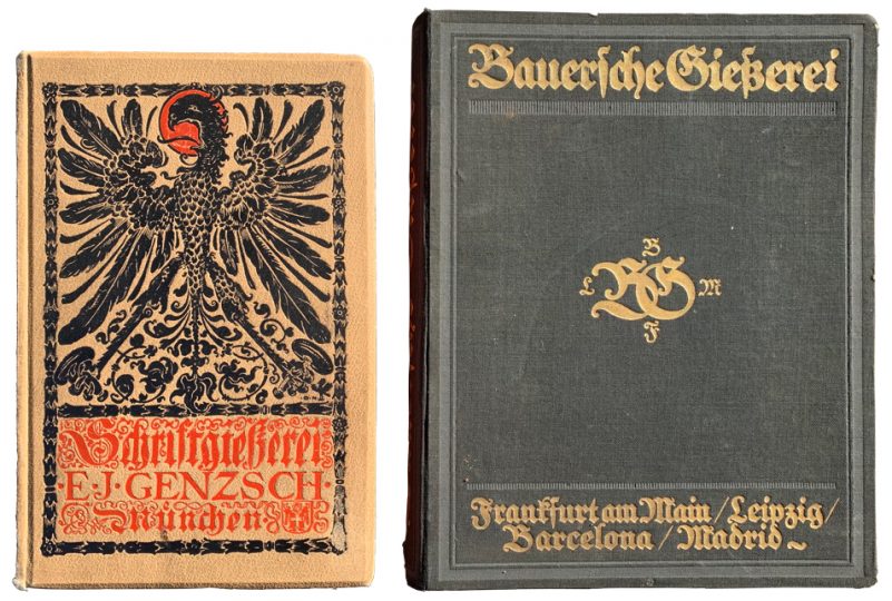
Above: The 1902 type specimen catalogue from E.J. Genzsch in Munich and a circa 1915 catalogue from the Bauer’sche Gießerei of Frankfurt am Main. Although exceptional specimens were printed as broadsheets, small ephemeral cards, or magazine advertisements, most foundries used pages whose average sizes were similar to those in these two catalogues. The Bauer specimen on the right is almost 30 cm tall and basically a quarto format; some foundries also used slightly larger sizes (the folio format is about 48 cm in height, for instance).
German sans serif typefaces: Research objective and the sources I investigated
Between May 2018 and April 2019, I carried out a research project to track the distribution of sans serif designs across German-speaking type foundries during the nineteenth century. I primarily relied on the collections of three public institutions in Berlin. Those institutions – as well as other public and private collections I consulted – are listed below in their own section of this post. I examined every type specimen catalogue and other bound-collection of foundry specimens that was held by those collections and which was published in a German-speaking territory between about 1830 and 1918. By ‘German-speaking territories,’ I mean the parts of Europe that unified into the German Empire in 1871, plus the Austrian/Austro-Hungarian Empires, and the German-speaking cantons of the Swiss Confederation.
In addition to bound specimens, I also included issues of two German-language printing trade journals in the scope of my investigation. Those were the Journal für Buchdruckerkunst, Schriftgießerei und verwandte Fächer, published between 1834 and 1919, as well as the Archiv für Buchdruckerkunst und die verwandte Geschäftszweige/Archiv für Buchgewerbe, published under these names from 1864 to 1899 and from 1899 to 1919, respectively. Foundries often provided loose specimen sheets to those journals, which would be shipped as supplements to subscribers. Not all bound volumes of the journals’ issues include the supplements today. In fact, the presence of the supplements often varies from year to year within one library’s collection.
Even for issues where I was not able to view a copy of a journal with the supplements intact, the publications still contained information that was relevant to my research, such as design patent registration notifications and discussions of the typefaces shown on the missing supplements. On rare occasions, the latter also provided the names of a typeface’s punchcutter – information that was almost never included in foundries’ own specimens. Together with the journal supplements, I was able to use these reviews and patent listings to discern many dates of first publication. Foundry specimen catalogues were rarely dated.
Above, left: The 8 through 16-pt sizes of the Elephanten-Schriften, from E.J. Genzsch’s 1902 catalogue. Above, right: The 8 through 20-pt sizes of Fette Grotesk, from a circa 1915 Bauer’sche Gießerei catalogue. These are just two of the many examples of third-party foundries carrying the Zeitungs-Grotesque design. That typeface was originally published in 1874–75 by the J.G. Francke Nachfolger A.W. Kafemann foundry of Danzig (today: Gdańsk). I suspect that most of the sorts shown on each page were cast from matrices of Kafemann’s Zeitungs-Grotesque. The top-left of the lowercase ‘a’ instances seen here may not be a complete match, however. The angle of these fonts’ upper terminals for that letter differ from Kafemann’s design. Perhaps whoever applied that change did so to open the letterform’s aperture slightly and prevent the ‘a’ from closing up in print, or otherwise appearing too dark in colour. The Elephanten-Schriften included a 24-pt size not found on Kafemann’s specimen sheets. Bauer’s Fette Grotesk had a 6-pt size which was probably added to the design by Gustav Reinhold’s foundry. Aside from Kafemann and Bauer, plus E.J. Genzsch and their mother house – Genzsch & Heyse in Hamburg – I believe that this exact design was carried by at least 35 other foundries in Germany, Austria, and Switzerland. I’ve posted my current list of those foundries, and the names they used for this design in a post on the typeface. The Flinsch foundry at Frankfurt am Main produced a similar typeface, which they called Fette Grotesk (the same descriptive name about half of the foundries selling Kafemann’s design used for that typeface).
Framework in which I undertook this project
This is a private research project, and therefore something like a hobby. During the time in which I undertook it, I worked as a full-time type designer at LucasFonts in Berlin. In January 2019, I presented intermediate findings from this research in a lecture at the Staatsbibliothek zu Berlin. A recording is viewable online (in German). After I finish my research, I plan to publish an article about my findings. I also hope to make further presentations with the materials I collected (in case you are in charge of inviting speakers to a conference).
Above: Comparison of the 28-pt sizes of Moderne Steinschriften as seen in E.J. Genzsch’s 1902 catalogue, and the Neueste schmale Grotesk typeface as seen in Bauer’s circa 1915 catalogue. Both typefaces were first published in 1865, and there are some similarities between the designs. The Moderne Steinschriften were not a Genzsch product. This size of the family was created at the Benjamin Krebs Nachfolger foundry in Frankfurt, where it was part of a family also named Moderne Steinschriften. The Krebs-foundry Moderne Steinschriften design was carried by at least 20 other German firms. My list of those foundries, and the names they used for this design are on Flickr. The rest of Genzsch’s Moderne Steinschriften family was part of an 1866 design from Flinsch named Schmale halbfette Grotesk. That was similar to Krebs’s Moderne Steinschriften design, but did not have a kerning ‘f’. In comparison with Bauer’s Neueste schmale Grotesk, Krebs’s Moderne Steinschriften and Flinsch’s Schmale halbfette Grotesk have more contrast. In all three designs, the lowercase ‘a’ has an out-stroke at its bottom-right, but the capital ‘R’ in Neueste schmale Grotesk has one as well. Bauer originally published its design under the longer name Neue schmale halbfette Grotesque modern, and its punches were cut by the company’s founder Johann Christian Bauer (1802–1867), who likely also ‘designed’ the face. The design of the Bauer typeface shown in the lower half of the above image was also carried by other foundries, but not as many as were selling the Moderne Steinschriften types. In German, the term Steinschriften could have been intended to imply to printers that this was a style of letterform coming from antiquity, when it would have been carved into stone. Stein = stone, Schrift = a word for printer’s type – or even ‘writing’, more generally. Alternatively, the term could be referring here to a style of lettering that was then being used in lithography, as that kind of printing was called Steindruck in German (‘stone printing’).
Methodology
I ordered each type specimen catalogue from the three Berlin collections described below and searched for all of the sans serifs inside (if any). The information I collected in my research came from examining that body of catalogues, as well as printing journal issues. I took photographs of each specimen page and entered the following data into an Excel table:
- type foundry name
- type foundry location (city and country)
- publication title
- publication date
- page number
- typeface name
- typeface product numbers
- type size names, and the sizes of those types in Didot points
- company owner’s name
- type designer’s name (if known)
- punchcutter’s name (if known)
- case present (e.g., is it all-caps, or u&lc, etc.)
- decorative features of the typeface
- short description of the typeface’s design
- whether the design was claimed as an original product of the foundry
- similarity to other typefaces
- whether the typeface was identical to other typefaces
- name of institution holding the publication
- its call number at that institution
- other local collections containing the publication
- if Sara Soskolne mentioned the typeface in her 2003 MA dissertation.
If after already having made an entry for a typeface because of its appearance in a type specimen catalogue, I later found the same typeface in a journal supplement or a catalogue published by the same firm at a different date, I compared the letters’ designs, as well as the meta-textual information present in each showing (e.g., if one catalogue denoted the typeface as a product originating at that foundry, but the other did not). Apart from a purely visual comparison, I was chiefly able to decide if two fonts of type shown in specimens of the same foundry, printed decades apart were the same based on their product numbers.
I was pleased to discover that – for most German-language foundries – type specimen catalogues published before the First World War were cumulative. By this I mean that, once a typeface was added to a company’s product portfolio, it was not removed. Many mid nineteenth-century display typefaces had no names at all – not even descriptive ones akin to ‘wide gothic’ or ‘shaded sans’. Occasionally, an anonymous type was given a name later in its life, or a name might change over time. Several sizes of unnamed display or ‘decorative types’ (Zierschriften) might be merged together into a family, too, but the internal company product numbers for each size of type would almost always stay the same, even over decades. It is common to find typefaces with several different product-number ranges among their sizes. In many cases, this indicates that a pre-existing size range was expanded later on.
With these methods, I catalogued the nineteenth and early twentieth-century sans serif typefaces sold by fifty-six German-speaking foundries. A list of those foundries follows at the end of this report.

Above: Two sizes of the Longina typeface, as seen in the 1902 E.J. Genzsch catalogue. Genzsch & Heyse called this design Longina, too, but the design did not originate with the Genzsch foundries. In fact, I have found no German foundry who took credit for it. The design probably originated in the 1860s at the foundry of James Conner’s Sons in New York before being imported (or electrotyped illicitly) by German firms. D. Stempel AG sold the design under the name Schmale enge Grotesk. As Schmale Grotesque/Schmale Grotesk, the design was sold by the Aktiengesellschaft für Schriftgießerei und Maschinenbau in Offenbach and Emil Gursch of Berlin. Krebs and Ludwig & Mayer at Frankfurt, as well as A. Numrich at Leipzig and Poppelbaum at Vienna, sold it as Schmale Steinschrift. Under the simpler name ‘Steinschrift,’ this typeface was distributed by the Emil Berger foundry in Leipzig and also by the Schriftgiesserei Bern. At H. Berthold, who acquired the Emil Berger foundry via their merger with Gustav Reinhold’s business in 1893, this design eventually became known as Akzidenz-Grotesk schmalhalbfett. It has also been suggested that Berthold purchased matrices of this design from the Viennese foundry Poppelbaum in 1896. Berger/Reinhold/Berthold did not create most sizes of the typeface, but by the time they renamed the typeface Akzidenz-Grotesk schmalhalbfett from Enge Steinschrift, which was the name Berthold sold this design under for the first few decades they had it, I think that they edited and recut most of the letters in each size – presumably so that they would be more compatible with Akzidenz-Grotesk’s other styles. That narrow ‘t’ with the special out-stroke? Berthold kept that as long as the typeface was sold in metal, but it is not in the photo-type font.
Problems
In almost every type specimen produced in the period I researched, full character sets were not included for the typefaces shown. In most instances, a specimen would only show several words in each size of a typeface, either a sole word, a single line of text, or a few lines of text – but rarely more.
The quality of the digital photographs I shot myself is generally poor. The use of lights and tripods is not permitted in the Kunstbibliothek or the Staatsbibliothek. Natural light was often not available (Berlin is often cloudy). A number of items in the Staatsbibliothek’s collection may only be viewed in that library’s rare book reading room, where photography is generally not allowed; however, I was granted permission to make photographs of some specimen pages with book scanners, on an individual basis. I also ordered better quality photographs of type specimen pages. Where possible – and within my budget – I ordered images from the Kunstbibliothek’s photography service, which offers much better quality than the Staatsbibliothek’s (but which is also more costly).
During my research, the use of photographs has been essential for several reasons: first, no institution had all the catalogues I examined in its collection. Second, comparing photographs was an activity I could do outside of the library. Third, the ability to zoom in on letters electronically, as I was comparing typefaces in different specimens helped me to decide if two similar-looking typefaces might be the same design. Unfortunately, all of my images – whether shot myself, or ordered through a photography service – are limited by the institutions’ conditions to my personal, non-commercial use. Publishing any of the images may require the payment of an extra fee (that is why none of the images accompanying this post are from those institutions; all but the very first and the very last are scans from my own items). On the other hand, I may eventually be able to source desired images for publication from other institutions or from private type specimen collectors.
Authorship of a specific typeface is not always determinable. While many foundry catalogues denote which typefaces – or which sizes of a typeface – originated in-house with an asterisk or with some other sort of explanation, other specimens included no such information. Claims of authorship were generally more common on the specimen sheets printed as supplements for printing journals, but not every foundry produced these sheets for each new typeface they created. If matrices for a typeface were imported from abroad, either following a purchase of matrices from a foreign foundry or via more illicit means, notification of this was almost never made by a foundry itself in its own publications. That detail was only rarely mentioned in trade journals, either. After Germany introduced a design patent law in the 1870s, new typeface designs were usually registered with local magistrates. Notifications of these registrations were often published in the Journal für Buchdruckerkunst, but I do not believe that its editors were notified of every single case. Germany’s patent office today maintains no record of these pre-WWI registrations.
Currently, the data that I have collected in my research is housed inside a single, large Excel file. I also have a file/folder categorisation system for my images on my computer (and in cloud-based storage). In the future, I hope to combine my data and my images into a database, which would make searching for specific typefaces – as well as for the connections between various typefaces – easier. I have not found an out-of-the-box solution for this challenge. The Type Record project presented by Indra Kupferschmid and Nick Sherman at ATypI 2013 would have been an ideal database to import my data into, but the website never launched, and is now in hiatus.
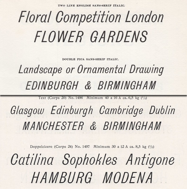
Above: The upper two fonts here are the Two Line English and Double Pica sizes of Sans-Serif Italic, as seen in the facsimile edition of a circa 1873 catalogue from the Miller & Richard foundry at Edinburgh and London. The lower two fonts are the Text (20 Didot point) and Doppelcicero (24 Didot point) sizes of the Caledonia-Schriften, as seen in E.J. Genzsch’s 1902 catalogue. The strokes in the upper half of this image are likely darker not because they were cut that way, but because I scanned that specimen from a facsimile print. The lower half of this image is scanned from a page actually printed with the type (as cast by Genzsch). The design seen on both halves the image above was also sold as by J. John Söhne at Hamburg as Cursiv Grotesque, and as Patent Italic by the Benjamin Krebs Nachfolger foundry at Frankfurt am Main.
Looking for specimens of German sans serif typefaces: List of libraries and public collections consulted
The three Berlin public institutions in which I performed the bulk of my research were the Kunstbibliothek, the Staatsbibliothek, and the Deutsches Technikmuseum. The historical archive at the Deutsches Technikmuseum has the company library of H. Berthold AG. That firm, established by Hermann Berthold in Berlin in 1858, cast foundry type from 1893 until 1978. Afterwards, Berthold continued to work in the photo-typesetting and digital-typesetting sphere until its bankruptcy in 1993. The Berthold library consists of 880 items, including specimens produced by the firm, the many they acquired over the course of their history, and other foundries.
As institutions, the Kunstbibliothek and the Staatsbibliothek are both part of the Stiftung Preußischer Kulturbesitz. Together, that foundation holds what is almost certainly the most thorough collection of foundry specimens published in Germany during its imperial years, i.e., from 1871 until 1918. I wanted my investigation to be be systematic: the foundation does not have a copy of every type specimen published during that period to survive into the present. There are gaps. So using the lists from Friedrich Bauer’s 1928 chronicle of the foundries in German-speaking Europe since Gutenberg’s time, as well as a bibliography of German foundry specimen published by the H. Berthold AG in 1923, I made a tally of firms and visited five more German libraries. These were the university libraries in Darmstadt and Frankfurt am Main, the German National Library in Leipzig, the Gutenberg Museum in Mainz, and the Klingspor Museum in Offenbach am Main. In those libraries, I only ordered catalogues that were not present in Berlin collections.
In May 2019, while attending a conference at the Pavillon-Presse printing museum in Weimar, I will consult more specimens from their Buchstaben-Bibliothek. Finally, in July 2019, I will do the same at the Letterform Archive in San Francisco. Naturally, there are other libraries abroad where I could surely find type specimen missing from the German public collections I relied one, not least at the St Bride library in London and the university libraries in Amsterdam and at Columbia in New York. The same is true for private collections.
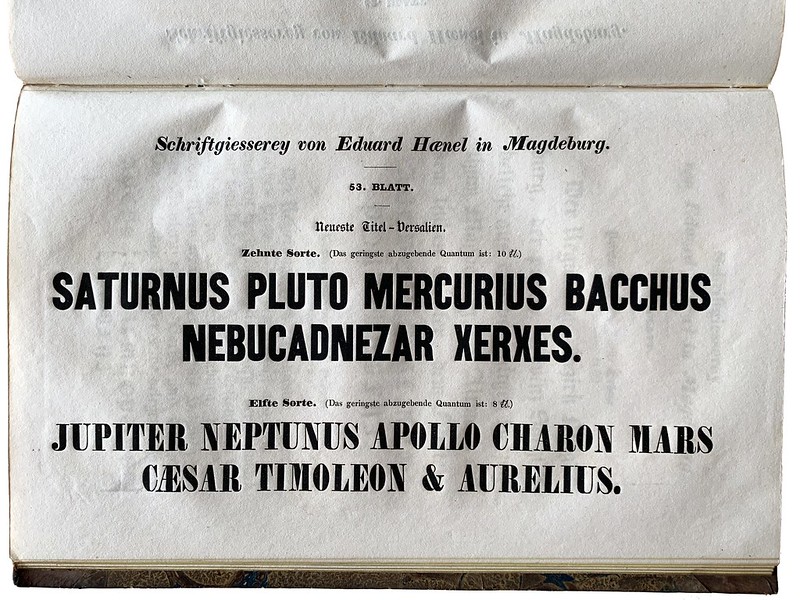
Above: Neueste Titel-Versalien, zehnte Sorte. This is the oldest specimen of a sans serif typeface printed in Germany. From a definitely-dated 1833 catalogue printed at Eduard Haenel’s foundry, which was then still in Magdeburg. This typeface must have originated at Caslon, Son & Livermore, who called it Great Primer Two-Line Condensed – even though the first appearance of that typeface in a Caslon catalogue is from 1834. Photographed at the Gutenberg Museum in Mainz.
List of type foundries included in my research
- Gebr. Arndt & Co., Berlin
- F.W. Aßmann, Berlin
- F.W. Bauer, Frankfurt am Main
- Bauer & Co., Stuttgart
- Bauer’sche Gießerei, Frankfurt am Main
- Emil Berger, Leipzig
- Schriftgiesserei Bern, Bern
- Gustav Reinhold/H. Berthold, Berlin
- Augustus Beyerhaus, Berlin
- Göttfried Böttger, Leipzig
- Breitkopf & Härtel, Leipzig
- Karl Brendler & Söhne, Vienna
- F.A. Brockhaus, Weimar/Leipzig
- Brötz & Glock, Frankfurt am Main
- Brüder Butter, Dresden
- Rudolf Ludwig (von) Decker/Reichsdruckerei, Berlin
- Dresler/Flinsch, Frankfurt am Main
- W. Drugulin, Leipzig
- Albert Falckenberg & Comp., Magdeburg
- Gebr. Fickert, Berlin
- J.G. Francke Nachfolger A.W. Kafemann, Danzig
- Genzsch & Heyse and E.J. Genzsch, Hamburg and Munich
- Gebr. Gundelach & Ebersbach, Leipzig
- Emil Gursch, Berlin
- Haas’sche Gießerei, Basel
- Gottlieb Haase Söhne, Prague
- Eduard Haenel/Wilhelm Gronau, Magdeburg/Berlin
- Herrlinger & Schmidt/A. Reimann, Berlin
- Heinrich Hoffmeister, Leipzig
- J.M. Huck / Actiengesellschaft für Schriftgießerei und Maschinenbau, Offenbach am Main
- J. John Söhne, Hamburg
- C. Kloberg, Leipzig
- Benjamin Krebs Nachfolger and K. u. K. Hofschriftgießerei Poppelbaum, Frankfurt am Main and Vienna
- Oskar Laessig, Vienna
- Ludwig & Mayer, Frankfurt am Main
- A. Meyer & Schleicher, Vienna
- Nies’sche Schriftgießerei, Frankfurt am Main
- A. Numrich & Co., Leipzig
- Rohm’sche Schriftgießerei, Frankfurt am Main
- Roos & Junge, Offenbach am Main
- Joh. Peter Nees & Co./Rudhard/Gebr. Klingspor, Offenbach am Main
- C.F. Rühl, Leipzig
- J.H. Rust & Co., Offenbach am Main and Vienna
- Gustav Schelter/Julius Klinkhardt, Leipzig
- J.G. Schelter & Giesecke, Leipzig
- Eduard Scholz, Vienna
- C. Schreyer & Ignaz Fuchs, Prague
- D. Stempel, Frankfurt am Main
- Otto Tech, Berlin
- Ferd. Theinhardt, Berlin
- Trowitzsch & Sohn, Berlin
- Schriftgiesserei van der Heyden, Offenbach am Main
- Buchdruckerei und Schriftgießerei des Verlags-Comptoirs, Grimma
- C.E. Weber, Stuttgart
- Otto Weisert, Stuttgart
- Wilhelm Woellmer, Berlin
The Leipzig punchcuttery Wagner & Schmidt and/or the Ludwig Wagner foundry, also at Leipzig, created a number of sans serif typefaces that were distributed throughout the international type foundry network (not only German-speaking firms). Those type designs appeared in the later catalogues of several of the above-mentioned companies, under various names. Since Ludwig Wagner only purchased the Gebr. Gundelach & Ebersbach foundry around 1902, and since the ‘Wagner’ sans serifs don’t appear in catalogues printed before that time, I’ve decided to view those products as twentieth-century type designs. This means that they fall outside the scope of this research, strictly speaking, which is why you won’t find any hint of them here. They might turn up in later articles, as mentions in footnotes, but Indra Kupferschmid already has them covered anyway.
Acknowledgements
Finally, I would like to thank everyone who supported my research so far with advice, feedback, and specimens. Thank you very much to Boris Chauvet, Mathieu Christe, Florian Hardwig, Wolfgang Homola, Indra Kupferschmid, Mathieu Lommen, Thomas Maier, Sébastien Morlighem, Pierre Pané-Farré, Daria Petrova, Sara Soskolne, Kris Sowersby, and the Printing Historical Society.