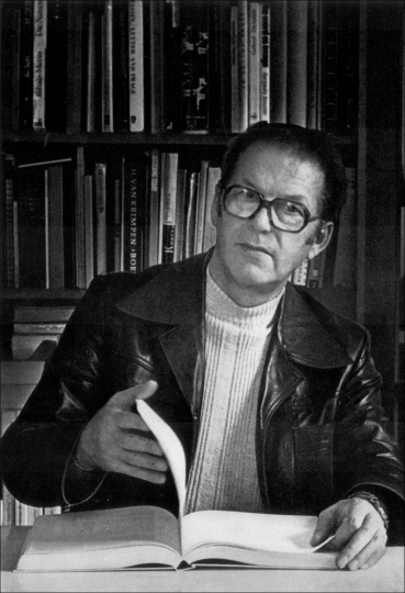
Figure 1 (above): Portrait of Albert Kapr from his 1982 book, Schrift- und Buchkunst. Historical-critical editions pose more than just academic challenges for publishers: they also raise technical and typographic questions. I originally wrote the following article in German for the Journal für Druckgeschichte, which published it in 2012.[1] Sylvia Werfel, who edited that version, invited me to write it after seeing my presentation on this subject at a 2012 symposium held at the Gutenberg Museum in Mainz, Schrift / Macht / Welten. Typografie und Macht (which could be translated as “Writing / Power / Worlds. Typography and Power”). My presentation on Albert Kapr at the 2011 ATypI conference in Reykjavík also touched on this topic.
Were Albert Kapr’s typeface choices for the MEGA aesthetically motivated or dependent on available technology?
In May 1989, a few months before the fall of the Berlin Wall, the Arbeitskreis Druckgeschichte met in Leipzig.[2] During a visit to Interdruck, the participants saw the current production status of the Marx/Engels Gesamtausgabe (MEGA), among other things. At that time, it was expected that the project – which began in the 1970s – would be completed in the year 2010. In fact, by the time that 2010 rolled around, only the fifty-eighth volume in the series had been published (from a projected total of one hundred fourteen volumes for the entire series).
Albert Kapr was responsible for the typographic design of the series. Kapr, who would have turned 100 this year, lived from 1918 until 1995. After a typesetting apprenticeship, he studied with F.H. Ernst Schneidler at the academy in Stuttgart. In 1948, he left American-controlled Baden-Württemberg for a teaching post at the architecture and design school in Weimar, a city then in the Soviet Zone of occupation. In 1951, he moved to Leipzig, becoming a professor at the Hochschule für Grafik und Buchkunst. Kapr was the most influential typographer and book designer in the German Democratic Republic (the former East German state). In the case of the MEGA, however, his available design choices were limited by technological changes in text composition.
The MEGA is a historical-critical series aiming to publish all the texts written by Karl Marx (1818–1883) and Friedrich Engels (1820–1895), including early drafts of their later publications and correspondence, etc. The first anthology of Marx‘s writings was already published in 1851. In 1927, a short-lived attempt to publish a Complete Works of Marx and Engels began. Between 1955 and 1966, a thirty-nine-volume edition of their writing was published in Russian translation in the Soviet Union. Although this was not a complete collection, it was the most substantial Marx/Engels series then published to-date. It served as the basis for Marx/Engels editions in other languages. From 1956 on, for instance, a German-language edition of this series was produced through the Dietz publishing house in East Berlin. This had the title Marx-Engels-Werke, or Marx and Engels’s Works, and it is often described by the initials MEW.[3]
Kapr was commissioned to develop a the MEGA series’s design in 1968. The production department at Dietz took care of the realization. For example, the typographer Horst Kinkel tackled the complicated line breaks. Originally published by the Marx–Engels–Lenin Institutes of the Central Committee of the CPSU and the Central Committee of the SED, the MEGA was brought out by the Dietz publishing house until 1992. In 1990, the politically independent Marx-Engels International Foundation in Amsterdam became the publisher. Between 1992 and 1998, no new volumes were published. Since 1998, the Akademie Verlag in Berlin has brought out the MEGA. The Berlin-Brandenburg Academy of Sciences coordinates the editing work.
Advanced technology, but limited font choices
Kapr was aware of the work’s significance: once defined, his design decisions would have to be recognized by later generations working on the series. He had to answer many questions in advance, such as whether the same fonts and paper stocks would still be available in twenty years’ time. Which typesetting technologies could he assume might be likely survive for several decades? Would the Linotype and Monotype machines then in-use be working so far into the future? Which of the then-available photo-typesetting systems would prevail?[4] Based on Kapr’s specifications, Claudia Reichel asked roughly these same questions again in the 1990s.[5] Even though she was then looking at an entirely different technological landscape.
A trial volume printed in 1972 proved extremely helpful. By consulting it, a number of detailed typographic details were clarified. The first two “regular” volumes in the series were published in 1975 [see fig. 2]. Although the layout of all MEGA front covers referenced the design used by on the discontinued attempt at creating a complete Marx/Engels series that had begun in the 1920s, the Kapr’s MEGA was different both because of its design (format, layout, etc.) and its manufacturing processes. While that earlier attempted Complete Works series – as well as Dietz’s MEW – had even been set with lead type and printed via letterpress, the team responsible for the new MEGA opted for photo-typesetting and offset printing.
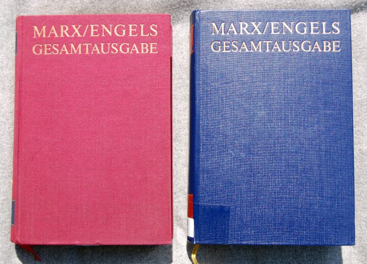
Figure 2: Trial volume from 1972, bound in red linen with gold-embossed text set in Times Roman (left). All other volumes are bound in blue linen.
Changing font-pairings
For good text differentiation, the MEGA uses two contrasting typefaces: original texts written by Marx or Engels are in a serif typeface. Running heads, chapter openings, and the critical apparatus are sans serif. Over the decades, the specific typefaces used changed. The trial volume from 1972 was printed with Times Roman and Univers. Between 1975 and 1992, the Maxima typeface – designed by Gert Wunderlich for VEB Typoart – was used instead of Univers [see fig. 3]. Since 1998, the sans serif text is set in Helvetica, which does not harmonize well with the version of Times used [see fig. 4].
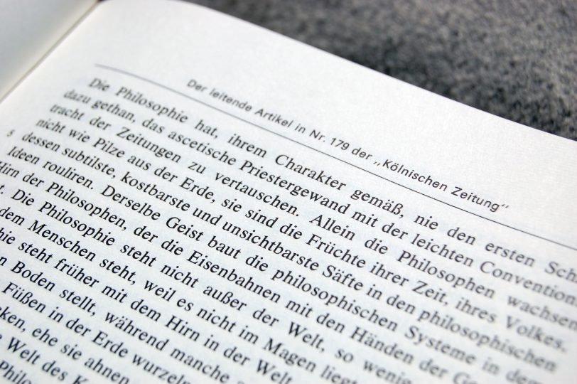
Figure 3: Text page from Vol. I:1 (1975) with Times Roman for the main text and Maxima for the column header.
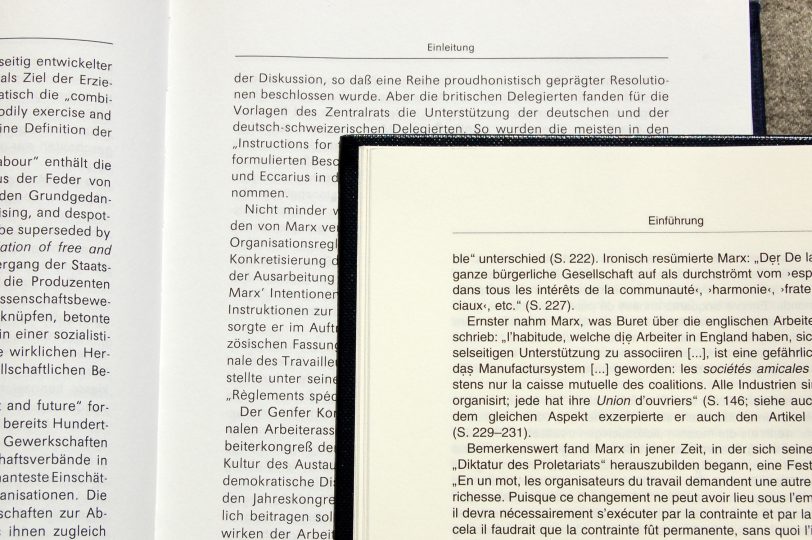
Figure 4: Comparison of sans serifs used in the MEGA, with Maxima from a 1992 volume (back) and Helvetica from 1998 (front).
Photo-typesetting
At the beginning of the 1970s, it was clear to Kapr that photo-typesetting would replace lead type, whether that type was set by hand or on typesetting machines like those from Linotype or Monotype. In order to guarantee a uniform text appearance over the course of several decades, he logically relied on the technology that was the most-advanced then. This was photo-typesetting, using machines employing cathode ray tubes (CRT). In the Eastern Block countries, photo-typesetting machines of that kind were not yet being manufactured, however, so they had imported them from abroad. This meant purchasing them from firms in the “capitalist” West. From the 1970s through the early 1990s, for example, the MEGA was composed with Linotype’s Linotron 505 machines. These saved text on sheets of film, with the help of fonts installed in the machine, which were stored on physical matrices (digital font storage came later).
In 1972, the Linotron still only had only a few fonts on offer, and there not yet any photo-type versions of Typoart’s typefaces for hand-setting or hot-metal machine-setting available at all. Times and Univers, which could be purchased along with the Linotron 505 machines, were the best-possible options available, because of their range of characters – including Cyrillic and Greek, as well as special mathematical symbols. Nevertheless, the Linotron-version of Univers did not look convincing enough in print, as the trial volume shows. Typoart’s staff produced Linotron versions of the Maxima fonts as quickly as was possible. Additionally, Wunderlich designed a Cyrillic extension.[6]
Italics posed another problem. The Lintron disc was not initially large enough to include the needed Italic. Instead, the Times Roman was electronically slanted. Kapr wrote that “later generations will consider such a solution unsatisfactory, but we had no choice.” In the end, the electronically slanted type did not look as bad as he feared. In the 1980s, Times Roman was replaced in project with Typoart’s Times clone, named Timeless. This was replaced in turn by Monotype’s Times New Roman in 1998. Both Timeless and Times New Roman have real italic fonts, and these were also used in the production of the respective MEGA volumes.
Kapr was likely unhappy with the use of Times. In 1977, after the MEGA was already in production, he wrote that Times was unsuitable for the works of Marx, just as a nineteenth-century grotesque would not be an appropriate typeface for setting a text by Shakespeare or Schiller.[7] The works of socialist authors should not be set with typefaces from the capitalist era. Kapr’s ideal choice, I believe, would have been a contemporary typeface specially designed for socialist and political literature – like his own Leipziger Antiqua, for instance [see fig. 5]. Unfortunately, in the early 1970s, Leipziger Antiqua was only available in fonts and matrices for use in letterpress printing. Designing and expanding it for use on the Linotron, as was done for Maxima, would have been time-consuming and too costly. In a 1976 portfolio entitled titled Marx-Engels-Worte (“Marx-Engels-Words”) [see fig. 6], Kapr gave his selected content what he might have considered a more adequate and artistic form. The letterforms he use there were from woodcut blocks. They are angular and rough, and they seem both lively and untamed.
Figure 5: Leipziger Antiqua, roman and italic designs (detail from Kapr: Schrift- und Buchkunst). This sample was not set with the photo-type version of Leipziger Antiqua but with the old hot-metal version for use on linecasting machines.
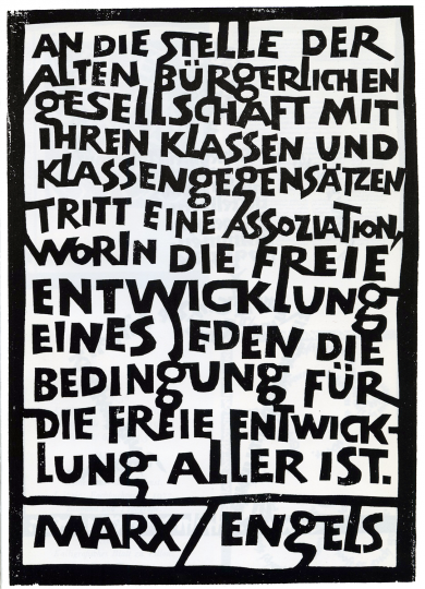
Figure 6: Print from Kapr’s Marx-Engels-Worte portfolio (original dimensions 64 x 50 cm). Reproduced from H. Bunke: Schrift- und Buchkünstler Albert Kapr.
Conclusion
With its 1998 volume, the MEGA’s production means changed considerably. Instead of DTP-era text processing, a text-data-processing based on SGML and XML for media-friendly publishing (print, CD-ROM, Internet) was used. With TUSTEP – the Tübingen system of word processing programs that has been steadily developed since 1966 – data can be structured with tags, both content-wise and typographically, and then processed in a media-neutral way. Processing speeds of about 30,000 pages per minute are possible.[8]
Like the earlier typeface choices made for the MEGA’s design, the series’s latest specifications – calling for the use of the standard fonts Times New Roman and Helvetica – do not seem motivated by the books’ content itself, or by the aesthetic desires of any designers. Instead, the choices were dependent on technology available at the time. From the project’s beginning, decisions about which typefaces to use in the MEGA have always followed decisions about which particular typesetting techniques would be employed.
Notes
- See Dan Reynolds: »Schriftwahl – ästhetisch motiviert oder technikabhängig? Albert Kapr und die Marx-Engels-Gesamtausgabe«. Edited by Silvia Werfel. In Journal für Druckgeschichte. (Neue Folge, vol. 18, no. 4), p. 27–28. Bound together with Deutscher Drucker. Issue 36, November 29, 2012 [read online].
- In 1989, the Arbeitskreis Druckgeschichte visited Leipzig. This “Printing History Working Group” was primarily a West German organization. They were also the the publishers of the Journal für Druckgeschichte, in which a report about that trip was printed. That report appears in English on p. 3–4 of the PDF linked to in the previous sentence.
- »Über die Vorbereitung einer historisch-kritischen Gesamtausgabe der Werke von Karl Marx und Friedrich Engels (MEGA).« In Beiträge zur Geschichte der deutschen Arbeiterbewegung (BzG). Vol. 1 (1968), p. 773
- Albert Kapr: »Texte optimal erschließend, leicht handhabbar und zugleich ästhetisch.« In Börsenblatt für den Deutschen Buchhandel. Leipzig 1975. (Also in Schrift- und Buchkunst. Leipzig: VEB Fachbuchverlag 1982, p. 171–178; here p. 171)
- Claudia Reichel: »Auswählen, Gliedern, Anordnen und logisch Lesbarmachen von Schrift – Zur Typographie der MEGA.« In MEGA-Studien. No. 1999 (2002). Published by the International Marx-Engels Foundation in Amsterdam, p. 34–52
- Schrift- und Buchkunst, p. 176
- Albert Kapr: Ästhetik der Schriftkunst. Leipzig: VEB Fachbuchverlag 1977, p. 60–62
- Tobias Ott: »TUSTEP und die MEGA – Vom Satz zur elektronischen Publikation.« In MEGA-Studien. No.1999 (2002). Published by the International Marx-Engels Foundation in Amsterdam, p. 13–25