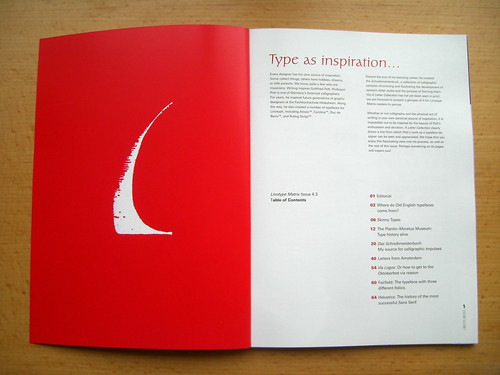
One of my favorite Linotype projects has always been the Linotype Matrix! Linotype releases this journal “from time to time,” and the third issue is now available. I have the privilege to co-edit and art direct the Linotype Matrix together with Nadine Chahine and Otmar Hoefer; this issue’s cover story is a 20-page article on calligraphy as a source of inspiration for typeface design by Gottfried Pott. But there are number of gems, including an article about the development of Helvetica by Dr. Walter Greisner—fomer CEO of D. Stempel AG. As you might glean from just these two mentions, the Matix’s articles are written and designed by quite a team. Below are a number of images and comments. Click here to see a full table of contents or to order your own copy!
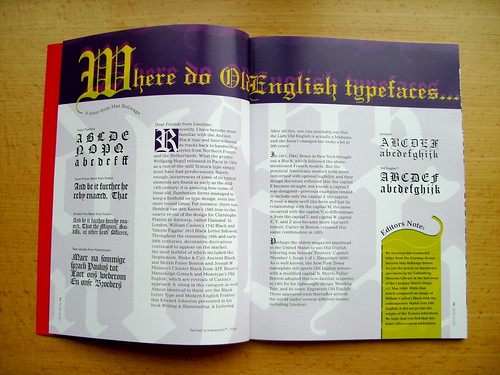
The first article explains where the term “Old English” comes from. This is a letter to the editor from Max Bollwage, a German typographic author.
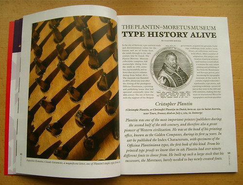
Tupigrafia’s Claudio Rocha wrote and designed an article about the Plantin–Moretus Museum in Antwerp. Images include photographs of Garamond’s punches, Hendrik van den Keere’s types, and the building itself.
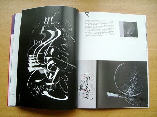
As was mentioned above, the cover story shows images from Gottfried Pott’s personal writing book. This article is filled with 20 pages of breath-taking images.
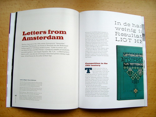
Perhaps my personal favorite this time around is the article entitled “Letters from Amsterdam.” About the Dutch Tetterode foundry, the text was written by none other than Jan Middendorp, and the pages were designed by Tiffany Wardle de Sousa!
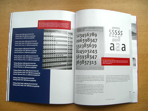
Another article shows some images from the development and implementation of the Vialog typeface in the Munich Transit System. The article was written and designed by Fuenfwerken, who spearheaded the Munich redesign. Vialog was designed by Werner Schneider, who has a new typeface system out: Satero.
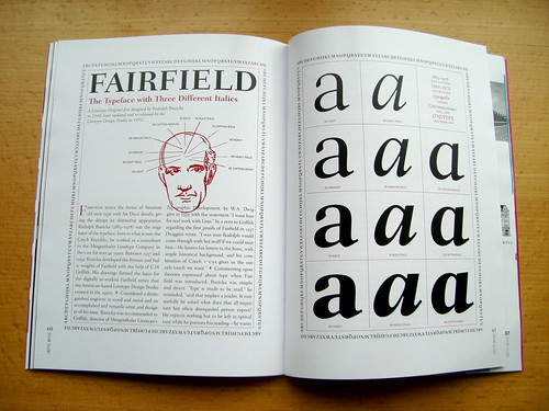
A short article about the Fairfield typeface was designed by Filip Blažek. This is an interesting mix, since Rudolph Ruzicka—Fairfield’s designer—emigrated during the early 20th Century from Czechoslovakia to the United States, and Filip is one of the Czech Republic’s most interesting graphic designers now.
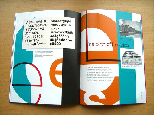
The last article in the issue is a 16-page account of Helvetica’s march to becoming, well, Helvetica! It was written by Dr. Walter Greisner, former CEO of D. Stempel AG, a company with which he was associated for 20 years (1967–1987).