Yesterday in a small used bookstore on the Oranienstraße, I found a small booklet on lettering in the Buchwesen section. This is Karl-Heinz Lange’s Schrift: schreiben, zeichnen, konstruieren, schneiden, malen. Eine praktische Anleitung. The book was published in Leipzig by the VEB E.A. Seeman Verlag in 1965. It’s dimensions are 19cm high by 11.9cm wide. Inside are 24 black and white pages. I paid four euros for it.
I had the honor of meeting Mr. Lange at a Berlin Typostammtisch earlier this year. I also sat in on Ole Schäffer’s presentation of his typeface designs at the ATypI conference in Brighton. You can garnish a bit about Mr. Lange and VEB Typoart, where he worked during the GDR years, at the Typoart-Freunde (Typoart friends) site. That page is only available in German, but if you click on “Gestalter” you can come to a page that has his name, and click on that, too. PingMag in Japan has put together a great article in English on Mr. Lange and Typoart as well.
Mr. Lange’s is the first book I’ve bought was printed in East Germany, although I’ve been looking for some bargains on a few titles by Albert Kapr for about a year.

The Typoart friends list three typefaces from Mr. Lange: Minima, Primus, and Publika.
Minima was designed especially for the GDR telephone books. Unfortunately for Mr. Lange and his design, he finished work on the type at the same time that there ceased to be a GDR altogether. It is interesting to compare Minima with Meta, which was also designed during the 1980s with the intention of being used in telephone books (West Germany’s). Meta never got used for its intended purpose either. Meta and Minima are very different from one another, but are both a bit condensed. Also, Meta went on to become world famous…
Primus was created for newspapers during the early 1960s, and received quite a fair amount of use in the GDR. Primus also has Cyrillic characters. Publika is a condensed jobbing sans serif that maintains a touch of calligraphic influence.
Lange also worked on other faces, including converting a number of older designs, like Super Grotesk, into phototype format. The website of Ole Schäffer’s foundry, primetype, lists Mr. Lange as one of its designers, and currently states that PTL Minimala will be released soon. PTL Minimala was discussed in Brighton; I believe that it’ll be the digital release of Minima.
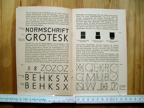
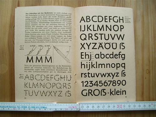

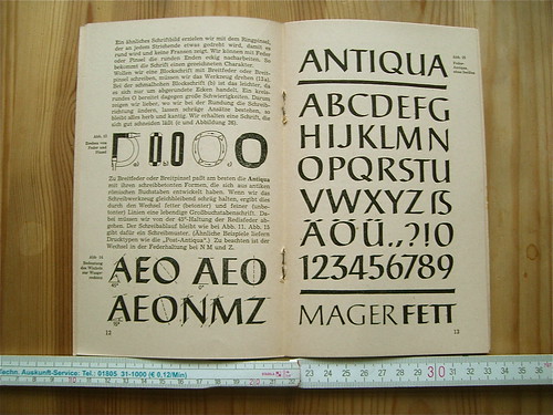
There were a few years during the 1960s where the GDR seems to have supported the use of a capital ß. Perhaps this book was produced inside that small window.