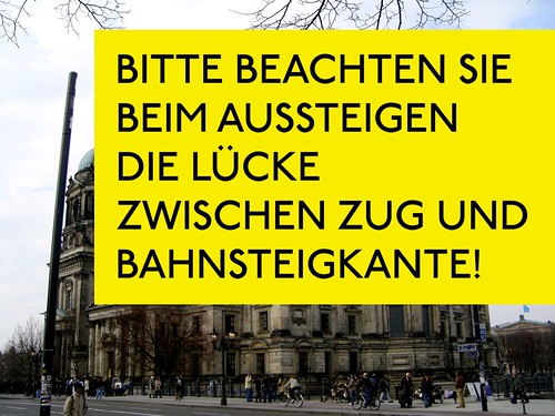
I’ve often heard that German is a more economical language than English. I don’t quite know if this is always true, even though German does seem to have a quite a high number of longer words, even a few massive super-words, like Dampschifffahrtsgesellschaft. But never has the difference between English and German been more clear to me than on the Berlin subway.
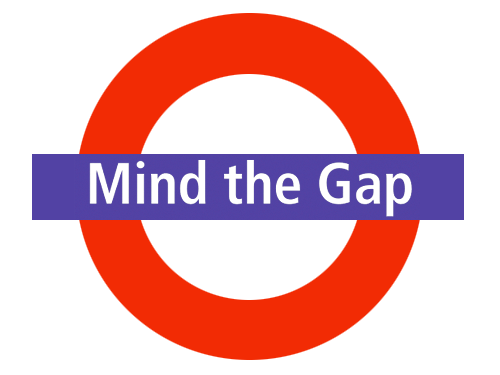
When riders exit a subway car, an official announcement needs to be made, no matter in which country one finds oneself. In London, the safety message has become iconic:
Mind the gap
The same phenomenon cannot be attributed to the BVG, however. Long before a train pulls into the station, the driver must begin his eleven-word, 21-syllable cautionary advice:
Bitte beachten Sie beim Aussteigen die Lücke zwischen Zug und Bahnsteigkante!

The text in the images above is set in P22 Underground Pro Medium, which should be very close to the type used in the London Underground. The new pro version of this family was developed by Paul Hunt. The “R=248 B=236 G=0” yellow seems to be the color that the BVG uses, at least on their website. The BVG’s signs, of course, use FF Transit.
FF Transit. Great design, but maybe better for Berlin than London?
Comments
13 responses to “On the economy of English”
Germans loves letters. Spoken, written … no matter. The main thing is to use as much letters as possible ;)
…kante!
Hi Dan, funny article. But please remove the double-n out of the word »Bahnsteigkante«. It should read …kante. Thanks.
German an economic language, who says something? When we works with german and english texts, the german version is some paragraphs longer than the english. And the two warning signs are very good example for the economic of english texts.
Sorry about the misspelling of “Kante” everyone. The images are fixed now.
From Jürgen Siebert:
It’s not only a language problem but a problem of talent. The 1:1 translation of Mind the Gap is »Achte auf die Lücke«. Much shorter that the BVG-solution. But there is more potential for cut-offs. We have such nice strict words like »Achtung« or »Vorsicht«. Insted of the tiny Lücke (the spave between two teeth) I would prefer a much more dangerous distance, the Spalt. Result: Vorsicht: Spalt.
Peter, in my experience setting English, German, and French together, the French texts have always been far and away the longest. I’ve always found this very odd.
I’ve been told that French can be a very economical language, but when foreign texts are translated into French, somehow an awful lot more words are needed to describe the point…
But this is the thing that makes German beuatiful. I love these long sentences =)
Do you see that the type, which is used for the london signs ist uglier than the german counterpart?
Oh, I don’t find Johnston’s design for the London Underground signage ugly at all! What would the city be without it? It is unthinkable to imagine… this has helped shaped British design for almost a century.
I think that the Berlin system is also quite good, and in many ways, it is more easily navigable.
But one thing I just do not like at all is the similarity of typeface across navigation systems the world over. Frutiger is a great typeface, but it was designed for the Charles de Gaulle airport and is very very French. And somehow Swiss and German, too.
But now, it seems as if every second airport in the world uses Frutiger. Why should an airport in the Netherlands or the UK look like Paris? Dutch, British, and French culture are so very different.
As successful as I find the Berlin network, I wish that someone would redo it sometime in the future, with a more “Berlin” typeface. What does a Berlin typeface look like? I have no idea! But it’d probably be more like Erik Spiekermann’s Meta or Unit, and less like something created to be used in Paris.
> But one thing I just do not like at all is the similarity of typeface across navigation systems the world over.
Amen. Heathrow’s wonderful custom face by Fiona Ross is slowly being replaced with Frutiger. It’s more depressing each time I fly through as I see the lovely Plantinesque (very British) thing whittle away.
Well, you are right Dan, French can be very long and quite economical. This things are hard to compare, a the German translation of a French text will be longer for sure, and a the French translation of a German text will probably be longer too… Damn it.
And all in the name of branding, Stephen…
Mathieu, the biggest problems often come about when the translation’s end language content is written by a non-native speaker, e.g., if a German-speaker translates a French text into the German, I’d bet that his German text would be shorter than that of a French-speaker who translated the same French text into German.