This isn’t a New Year’s card. Many people seem to enjoy sending out a mass e-mail to everyone they know, wishing them a merry Christmas, a happy Hanukkah, a good new year, or what have you. I appreciate the thought, but I never read these (sorry :( ). A hand-written—or at least hand-typed into the e-mail program—note is my personal preference. Every few years, I manage to get cards printed up to mail out. Not this year. 2008–2009?
Looking ahead toward a new year is a bit like standing on a street corner and waiting for the light to change. But today, I’m just thinking about the next two weeks. I’ve an essay due on the fourteenth, and I’m weighing how best to put that together. Then there is this typeface I’m designing…
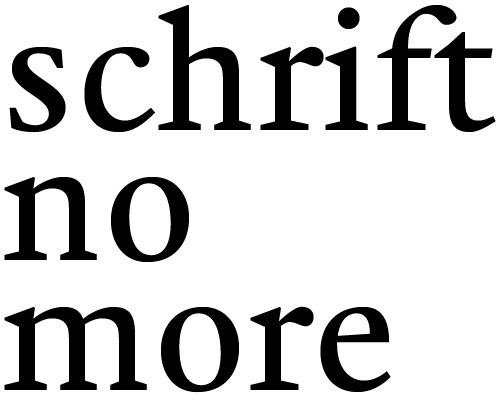
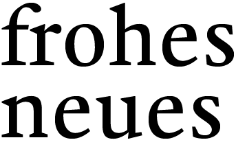
Err… designing? More like spending hours staring at the print-outs I’ve hung on the door of my girlfriend’s refrigerator until my eyes itch too much. Since I’ve come back to Germany, I’ve been able to show my progress to a few designers here. That has been nice. The verdict has been a lot of food for thought, though; and for the moment is not so nice, if only because it confirms what I was afraid it would.
Now, you cannot really judge my development from the two images above. I’m shooting for a font that will work best at 10 point, or maybe 9. So at 80 or 100 points on screen, it isn’t really in its métier. Not to mention that three words does not Mengentext make. Also, the first graphic and the second each have a different lowercase e.
Since earlier this month, I’ve had a rather sinking feeling about this design, so it is going to have to change course. Several people have told me now that it looks like it falls somewhere along a spectrum between two existing typefaces. Now, let’s be honest. The world doesn’t really need that, does it? I’ve also drawn a series of pesky details that rub everyone a little bit differently.
I won’t name any names or brands here; that would be silly. But I do feel I need to change the form of the letters, or maybe their genre altogether, while somehow keep that sparkle that I’m shooting for. First, though, I’ve got a looming essay deadline to consider, plus another good week in Germany. Frohes neues!