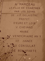
During my last visit to Chartres—about a year and a half ago—I photographed this inscription from a monument in one of the town squares. Its letters are just divine, in my opinion. This sort of thin sans serif form does wonders for a monument, and I must admit that this genre sways every time.
Around the time I shot this image, I was in the thick of my work on a Bank Gothic revival for Linotype. I lightened up its light weight during the autumn of 2005 (because, you know, who doesn’t love light type?). It may have just been a coincidence that I was drawing some of light letters around the time I saw this baby, and that I was more receptive to forms such as these than usual; I’ll never know. I’ve been to Chartres twice, both times for the cathedral, but now I’d like to go back again soon… even just for these letters. I can’t recall what the rest of the monument looked like, and I’d love to get a date on when this was actually cut. It seems to refer to the Bonaparte era. But even for the late French Revolution, these letters look far too revolutionary! I wonder how old they really are?
Click on the image to enlarge and view the entire setting.
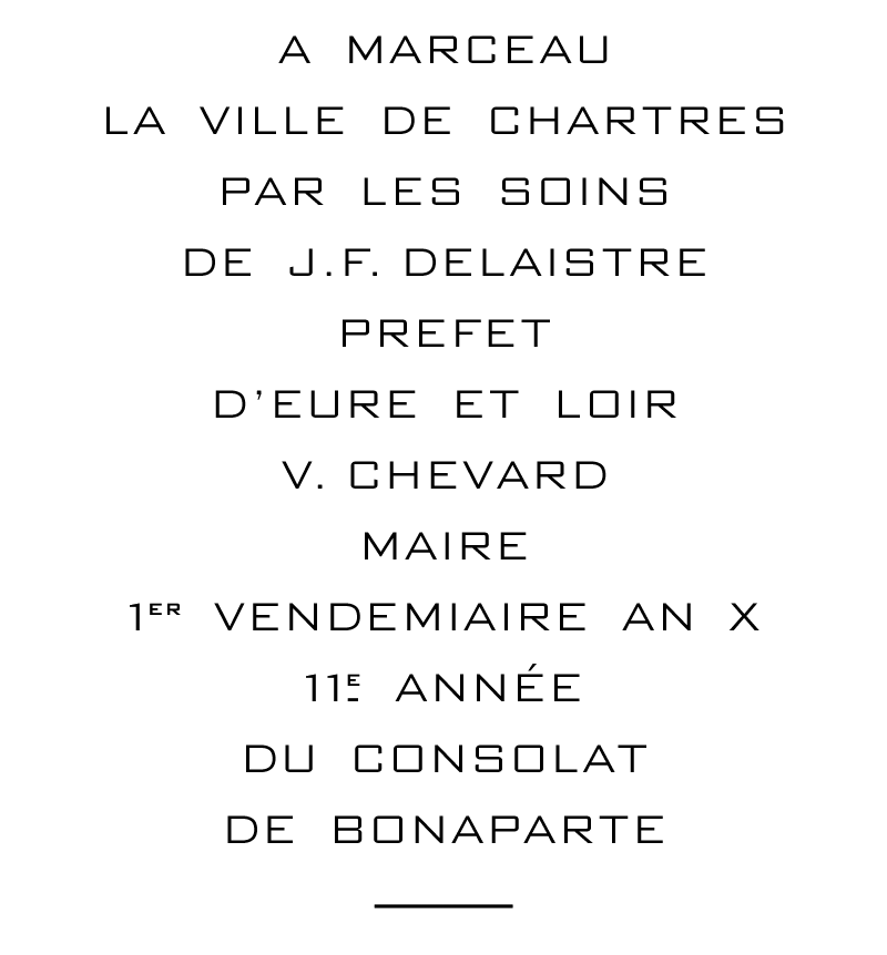
Now that the revival is finished (it will be released under the name Morris Sans), I’ve set the monument’s text in its Light weight, which I was working on during and after that French vacation. Of course, these letters don’t really look like the monument’s. But they feel similar enough… and that’s enough to make me happy.