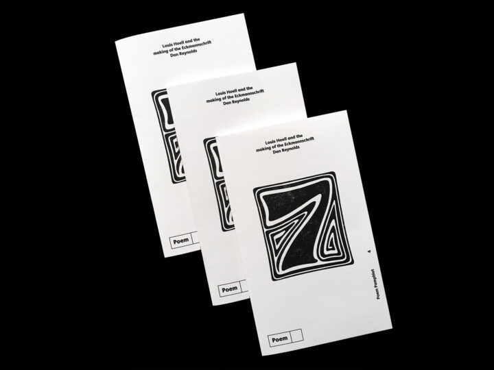
Jérôme Knebusch and Alice Savoie’s Poem Pamphlet series has been a typographic highlight of 2020. The first pamphlet tells the story behind Rudolf Koch’s Blumenbuch. In the second, Sébastien Morlighem writes on “Robert Thorn and the origin of the ‘modern’ fat face.” Riccardo Olocco wrote the third pamphlet, about Erhard Ratdolt’s 1486 type specimen sheet. The fourth pamphlet was published last week. I wrote the text, presenting the story of the Eckmannschrift’s creation at the Rudhard’sche Gießerei from the point of view of Louis Hoell. Or at least, as close to Hoell’s perspective as I could reconstruct in a format like this one.
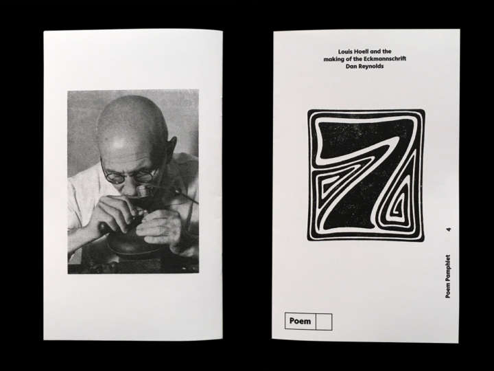
The pamphlet’s covers. The back shows J.F. Gutermann’s portrait of Louis Hoell at work (probably from the early 1930s). The front features Otto Eckmann’s stylized 7 for the magazine Die Woche. Edited from two photos made by Jérôme Knebusch.
I have approached the topic of Louis Hoell and the Eckmannschrift on TypeOff. once before. My text in the Poem Pamphlet is based on part of my dissertation’s sixth chapter, where I describe Hoell’s potential contributions to the Eckmannschrift and the Behrensschrift at some length, putting them into context with many more of the Künstlerschriften produced by German typefoundries between the 1870s and 1914.
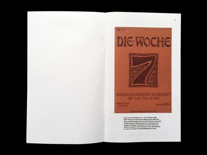
Since the lettering on Die Woche was the impetus for the Eckmannschrift’s commission, the pamphlet begins with a color reproduction of the magazine’s cover. This photograph, and all other images with black backgrounds in this post, were made by Jérôme Knebusch and I have lifted them from his website.
As I wrote for my doctoral defense about two years ago, “the Eckmann typeface has been a common thread binding much of my previous [professional and research] experience together.” While it was not the main focus of my too-long doctoral research between 2012 and 2018, the Eckmannschrift is probably the typeface from Imperial-era Germany for which the greatest number of primary sources have survived.
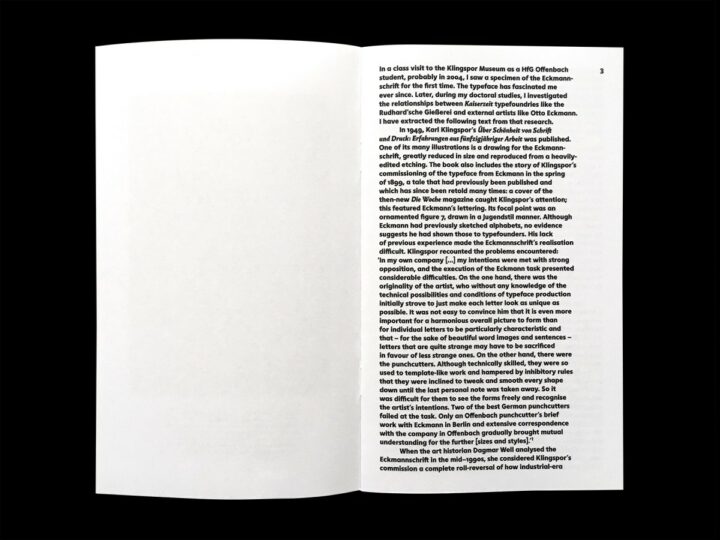
Pages 2 and 3. Jérôme Knebusch designed both the pamphlet and the typefaces used to set its texts, Instant and Almost. Instant is the text you see most; Almost is reserved for words in italics.
I am not exactly sure when I first saw the Eckmannschrift. I do not remember if it was a typeface explained to us during my undergraduate studies in graphic design and art history in the United States or not. Between 2003 and 2005, I studied design at the HfG Offenbach, a short walk from the Klingspor Museum. If my memory is correct, two of my teachers there took their classes into the museum: Fritz Friedl and Dieter Lincke. In the museum, director Stefan Soltek presented us with some of the collection’s highlights. On one of these visits, he showed us one of the Eckmannschrift specimen brochures the Rudhard’sche Gießerei had produced. One page from that specimen placed itself firmly in my memory, as I remember Soltek highlighting it in his presentation. There is a saying in German about “decorating yourself with the wrong feathers.” The illustration below accompanied a text where the Rudhard foundry warned other foundries against copying the Eckmannschrift. Crows covered in a swan’s feathers are still crows.
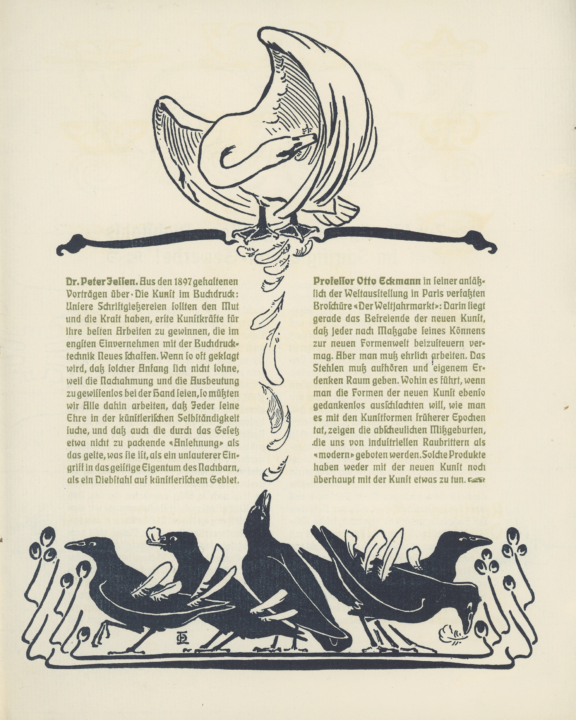
The anti-piracy page from what was probably the second type specimen brochure the Rudhard’sche Gießerei produced for the Eckmannschrift. Photograph by Ethan Cohen.
The first time I met Jérôme Knebusch was in Offenbach, in one of those classes. I remember failing at my attempt to make small talk with him, as our class walked from the school’s campus over to the museum. But I do not recall if that museum visit was the same one where Soltek showed us the Eckmann brochure and commented on the swan’s feathers.
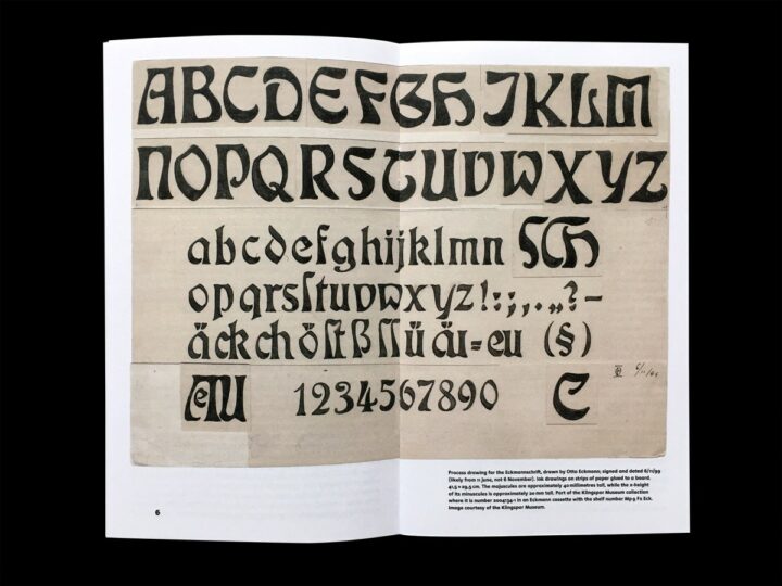
This drawing of Otto Eckmann’s for his typeface is kept at the Klingspor Museum in Offenbach am Main. It is one of the oldest examples of a drawing created by a type designer for a typefoundry to interpret to have survived the Second World War in Germany.
It is a nerdy detail, but one of the details of the pamphlet I’m most excited about is an endnote I added about this drawing’s date, “6/11/99.” Since Otto Eckmann filed a design patent for what must have been the Eckmannschrift on 19 October 1899, I suspect that the drawing in the photograph above is from 11 June, not 6 November 1899. A later notice in the 4 October 1902 issue of the Deutsche Reichsanzeiger newspaper referred to Eckmann’s 19 October 1899 design patent registration. My translation of that notice reads:
To No. 17 545. The Rudhard’sche Gießerei firm in Offenbach am Main is the legal successor of Professor Otto Eckmann in Berlin regarding the illustration of a design for alphabets, factory number 58, registered on the morning of 19 October 1899 between 10 and 11 o’clock with a period of protection of three years, [they] requested an extension of the period of protection to 15 years on 13 September 1902 between 10 and 11 o’clock in the morning.
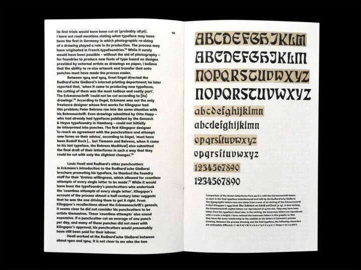
In this pamphlet, I argue that the clear difference between the appearance of the letters in Otto Eckmann’s drawing and the typeface is very likely Louis Hoell’s contribution.
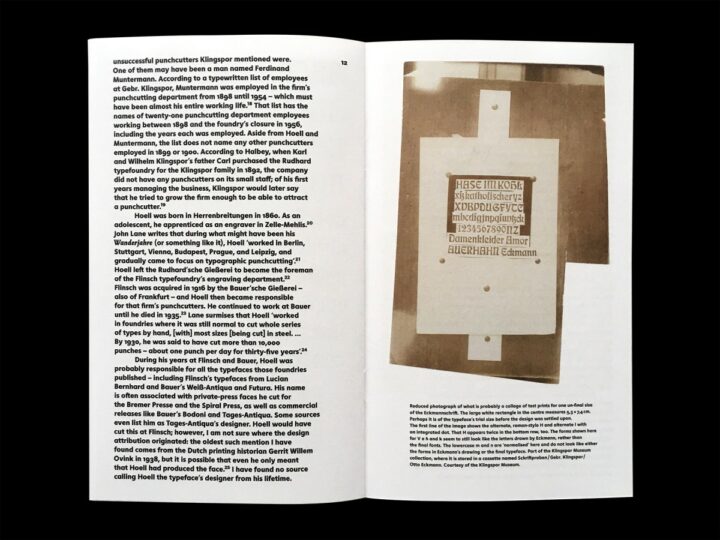
The photograph reproduced on the above spread captures what might have been an intermediary step in the Eckmannschrift’s production at the Rudhard’sche Gießerei, somewhere between when the typeface’s cutting began and when its final forms were determined.
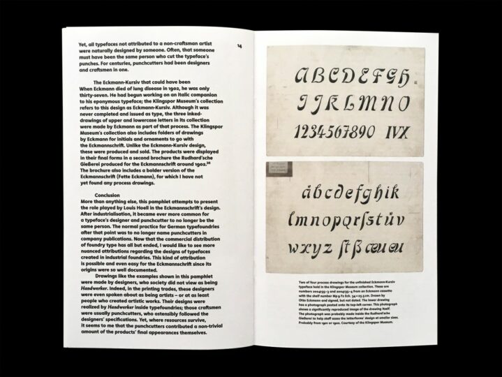
Otto Eckmann’s unfinished design for a companion italic to the Eckmannschrift is the last topic this pamphlet addresses.
If you want more information about the pamphlet, here is the official description from the Poem website:
Louis Hoell cut the punches for the only published typeface Otto Eckmann ever designed. The story of the Eckmannschrift’s creation has often been told. In retrospect, it was the release that made Karl Klingspor’s reputation as a typefoundry director of note. Yet instead of looking at the Eckmannschrift from Klingspor or Eckmann’s point of view, Dan Reynold’s essay directs its focus to what Hoell’s design contributions to the project might have been. With rare and unpublished material from the Klingspor archives. Co-edited with Alice Savoie in the Poem Pamphlet series.
English texts
20 pages, 12 × 20 cm
Offset print on uncoated paper
Glossy UV varnish
Saddle stitch binding
Poem sells the pamphlet for €8, which includes shipping within the EU. Visit the Poem website to place your order: poem-editions.com/products/eckmann
