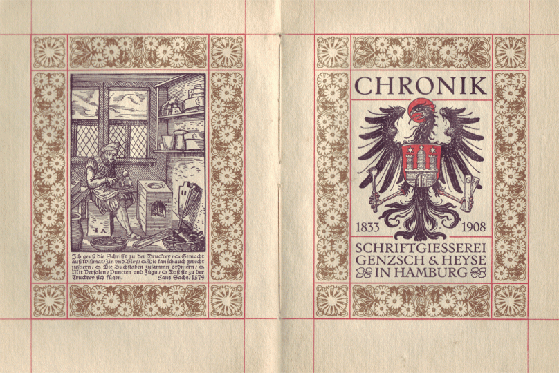
The list in this post is taken from a chronicle Genzsch & Heyse published to celebrate its 75th anniversary in 1908. The image above, of that book’s title spread, is taken from the Freunde des Klingspor Museums website.
When researching the history of typefoundries, many sources have not survived. Rosters of company employees are one kind of source that I wish were more abundant. At least when it comes to German typefoundries, there are very few examples of employee lists that I have been able to find. Nevertheless, we have a snapshot of the Hamburg typefoundry Genzsch & Heyse’s workforce at two different moments in time. The foundry included these in a small booklet printed to celebrate its seventy-fifth anniversary entitled Chronik der Schriftgießerei von Genzsch & Heyse in Hamburg, 1833–1908.[1] The first list commemorates the employees the firm had in 1883 when it celebrated its fiftieth anniversary. The second dates to the book’s time of preparation (1907).
This is the first entry in a two-part series looking at Genzsch & Heyse’s corporate structure and how it changed over a quarter-century-long period. I’ve taken the following names and business units from the Chronik’s pages 29 and 30. Note that neither this list nor the 1907 list I will address in this series’ next post includes the employees at Genzsch & Heyse’s subsidiary in Munich, a company called E.J. Genzsch GmbH that Emil Julius Genzsch established in 1881 after purchasing the typefoundries run by Jean Lean and Oscar Haseney.[2]
A brief history of Genzsch & Heyse through 1883
The foundry began doing business in 1833. It was established by Johann August Genzsch (1800–1869). As a boy, Genzsch had apprenticed at Breitkopf & Härtel as a typecaster. He then worked at Tauchnitz.[3] Breitkopf & Härtel and Tauchnitz were each Leipzig printing houses that operated in-house typefoundries.[4] Genzsch’s next job was as foreman of typecasting at F. Dresler & Rost-Fingerlin in Frankfurt am Main.[5] Unlike Breitkopf & Härtel, F. Dresler & Rost-Fingerlin was an independent typefoundry. Instead of printing, making type was its primary business. When Genzsch & Heyse opened, typefoundry businesses operating independently of printing houses was relatively novel in the German printing trades. Even though Genzsch soon had the printer Johann Georg Heyse join his firm as a partner, Genzsch & Heyse was a typefoundry, not a printing office. After Heyse died in 1849, Genzsch resumed sole ownership of the business.[6] No members of the Heyse family were ever in the company’s management after that point, but the “Genzsch & Heyse” name would be retained by the company, even after they stopped casting type in the 1960s and moved entirely into the sign-engraving business.
Around 1840, Johann August Genzsch married “Juliane Josephine Ratelle, the step-daughter of … [Mr.] Hartmeyer, the later owner of a printing house of the same name and the publisher of the Hamburger Nachrichten.”[7] When he retired in 1866, he transferred ownership of the typefoundry to their son Emil Julius Genzsch (1842–1907).[8] In turn, Emil Julius Genzsch would eventually turn over the operation of the foundry to his sons.[9] Today, the Genzsch family’s papers are held by the Staatsarchiv Hamburg. Absent from my brief account here is any discussion about technical advances, particularly the effects that mechanization had on typefounding, or the number of sorts that one worker could cast per day. In 1833, Genzsch and his workers would have cast type in hand-held moulds or with Gießpumpen (i.e., hand pumps, which were primitive pump-based machines whose casting mechanism was driven by pressing down a lever each time a sort should be cast). By 1883, Genzsch & Heyse had used typecasting machines of various kinds for more than three decades. All of the historical accounts I list in the notes at the bottom of this post explain those changes in detail, so I will not repeat them here.
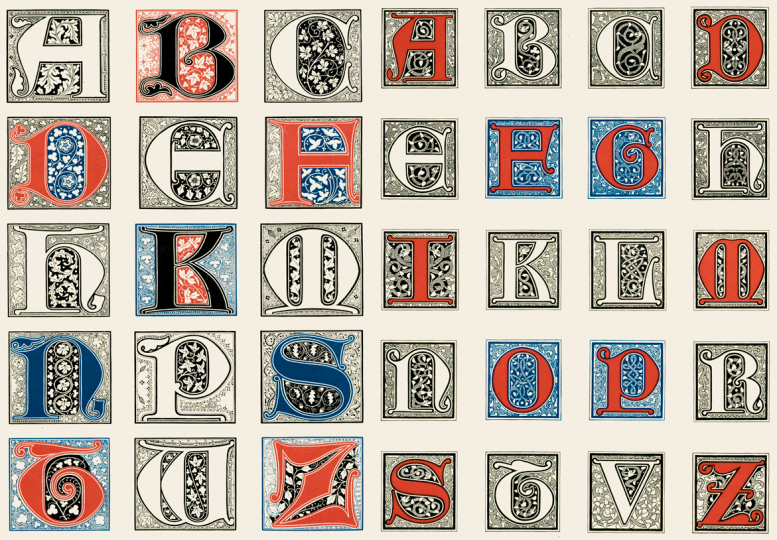
Above: The larger fifteen polychromatic initials on the left are Heinz König’s Gothische Initialen, published by Genzsch & Heyse in 1881. The twenty smaller initials on the right are his Nordische Initialen. These series of initials were König’s first foray into type design. He would continue to design typefaces for various foundries on a freelance basis until the late 1920s. The production of the matrices for these polychromatic designs was probably carried out – or at least supervised – by Albert Anklam.
Genzsch & Heyse was also novel in that it was a typefoundry established by a typecaster instead of a punchcutter. While there are suggestions that Johann August Genzsch could also cut type, I cannot gauge exactly how fit he would have been in that area. Citing Genzsch & Heyse’s 1958 company history, Klaus-Peter Gerlach reports that, while at F. Dresler & Rost-Fingerlin, Genzsch had the opportunity to continue to improve his punchcutting capabilities.[10] This implies that he would have already learnt a thing or two about punchcutting at Breitkopf & Härtel or Tauchnitz.
One way or another, Genzsch would have had to acquire matrices before opening his business. Whether he hired a punchcutter before officially setting up shop is not recorded,[11] but Friedrich Bauer did state that Genzsch’s initial business was a »Schrift-Schneiderei, Schrift- und Stereotypen-Gießerei« (punchcuttery, type- and stereotype foundry), which certainly implied that the firm offered punchcutting services from the beginning, whether that work was performed by Genzsch or not.[12] Genzsch & Heyse printed its first specimen relatively quickly. It was published in 1834.[13] I do not know where Genzsch acquired all of his initial matrices. He could have made the punches for them himself, he could have hired a punchcutter, he could have bought duplicate matrices from a different foundry, or he could have engaged in a combination of those possibilities. In 1838, Genzsch & Heyse acquired another foundry whole (that was also a tried and true method for foundries to increase their product ranges). The business that they purchased was the Lampe foundry, also from Hamburg, which had a stock of Fraktur and Schwabacher punches and matrices dating back to the sixteenth century.[14]
At some point between 1870 and 1876, an engraver from Berlin named Albert Anklam (born 1842) joined the foundry.[15] Anklam is the first named punchcutter at Genzsch & Heyse that I have so far encountered in my research. In 1883, he seems to have been the only punchcutter working at the firm, and certainly – from perhaps 1876 until at least 1884 – he was its chief punchcutter if they employed any other punchcutters at that time. I shall return to Anklam later on in this post. By 1883, two designers responsible for many of Genzsch & Heyse’s most-successful typefaces over the coming twenty years were also already carrying out their first commissions for the company: Otto Hupp and Heinz König. I wrote about their typeface and ornament designs for Genzsch & Heyse/E.J. Genzsch in my dissertation’s sixth chapter, which you can download here.
And what about Friedrich Bauer, who will play a larger role in this series’ next entry? Well, in 1883, Bauer was still only a young man of twenty, although he must have finished the printing apprenticeship he had begun in 1877.[16] Bauer joined E.J. Genzsch at Munich in 1898, moving to Genzsch & Heyse in Hamburg shortly afterwards.[17]
The 1883 employee list
Many of the skilled workers in this roster were not listed with their first names. Instead, only the initials of their proper names were given, or abbreviations.
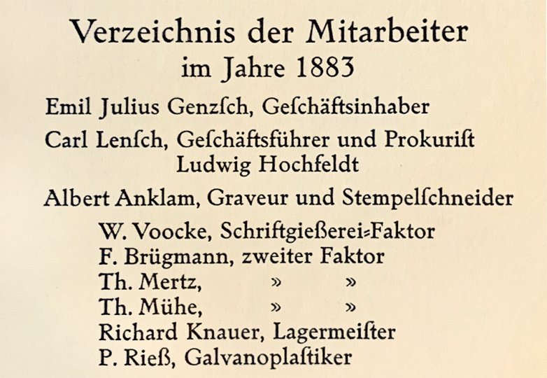
Company management
- Emil Julius Genzsch, Geschäftsinhaber [proprietor]
- Carl Lensch, Geschäftsführer und Prokurist [managing director and authorised officer or the company]
- Ludwig Hochfeldt
- Albert Anklam, Graveur und Stempelschneider [engraver and punchcutter]
- W. Voocke, Schriftgießerei-Faktor [typefoundry foreman]
- F. Brügmann, zwieter Faktor [deputy foreman]
- Th. Mertz, zwieter Faktor
- Th. Mühe, zwieter Faktor
- Richard Knauer, Lagermeister [keeper of the storeroom]
- P. Reiß, Galvanoplastiker [electrotypist]
Justierer [matrix justifiers]
- J. Strufe
- E. Schwenger
Fertigmacher [type finishers]
- Heinr. Paulsen,
- H. Niesch
- Jos. Wirth
- H. Ludwig
- Ad. Biermann
- C. Krauß
- Wilh. Rix
- Jos. Urbanyi
- A. Sanck
- Gust. Heinrich
Schriftgießer [type casters]
- Aug. Schmidt
- Ludwig Locke
- Th. Küchler
- Fr. Küchler
- E. Keimling
- W. Hackert
- J. Looß
- Herm. Suhling
- Albert Albinus
- Fr. Halberstadt
- A. Weber
- Th. Diemich
- Heinr. Düjon
- Herm. Gerecke
- Ed. Gutknecht
- Wilh. Zahn
- J. Rieß
- G. Heimgartner
- Friedr. Mentel
- H. Colditz
- Adolf Schlegel
- Herm. Hansmann, Stereotypeur [stereotypist]
Schlosser und Maschinenbauer [locksmiths and machinists]
- Emil Gentzsch, Maschinenmeister [master maschinist]
- Karl Finck
- Johann Gädgens
- M. Pfensig
- Karl Hansen
- Friedr. Lühr
Lehrlinge der Schriftgießerei [the typecasting apprentices]
- Otto Schröder
- Karl Schröder
- Emil Knickrehm
- Otto Suhling
- Adolf Reitemeyer
- John Vermehren
- Karl Stephan
- Heinrich Bröcker
- Georg Sönnewald
- Rudolf Fritsch
- Gustav Ralf
- Julius Pfeiffer
- Henry Roß
- Ernst Rose
Assistants
- Friedrich Becker, Kontorbote [I don’t have a solid translation for this; maybe “office messenger”]
- Fried. Holtz, Heizer [furnace operator]
- Ferdinand Schweder
- Rudolf Calosso
Above: Neue Schwabacher typeface, in its Cicero size (12pt). Cut and presumably also designed by Albert Anklam at Genzsch & Heyse in Hamburg. Published in 1876. The family would eventually have at least fourteen sizes, as well as a companion bold weight. Scan from E.J. Genzsch’s 1902 specimen catalog.
Albert Anklam’s typefaces
In their brief biography of Anklam, the editors of Buchdruckschriften im 20. Jahrhundert, published in Darmstadt in 1995, called attention to how high up in Genzsch & Heyse’s corporate hierarchy this list made Anklam out to be; he was the fourth name listed.[18] In addition to simply cutting punches, the design of at least two Genzsch & Heyse typefaces is attributed to Anklam, including Neue Schwabacher, which by all later company accounts was a highly successful typeface. The Freunde des Klingspor Museums PDF for Anklam lists more than twenty–five other foundries sold the design, most of which were inside Germany.
Unfortunately, I have not yet seen a complete Genzsch & Heyse specimen printed before 1876. By all accounts I have read, Genzsch & Heyse carried old Schwabacher-style types in various sizes before that time, many or all of which could have come into the company’s portfolio after their acquisition of the Lampe foundry in 1838, reported to have had type-making material from the 16th and 17th centuries. Schwabacher type styles themselves date back to the late 15th century, and became particularly prominent in German-language printing during the 16th century, in part because of the prevalence with which Martin Luther’s texts were set in Schwabacher styles. Nevertheless, the Fraktur style – which was also typographisized more or less concurrently with Luther’s initial years as an author – eventually became the dominant style for German book text, and Schwabach came to have a secondary role, similar to the use of italic styles in roman-type composition. I suspect that, before 1876, Genzsch & Heyse simply called its existing Schwabacher types “Schwabacher” and only renamed them “Alte Schwabacher” (old Schwabacher) after Neue Schwabacher (new Schwabacher was released). The larger sizes of Alte Schwabacher cut at Genzsch & Heyse itself may also all date to after 1876.[19]
On Flickr, I have uploaded a comparison of the 12pt sizes of Alte and Neue Schwabacher. Neue Schwabacher is lighter in color, in part because its uppercase letters have simpler forms. These are less ornamented, too. If you compare the capital D in both fonts, you’ll see that Alte Schwacher used a construction with a double-stroked left-hand stem, for instance. The capital S is Neue Schwabacher has become practically Latinized. Neue Schwabacher’s letterforms also feature rounded, ball-shaped (or better: teardrop-formed) terminals, which you can find on the h and the ß. I suspect that all of Anklam’s changes made Neue Schwabacher much more harmonious to combine with other 19th century types – be those Fraktur letters, the new romans described by founders as being “oldstyle,” or even italics. The darker color of the Alte Schwabacher fonts was likely only an even match for Fraktur types cut before the 1790s. While Neue Schwabacher might occasionally have been used to compose whole books, I suspect that its primary application was in magazine and newspaper headlines, or in jobbing printing.
The next Genzsch & Heyse release that Anklam was mentioned in conjunction with was the Mediæval-Gotisch, published in 1877 or 1881.[20] A Genzsch & Heyse publication printed to commemorate their seventieth anniversary in 1903 provides a few details about the typeface, mentioning that Anklam had drawn and cut it after “the best examples from the Middle Ages to have been preserved in inscriptions and on coins” and that “Mediæval-Gotisch is still one of the best Gothic typefaces also meeting modern requirements.”[21] To be honest, I do not have much to say about this design. It combined Lombardic capitals with an ornamental Textura-style lowercase, as you can see in the specimen below. I do find it worthy of mention that Genzsch & Heyse published another typeface based on Medieval coin lettering about 18 years later: Otto Hupp’s Numismatisch. But Numismatisch was only cast in one 8pt size.

Above: Three sizes of Mediæval-Gothisch. Scan from E.J. Genzsch’s 1902 specimen catalog.
At least by 1933, Genzsch & Heyse was also crediting Anklam with having cut the Römische Versalien, an all-caps Renaissance oldstyle typeface. It was produced in nine sizes, ranging from 12 through 72pt. According to that text, Emil Julius Genzsch had found the model for these capitals in the Vatican Library.[22] As an aside, I have to state that I find the phrase “… found by Emil Julius Genzsch in the Vatican Library,” infuriatingly vague, especially as it was issued almost 50 years after the typeface itself. It is not a unique statement in typefounding history.[23] Does this mean that Genzsch found a set of capital letters in a book, or might it refer to an inscription on a building? Were the capital letters drawn or were they printed from type? Were they a series of initial letters, or was this “source material” intended for use in text? If so, was the text he saw all caps or mixed case? What is going on with the letter D? How faithful are the Römische Versalien letterforms to the source materials that Genzsch consulted? What exactly did he provide his punchcutter with? An oral description? A written statement? Detailed sketches? A photograph? Perhaps Genzsch could later locate another copy of the volume if he did indeed find his source letters in a printed book. I have no answers to offer, only questions to ask.
These capitals had a second life in America: the easiest source for that story for me to link to is FontsInUse, which summarizes that they “were acquired [by the famous New York printer Theodore Low De Vinne] from Genzsch & Heyse … and used as reference in negotiations with the Central Type Foundry in 1888/90, which led to the De Vinne types.” In a chat I had with Antonio Cavedoni, he expressed scepticism about there being a design connection between the Römische Versalien and Central’s De Vinne typeface. Nevertheless, Genzsch & Heyse’s claim that Theodore Low De Vinne had fonts of the Römische Versalien types (the earliest statement to which I have found so far in the 1908 history) is correct. In this online version of the 1907 De Vinne Press catalog, you can see the type listed under the name Ancient Roman, hailing “from a German foundry.”[24]
Since the Römische Versalien were published in 1885, they may have been the last typeface that Anklam cut for the foundry; Buchdruckschriften im 20. Jahrhundert reports that he returned to Berlin in 1884.[25] After the Römische Versalien were published, the still-young Heinz König designed lowercase letters to match. The resulting typeface was produced in even more sizes and published under the name Römische Antiqua. I have not found any sources indicating who might have cut the punches for those lowercase letters.
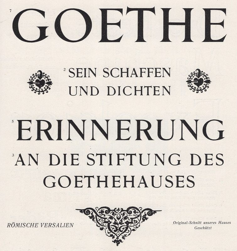
Above: Four sizes of the Römische Versalien. Scan from E.J. Genzsch’s 1902 specimen catalog.
When I showed the above image to Antonio, he replied that “this is clearly an ‘elzévir’. Something doesn’t add up in these drawings … some letters have much more contrast than others and the spacing is atrocious. Italian ‘elzévirs‘ don’t look like this. It has ‘dutch’ proportions [not surprising, as the ‘elzévir’ style’s origins are there]. I think this Genzsch was … copying French models, but concealing his tracks by saying he went to the source (the Vatican Library). [An article by Ovink] … in Quaerendo traced a bunch of these faces out. I love that G with the underbite in GOETHE.”
Ovink mentions that Genzsch & Heyse published a typeface it called Französische Elzevir in 1892. That typeface’s smaller sizes came from France and were the Deberny foundry’s “‘Romain Ancien’, cut by the Aubert frères and by Huchot.”[26] Genzsch & Heyse expanded that typeface in-house, too, cutting matching fonts in the 14, 20, 24 and 32pt sizes. The Römische Versalien capitals are not like that particular Elzévir – aside from the C, M, O and S. Those letters do look the same, in the Römische Versalien they are simply cut with thicker main strokes, making them appear darker than the Französische Elzevir in print.
Why does Anklam matter?
During his years at Genzsch & Heyse, Anklam may have cut dozens of typefaces, although he is only credited in company publications with having worked on three. Those publications were also printed more than a decade and a half after he left the firm. Without those retroactive design attributions, it is unlikely that he could ever have been remembered as a type designer; if the foundry had not published the information, how would anyone in subsequent decades have learned what his role was? It is not clear if or how much of a design role he had in Genzsch & Heyse’s product development, especially in the design of those types never attributed to a specific external designer, or another type foundry. I can imagine that Anklam may have played a design role in the development of those products. How many of Genzsch & Heyse’s products was he responsible for determining how they would appear? Were there other products from the foundry that he determined part, but not all of their appearances? I find it notable that Genzsch & Heyse did not seem to have mentioned Anklam’s design contributions in print until after about 1899 – or at least not mentioning him regularly until after that point – when it began attributing the design of new typefaces like Neudeutsch to Otto Hupp, and also began retroactively attributing the design of typefaces and fonts of ornaments produced during the 1880s and 1890s to their designers with more regularity, including designs from Hupp and König, etc. During the first few years of the twentieth century, it became increasingly more common for typefoundries to attribute new typefaces as having been designed by specific individuals.
Notes
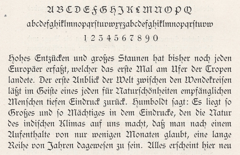
- The Chronik der Schriftgießerei von Genzsch & Heyse in Hamburg, 1833–1908 was published in 1908 by Genzsch & Heyse in Hamburg. Its text is composed in Genzsch-Antiqua, which was then a new release from the foundry, designed by Friedrich Bauer. The book’s design and printing may also have been supervised by Bauer, as he ran the company’s printing unit at the time. I also suspect that Bauer wrote the book as well. No one else is credited in the volume, but Bauer was already a well-known trade author at this point, and later became a prolific historian of German typefounding, too.
- Friedrich Bauer: Chronik der Schriftgießereien in Deutschland und den deutschsprachigen Nachbarländern. Third edition, edited by Hans Reichardt and published as a PDF in 2011. p. 113
- Bauer/Reichardt, p. 69
- Breitkopf & Härtel was also a publisher and indeed is still in business as a sheet-music publisher today. For most of the second half of the eighteenth century, the business was owned and run by Johann Gottlob Immanuel Breitkopf (1719–1794). I suspect that, for at least part of Breitkopf’s tenure at the helm of his company, its in-house typefoundry was the largest in German-speaking Europe. See my translation of his essay on punchcutting and typefounding for more details.
- Bauer/Reichardt, p. 69
- Ibid., p. 70
- Klaus-Peter Gerlach: Geschichte der Hamburgischen Schriftgießereien J. D. Trennert & Sohn, Genzsch & Heyse, J. John Söhne. Museum der Arbeit, Hamburg 1995, p. 78–79
- Bauer/Reichardt, p. 70. From my perspective, Emil Julius Genzsch is as important to the history of German typefounding as figures like Johann Christian Bauer, Georg Hartmann, Oscar Jolles or Karl Klingspor who are more well-known today. I cannot devote enough space to a proper biographical summary here. A good place to start is Emil Julius Genzsch: 50 Jahre Schriftgiesser, ihrem Seniorchef zum Goldenen Berufsjubiläum gewidmet von den Firmen Genzsch und Heyse, Hamburg, und E. J. Genzsch, München (1906) or Gerlach, p. 82 ff
- Bauer/Reichardt, p. 72
- Gerlach, p. 68–69. It is certainly conceivable that Johann August Genzsch could have learnt a great deal of punchcutting skills at F. Dresler & Rost-Fingerlin. His tenure at the Frankfurt foundry overlapped with that of Johann Christian Bauer (1802–1867). Bauer was also hired in 1827; he had trained as a locksmith, and probably was probably some kind of metal-worker or machinist at F. Dresler & Rost-Fingerlin. However, he certainly learnt to cut punches at the foundry; a punchcutter there named Andreas Schneider is reported to have taught him. Bauer may have left F. Dresler & Rost-Fingerlin a little earlier than Genzsch, who departed in 1832. Like Genzsch, Bauer also set up his own foundry in 1833. This eventually because Bauer’sche Gießerei of Frankfurt am Main. See Konrad Friedrich Bauer: Werden und Wachsen einer deutschen Schriftgießerei – Zum 100jährigen Bestehen der Bauerschen Schriftgießerei. Bauer’sche Gießerei, Frankfurt am Main 1937, p. 9–10
- Klaus-Peter Gerlach writes that Genzsch initially had three journeymen and an apprentice working for him, and that they operated two typecasting furnaces. But one or more of the journeymen could conceivably have been punchcutters. See Gerlach, p. 73. Gerlach also cites a 1838 letter from Genzsch to his old employer, F. Dresler & Rost-Fingerlin, which he uses to source his statement that by 1838, Genzsch & Heyse had typefaces of its own creation and from the Lampe foundry it acquired whole, as well as matrices purchased from other foundries – including F. Dresler & Rost-Fingerlin; Ibid., p. 78. As another means of duplicating matrices, electrotyping began making its way into typefounding around 1845. Genzsch & Heyse began using electrotyping themselves in 1852; see Genzsch & Heyse 1908, p. 12. Genzsch & Heyse would even use electrotyping to illicitly duplicate matrices from F. Dresler & Rost-Fingerlin that it had not purchased earlier; see Gerlach, p. 81. At some point between 1881 and 1883, Genzsch & Heyse adopted the “American” method of creating electrotyped copper matrices from the Central Type Foundry; Ibid., p. 102
- Bauer/Reichardt, p. 69
- In 1834, the Journal für Buchdruckerkunst, Schriftgießerei und die verwandten Fächer reported that this specimen included a Reversed Egyptian imported from England, presumably from Thorowgood; see Gerlach, p. 74. More contents of the specimen are listed on Ibid., p. 75
- Gerlach, p. 77
- Philipp Bertheau (ed.): Buchdruckschriften im 20. Jahrhundert – Atlas zur Geschichte der Schrift, ausgewählt und kommentiert von Philipp Bertheau unter Mitarbeit von Eva Hanebutt-Benz und Hans Reichardt. Technische Hochschule Darmstadt 1995, p. 579
- See Gerald Cinamon’s online biography/bibliography page for Friedrich Bauer.
- Ibid.
- Bertheau, p. 579
- The Alte Schwabacher sizes that Genzsch & Heyse designated as in-house products were the 28, 36, 48, 60 and 72pt offerings.
- Both Gerlach, p. 101 and Emil Wetzig’s 1926 Handbuch der Schriftarten, p. 9 give the year as 1877. Genzsch & Heyse 1908 gives the year 1881.
- 70 Jahre der Schriftgießerei Genzsch & Heyse in Hamburg 1833–1903, no page numbers
- Genzsch & Heyse: 50 der schönsten Schriften aus 100 Jahren Schaffen 1833–1933, no page numbers
- I have encountered several examples of typefoundry owners in this general era determining the design of new products themselves and then having employees produce them. Another example is a series of border printing elements published by the typefoundry inside the Trowitzsch & Sohn printing house in Berlin, which they called the Mosaik-Einfassung (mosaic borders). According to a specimen accompanying the 10 March 1869 issue of the Journal für Buchdruckerkunst, Schriftgießerei und verwandte Fächer, Eugen Trowitzsch – then the head of operations at Trowitzsch & Sohn, and not a punchcutter himself – was inspired by ornaments he saw inside the Hagia Sophia in Istanbul and instructed his employees to produce the Mosaik-Einfassung. However, according to the text on that specimen, Trowitzsch made the drawings that the firm’s engravers presumably interpreted while cutting the punches. I have found no indication about whether Emil Julius Genzsch might have made any drawings or photography for his foundry’s Römische Versalien.
- In a 1971 article by Gerrit Willem Ovink that I link to elsewhere in this post, while quoting Antonio Cavedoni, Ovink had the following to say about the transatlantic matrix trade: “Some almost synchronic type productions by different foundries occurred when an independent typecutter sold strikes to any interested party; others, with creative foundries involved, can be better explained by assuming that a firm, embarking on a new series and anxious to reduce its risk, showed advance proofs to a colleague, who could then secure the rights for an almost simultaneous production. Such cooperation was not unusual between foundries which served different markets, regional or national, and were therefore not rivals. There was a lively exchange between American and German foundries; the former needing novelties in German black-letter for their huge immigrant groups, the latter novelties in roman display types, but the Germans also bought from all the leading British foundries.” See Gerrit Willem Ovink: “Nineteenth-century reactions against the didone type model – II. The Elzévirs.” In: Quaerendo, vol. 1, no. 4 (January 1971). Brill Publishers, Leiden 1971, p. 282–301
- Bertheau, p. 579
- Ovink, p. 299–301