Years ago, in what seems to have been a time before the German type blogs Slanted and FontBlog were born, I recall often visiting a site called Design Made in Germany. Under the motto “German design is gray,” this site offered users a reduced, simple interface, as well as lively discussion. It was not unique on my radar; the two German type fora Typografie.info and TypeForum were great sites to visit as well. But dmig did occasionally have interesting type and font-related threads.
At some point, the site disappeared into the ether, but I never seemed to notice. Slanted had become a strong force from the southwest, and FontBlog was on its way to becoming one of the most important blogs in the entire country. TypeForum seemed to die down (I stopped visiting the site regularly after some acidic discussions about the then-new idea of a capital German ß), and Typografie.info neve ceased to be actve.
Design Made in Germany has seemingly been resurrected. A new graph of dubious origin even reports that it has a wider reach than FontBlog. This would be like some small obscure country beating the NBA champions in a pick-up game of basketball, if were true. Nevertheless, the new dmig has something that I can’t recall the old site ever having: an online magazine.
The second issue of the dmig magazine was published last week. The magazine may be viewed either in an HTML version (there is even an iPhone-optimized page), or as a PDF. You could even do both… each article also has its own PDF-download link.
dmig approached Linotype awhile back, asking if we’d be interesting in sponsoring their second issue with a typeface family. I was glad when the discussion came around towards my Malabar family. However pleased I am to see anyone use my typeface, though, I hope that no one reads this magazine in PDF form.
I do not wish to deride the dmig magazine, or even this particular issue—Dmig2. I finally got around to finish reading all of the articles yesterday. Some of them were quite nice, especially the interview with Daniel Janssen on his punchcutting experience in Paris. Then are are several good articles, such as the interview with Thomas Klein from Metadesign on the refreshed Commerzbank identity. Even articles that are not so up my alley still offered an interesting point of view.
I just find the idea of a PDF magazine completely against the idea of the Internet. I also think that it is plain unnecessary. Sure, if makes it easier to save articles for reading later, or to perhaps to print them out and to store them. But websites are dynamic and temporary. PDFs—perhaps despite their original intention?—strike me as only being really great for streamlining the print production process.
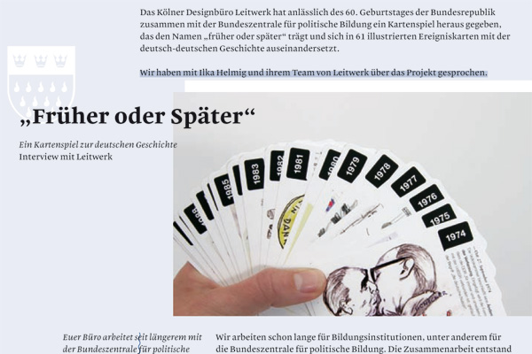
From the top half of page 5: the beginning of Früher oder Später – Ein Kartenspiel zur deutschen Geschichte, an interview by Nadine Roßa with Leitwerk.
Moreover, the reading and the viewing experiences of the magazine in PDF or in HTML format are totally different. Every article in the web version is styled in the same way (quite nicely, I might add), whereas the layout of each article in the PDF version is completely different. The only unifying factor of the “magazine” is that each article uses my Malabar typeface. But the first issue of the dmig magazine wasn’t set in Malabar, and I assume that the editors will move onto another typeface for issue three. So what binds the dmig PDF magazine together? The A4 page format?
You might be asking yourself why I am going through the trouble of writing a whole blog posts about my PDF discontents. Why not just be quiet? Well, normally, that is what I would do in this situation. Perhaps I would tweet about my feelings, or something in that direction. But one of the dmig editors explicitly asked me last week to blog about Dmig2. Even though I had discussed my feelings about the magazine with him on several occasions, he still wanted the press. Let this be a lesson to people who ask bloggers for their opinions.
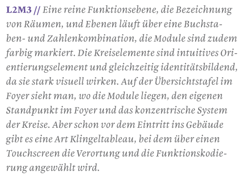
From the bottom of page 21: text from the Münchner Technologiezentrum article. An interview by Ulrike Daraghma with Sascha Lobe from L2M3. Set in Malabar Italic.
From the bottom of page 24. Here, Malabar Bold is paired with Malabar Italic for use in a headline. This kind of type combination is particularly juicy. I could set samples looking like this all day.
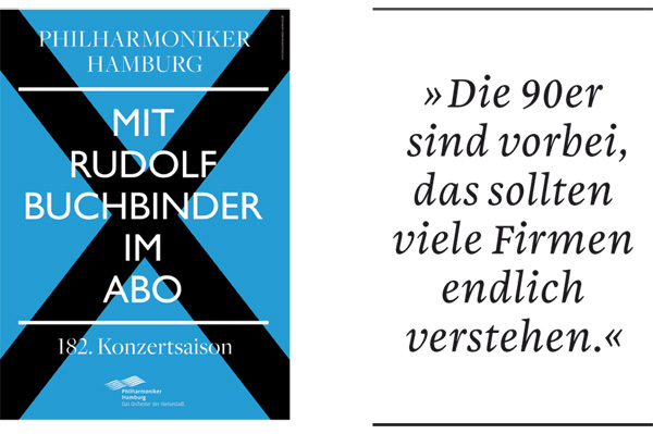
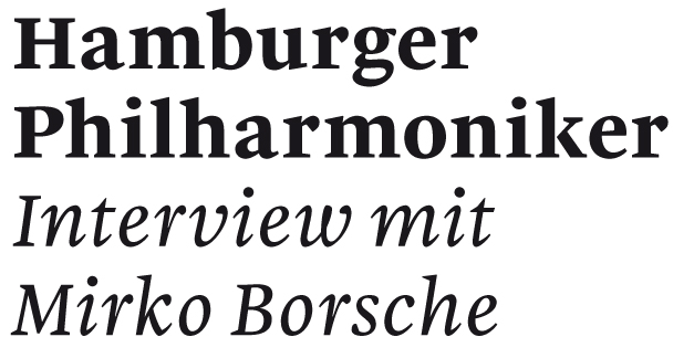
From the top of page 28: image from the Hamburger Philharmoniker article, an nterview by Nadine Roßa and Leif Wolkenhauer with Mirko Borsche. Translated into English, the quote from Mirko Borsche reads, “the 90s are over; many companies should finally realize this.”
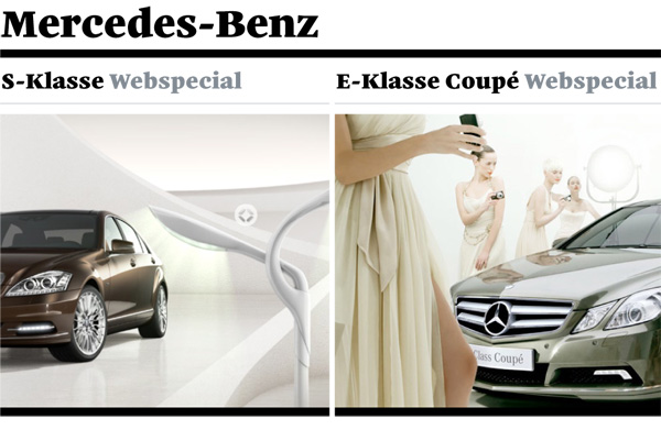
From the top of page 29: text and image from Mercedes Benz E-Klasse und S-Klasse Webspecials, an interview from Patrick Marc Sommer with Uwe Todoroff and Tim Sobczak from Scholz & Volkmer. Malabar and Mercedes… come on, now that is hot! I hope that some Daimler employee out there reads my blog. This is Malabar Heavy.

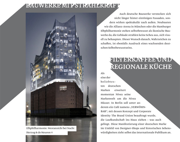
From page 50: text from Die Deutschlandkollektion, an interview by Nadine Roßa with Professor Axel Kufus from the UdK Berlin. The vertical bars with the colors of the German flag at the start of each question in this interview is a nice effect. Sort of like a pilcrow, but with more meaning behind it.
From the bottom of page 79: text from the Unentschuldigt deutsch article by Sina Peters. This three-dimensional searchlight effect is something that I actually would recommend all Malabar-customers to try out in their work…
Lastly—and this is purely a type designer’s lament—there is a problem with Malabar and these PDFs. The versions of the fonts that were sent to dmig had faulty stem and blue zone hinting settings. As a result, if you read the PDF in Adobe’s reader, the letters seem to bounce up and down long the baseline, and have different x-heights. I won’t show you an image of that here, because uploading such an artefact would surely bring me to tears. Immediately upon seeing this effect in Dmig2, I sent one of the editors new versions of the fonts, with display improvements. But I don’t think that they are going to re-generate the PDF files.
Indra Kupferschmid did point out on FontBlog that this bug isn’t at all apparent if you read the PDF in Apple’s Preview. This is because the text renderer used by MacOS X system applications does not take hints into consideration when determining how to rasterize the letters.