
Please make this terrible small cap r go away.
What is it like to be a typeface design student? It is both wonderful and wonderfully depressing. You can—and will—spend days looking at a few letters, knowing that their design is bad. They are neither what you had intended nor even what you had managed to to capture fleetingly in a quick sketch (this is not a dig at bezier curves or contemporary glyph drawing technology—both are more than adequate at rendering all of the letters I’ll probably ever manage to think up).
Also, it is often clear to see that, while you may have drawn what you wanted, it still does not harmonize with the other letters you have. This means that:
- the new letter must change
- all of the older letters require rethinking
Both occur regularly, although in my case I must admit that I tend toward the former rather more often than the latter. The worst aspect is staring at the screen—or better yet at a print out—knowing that a curve or element isn’t working, while still not having the faintest idea how to correct it.
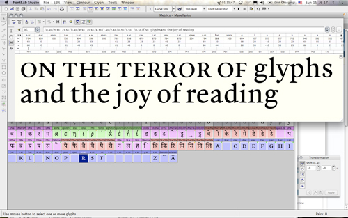
There are often times when you have to stop. In the morning, either the tricky glyph will not look so bad, or the necessary solution will seem as clear as the sun shining through the window (not that we have much sun in Southeast England at this time of year). This means one of two things:
- time really does give you the capability to work through things better
- time beats you down like a whip, leaving you more likely to compromise
Once again, I hope that I tend more often toward the former possibility, rather than the latter. After months and years of looking at full pages of small type, you do get the feeling that you are learning to see more clearly. On the other hand, the mind does like to play tricks.
Yes, there is some artificial condensing going on here.
So when you aren’t drawing, proofing, trolling Typophile or Mathieu’s blog, but are still in the mood for working, what do you do? Well, at Reading you read (forgive the pun, please). Last week we had a research seminar meeting with the other postgraduate and doctoral students in the department, in which the proposition that PhD students should spend two years of their time reading and one year writing was resoundly debunked—the corollary for the MA Typeface Design students being that under no consideration should we, regarding our dissertations, spend nine months reading and two months writing. Well, this is most likely going to be the way it is—not for want of a difference, but rather out of fear of any other realistic possibility.
Like the four months before it, I’ve spent much of the last month reading, and most of what I read was quite worthwhile. Here is a sampling:
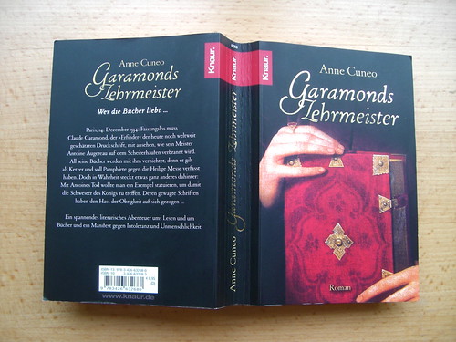
Garamonds Lehrmeister, by Anne Cuneo (2006)
This is a German translation of Cuneo’s Le maître de Garamond. Antoine Augereau – graveur, imprimeur, éditeur, libraire (2002). There is no English translation, but one can always hope. Note that the German title is much, much shorter than the French. I cannot say if this wonder of translation was applied to the whole book or not—my German copy has 590 pages. Order the book in French, or in German.
Garamonds Lehrmeister is a novel, a piece of historical fiction. Broadly, it retells Claude Garamond’s apprenticeship period with Antoine Augereau. It is my (limited) understanding that very little is known about Augereau, other than that he was convicted of printing some sort of Protestant text. The punishment was death, and he was burnt at the stake in Paris during the 1530s. This is all recounted in the book from Garamond’s point of view, as are his recollections of the young Henri Estienne, and a trip to Venice to meet Aldus Manutius and Francesco Griffo. Garamond was creating type that Estienne printed with in the 1540s, but whether he and Augereau ever went to Venice is something on whose factuality I cannot speak. I bet that James Mosely would know.
I recommend Garamonds Lehrmeister to anyone who enjoys reading historical fiction set in the Renaissance. Typographers may not find enough in it for them, other than a whole slew of questions. Yet, I find it delightful that an author set out to create a book with punchcutters as protagonists. The book is typeset in 1530 Garamond, by W. Ross Mills, and is dedicated to Adrian Frutiger. The forward and acknowledgements sections talk about all of this, as well as contemporary and ancient typeface design. That alone is a fun fact, too.
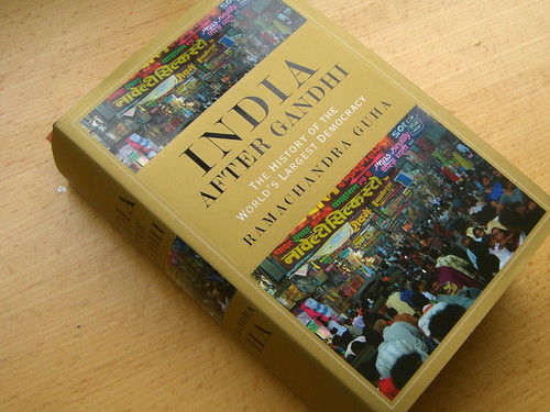
India after Gandhi: The History of the World’s Largest Democracy, by Ramachandra Guha (2007)
Exactly 900 pages, this book covers what I had hoped—a history of India from independence through to the present. I became aware of the book via a series of podcasts offered via the iTunes Music Store from Yale University, specifically this one. Definitely listen to the podcast, and do consider the book. I found it on Amazon.co.uk at half the retail price. Be prepared for intensely-detailed political discussion. There are little bits of discourse regarding language and script issues scattered throughout. Naturally, I enjoyed these parts the most. But the whole was a quick and worthwhile read.
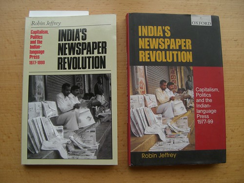
Yes, I have two copies. Long story…
India’s Newspaper Revolution: Capitalism, Politics and the Indian Language Press 1977–1999, by Robin Jeffrey (2000)
To my delight, since I had already ordered it, this book was mentioned in Guha’s India after Gandhi. Jeffrey writes a brilliantly fun personal history of the developments in technology and society that made a boom in the Indian newspaper industry possible. Other MATD students may take note that there is much discussion about Telugu, Tamil, and Malayalam media as well as Hindi and English titles. However, I would not recommend beginning this book until you have read something akin to Guha’s title above. Without a basic understanding of recent Indian political events, it is easy to get lost in some of Jeffrey’s details.
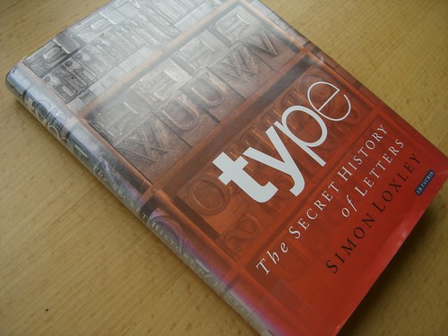
Type: The Secret History of Letters, by Simon Loxley (2004)
I checked this book out from the University library because I thought that it would be deliciously gossipy and I was not disappointed. Although I had encountered most of the gossip over the past 10 years in other books or lectures, it was nicely packed together here. However, I was sad to see that most of the gossip was historic. I’d so love to see the sequel, a page turner documenting the sordid underside of the contemporary type community. I’m sure that it would add years of discussion material to Typophile, iLoveTypography, and the ATypI mailing list. I know lots of gossipy people—perhaps there could be some sort of collaboration?

brand eins, February 2008 issue
brand eins is a popular German economic magazine, and this issue is devoted to marketing. I read it solely on the recommendation of Jürgen Siebert at FontBlog. I’m not going to comment further on the issue here, unless anyone really wants me to.
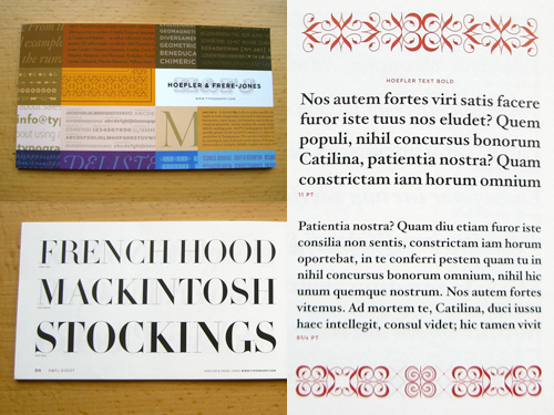
New Typefaces, by Hoefler & Frere-Jones
Back in November, I ordered this catalog on Gerry’s recommendation. I wanted to take a closer look at Chronicle. The catalog just recently arrived in the mail, but the Chronicle type must be too new, as it isn’t in this one. But the design of the piece is exquisite anyway! Visit the H&FJ website—www.typography.com.