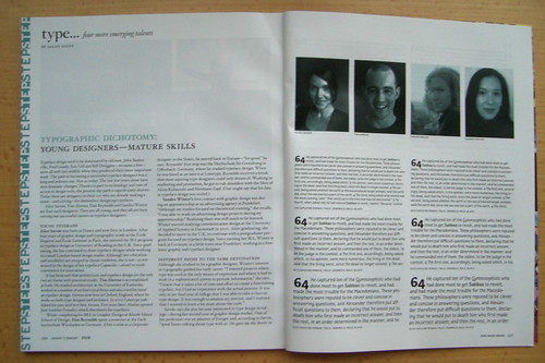
I received my copy of the January–February 2008 issue of STEP Inside Design while I was away for the holidays. Inside is an article by Allan Haley entitled “type… four more emerging talents.” This profiles the work of Alice Savoie, Tim Ahrens, myself, and Sandra Winter. I’m studying at Reading now, while the other three designers are graduates of the classes of 2007 and 2006.
The article is a great introduction to our work. Alice and Sandra exhibit the typefaces they designed in Reading. Tim displays his Lapture, and I’m in with Morris Sans. Lapture is a revival of Albert Kapr’s Leipziger Antiqua, and Morris Sans is a Bank Gothic with lowercase that is named after Morris Fuller Benton – Bank Gothic’s designer at ATF.
Plus, the University of Reading’s MA Typeface Design program gets mad props in the article. Worth a read, in any event!
Left, Sandra’s Filia. My Morris Sans is to the right.
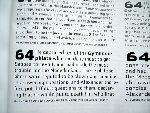
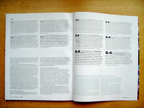
The magazine shows the best printed sample of Morris Sans I’ve seen yet, actually. Above is a close-up.