While I was a student at the Hochschule für Gestaltung in Offenbach, I was involved in an illustration course interpreting letters and the book arts for an exhibition on at the Klingspor Museum. Instead of creating a series of illustrations or an ornamented alphabet, I set out on an eight-week meditative exercise. I did not intend to create a book at all, but rather scores of letters. The result was an oversized lettered page that took me back to Eric Gill’s assertion, “letters are things, not pictures of things.”
Close-up of the thin italic forms.
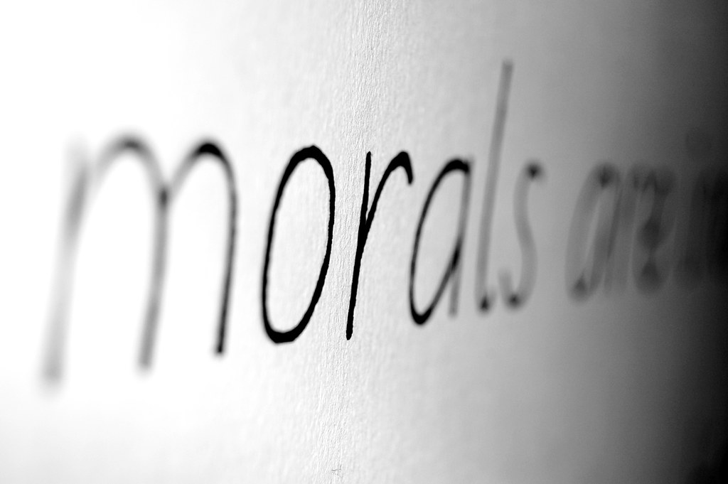
In 1931, Eric Gill wrote a slim volume entitled An Essay on Typography, extolling his views on the subject. Still in print today, the book is broken up into several parts, one chapter entitled “On Lettering.” Here, Gill describes the just shaping of the alphabet, including his now famous statement (quoted above). Letters, alphabets, and most writing systems are not visual representations of things, as Egyptian hieroglyphs functioned in some cases. Rather, letters are living and evolving objects. They are created and designed; they may be clothed and employed either correctly or inappropriately. This is why I suspect that have never particularly fancied illustration, or even image making. Over the past decade, studying and working as a graphic designer, I have become less interested in imagery and more consumed by words and typographic systems. I tend toward a view of type design having more affinity with industrial design than with fine art… things, not pictures of things.
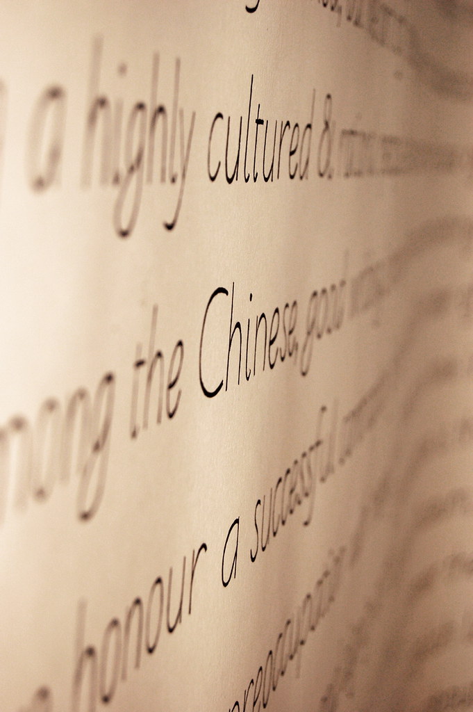
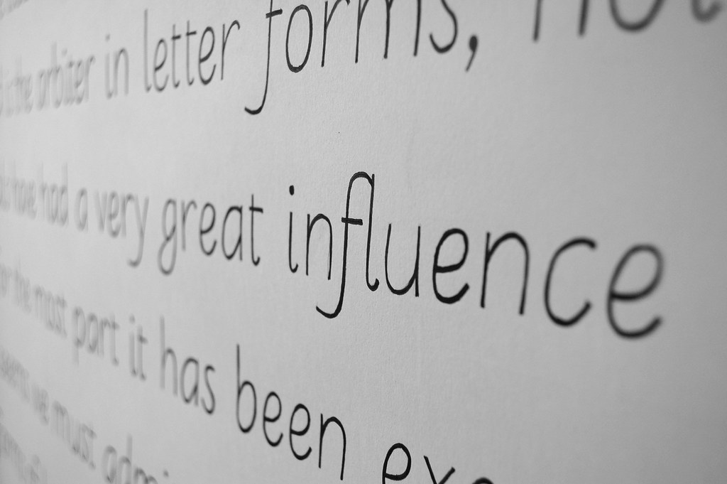
Being hand-lettered and not handwritten, the swelling of the strokes is irregular.
I drew a font* of lightweight sans serif letters, which I then used to set the text of Gill’s “On Lettering“ on a page about 1.5 × 3.3 meters in size. A two-month-long process unfolded as follows: after tracing each letter of the text onto another, heavier-grade sheet of paper via graphite transfer, I inked them in, lettering the text “On Lettering” by hand.

This post is an extension of an article by Lara Glück written on November 20, 2004.
* “Farewell,” as the base fonts were called, is one of only two typefaces designed to date at the Typostammtisch, The letter proportions for the two fonts—upright and cursive—were sketched out and corrected between rounds of beer, and the Cyrillic character sets that are included would have never made it into the data if it were not for Alexey Lysenkov’s input. I have always enjoyed looking at the Cyrillic characters, which unfortunately could not be used in the project, Gill’s text not employing even a bit of Russian, or any other language that uses that alphabet.