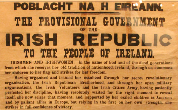
One of the few remaining copies of the 1916 Proclamation of the Irish Republic, currently on display at the National Print Museum, Dublin. Photo by Kunihiko Okano (Shotype).
This is part three of a four-part recap of the 2010 ATypI conference in Dublin. Follow these links for part one, and part two. Writing my third instalment feels different from the first two; it has been almost a month since the event took place, and I have had a long vacation in the interlude.
Like most design conferences, the content at this year’s ATypI had several threads running through it. There were loosely-grouped talks about legibility, web fonts, collaboration in design, and the Arabic script. But two umbrella themes stick out in my memory: I’ll call these “the heavy hitters” and “the Irish track.”
James Mosley on the main stage in Dublin Castle during ATypI 2010. Photo by Catherine Dixon.
My heavy-hitters: Lupton, McGuinne, Mosley, and Stiff
In a post like this, it is difficult to single out specific talks; I enjoyed almost every presentation that I heard. And with a multi-track conference, it’s easy to skip topics that seem less interesting. Sometimes, you just get a little tired, and you’d rather chat with other conference attendees over a coffee; however, the talks by Ellen Lupton, Dermot McGuinne, James Mosley, and Paul Stiff were not something that I wanted to miss. I looked forward to all each for different reasons, and I enjoyed them all.
Ellen Lupton
Ellen Lupton gave the Saturday evening keynote, “Typography and Authorship.” She filled her presentation with painted imagery, which I assume she made herself. These added quite a visual punch to her slides. As Paul Stiff had on the morning before, Ellen mentioned that the designer as author trend from the early 1990s was a reaction to the availability of Desktop Publishing tools. Yet, according to Ellen, in their rush toward authorship, designers overlooked that French philosophy had already concluded the “death of the author” in the late 1960s.
From the death of the author, she transitioned to a discussion about e-reader devices. An early Kindle adopter, she would later prefer the iPad and iPhone 4, both because of the touch-screen (no Kindle “five-way controller”) and the iPhone 4’s Retina Display screen.
I was a bit confused by Ellen’s conclusion that graphic designers should strive to become pop stars. With the growing number of crowdsourcing websites, graphic design is coming closer to the casting show world of reality television, where dozens, or hundreds, of individuals compete for a handful of potentially paying jobs. The majority of participants leave empty handed. Maybe designers secretly do want to become celebrities, but why can’t designers just be designers, rather than authors or pop stars? Design is a cool thing in its own right.
I was surprised not to hear Ellen mention of her last ATypI keynote, at Lisbon in 2006, where she presented the free font manifesto. Many things have changed over the last four years, not just in graphic design and type design, but also in the programs of ATypI conferences. With the advent of the Google Font Directory, and “free” levels on various web font services, Ellen’s call-to-action might have found more adherents this time around. At the very least, I’m willing to bet that the discussion would have taken a different tone this time around. I certainly feel differently about the topic than I did four years ago.
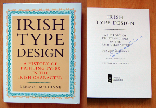
The new, second edition of Dermot McGuinne’s Irish Type Design was on sale during the conference.
Dermot McGuinne
My list of heavy-hitters is alphabetical by last name, not chronological. Dermot McGuinne, the author of Irish Type Design, gave the Friday night keynote, “A roman arrested in time.” This summarized the various metal typefaces designed for the Irish language, and for printing in Ireland, from the reign of Queen Elizabeth I to ca. 1940.
While I was researching my own presentation on Victor Hammer’s relationship with the Klingspor foundry, one of the sources I enjoyed most was Dermot’s Gutenberg-Jahrbuch 1995 article, “Victor Hammer and the Baoithín Irish Type.” There was also his 1992 book, Irish Type Design. Until recently, Irish Type Design was out of print. Now, a second edition has been published by Ireland’s National Print Museum and this was for sale during the conference. During my research, I consulted the book in the Staatsbibliothek zu Berlin and I was quite pleased to be able to buy my own copy, and have it signed by Dermot during the conference.
The highlight of Dermot’s keynote came toward the end, as he recounted the development of the Colmcille typeface. Designed by Colm Ó Lochlainn, the work was stewarded by Monotype’s typographical consultant Stanley Morison. Dermot cited bits from the long correspondence between Ó Lochlainn and Morison, some of which was humorous, and a bit of which was also touching.
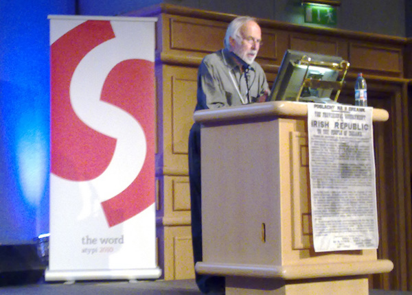
James Mosley
I would listed to James Mosley read the telephone book. Years ago, I purchased his The Nymph and the Grot, and I heard him speak for the first time at the 2007 ATypI conference at Brighton. There, so close to Ditchling, he criticized the course change in British lettering influenced by the work of Edward Johnston. To see him close his presentation the way that he did was simply delicious. Just weeks later, I began the MATD course at Reading, where James held weekly history lectures for the first half of the year.
His paper at this year’s conference, “The Types of the Proclamation,” covered the typographic differences between the original printed version of the Proclamation of the Irish Republic, from April 23, 1916, and several later copies. For example, at least one copy included a font from the Gill Sans family, which was not even designed or released until more than a decade after 1916. James’s presentation seems to have grown out of a blog post he first published on January 6, 2010, detailing his research on the matter. Like all other articles on his blog, Typefoundry, it is well worth reading.
He has since published further observations in a new Typefoundry blog post, The Proclamation of the Irish Republic: notes from Dublin. James has also been interviewed by RTÉ; a brief MP3 thereof my be downloaded here.
Paul Stiff
Paul’s lecture, “Material text in everyday life,” was slated to open Track B on Friday morning, the first full day of the main conference. However, it was moved into the main room at the last minute, which I think was very beneficial. Paul, who has helped define information design as a discipline, ripped into the ideas behind much of the avant garde design of the 1990s. He argued that texts should be designed to enable the ease of their reading… that the message of the text itself is of paramount importance. He discussed the public nature of reading itself, stating that reading is an active activity, not a passive one. He backed this up with perhaps the best, and most interesting public speaking performance of the conference, as well as with some of the most riveting imagery. There was time for Q&A after the talk had ended, and at the conference were speakers and attendees who must have large disagreements with his ideas. Sadly, I did not see any of them in the audience. It could have been an intriguing exchange.
The Irish type track
On Friday, a number of lectures made up what I’m calling the Irish track. This series included Irish designers and non-Irish speakers presenting on topics related to Irish typefaces, design, and history. In order of their presentations that day, the list of speakers included Wendy Williams, myself, Mathew Denis Staunton, Thomas Foley, Michael Everson, Jean François Porchez & Ciarán OGaora, Linda King, Liam McComish, Tom Spalding, Stephen Ferguson, James Mosley, and Dermot McGuinne.
Sample of Victor Hammer’s Pindar typeface, reproduced from Schmidt-Dengler, Filip, Österreichische Blätter: Victor Hammer. Zweiter Band einer Bücherreihe. Graz: Verlag Schmidt-Dengler (1936). Page 108.
As I mentioned in part one of this series, 2010 was my sixth ATypI conference. Aside from 2009’s event in Mexico City, I’ve attended each of the annual conference since 2004. For me, one of the benefits of the ATypI’s rotating location is that each year brings its own unique, local typographic flair to the table. 2004 – in Prague – had several papers on Czech and Eastern European typeface design. Brighton 2007, as I touched upon while recapping James Mosley’s talk, saw many presentations discussing the work of Edward Johnston. The 2008 conference in St. Petersburg had a Cyrillic track. Mexican and South American designers help fill the Mexico City 2009 schedule. Dublin offered a great opportunity to examine the depths of Irish faces, uncials, and other typefaces used in Irish printing. The time given to the depth of this subject might not have been as appropriate during another year, but I find it difficult to understand criticism of so much program space being devoted this time around.
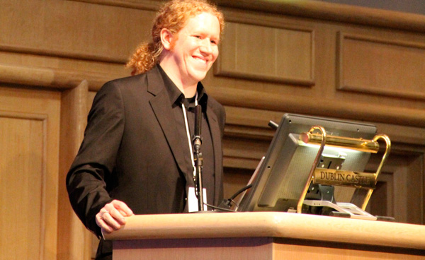
This is quite a smile. Truly, I can’t remember a time where I have been as happy as I was after this presentation. Photo by Kunihiko Okano (Shotype).
My own talk
I was thrilled to have my first ATypI main conference paper proposal accepted. Over the past several months, I acquired more books, visited a few libraries, and read a lot about my favorite typographic topic: the history of the Gebr. Klingspor foundry. Here is an abstract of what I touched upon in Dublin. I have updated the text a little since providing the ATypI with the version posted on their website.
For half of the 20th century, the Klingspor foundry in Offenbach was a creative force in type design. A chief marketing concept—then new—was to publish types created by prominent applied artists. One of their designers was the Austrian painter, graphic artist, and printer Victor Hammer (1882–1987). Hammer’s career was characterized by a love for the uncial letter. Most of his typefaces, and many of his books, used this form. Hammer’s first type—the eponymous Hammerschrift, or Hammer Unziale—was released by Klingspor in 1925.
Through Klingspor, Hammer befriended Rudolf Koch, a type designer employed by the company, and one of Germany’s most prolific letterers. Koch’s work encompassed many areas: typefaces, calligraphy, printing, metalwork, and even textiles. His creations were intensely personal and expressive; one may draw parallels between Koch’s passion for blackletter and Hammer’s for uncials. Both Hammer and Koch were self-taught punch-cutters, although others cut many of their typefaces. Hammer was not a member of Koch’s Offenbacher Werkstatt, but there was cross pollination between their studios.
Hammer immigrated to the United States in 1939. There, the Dearborn Type Foundry cut a trial version of the design that would become his most successful face: American Uncial. In 1954, Klingspor brought the typeface to market under the name Neue Hammer Unziale. The American Uncial/Neue Hammer Unziale design, for which divergent digital versions exist, often plays the role in many countries of a stand-in for Celtic-themed applications. American Uncial has become almost as ubiquitous as some other fonts many designers love to hate, but Hammer’s work was too multi-faceted for this to be his chief legacy.
During the presentation, Dan Reynolds will enumerate on Hammer’s working partnerships with the Klingspor foundry, as well as with the Koch family, and members of the Offenbacher Werkstatt. Perhaps a bit of the assumption of the “Irish-ness” of American Uncial will be debunked in the process.
You can read a full-text version of my presentation, with lots of illustrations, on another post to this website: Victor Hammer and Gebr. Klingspor. The paper was fun to research, and nice to give. Aside from having the opportunity to examine a few little-held type design ideas, I was able to uncover certain tidbits (with help from other researchers), such as more about the identity of Hammer’s first punchcutter. Variously referred to in certain literature as A. Schuricht or N. Schuricht, this punchcutter’s employer is occasionally misattributed. Arthur Schuricht was not a Klingspor employee. Instead, he lived in Vienna, and worked in the Austrian Staatsdruckerei. As he also worked on stamps, Linotype’s Hans Reichardt found an entry for Schuricht in a philatelic database.
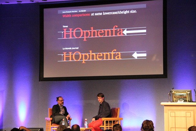
Jean François Porchez and Ciarán OGaora
“Head to head on type nationalism” was not what I expected. I assumed it would be some sort of debate about the role of national identity in typeface design … perhaps even a Franco–Irish showdown. This isn’t what took place on stage, however. It seemed to primarily be an interview by Ciarán OGaora with Jean François Porchez, about the later’s work. I would have liked to hear questions like, how French typographic nationalism might differ from Irish typographic nationalism. When is typographic nationalism good, and when is it bad? Do French typographic nationalists ever feel threatened by Dutch – or German – typographic nationalism? Don’t get me wrong … I like Jean François’s typefaces. In fact, I would even go so far as to describe myself as a JFP fanboy. During the talk, I was mesmerized by a really condensed sans serif typeface that I hadn’t seen yet. Is this an upcoming Typofonderie release?
Ciarán referred to Jean François several times during the interview as a typographer. While JFP certainly is a masterful typographer, I’d say that he works primarily as a type designer. I hope that I don’t sound too pedantic.
More great things that other bloggers have written about the conference
Florian Hardwig’s report on the second day of the main conference at MyFonts.de (in German)- Martin Majoor, ATypI Dublin: four personal highlights
Yves Peters looks back at ATypI 2010’s keynote addresses on the FontFeed