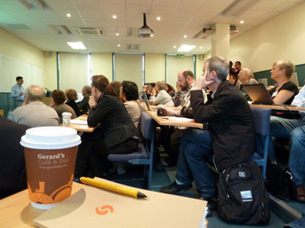
Designers in Track A of the PreFace listen to Steve Lee’s presentation, “Development of a web font service – lessons learned.” Photo by Atilla Korap.
This is the second part in an article series of indeterminate length about the 2010 ATypI conference. Interested in reading part one? Today’s post includes a few thoughts about the PreFace and the opening night of the main conference.
TypeTech vs. PreFace
Many recent ATypI conferences have been preceded by a two-day series of technical talks, workshops about various aspects of font production, and font creation software demos. These used to be called TypeTech Forums. The only TypeTech Forum that I attended in its entirety was in 2004, although I was able to hear some forum sessions in 2005, 2006, and 2007. This year, the TypeTech Forum was renamed the PreFace, and the focus was broadened to encompass more than just font production-related topics. Webfont distribution strategies were presented, for instance, as were talks on legibility. There was also a calligraphy workshop led by Santosh Kshirsagar. I am not sure of the ATypI’s figures, but I have the impression that this year’s PreFace was better attended than any of the TypeTech Forums. Florian Hardwig suggested to me over lunch that this might have to do with the name of the event. Without the word “tech” in the title, potential attendees are less likely to be scared off. It sounds a lot less nerdy. On the other hand, there seems to be less differentiation now between this, and the content of the main conference.
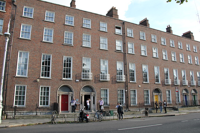
The PreFace took place in one of the many buildings belonging to the Dublin Institute of Technology. Located on Mountjoy Square, our host building was a converted Georgian house. Photo by Kunihiko Okano (Shotype).
I arrived at the PreFace venue about a half an hour before the day’s first session began.[1] While I was loitering in the lobby, one of the DIT faculty members asked me if I wanted any coffee.[2] I followed him through the first maze of corridors I was to walk through that day, and I came into a room full of other attendees, as well as quite few bagels, muffins, danishes, coffee, tea, and other beverages. This was just a hint of the quality of this year’s organization. The little things that count, like good coffee and enough refreshments, were available in plentiful amounts throughout the entire conference. I was pleased not to have paid an extra €10 for a breakfast in my hotel that morning.
Font development sessions
Most of my Linotype colleagues flew into Dublin the night before the PreFace began, on a late flight from Frankfurt. So, the PreFace coffee room was the first chance that I had to catch up with them. Atilla Korap and I attended the Dutch Type Library sessions together.[3] It is always interesting to hear about other potential font development workflows, but whenever I hear the DTL run-through, I think, “cool, but there is not a benefit (yet?) for us to switch.” I am quite a fan of their OT Master application, but in most fonts I produce, if I need to make a change, the change should be made in the master VFB, not an already-exported TTF or OTF. We already work with separate naming files and script libraries in our FontLab workflow. DTL products are not python scriptable, either. So … maybe next year? Sitting in DTL sessions is certainly worthwhile, but the font production developments that interest me most are Glyphs, and the upcoming application that Petr van Blokland teased the audience at the ICTVC in Cyprus about.
FSI’s Andreas Eigendorf and Georg Seifert, type designer and developer of the Glyphs application. Photo by Eben Sorkin.
In my experience, the lunch arrangements for an ATypI pre-event have never been so creative, so lavish, and so good as during this year’s PreFace. When lunchtime rolled around, Irish student volunteers marched us to a hotel several blocks away, in the city center. A buffet had been erected in one of its basement ballrooms; this was classy stuff, and it tasted better than any pub fare or supermarket sandwiches I would have bought, if I had been left to my own devices.
The lunch break was long, but it turns out to have been the right length. Instead of tiring me out, it really refreshed me for the late afternoon sessions. During the first afternoon, Atilla and I attended Miguel Sousa’s talks on aspects of the AFDKO, although I ducked out for the second of Miquel’s three talks in order to see Dave Crossland give Raph Levien’s presentation of the Google web fonts system.[4]
It isn’t be possible for me to discuss all of the PreFace talks here, but this seems an appropriate synopsis of what I experienced during its first day.
For he’s a jolly good fellow …
There were more late-afternoon PreFace events at DIT, but at some point after 6pm, Atilla and I walked back to our hotel. We had plans for 8pm: Dan Rhatigan’s 40th birthday party. There are many conference events that I wish that I had good photos of; not having images from this evening make me the most sad of all. Dan Rhatigan invited us to celebrate in his hotel’s spacious bar. There were many people in attendance, including designers with and without strong associations to the University of Reading; three students about to begin the MATD 2011 course were already in the bar with Dan by the time that Atilla and I arrived.
I can’t remember how late the party lasted, but I don’t think that I got home too late; I had a presentation the next morning that still needed some preparation. I left with Atilla, who I think was already very tired. I remember him walking quickly on our short route back to the hotel.
Angst, angst, and more angst
I feel privileged to have been permitted to present twice at this year’s conference. My first talk took was scheduled for the second day of the PreFace. As on the day before, I arrived at DIT a little early. Actually, I woke up rather early … I had rehearsed my presentation alone in my hotel room before going to bed, and I set my alarm clock for 8:15am, which would have given me just enough time to wake up and shower before arriving at the DIT in time for the day’s first session. My internal clock, however, had other ideas, and I woke up at 7am. I decided to use this additional time to rehearse one more time.
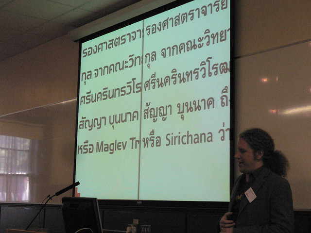
Image from my presentation, “non-Latin typefaces for global clients.” Two Linotype Thai typefaces are shown on the slide: a Thai complement for Handel Gothic on the left, and Linotype Sirichana on the right. The word “Sirichana” in the Latin script is set in Frutiger. Photo by Nina Stössinger.
This early start gave me plenty of time to relax, and also more than enough time to drink coffee and snack on the breakfast foods. About an hour and a half before my presentation was to scheduled to begin—while I was still in the coffee lounge—the conference organizers switched the schedule around, putting me in the bigger hall. This was something of a surprise, as I had practiced the talk with the assumption of being in a more low-key studio classroom atmosphere. On the other hand, when you want to present, who wouldn’t rather be in the bigger, cooler room?
Thursday’s program officially started out with Ivo Gabrowitch’s “Goodbye monotony, hello web fonts!” talk, which I hope that he will forgive me for not seeing.[5] Instead of more web fonts, which I knew were going to be a running theme throughout the week anyway, I went upstairs into the Track B room, where two American professors reported on the letterpress lessons they prepare for their students.[6] After their session ended, I went back downstairs to catch the second half of Steve Lee’s PowerPoint presentation on the Monotype Web Fonts Service. Over the past year, I’d heard his voice in many telephone conferences. It was great to finally see him in person.
Then, it came time for me to go on. I presented on the topic, “non-Latin fonts for global clients.” Being moved into Track A was flattering, even though the organizers must have had more mundane, logistical reasons to rearranged the schedule. My time slot was 40-minutes-long, although I had initially proposed a 20-minute one. While I had put the slides together, I tried to stretch out the material I had as much as possible, but I did not have 40-minutes of content. Fortunately, the day was slightly behind schedule when it was time for me to start; the moderator asked me if I could cut down to 30-minutes, to which I readily agreed.[7]
My paper recounted a few of the non-Latin typeface pairings, designs, and extensions that Linotype has delivered to corporate clients over the past few years. This was the first “Linotype” presentation that I have ever given at a large typographic conference. Usually, when I present, my talks revolve around my own work as a typeface designer, or my research.
I had a good feeling during and after my presentation. Already this year, I had presented in four different venues (Munich, Berlin, Cyprus, and Brno), and I felt disappointed about the way three of those talks went. This is something that I can’t adequately describe … people will tell you that a presentation was fine, or funny, or even insightful, but sometimes, it just doesn’t matter. If it didn’t feel right, it wasn’t good. As a speaker and as a designer, I set certain expectations for myself, even if these are not always realistic.
Of my two presentations in Dublin, I spent far less time preparing this one that I did preparing the later talk about Victor Hammer. Before I arrived in Dublin, I was quite worried about being able to make any coherent point at all during that later talk, and even more terrified that this earlier Linotype one would fall flat, since it had gotten less preparation. My mood changed entirely after this first presentation had ended; I wasn’t shy about the upcoming presentation anymore.
Highlights of the PreFace’s second afternoon
From Gerben Dollen’s PreFace presentation, “The alphanumeric word.” Photo by Eben Sorkin.
The remainder of the second PreFace day is something of a haze. I remember attending the talks by Richard Fink, Typekit, Gerben Dollen, and Tim Ahrens. All of these were interesting in different ways. I enjoyed the personality of Richard’s presentation, but I also wondered the entire time why he didn’t just hit the “full screen” button in PowerPoint; I don’t need to see the presenter’s screen, with the notes, etc. Although, since I could see the page miniatures, too, I could tell how far along he was in his file. Typekit gave a great presentation. It had something a victory lap feel to it, which – if you saw the numbers and the screenshots that they had in their deck – was well deserved. Bryan Mason and Ryan Carver, the Typekit presenters, just exuded enthusiasm. As an audience member, it is hard not to enjoy that. Gerben Dollen gave a brief and insightful presentation about an OpenType scripting solution to the problem of mixing capital letters and numbers in text strings … just look at the typographic conundrum posed by the UK post code in the image above, and you’ll know what the problem is.
The main conference’s first night
My head still spinning from the PreFace sessions, I walked back to my hotel around 5:30pm to met up with Mathieu Réguer, who had just arrived from Paris. Together, we walked over to Dublin Castle, where the main conference was about to begin. In the lobby, we quickly found Emanuela Conidi and Joke Gossé; it was sort of a mini MATD 2008 reunion. Indeed, this was the first time that the four us had been in the same place since we graduated in Reading together.
For over an hour, attendees gathered in the building, picked up their badges, and mingled in a room filled with more than enough finger food, beer, and wine. Afterwards, Robert Bringhurst gave the opening keynote.
Robert’s talk was not exactly what the title suggested,[8] something that he freely admitted. He had originally intended to speak about typeface designers, but instead moved in a direction closer to his own interests: issues relating to letters themselves, rather than the people who make them. I have to admit that both letters and their designers interest me quite a bit, and I wonder what he could have said about type designers. Since he works as an author, a book designer, and a poet, he must have a unique perspective into our strange breed. Alas, I may have to wait for a future conference to hear him speak on this topic.
While his keynote was brilliant, I am not sure that I agree with everything he put forward. For instance, he suggested that we need to be able to translate the form/geist/whatever-it-was of humanist styles into type.[9] He lamented that no font-makers have brought Renaissance Greek handwritten and typographic forms into digital type, at least not in the way that they have done with the Latin script. A typesetter today has to make do with later Greek styles, e.g., with digital fonts based on Enlightenment-era Greek types. These faces may be fine on their own, but they do not match digital fonts made in the style of Renaissance Latin types, nor do they look like Greek letters written or printed during the Renaissance.[10] I am skeptical of this proposal. How do the needs of the reader overlap with the ideas of the author and the typesetter? Do Greeks today read or write in the same manner that they did in the 15th century? How many of the humanists in Italy who were writing out Greek texts, or cutting Greek type, were really Greek? Could it be that the Latin script has changed its form much less since the 15th/16th century than the Greek has, and that this in turn accounts for some of our ability to “reproduce” humanist documents in Latin, Italian, etc. vis à vis Greek?
Mathieu Réguer, Joke Gossé, and Dan Rhatigan at dinner after the conference opening. Photo by Atilla Korap.
After Robert had finished, the ATypI organizers seem to have made sure that the supplies of food and drink outside the lecture hall had been replenished. About an hour later, Linotype hosted a spontaneous dinner party at a Spanish restaurant across from the Castle. Almost all of the Linotype employees from the conference were there, as well as some of our Monotype colleagues, many current students and graduates from the University of Reading, and few other people thrown into the mix as well.[11] This was a fabulous ending for the day. The next morning, my main presentation was scheduled. But I’ll write more about that – and about the other activities from Friday, September 10 – in this article’s next instalment.
Footnotes
- Something should be written about this building, as I hear that DIT will be moving and consolidating onto a new campus. The DIT building where the PreFace was held was cool. On the outside, it looked like any of the other Georgian buildings on the square. On the inside, the lobby looked, I don’t know, like any bureaucracy interior would look … at least in terms of color, trim, lighting, etc. However, the building seemed to include a labyrinth of rooms inside of it, including large, spacious drawing studios, computer labs, a lecture hall … the works. I never seemed to know where I was going during the two days I walked through its halls, but getting to sessions was always fun.
- This is like asking banker if he would like some more money. I sometimes consume liters of coffee a day. Would I like some coffee? Of course I would!
- Dutch Type Library, or DTL, produces several font development applications. All of their product names seem to end in “Master.” Some of their programs are further developments of the old IKARUS system.
- Dave Crossland’s presentation, entitled, “How to achieve quality web fonts,” was quite good. Dave was subbing in for Raph Levien, who seems to have been unable to attend the conference. I had been looking forward to finally meeting Raph. Perhaps at another ATypI event?
- I had already seen Ivo present masterfully on this subject twice, both times in German. Ivo speaks very well, I think. I would like to hear how his English presentation went. Perhaps the ATypI will release it on video?
- American design professors presenting papers on letterpress assignments seems to be a new theme at European conferences. Is letterpress a phenomenon in American graphic design now? If it is, there is no parallel movement in Europe that I can see.
- After the talk ended, my stopwatch read 30 minutes, 30 seconds.
- Billed as “Who are these people?,” the talk was to be a “brief sociology, and maybe some pathology, of type design.”
- By “we,” I mean the people who make books, I guess.
- Is this true? Gerry Leonidas told me after the talk that this sort of Greek had indeed already been done digitally.
- I think that there were 22 of us in total.