I know that you should never be jealous of your friends, but since I discovered the relaunched Typejockeys website yesterday, I haven’t been able to scoop my jaw up from the ground. I’ll be the first to admit that, for the past few years, I’ve viewed Austria with some degree of skepticism; Vienna, particularly, was not one of my favorite places. However, I take back everything negative that I have ever said about the place, Viennese design, or the coolness of the Austrian capital city. In fact, I’d go out on a limb and say the new Typejockeys website is the most interesting corporate presentation of any young type and graphic design studio on the planet. Congratulations to Anna Fahrmaier, Thomas Gabriel, and Michael Hochleitner for their excellent work.
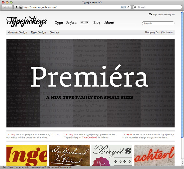
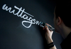
Typejockeys themselves should be no stranger to TypeOff. readers. I first blogged about them back in December 2008. Back then, they still had sort of a placeholder website. But no longer! You can see their new handiwork in a screenshot above. This is the redesign that knocked me off my rocker…
If all of this is news to you, you may be asking yourself, “What is the Typejockeys? And who are they?” Well, you can see the three of them above. But here are the details, in their own words:
Typejockeys is a graphic and type design company based in Vienna, Austria, established in 2008… The services go from printed material, like posters, editorial- and book design, over digital media, like web and screen design, to corporate design and signage. As the name already tells, the small and independent office focuses on an appropriate use of typography in its work. With its international experience Typejockeys can offer products like custom type and lettering with international standards uniquely offered in Austria. Always work and think whole-hearted. With or without serif.
On the left in the image above is is Michael Hochleitner—Michi for short. Michi and I studied on the 2008 MA typeface design course at the University of Reading. Anna Fahrmaier is standing next to him. A graphic designer with a diverse agency background, I have a feeling that she is the brains behind the Typejockeys operation. Thomas Gabriel is the third Typejockeys principal; he may be seen at the extreme right. Thomas is a 2007 graduate of the Type and Media type design program at the Royal Academy of the Art (KABK) in The Hague.
Michi and Thomas have each finished up their respective Reading and KABK typefaces, and they are on sale via the Typejockeys website (and elsewhere…). The release of these two typefaces—named Ingeborg and Premiéra—was pre-announced at TYPO Berlin 2009 with an exquisitely designed flyer.
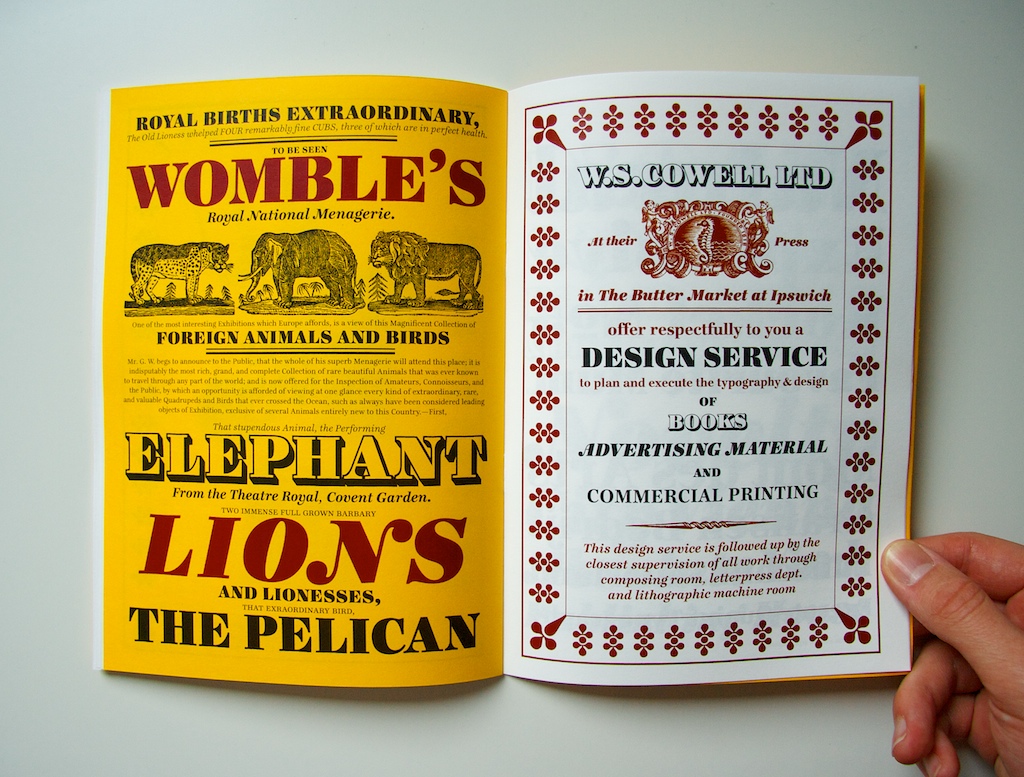
Premiéra is surely a great typeface, but my heart sings for Ingeborg. While studying in England, Michi soaked up the rich 19th century tradition of British modern typefaces—both their text-sized and display-sized variants (here are a few photos from his collection). Over the course of a year, Ingeborg developed from a series of quirky sketches to a serious typeface family with a grand number of fonts. Ingeborg’s text faces are quite good, but Michi’s creativity is best captured by Ingeborg Block, a drop shadow display letter. The shaded option is my favorite of the lot.
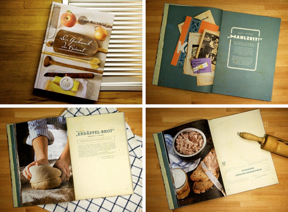
Typejockeys, I suspect, is first and foremost a graphic design studio (not that there’s anything wrong with that). I presume it is where the bulk of their income comes from. Their website showcases a number of recent projects, including the one shown above. But their love for quality in graphic design is quite visible even if you aren’t looking for their catalog of client work. The specimen for their typefaces, their TYPO Berlin flyer, and their website should be enough to sell you. Only thoughtful designers, with PANTONE and picas running through their blood, can devote so much care to their work and develop this degree of quality.
Personally, I think that it is not enough to just license the Typejockeys fonts. TypeOff. readers out there need to consider commissioning their next graphic design work from this fine team.
![]()
Of course, there is also the hype factor. Michi tells me that the crew is currently on tour. Like a rock band. Except that the venues are Austrian graphic design studios. Sounds like a good marketing tactic to me! Like any 21st century company, the Typejockeys know that untraditional marketing tactics, as well as the social networking spectrum, are part and parcel for success. So it goes without saying that they’ve printed up their own t-shirts. You can also follow them on Twitter (@Typejockeys), or visit their Facebook page.