I still haven’t been in Reading for very long. On Monday night, I’ll have been here for three weeks. On the other hand, my time here already feels like it has gone on for about half of forever. Maybe that is because each day, as well as each weekend, tends to be remarkably similar. Some days, the weather might be better than others, and the temperature has been slowly spiraling downward. I’ll spare you with further such details, as I’m sure that all readers are familiar with English weather and its many (all true!) stereotypes. Nevertheless I feel like I already have quite a routine here, which I guess has its own positive and negative aspects.
What was different were the past four days. Gerard Unger flew in from the Netherlands to hold a workshop. After a week and a half of drawing sketches after old typefaces, this was our introduction to type design. Gerard’s topic for this year’s workshop seems to differ a bit from the previous courses. Instead of ‘the Unger Method’ (which you can read about on Sparky’s blog from last year), we were each instructed to create a condensed face.
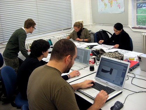
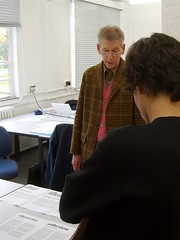
This is the corner of the “MA” studio in the typography department. The whole class is not visible, but Yvonne, Emanuela, Paul, Mathieu, and Michael (clockwise, from the top right) are.
Examples from Gill and Excoffon were shown, but mostly—I believe—to illustrate just how condensed a condensed face can be, while still exhibiting a tremendous amount of character.
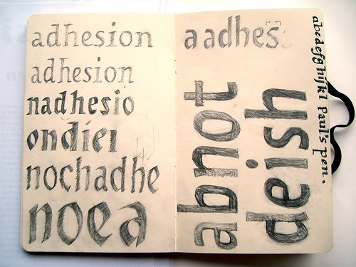
Photograph from my sketchbook after the end of the first day.
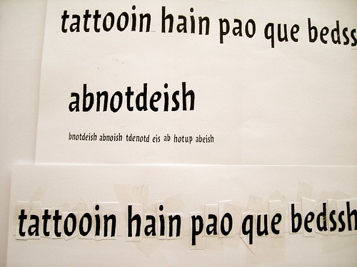
Draw, photocopy, cut, and paste. Then repeat.
I think that we all started by drawing letters on paper. By the second day, at least one of us had moved on to FontLab. And after a day of photocopying, reducing, and “hand-setting” new text, I was ready to go digital by day three. Unfortunately, it took me most of the third day to reconcile with myself that my digitised drawings in FontLab weren’t going to be as lively as my initial sketches. But by the fourth and last day, I was happy with the letters, all 16 of them.
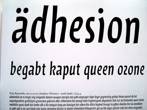
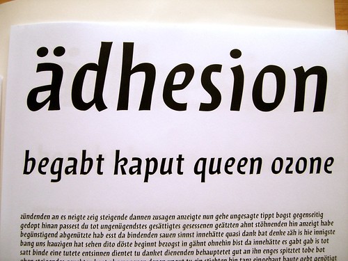
The finished design, with a slight slant, shown at 100 percent width.
Scaled in InDesign from 60 percent width to 200 percent width.
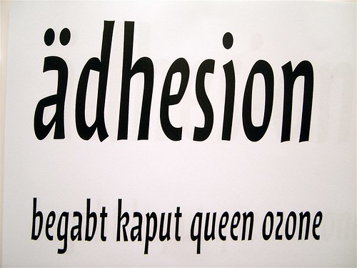
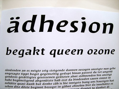
Here is the 70 percent version.
This is expanded to 120 percent.
200 percent; rather hideous, actually.
During the workshop’s last hour, I electronically condensed and expanded the font in InDesign, to text the limits of my quickly-drawin letterforms. In spans of 10 percent, I condensed the width down to 60 percent, and up to 200 percent. Surprising, the design functions well in the (wide?) range from 70 percent to 120 percent. Perhaps even 130, if one is generous.
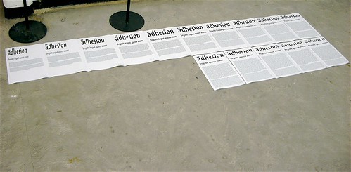
Paul Hunt has also written a bit about the workshop on his Pilcrow Type blog. I’ve posted some photos on my flickr space, and for MATD goodies, there is always the Typeface Design at Reading flickr pool.