Some of you may remember that the doorbell and mailbox signs at my old apartment in Wiesbaden were set in Akira Kobayashi’s Conrad. Linotype.com has just released Akira’s newest typeface, Cosmiqua.
From Linotype.com:
Cosmiqua™ is a lively serif family from Linotype’s Type Director, Akira Kobayashi. Inspired by advertising design from the 1950s, Kobayashi began to closely examine his favorite letterforms from this genre, particularly those headline faces that appear to live in the space between formal italic types and casual handwriting. These letterforms exude a certain hope for the future, and also appear to be a little odd, or kitschy, to our 21st century eyes. Yet the serifs and terminals on these letters do not let go of one’s attention.
On further examination, Kobabyashi found these same traits in even older faces, particularly 19th century English advertising types. Assuming the spirit of these diverse sources into himself (one typeface in particular, Miller & Richard’s Caledonian Italic, was quite influential) Kobabyashi drew Cosmiqua.
Cosmiqua is an amalgamation of the French “cosmique,” meaning cosmic, and “Antiqua,” the German term for serif type. In other words, this is a cosmic serif face; a typeface for the future, as the future was seen in the 1950s.
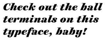
Kobayashi first drew the Italic weights of Cosmiqua, refining his favorite lowercase forms (x and y), as well as creating sublime ball terminals on the A and N. Only later did he move on to the upright, Roman forms. Although Cosmiqua was originally conceived for display uses, it is a serviceable text face as well.
Cosmiqua has five weights, each with an Italic (Light, Regular, Semibold, Bold, and Heavy). The Cosmiqua Font Family is part of the Linotype Originals. Cosmiqua is a trademark of Linotype GmbH and may be registered in certain jurisdictions.