Letter Drawings From Lisbon

Written by

in

,

Some type designers make beautiful drawings. Some of these make their beautiful drawings everywhere they go. Restaurants who have paper tablecloths or paper napkins are likely to inspire them, especially if they brought their pens with them. A beautiful series of letter drawings from the 2006 ATypI Conference’s Gala Dinner is on display at http://fontme.net.
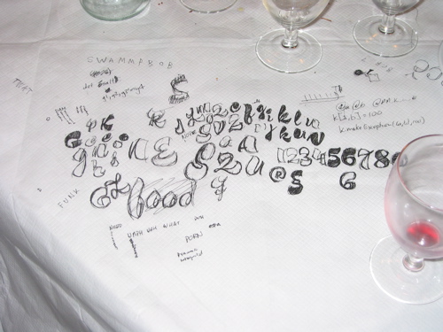
TypoTechnica 2005, in London
See, designers do this sort of thing all the time.

The image above was taken after one of the dinners at Linotype’s TypoTechnica conference in London, 2005.

Comments

2 responses to “Letter Drawings From Lisbon”

  1. i’ve started to draw some letters, but now i stick to heave “IBM”ish slab serif letters, which are the easiest to draw because they are very simple and accurate. blackletter is more hard to draw because the rules are not understood to me, i havn’t deciphered it’s codes.

    it’s so fun drawing letters.

  2. Dan Reynolds

    Yes! It is. And I don’t do it enough… I really need to carve out a few hours of my schedule several times a week for letter drawing.