P22 has recently brought two Blackletter fonts onto the market – or three, if you add P22 Declaration, which was released on the Fourth of July. All of these typefaces are of the handwriting variety. It is no secret that script typefaces are among the most popular fonts at the moment. Blackletter styles have been cropping up all over the world with a vengeance as well over the past year, used in campaigns ranging from Snoop Doggy Dog’s new album to Reebok. In my opinion, P22 has successfully interpreted the desires of the font-buying public; they’ve mixed two trends together.
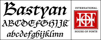
P22 Bastyan, which I suppose mimics the German pronunciation of the name “Bastian,” is designed by Frau Jenson, who also has a series of desktop images on TypeOff. available for download. P22 Bastyan is a Bastarda, which is particularly noteworthy, because the digital font world has long-been suffering from a dearth of Bastardas. Texturas, Frakturs, and Old English faces seem to have it much better among contemporary type designers.
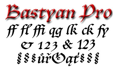
Although it is difficult to tell from online previews, P22 Bastyan’s outlines are rugged, lending extra polish to the font when it is used. Of the two versions available for sale, Bastyan and Bastyan Pro, I heartily recommend the Pro version. Not only does the Pro character set include Central European glyph ranges, it also is packed with ligatures and ornaments. These are recommended for setting any sort of Blackletter type, especially one that falls into the handwritten-Bastarda category. Historically, German typesetting rules required the use of certain ligatures; although these ligatures are not required for the typesetting of English-language texts, most German Blackletter typefaces just look better when they take advantage of these extras.
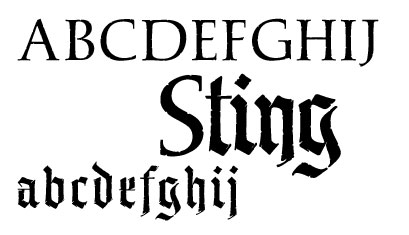
Michael Clark‘s P22 Sting is a more traditional Blackletter face, in the sense that it reminds me of calligraphic display Blackletters I grew up seeing back home in the States. Mixed together with stately Roman capitals (an approach also used on multiple occasions by the Offenbach master of 20th century Blackletter types, Rudolf Koch), this free-flowing Textura lowercase looks better the bigger you set it. The fits and spurts of the pen nib are a delight for the eye.
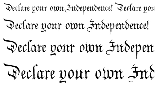
The “Blackletter” member of the P22 Declaration family, designed by Paul Hunt, is based on one of the handwriting styles used on the American Declaration of Independence, from 1776. Such an ornate hand as this defies classification. Is a Textura? Sort of, but it lacks the even regularity of older Texturas and newer Gotisch varieties. Where it lacks in regularity, it makes up for this in its decorativeness and liveliness. This is a style that every American knows. Yet seeing the letters liberated from their original context is refreshingly surprising. This typeface is perfect for marketing almost anything, at least in the United States!