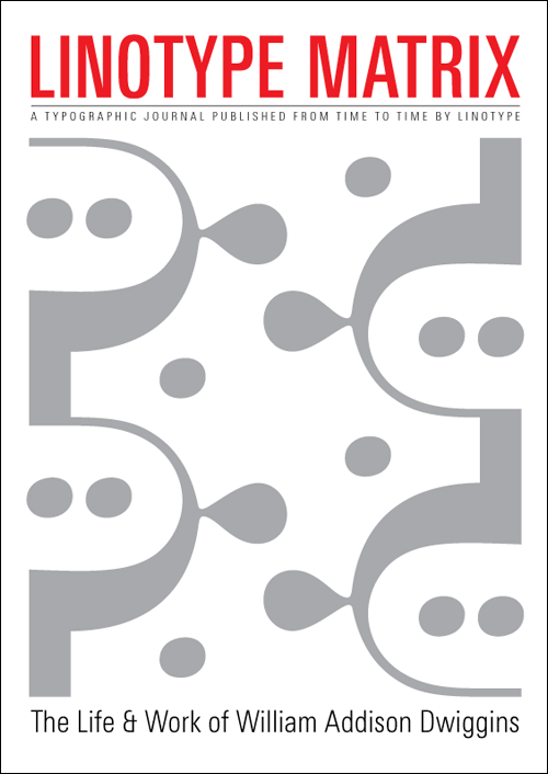
Linotype began distributing the second issue of the Linotype Matrix at TYPO Berlin 2006. This issue’s cover story reports on the life and work of W. A. Dwiggins (the article was written by Paul Shaw, and designed by Tiffany Wardle). But you should really buy the magazine to read my photoessay on historic type specimen in the Gutenberg Museum library.
The magazine is available on the Linotype website. With 64 pages, it is a bargain at just 15 USD/EUR. Order it today!
Below are three snapshots of my article.
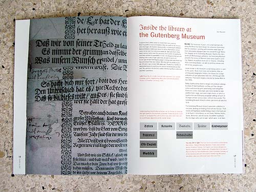
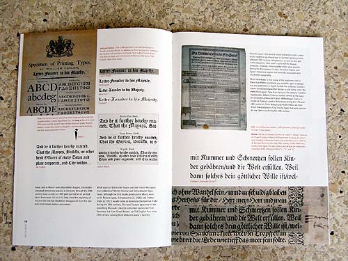
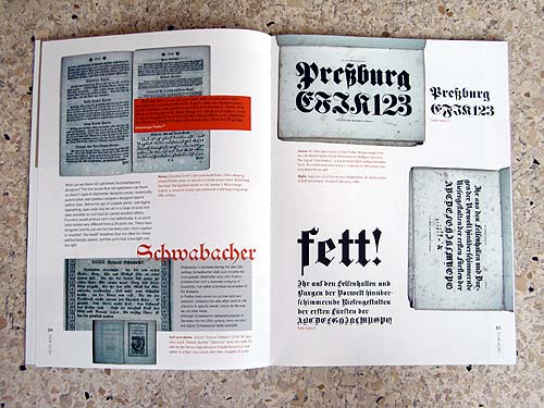
That particular 1840 J. B. Metzler’sche catalog was a laugh to read – a real page-turner. And very German. Here’s one of the photos I took that unfortunately didn’t make it into the article:
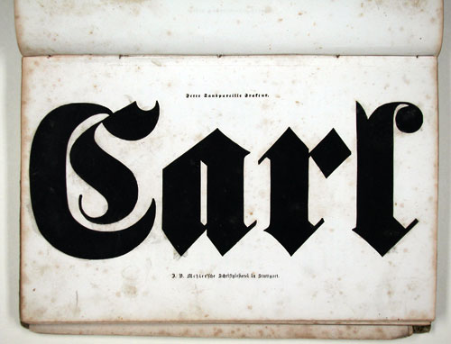
The Gutenberg Museum’s library isn’t as well-visited as its other attractions, but it is open to the public, and worth a visit.
http://www.gutenberg-museum.de/
Comments
7 responses to “Buy this Magazine, #2”
Wirklich ein schickes und gehaltvolles Heft, das kann ich bestätigen, Dan!
Danke. Die Ausgabe kam bei der TYPO ganz gut an, was mich sehr gefreut hat. Ich hoffe, dass wir noch eine Ausgabe in diesem Jahr rausbringen werden, aber dazu kann ich noch nicht mehr wirklich sagen.
Ich habe es noch in der Nacht in aller Ruhe gelesen – ein willkommener Kontrast, zum lauten, hektischen TYPO-Geschehen. Mein Respekt vor der redaktionellen Leistung. Auch gestalterisch ein Highlight. Solche Drucksachen brauchen wir auch in Zukunft. Kompliment und Dank an alle Beteiligten. JS
Danke Jürgen. Dies ist schon die zwei Ausgabe seit September. Höffentlich werden wir noch eine dieses Jahr auf die Beine kriegen.
Sieht gut aus…nur das Cover finde ich sehr undwiggineanisch. Ich wäre jedenfalls nicht drauf gekommen. Das wort “fett” ist ein bißchen steif im vergleich zum dicken Carl. Wie sieht es denn mit dem Vertrieb aus? Welche Authoren sind für die nächste Ausgabe vorgesehen? I wanna know more!!!
The Price is t o o high. 64 pages is n o t much. If you know w h a t i mean!!!
Till, auf dieser Seite (unten) kann mann das Heft bestellen.
Der Preis ist meiner Meinung nach nicht zu hoch ;) Wenn du zum nächsten Typostammtisch kommst dann kann ich dir es zeigen.