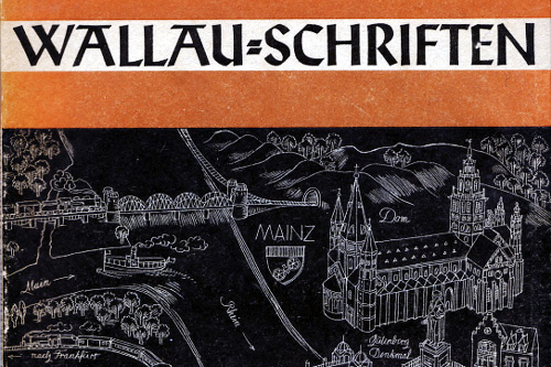
Between 1924 and 1930, Rudolf Koch designed the Wallau type family for the Klinsgpor foundry. Wallau is a rotunda-style blackletter face (rundgotisch) with two sets of capitals: a gothic (deutsche Großbuchstaben) and an uncial version. The gothic is quite “old-German” in its appearance, while the uncial works more like an odd Italian sans serif.
The Klingspor foundry released this 55-page Wallau specimen book in 1939. The typeface was named after Heinrich Wallau (1852–1925), a printer from Mainz. A beautiful line drawing of Mainz appears on the front cover of the brochure (shown above). A map of Offenbach appears on the back cover.
Short Digression
In Letters of Credit, Walter Tracy wrote, “the quality of [the Klingspor foundry’s type specimens,] typography and printing has never been equaled.” This may be true, but I think that there are a few gems among present day type specimens: for instance, Linotype’s Sabon Next specimen (designed by Jean-François Porchez) is my favorite catalog of our digital era. I think that it can stand shoulder to shoulder—especially in terms of written contencontent—with the giants of the past. Here is a quick cover comparison with the Wallau brochure.
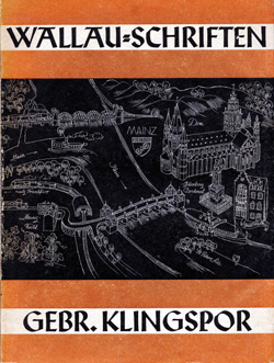
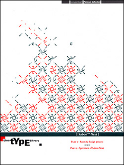
Perhaps even more typographic, actually. But this is an article about the Klingspor’s Wallau brochure. Enough of this sidetrack.
The Wallau Brochure
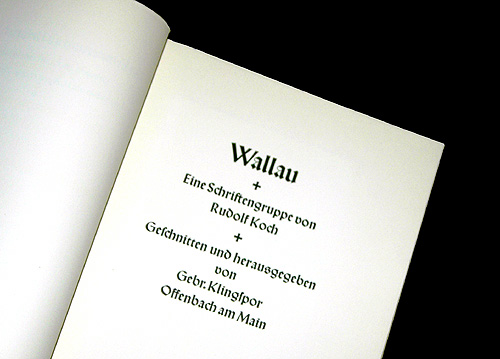
Unlike so many specimens, the old Klingspor examples really showed off their type. Generous white space surrounds the letters and text settings.
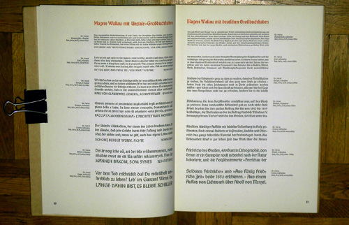
Inside the brochure, the typeface is shown at multiple sizes. This was even more important in that past than it is today, as the design of lead types would normally change slightly with the increase of point size. Very few digital type families have different optical versions available.
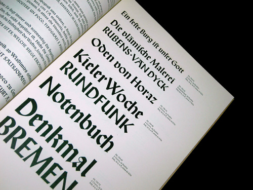
Above, some sample headlines, showing the unical caps.
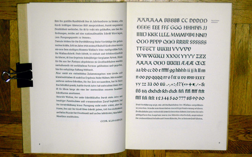
The page above reproduces some of Koch’s sketches from the upper and lowercase letters.
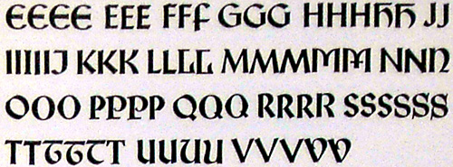
A close up of some of the sketches for the uncial capitals shows the array of forms that Koch tried out before coming to his final design.
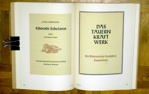
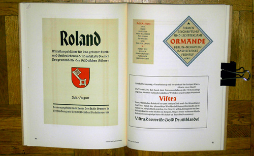
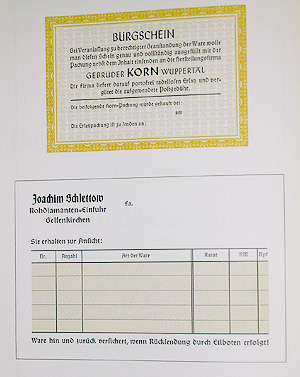
The brochure is filled with samples of advertisements and designed pieces that show how the typeface could be used. These pages are letterpress-printed, with multiple colors employed.
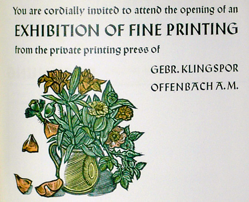
Klingspor specimen books often had some sample English-language showings.
I think that Wallau is a typeface which could successfully be brought back into design use. For a blackletter design, its letters are considerably open and round. While it may not be the best choice to clothe contemporary text with, I think that it could set a mean headline. Images from a much earlier Koch typeface, the Deutsche Schrift, may be found in this entry.
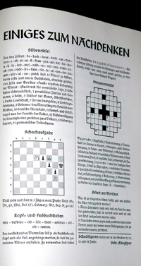
I particularly enjoy the chess and crossword puzzle sample at the end of the book. What a creative sample.
Comments
8 responses to “Die Wallau Schriftprobe”
Fine. Wallau is a small village nearby Frankfurt, too. I think, that Mr. Wallau is coming from this location, right?
Wallau liegt nordlich von Frankfurt, im Kreis Marburg-Biedenkopf.
Oh, danke. So genau weißt du schon Bescheid. Bei Marburg an der Lahn…
Ich könnte es aber nicht herausfinden, wo Heinrich Wallau geboren ist. Sorry!
Ich zweifel an der Idee das Blackletterschriften “back to design use” gebracht werden können. Ich denke trotz der Offenheit der Wallau-Buchstaben können die mit Breitbandfeder geschriebenen Schriften, die auf klassischem formalem Schreib- oder Konstruktionsmustern basieren, immer nur als altertümliche Stilisierung verstanden werden. Ich kann mir keine Anwendung vorstellen in der Blackletter so benutzt werden, daß sie nicht nostalgisch wirken oder in irgendeiner Weise vermeiden auf “Altes” zu verweisen. Außer vielleicht für Gangster-Hiphop-Promo-Material.
Das Problem ist wohl eher das der allgemeinen Leserschaft. Blackletter Schriften werden von Lesern durch die Logik des Bildes als Stil verstanden. Es gibt keine formale Schreibkultur die lebt (außer Schulschrift 68) und so dem formalen Schreibstilen eine andere Bedeutung zukommen lassen k¨ønnte als Nostalgie. Das selbe Problem sehe ich bei den ganzen 50er Jahre Scripts – siehe House Industries etc. Diese Schriften werden entweder total zufällig benutzt oder um Retroaspekte zu erwecken – zu Stilisieren im rein bildlich visuell-illustrativem Sinn. Das ist historisierender Formalismus. Selbst modernere Schriften die auf Blacklettermodellen basieren funktionieren nur als hybride Stilisierung im Sinne rein visuell formaler Referenzen. Das ist dasselbe wie mit den alten Schreibmeistern oder der Kalligraphie (“Schönschrift”). Es sind hauptsächlich Praktiken die ihre ursprünglichen Bedeutung (…ihren Platz im Leben) verloren haben und so zum Kunsthandwerk verkommen.
Die Broschüre finde ich aber trotzdem sehr schön. Das Kreutzwort-Rätsel ist echt super. Vielleicht wäre das sogar heute noch eine brauchbare Anwendung.
Der Ort, auf den sich hier bezogen wird, ist vermutlich der in der Nähe von Mainz (s. Bild oder http://de.wikipedia.org/wiki/Wallau_%28Taunus%29).
http://cafe.themarker.com/view.php?t=1455233
i wrote a hebrew essay about koch’s work.
the trajedy, in my opinion, of the fraktur and blackletter, is that it is no longer an active script as it was in it’s haydays. there are no books to my knowledge printed with fraktur text. so now the fraktur is more served as headliner and very stylish solution, which is better than nothing i guess. the fraktur is still influential in our times.
great post, very interesting.