I’ve wanted to post this online for a while now. In September, I designed a small family of display typefaces for MAGMA Brand Design GmbH & Co. KG to use in Bastard: Choose My Identity. I post irregularly on their typography blog, Slanted, and somehow I became invited to include a typeface in the Bastard project. That was flattering to say the least; I’ve been working in typography for a few years now, but hadn’t released any fonts (commercially or for free). When I agreed to submit, I had no idea what I would end up sending them.
Schriften Atlas, by Hofrat Ludwig Petzendorfer. Published 2004 by Matrix Verlag GmbH, Wiesbaden. This catalog is a reproduction of the Julius Hoffmann Verlag’s specimen book from 1903–1905 (Stuttgart).
TypeOff. was conceived as a “proselytizing” platform, so to speak. The small group of type-minded designers who founded it had always been impressed by Offenbach’s typographic tradition, but we hadn’t actually done much research into the typefaces produced historically in the city for the first year or so of our activities together. Almost concurrently, Peter Reichard from TYPOSITION. and I separately came across a geometric art nouveau typeface named Teutonia in the same specimen book (pictured above). We each began to draw our own digital versions.
Teutonia was released by the Roos & Junge typefoundry in 1902. Roos & Junge, which closed during the early 20th century, was one of several typefoundries that operated in Offenbach during its industrial era. It is much less well-know today than the Klingspor foundry, for instance.
For a typeface, Teutonia apparently lived a brief and unremarkable life, despite its being copied and distributed in Italy under the name Archimede. Similar letterforms would appear in Russian revolutionary and constructivist graphics during the 1920s. These letterforms changed over time, becoming more rational, and less eccentric. During the 1990s, Tagir Safeyev’s ITC Stenberg revived these changed, rather Russian-looking forms. A beautiful design, ITC Stenberg appears too “clean” with when compared with Teutonia. The charm brought about by many of the unexpected diagonal elements did not seem to survive the decades-long transition. And Teutonia was originally equipped with its own lowercase.
Characters from the first digital sketches I made for Mountain.
After showing my first digital drawings to Peter, I decided to keep working on the project, and it ended up being my contribution to the Bastard project. I gave Teutonia italics (obliques, actually), a feature it has never seemed to have. Both the upright and italic fonts include small caps (see samples below).
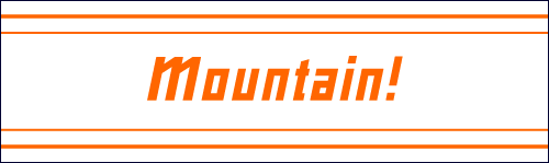
Before shipping the typeface off, I had to give it a new name. Teutonia is too inappropriate for a commercial font name today, I think, as it has seemingly nationalistic connotations. Also, many turn of the century German typefoundries had various designs that they named “Teutonia,” and these all looked different. How could I lay sole claim to the Teutonia name when it was just one of many typefaces to bear that name? Instead, I named the redesign Mountain. There isn’t much of a clever explanation behind “Mountain;” I happen like mountains, and it is sort of a play on “Volcano,” which is the name of the font foundry distributing Mountain online.
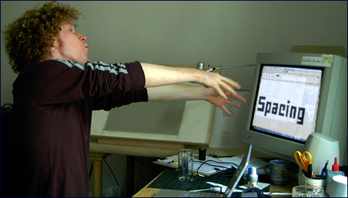
Dan channels the ghost in the machine to assist him with the spacing of font.
Mountain isn’t an “original” typeface design in the way that many fonts certainly are. Rather, I see it as way to bring a historical typeface back into contemporary use. All typeface revivals require a certain level of problem solving; today, we use a range of characters that were not common in text set around 1900. And we use type quite differently today, now that fonts have become ephemeral rather than physical. Hopefully, Mountain will find more use in print than Teutonia did 100 years ago!
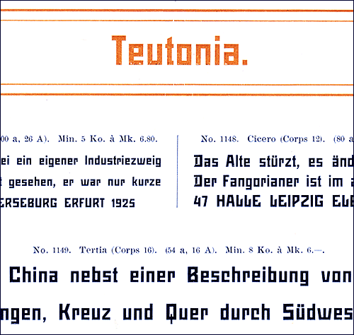
Above is a close-up of a scan from one of Roos & Junge’s specimen books showing Teutonia.
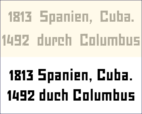
This comparison shows Teutonia (above) and Mountain’s regular weight (below).
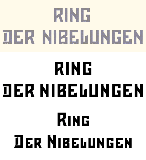
This comparison shows Teutonia (above) and Mountain’s uppercase and small caps (below).
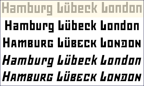
This comparison shows Teutonia (above) and Mountain’s regular, regular small caps, italic, and italic small caps (below).
Mountain can be seen further at VolcanoType and MyFonts.com.