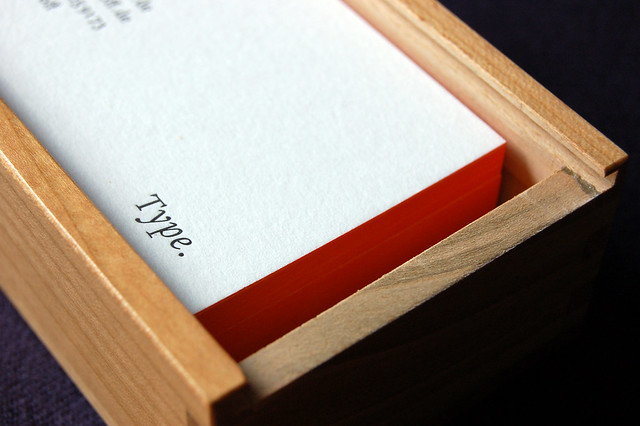
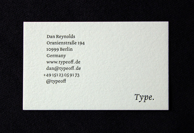
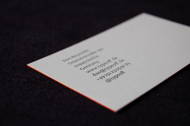
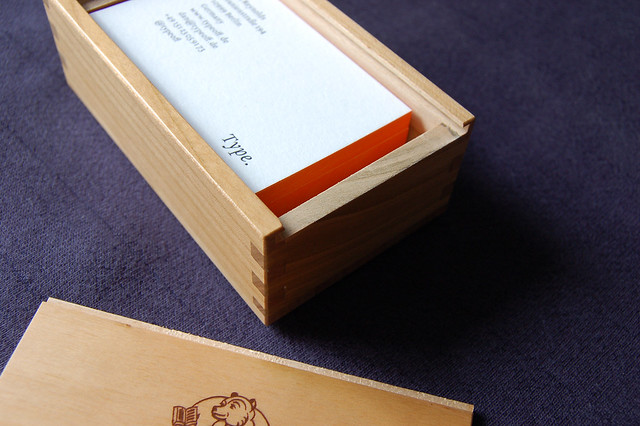
I picked up my new business cards today, and I do think they are really swell. These are the first business cards that I’ve had made for myself since 2004, and they are – both in terms of design and production quality – the best I have yet had.
I am not a fan of digital printing. I just don’t like it! Everything I’ve ever had done using digital printng has just been sub par. I know that digital printing is constantly improving, but despite its cost benefits, I am not willing to use it when I donÆt absolutely have to. So instead of having my new business cards printed offset, I went a step furtehr, and chose letterpress printing.
It was clear to me that the best address in Berlin for letterpress work is Martin Z. Schröder’s office, and I did order my business cards from him. But until the last minute, I was not sure which letterpress method I should used. I see myself as sort of a purist, and sketched up a few layouts with Weiß-Antiqua, for handsetting. Of all the typefaces ever designed, Weiß-Antiqua has been my favorite for a few years now. Well, that and Spiekermann/Schwartz’s DB Types – but those fonts are proprietary. In the end, though, I figured it would be best to have my business cards set in a typeface of my own, even though this would mean having a plate made. I think that plates are sort of anti-letterpress. But plates can be made in a jiffy! Real hand-set versions of my own typefaces … that would be much more costly.
My business cards are set in a custom fork off of my Malabar/Martel typeface. This version of the design is used to used the 2010 and 2011 Gutenberg-Yearbooks, and webfont versions of these fonts are currently installed right here on TypeOff.de!
The best printers are those who care about design, and have an eye for detail. I was glad to when Martin Z. Schröder pointed out several small elements in my typesetting that should be corrected – both for style and plate-production reasons. He also implemented a few more minor corrections on his own, and I am so pleased with the result.
My business cards are printed single color on Old Mill bianco paper (300g/m²) from Fedrigoni, Italy. There is an orange color printed along the trim because, well, I have flaming orange hair. After going through a few dozen sketches, I decided upon a layout with the word “Type.” down in the bottom corner. I think that this sums up everything I do pretty well, as it encompasses typeface design, writing about type, font marketing, and my teaching work. “TypeOff.” would have been OK, too, but “typeoff” already appears three times on the card anyway. I think it is so 2011 to include your Twitter handle on a business card.


