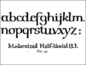
A modernized Half-Uncial, from Edward Johnston’s Writing & Illuminating, & Lettering (1906).
Month after month, the number one search term that brings visitors to this site is “gaelic font.” Readers may end up on TypeOff. because of Pater Noster, a type design shown further down in this article. I don’t know what people are looking for when they type “gaelic font” into Google. Are they looking for fonts to set a Gaelic language, Irish for instance? Are they looking for uncial fonts? Or for fonts that just look “Irish”? In any event, I’ve written this article to help them along their search.
According to font standards,all basic PostScript, TrueType, and OpenType fonts should be able to set Gaelic (Irish). However, this seems to be only part true. Gaelic requires acute accented vowels in a character set: Áá Éé Íí Óó Úú. These glyphs are part of standard western fonts. But the dotted consonants are not.
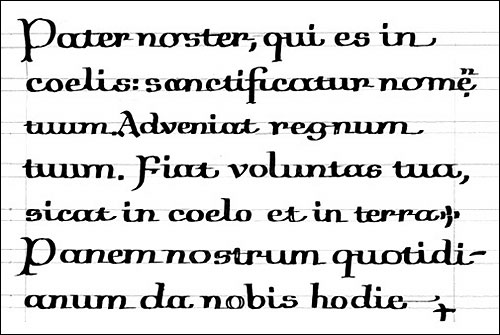
Half-Uncial writing exercise, Spring 2005.
Uncial fonts are a different story. While the Irish language may traditionally be set with Irish typefaces, not all uncials are Irish. Uncial hands were a style of writing used during the late Roman Empire, from ca. 200 to ca. 800. Since the Roman Empire was so broad, Uncial hands differ according to region. There were even Greek uncials, for instance.
When Christianity came to Ireland, so did Latin and uncial scripts. The sub-style of uncial that seems to have taken hold in Ireland is known as Half-Uncial (it had a rather unique G). Half-Uncial later evolved into the “Insular” hands used in Ireland and the British Isles.
Scribes in the western part of continental Europe seem to have stopped writing book text with uncial-related styles after Charlemagne’s writing reforms, ca. 800. However, Uncial has remained popular for headlines, titles, certificates, and display usage ever since.
As Ireland was neither part of the Roman Empire nor Charlemagne’s kingdom, the uncial tradition seems to have never really stopped. Also, the years between ca. 400 and ca. 800 A.D. may represent some golden age for the Irish, although I must admit that my Irish history is a bit shaky. In any event, Uncial-looking typefaces are still widely used in Ireland, especially when dealing with the Irish language.
Uncial typefaces and Irish typefaces do not necessarily overlap!
The first Irish typefaces seem to have been cut during the reign of England’s Queen Elizabeth I. Gaelic (Irish) typefaces descend from this era, while also retaining inspiration from the dawn of Ireland’s Christian period. Uncial typefaces on the other hand, are (mostly) intended for display settings, and may or may not have anything to do with Ireland or Irish typesetting requirements. The digital font market does not offer that many uncial fonts at all, and most of these fonts did not have the Irish language in mind when they were designed.
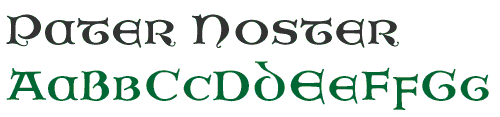
This is Pater Noster, a design for a typeface I first posted on TypeOff. in 2004. Although it isn’t a completed, released font, it has been used on a few occasions.
Below are a few of the real commercial uncial fonts I know and can recommend. These are all from Linotype. I should stress again that these are uncials; they are not necessarily suitable for Irish, or any other Gaelic language. But that is really up to typesetters, designers, and clients in the end.
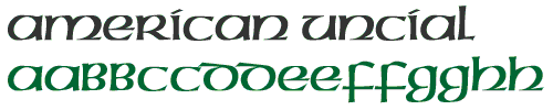
The image above shows a digital version of American Uncial – the URW digitization. American Uncial was designed and cut by Victor Hammer during early 1940s. The Dearborn Type Foundry cast it for him in 1943. Victor Hammer was an Austrian typographer who dedicated his career to designing uncial typefaces, which he also used to set books with at his own private presses. His first published typeface, Hammerschrift, was released by the Gebr. Klingspor foundry in Offenbach, Germany, in 1923. You can read all about that in another post on this site: Victor Hammer and Gebr. Klingspor.
The digital version of American Uncial is probably the most ubiquitous uncial font in the world, including Ireland. Unfortunately, its forms are not quite Irish; its i is dotted, and the shape of the dot runs the risk of looking like an accented i, which it is not. American Uncial is unicase; the upper and lowercase letters are the same style and size.
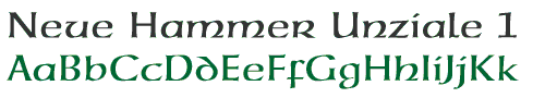
In 1953, American Uncial was re-released by the Gebr. Klingspor foundry, renamed Neue Hammer-Unziale. Like the original metal type version of American Uncial, Neue Hammer-Unziale has both upper and lowercase letters. The uppercase letters are more roman, while the lowercase is more uncial. Unfortunately for American Uncial’s brand legacy, it is a unicase font in its digital incarnation.
In fact, most of the letters in the digital versions of American Uncial aren’t even the original design’s lowercase, but a set of special drop cap letters from Gebr. Klingspor’s Neue Hammer-Unziale. This is particularly crass, as the drop caps were intended to stand on their own at the beginnings of paragraphs, and not be formed into words or lines of text. Really, no one should ever use the digital version of American Uncial for anything. Neue Hammer-Unziale is a superior alternative that encapsulates Hammer’s original design better.
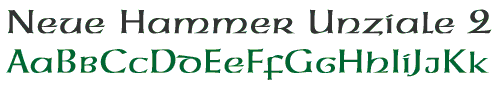
The digital fonts for Neue Hammer-Unziale are available in two versions. Neue Hammer Unziale 2 is basically those dreaded initial letters shrunken down to lowercase size, combined with the capitals from Neue Hammer Unziale 1. Linotype’s OpenType version of Neue Hammer-Unziale has the letters from Neue Hammer Unziale 1 on by default, with the #2 letters available as alternates within the font file. Neue Hammer Unziale 2’s lettercase letters should never be used to set running text.
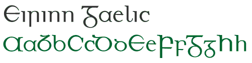
Eirinn has a lot going for it. In the Gaelic part of the family has a dotless-i. The g is insular in form, and the r and s are both long and round. Eirinn was designed by Norbert Reiners in 1994.
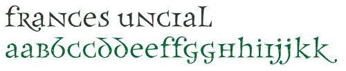
Frances Uncial has a strange character set, with lots of alternates and ligatures. The letter style looks sketched, or hand drawn (not written) with a pen. In fact, the feeling comes directly from its letters having been first executed as lino-cuts, which were then scanned in. This roughness is also something I employed when I began Pater Noster, but I eliminated the rough finish from that, while Frances Uncial keeps it. Michael Gills designed Frances Uncial in 1995.
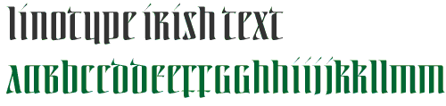
The upper and lowercase letters of Linotype Irish Text share the same height, but many of the forms are different. The letters here are very narrow, almost like in a textura design, although not in style.
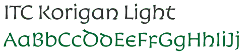
ITC Korigan is an uncial family; this is rather rare. The family contains two weights, light and bold. The type was designed by Thierry Puyfoulhoux of France, who wanted to create an alternative to American Uncial.
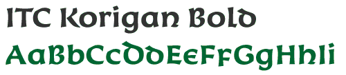
ITC Korgian is certainly uncial, but a perhaps more accurate description would be just “uncial-inspired.” Many of the forms have been modernized, and many of the capitals are more roman in appearance. Nevertheless, its cleverness is welcome, and its design feels much more modern than Hammer’s work.
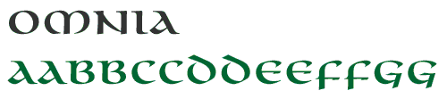
Omnia is a unicase typeface, but unicase-ness is more caps-like than lowercase—just look at the G form above. Part of Linotype’s “Type Before Gutenberg” collection, Omnia was designed by Karlgeorg Hoefer in 1990.
Show me more!
Want to look at more uncial fonts? Click here for part two of this topic! Also, you might enjoy looking at pictures of this specimen of Gebr. Klingspor’s for Rudolf Koch’s Wallau typeface, from 1939.