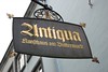
This picture to the left may be the most delightful typographic oxymoron I’ve yet to encounter. A sign for an art gallery in Cologne, which seems to be called “Antiqua,” its text is set in Wilhelm Klingspor Gotisch.
I like to see this sign as one sort of big inside joke; a gift to all typographers. In German, the word Antiqua also means “old style,” or serif typeface. Antiqua types can be used in text, just as blackletters could, or grotesks, script faces, etc. Wilhelm Klingsport Gotisch is not an antiqua type, of course, which is why this sign sings out to me so much.