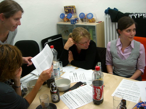
Last night, we had our monthly Typostammtisch in a different location. TYPOSITION. now has a new space, and hosted the event in their “conference room.” Throughout the evening, 13 designers were in attendence, and regarding how late into the evening we stayed in the office, a good time must have been had.
This was my second-to-last Typostammtisch. After seeing them run along for about 3 years and 3 months now, I only have one more left (September 25th) before I head off to the UK.
TYPOSITION. has hosted the Typostammtisch on one occasion before, in their old office in the Waldstraße. During that evening, in fact, Cardinal Ratzinger was elevated to the papacy. Two of us received phone calls at various points in order to pass along the information about Benedict XVI.
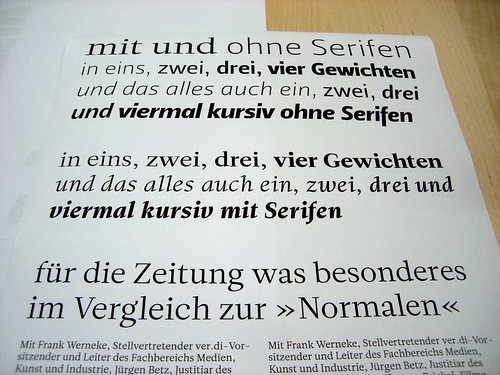
Since we did not have any formal presentations this month, Peter came up with a program idea that went off quite well: attendees were to bring print-outs of their favorite typefaces. To my surprise, this they did. The ensuing disccusion lasted for three hours! What I also did not expect was that everyone would discuss the single typeface they hat the most as well as the one they love the best. Hmm…
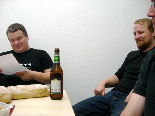
We had a special guest for the evening, Indra Kupferschmid, now a typography professor in Peter’s home town of Saarbrücken. Indra was in the neighborhood researching at the Klingspor museum, and Peter and Tanja must have conviced her to extend her stay a little longer.
Some photos from the evening, as well as from past Typostammtische, can be found here and here.
Comments
2 responses to “08/07 Typostammtisch (review)”
[…] Am Dienstag fand der Typo-Stammtisch, so zu sagen als Einweihung, in unseren neuen Büroräumen statt. Dreizehn Typografie-Interessierte kamen zum Smalltalk unter anderem über »Lieblings- und Hasschriften« auszutauschen. Im allgemeinen war es für jeden Schwierig seine all-time-Lieblingsschrift zu bennen da dies bei den meisten abhängig von verschiedenen Faktoren ist. Aber genannt wurden als Lieblingsschrift u.a. FF Scala Sans, Vista, Leitura, Auto, Delicious, FF Eureka, Blue Highway und Elektra. Unter den so genannten Hassschriften war erstaunlicherweise weder Arial noch Helvetica, was vor einiger Zeit sicherlich noch anders gewesen wäre. Der Hype um den Helvetica-Film mag an dieser Entwicklung seinen Anteil daran haben. Genannt wurden dafür jedoch Rotis, Marker Felt, Meta, Courir und seltsamerweise war die Scala auch hier vertreten. Einen weiteren Bericht gibt es bei Typeoff. […]
thanks a lot for this great post!!
greetings from bremen