From the HOW Design Conference, 2006.
A few months back, Jon Nagle, a graduate student at Savannah College of Art and Design, interviewed me for a type design class project. Here it is…
When Dan Reynolds, born in Baltimore in 1979, went off to the Rhode Island School of Design as a freshman in 1997, he had no desire to become a typeface designer. It wasn’t until his second year in the program that he “fell for type hard,” and switched the focus of his remaining time in school to typography and information design. He is now the editor of font content at Linotype GmbH in Bad Homburg, Germany. He is responsible for Morris Sans, a 2007 Linotype release [based on Morris Fuller Benton’s] Bank Gothic. Reynolds added lowercase letters to the established sketches, as well as multiple figure options and additional language support. I had a chance to speak with Dan and ask him about his experiences working at Linotype in Europe.
Was it through your studies at RISD that you were inspired to pursue typeface design as a career? How did the influence of your professors factor in?
I became typographically aware at RISD, but while I was a student there, I never really thought about a career in type design. I did have one course in stone-carved lettering, and a summer course in typeface design, but typeface design was not part of my experience there, really. It wasn‘t my professors who got me interested in type design, although without some great teaching, I never would have fallen in love with typography.
If it wasn’t through your school experiences, what made you make the decision?
When I was applying for graduate school in Germany, one of the professors looked at my portfolio and asked me if I wanted to design type. I answered in a quick fluster that I wasn’t nearly detail-oriented enough to make typefaces. But I didn’t really believe I was saying that as the words fell out of my mouth! This planted a seed. A year later, I started interning [in the product marketing department] at Linotype.
Why Europe? Did you make the move soon after finishing school? Was it a personal or cultural decision to move there?
In my seventh semester at RISD, a design school in Wiesbaden, Germany wanted to establish a student exchange program with us. They sent a student over, and asked for a student in return. They even offered some funding. I had had some German in high school, had visited Germany once and Europe twice, and jumped at the chance. So I spent my last semester at RISD on a semester abroad. I did my degree project remotely, sending weekly e-mails to my professors back in Providence. I was the first student to try this there; I don’t know if it was later repeated!
After the semester was over, my funding was up and I had to go home. I had my BFA, so I took a job doing in-house corporate work in Washington, DC. I applied to graduate programs in Germany and Switzerland, and made several trips to visit schools. My girlfriend is German, and I was taking night classes in German at the Goethe Institute after work to get my language abilities up to the point where I could pass the necessary language exams. I got into several schools, but it was financial more advantageous to study in Germany…they didn’t have tuition fees at all yet.
All in all, I studied at the Hochschule für Gestaltung in Offenbach am Main for four semesters. Halfway into my second semester there, I began an internship at Linotype. By the beginning of the fourth semester, I wasn’t enjoying my course work as much as my work at Linotype. In Offenbach, several students were very interested in typeface design. We even formed a collective (www.typeoff.de). But [some of] the professors at the school had a real allergy to type design. The decision to stop my graduate work and start working at Linotype full time was an easy one.
Is it easier and more profitable to be a typeface designer there?
I think that it is easier to work in typeface design in Europe, although having never tried to do that in the US, I couldn’t say whether or not it is difficult there. I think that several European countries…Germany, Switzerland, and the Netherlands in particular…have more of a typographic sensibility than most places in the US. There are a lot of type designers and even designers in general here. Plus there are more networks and conferences on the ground for typeface designers here. Last but not least, in Europe there are now two places where one can do a graduate program that is dedicated completely to type design, and which are supported by all the major industry players: The University of Reading in the UK, and the Royal Academy in The Hague (KABK).
How do you like living in Europe?
I love Europe. I love living and working here. I don’t have any reason not to love the US…if the right opportunity came up, I’m sure I’d consider going back. Only time will tell.
Is typeface design your primary means of income? If so, is it a struggle?
No, typeface design is not my “primary means of income.” I work at Linotype, in the marketing department. I think that all design is a struggle for those designers who don’t have an understanding of things like business, marketing, sales, etc. This isn’t limited to typeface designers. Some typefaces designers out there are struggling to get by. But the same is true for graphic designers, web designers, even architects.
How did you get hooked up with Linotype? What sort of portfolio did you present in order to get in there?
Many students from the HfG Offenbach were interested in typeface design. One of my professors knew that a colleague of mine was going to be leaving for Switzerland. They thought that I would be the perfect replacement, and Linotype seemed to agree. I showed Linotype my general graphic design portfolio. They wanted to know how well I could write about typefaces, and how well I could write in English.
How did you get the Morris Sans job?
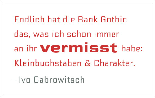
After about eight months at Linotype, it was agreed that I should work on my first typeface design project. My boss, the head of the Marketing Department, was really bummed that we hadn’t sold our own version of Bank Gothic since the early 1990s. As you know, Bank Gothic must be a very popular font…you see it everywhere, all over the world. We wanted to bring Bank Gothic back into our portfolio. But we also wanted to make the typeface better. Why do something if you don’t do it right, if you don’t improve on it? We had the digital outlines for the uppercase letters of one weight of Bank Gothic in our archives, in old IKARUS data. IKARUS was how fonts were created in the 1980s and early 1990s. I took this data, cleaned it up, designed a lowercase alphabet and more figure options, and then drew five more fonts. This ended up as the Morris Sans family.
Can you tell me a little about your design process? Do you practice extensive sketching, or jump straight to digital? What software do you use?
I doodle, but I don’t make tight sketches or drawing by hands. All of my work then, at least anything serious or understandable by others, is digital. I use FontLab exclusively.
How long do you work on a face per day, and how long total does it take for you to complete a font family? How many different fonts do you juggle at once?
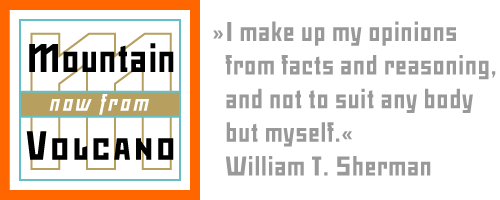
Since I’m not really a professional typeface designer, I’ve only ever worked on one or two typefaces at a time. And since I do other work concurrently, my timeframes are long. I spent two years with Morris Sans, but I did not work on it every day. One was released last year through Volcano-Type. Volcano-Type is run by some friends of mine in Karlsruhe. I love all their work and was glad to be involved with them a little bit. The typeface is called Mountain. I haven’t released any other typefaces yet. I began a number of projects while I was in Offenbach. Most can be found somewhere on my website.
Aside from Morris Sans, do you have any other font families that have been published? Are you working on anything now?
Aside from Morris Sans, just Mountain has been published. I’m not really working on anything serious at the moment. I’m busy with several other marketing projects at Linotype, and the type conference season has just begun here in Europe, and I’m out of the office every other week meeting with colleagues and clients.
But the real reason that I didn’t start on another professional project after Morris Sans was that, in October, I’ll be moving to the UK to enroll in the MA Typeface Design program at the Univesity of Reading. Anything I’d start now wouldn’t be finished before then, and after my year at Reading, I’d certainly start the project over anyway. I’m already really looking forward to the work that I will do there next year. It will be great to devote my time to a good, legible serif text face.