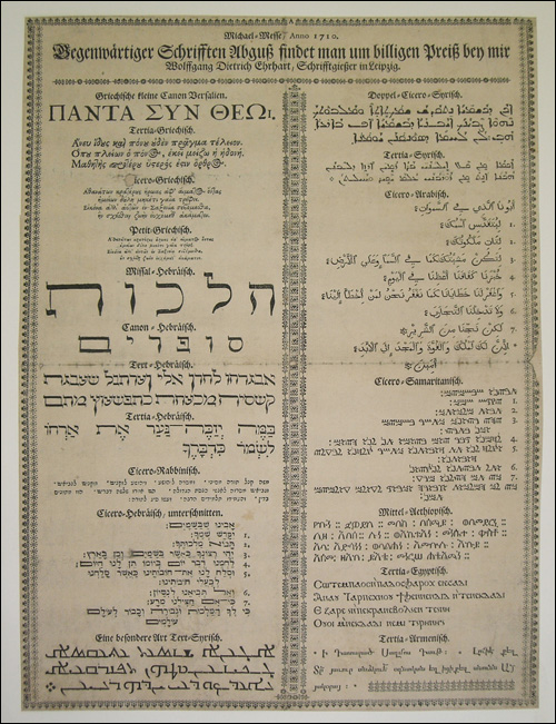
Yesterday I saw a peculiar type specimen sheet at the University library in Frankfurt. Although the specimen, printed in Leipzig in 1710, contained samples in Greek, Hebrew, Syriac, Arabic, Samaritan, Ethiopian, Coptic, and Armenian—all of which were surrounded by Fraktur letters and floral ornaments—the part I found particularly interesting was its headline.
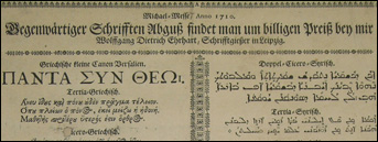
The text reads: Gegenwärtiger Schrifften Abguß findet man um billigen Preiß bey mir Wolfgang Dietrich Ehrhart, Schrifftgießer in Leipzig. In contemporary German, that would probably be written, »gegenwärtiger Schriften findet man um billigsten Preis bei mir, Wolfgang Dietrich Ehrhart, Schriftgießer in Leipzig.«
My English translation: The cheapest priced contemprary typefaces are to be found with me / I have the cheapest selection of contemporary typefaces / Wolfgang Dietrich Ehrhart, typefounder in Leipzig [circa 1710].
In other words, when writing his copy, Erhart did not call attention to the quality of his types, nor the extendedness of their character sets. Why should customers buy from him? Simple: he sold new fonts, at low prices.
Comments
6 responses to “Some Things Never Change”
I’m wondering if Abguß means copy … so he wouldn’t sell new typefaces but just cheap copies from several already existing.
Boy, cheap copies of already exitsing typefaces… in 1710! Some things really do seem to stay the same!
Nadine told me that the Arabic is set really poorly, i.e., the sample text is full of spelling errors. This sort of thing still happens in foundries and design studios today. But it makes me wonder what sort of people were working at this shop. I guess that would be impossible to find out now, though.
The Armenian is messed-up too.
Is it messed up because it is set incorrectly, or are the letters just bad? Both were probably just copied from someone else’s Armenian anyway…
beauuuuuuuuuuutifuuuuuuuuullllllll!!!
but – i have never seen such strange hebrew typeface before. it seems some of it was cut by craftsmen who, although quite creative, did not know hebrew as well as they should.
there are several interesting solutions here that im going to remember, but it looks some of the letters were made out of latin and hebrew parts.
what a mix..
the type sample in the middle (the third one from the large hebrew type) is undoubtly one the most strange and poorly designed font i have seen in my life. some of it cursive, some of it regular, some letters un readable, and the mem – it’s not hebrew, its too strange, yet interesting.
the type below it is okay though.
i love these examples because im looking for a way to design extra thin serif hebrew face.
[…] wouldn’t smile at Dan’s post, Some Things Never Change. It’s about a type specimen sheet, in German, advertising wares (translation by Dan) […]