Two years in the making, the fifth issue of Spatium magazine is now being shipped. Named »Hamburgefonts«, the issue tracks the state of type specimens. Following on the heals of issue four—a smaller piece that represented Spatium’s first venture into serious typographic theory—»Hamburgefonts« was worth the wait.
Having played a small role in the development of Linotype’s most recent Complete Typeface Catalog, A–Z, I can say with some degree of faith that creating a type specimen is difficult. But I have a hunch that creating a book about type specimens is even more challenging. How do you catalog a series of catalogs? Moreover, the editorial decisions must have been painful to make. Only so much can be displayed over 104 pages. The question is not what to leave out, but what tiny spectrum to even consider to include?
Spatium is edited by Peter Reichard and Tanja Huckenberg (Marie-Luise Mascia also received an editorial credit for »Hamburgefonts«), and functions as the house magazine for their studio TYPOSITION. in Offenbach, Germany. Each article in printed in two languages: German and English. The run-up to this issue has been immense in-and-of-itself, and included an article about type specimens in the first issue of Slanted (Issue #0), a workshop at a nation-wide conference, and a weblog. The magazine has already been presented publicly once, at the Klingspor-Museum in Offenbach, and I can only hope that conference organizers around the world will see the merit in Spatium’s latest issue, and invite Peter and Tanja to discuss it.
Articles
Aside from several articles by Peter and Tanja, »Hamburgefonts« contains contributions from:
Maie-Luise Mascia,
Catherine Dixon,
Daniel Janssen,
Jürgen Siebert,
and Oded Ezer
…as well as images from Robert M. Schöne and Eric Schmitt.

All images in the text deck are duotones. Rarely have I seen a designer who could make such beautiful duotones. The color mixing is perfect. I only know that these are, in fact, duotones because Tanja informed me of the work herself!
Spatium is not a magazine that focuses only on the Latin script. Their last issue was dedicated entirely to non-Latin writing systems and typefaces, and this magazine includes images from China and Israel.
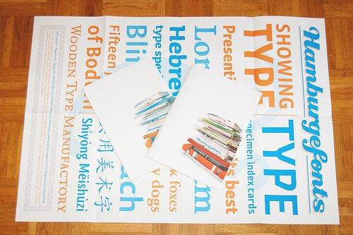
 A first for this issue of Spatium is the poster, which may be ordered separately in the Spatium shop. This beautiful, two-color A1 piece is a great accompaniment to the magazine, and I intend to hang it up in my office forthwith.
 The above spread further illustrates the specimen-like nature of the magazine. When it all comes down to it, »Hamburgefonts« is not just about type specimens, it is a type specimen, too. The magazine displays the following typeface families: Auto, Dederon Sans, Esta, Jenny, Kofired, Myriad, Newsletter, Sabon Next, Sauna, Sophisto, FF Strada, Tribute, and Vista. Some of these typefaces have never recieved proper specimen, and others have never been set so well. One more reason to order the issue!
External links, one more time:
http://www.spatium-magazin.de
http://www.typosition.de