Antiqua or Fraktur? By 1900, German printers increasingly wanted both – and something new as well. Inspired by British Arts & Crafts efforts, type producers like the Gebr. Klingspor foundry closed-out the art nouveau era by bringing new hybrid typefaces onto the market, like the Eckmann-Schrift and the Behrens-Schrift. Seeking out new artists to design these, as well as to reinvigorate the tradition-heavy blackletter motif, they came across Rudolf Koch.
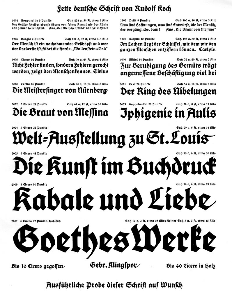
Above, a scan from a Gebr. Klingspor type specimen brochure for the Deutsche Schrift, showing a heavier weight, the fette deutsche Schrift.
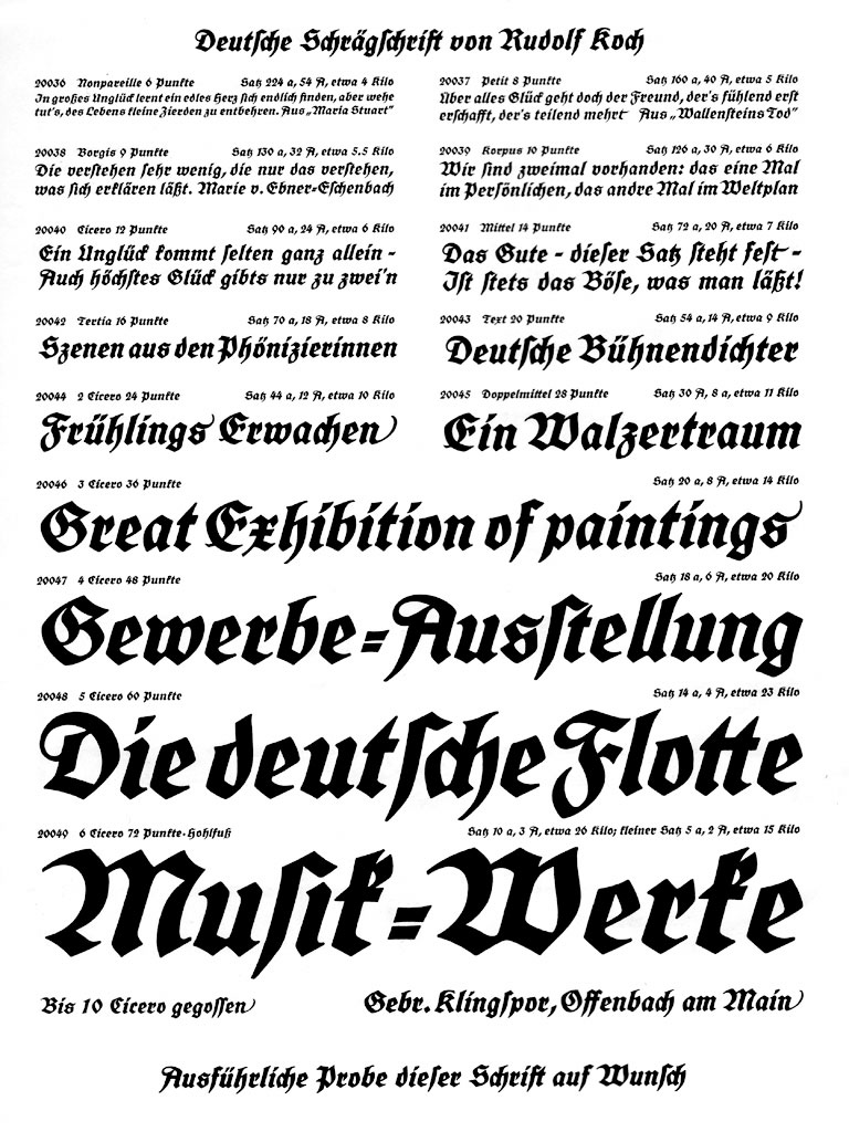
Another scan from a Klingspor specimen brochure for the Deutsche Schrift, showing a rare blackletter italic: the deutsche Schrägschrift.
By revisiting Fraktur’s origins in early Textura and Schwabacher printing, and by combining these styles with his own unique calligraphic hand, Rudolf Koch developed his first release, the Deutsche Schrift (the “German” type). The face met with such critical and commercial success that it would be regarded as the profoundest revolution in blackletter typography since the 1790s. Over the next three decades, the Deutsche Schrift family expanded to include over 15 different styles, storming the German book and advertising markets. Including features and alternates not yet found in today’s most up-to-date OpenType fonts, Koch’s convention-challenging design offered the unexpected, even including blackletter “italics.” All in all, the Deutsche Schrift may be seen as Koch’s largest and most creative typeface family.
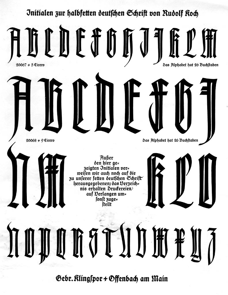
Scan from a Klingspor specimen brochure for the Deutsche Schrift, showing decorative capitals.
While its use outlived its designer, the Deutsche Schrift’s success could not survive the Second World War. Both the product’s name and design must have seemed out of place in the later half of the 20th Century. Does this temporary type warrant a twenty-first century commercial revival? Could this family have any intrinsic merits of its own? Or are we better served by relegating it—along with its varieties and options, which outweigh those found in any digital blackletter on the market today—permanently to the historical rubbish bin?
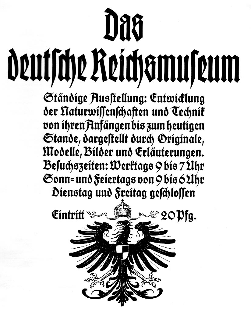
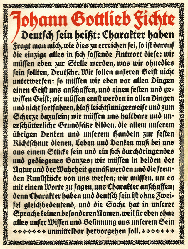
Scan from a Klingspor specimen brochure with a sample text set in the Deutsche Schrift.
Scan of Klingspor specimen brochure for the Deutsche Schrift.
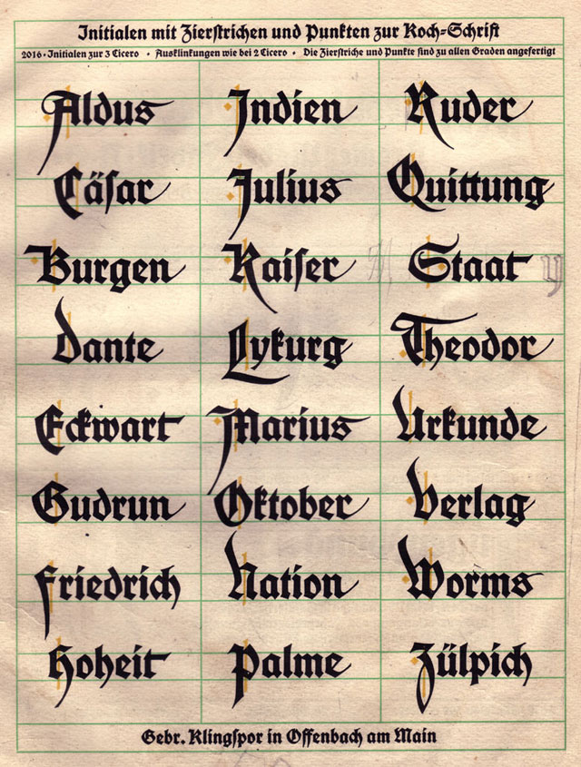
A previous reader tried their hand at copying a few letters, right here on the page!
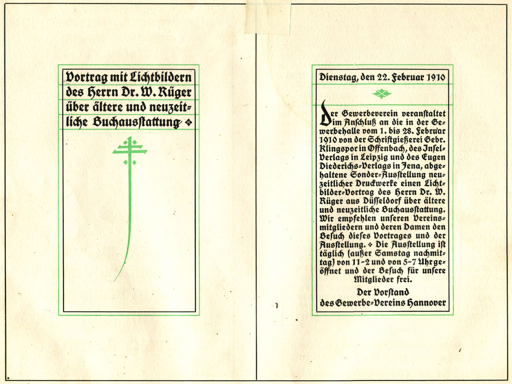
Scan of a decorative spread from the Klingspor specimen brochure for the Deutsche Schrift.
Images from the Klingspor foundry’s Wallau brochure may be seen here.