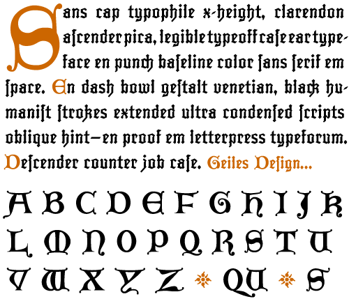
Ignaz Lombard Caps is a set of Lombardic Capitals that were designed by Dan Reynolds to accompany his Ignaz Textura faces. The Ignaz Textura family is loosely based off of texturas that were designed in the Germany city of Mainz during the early 1500s.
In books like Gutenberg’s 42-line Bible, probably the first complete tome ever created using modern printing techniques, Lombard Capitals were used for special accents, initial caps, and headlines. Unlike the textura letter, which was derived from handwriting, Lombard Capitals evolved from medieval inscriptional stone carvings, especially those that were created during the Romanesque era. Mainz, lying in the center of Germany’s Ottonian Romanesque region, is still secretly awash is these delightful letterforms.
Many Blackletter type designs from the present era also include accompanying Lombard sets. The best example is most likely Frederic W. Goudy’s Goudy Text, a revival of Gutenberg’s type that was drawn for Lanston Monotype during the early 1900s.