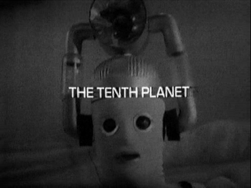
Episode Two of “The Tenth Planet.”
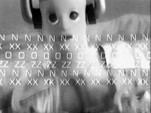
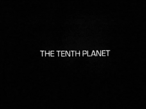
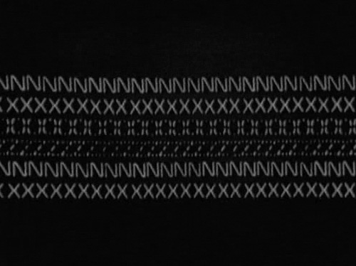
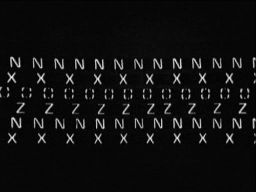
Re-watching older episodes of the seminal British sci-fi serial Doctor Who, I was amazed by the creative typographic animation added to the end of the opening credits in “The Tenth Planet” serial. Only used for these four episodes, they represent an interesting experiment in British television design. Early Doctor Who adventures had tried special titles before – for instance in Episode One of “The Dalek Invasion of Earth” – but this surpasses those, in my opinion.
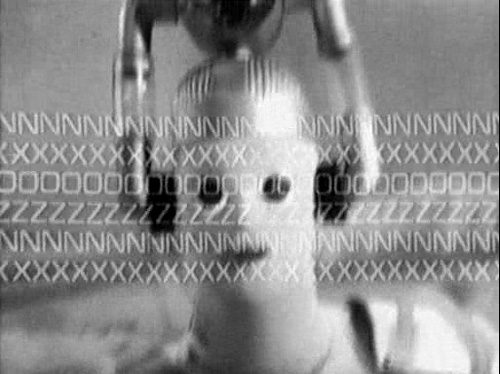
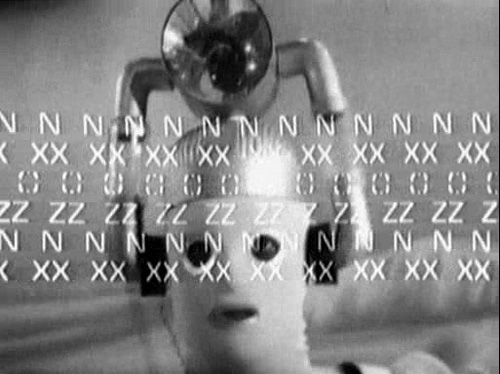
According to the BBC website, this sequence was designed by Bernard Lodge. “The Tenth Planet” aired from October 8th through the 29th, 1966. This experimental titling sequence could be seen as typical for the entire atmosphere of the adventure. Its episodes introduced a number of innovations that would become essential elements of the show’s success over the following four decades, specifically the new race of monsters known as the Cybermen, as well as a means to extend the series past the performance a single actor in the staring role, i.e., the Doctor’s regeneration capability. This particular trick allowed the show to bring in a new actor to star in the main role without having to sacrifice any continuity.
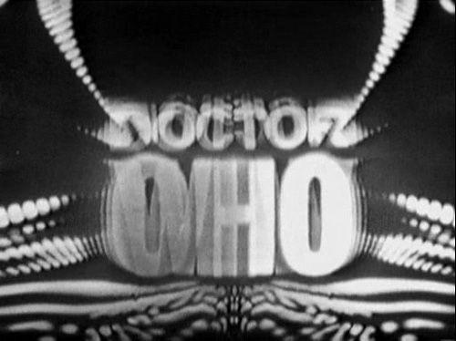
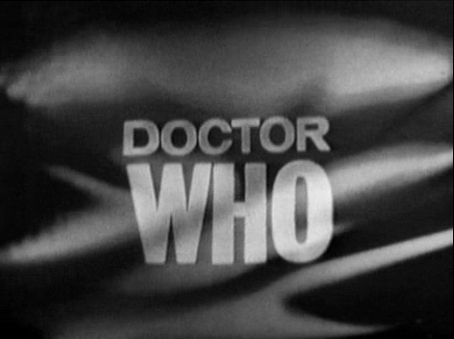
The opening credits for Doctor Who were always marvelous examples of period graphic design, and those used during the William Hartnell era (1963–1966) were particularly typographic in their own right. The first Doctor Who title sequence was particularly typographic. The letter’s are animated, appearing out of otherwise dominate smoky imagery.
After “The Tenth Planet,” the opening credits of the series changed, introducing the face of the new actor playing the lead role (in this case, Patrick Troughton. The animation element moved from revealing the letters “Doctor Who” toward revealing the actor’s portrait. The lettering treatment of the show’s title, “Doctor Who,” would become more iconic, even logographic over the ensuing. The new show (2005–) uses a spinning, Lord-of-the-Rings Sauron-sort-of-eye-element in the current title sequence. After “The Tenth Planet,” there would not be another animated typographic element in the opening credits until 1987, when the opening credits introduced that letters-spinning-out-from-the-asteroids thing. The show currently uses moving three-dimensional letters for the lead actors’ names.