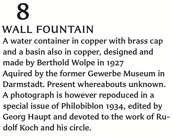
Above, setting of Carter Sans medium. Text from Berthold Wolpe: a retrospective survey. London: the Victoria and Albert Museum and Faber & Faber Ltd (1980)
Earlier this week, Monotype Imaging released Carter Sans: a new typeface family from Matthew Carter, designed for International Typeface Corporation. I happily worked on the Carter Sans project for several months in 2010, and am glad to see the fonts’ release.
While I usually try not to quote from press releases too much on this site, the Monotype Imaging press release for Carter Sans gives good background information about the design, so I’ve quoted some excepts from it below. If you’d like to read the full press release, you can find it on the Monotype Imaging website.
“We approached Matthew, one of the world’s most accomplished type designers, to head the design of a new sans serif family for our ITC library,” said Allan Haley, director of words and letters at Monotype Imaging. “The result is Carter Sans—an exceptionally beautiful design that reflects a spirit of distinction and authenticity, perfectly suited to our ITC collection.”
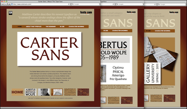
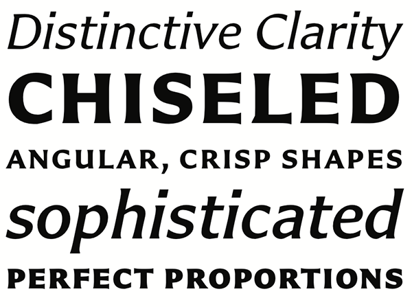
Carter Sans is a “sans serif with stroke endings that show the effect of the chisel more than the pen,” according to Carter. He was inspired by the work of his friend, the late Berthold Wolpe, and integrated the humanistic overtones, hearty shapes and the bold simplicity of Wolpe’s Albertus® typeface, which Wolpe completed for Monotype in 1940, modeling characters to resemble letters carved into bronze. While designing Carter Sans, Carter collaborated with Dan Reynolds, a senior type designer at Monotype Imaging’s Linotype subsidiary. Reynolds oversaw character set development and font production and also designed the small caps to complement Carter’s old style figures. “Carter Sans is ideally suited for display copy as well as text composition, thanks to the close collaboration between Matthew and Dan,” Haley said. …
Carter Sans fonts, selection packs and typeface families can be viewed, purchased and downloaded from www.fonts.com, www.itcfonts.com and www.linotype.com…
The typeface has already seen some pre-release use, first by Pentagram in their work for a New York ADC Gala in November, and also for the Yale University Art Gallery. I am quite curious to see how designers will take to the typeface, and what sorts of projects they will use it in.
It was quite an honor to be involved in this project. I think that the role I played could best be described as an “assist” (and maybe there is some sports metaphor that is even more appropriate than this…). Any credit for the quality of the design should go to Matthew Carter.
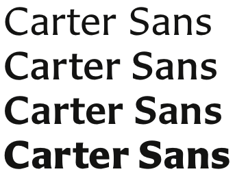
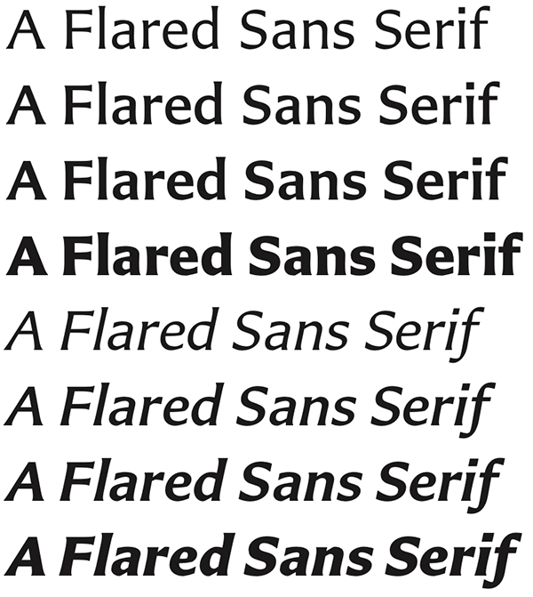
Carter Sans is a face with an inscriptional quality to it. The family has eight fonts: regular, italic, medium, medium italic, semibold, semibold italic, bold, and bold italic. All fonts include small caps. Each font has proportional oldstyle figures as the default figure style, but tabular OsFs, proportional and tabular lining figures, small cap figures, superiors, inferiors, numerators and denominators are available in each font via OpenType features.
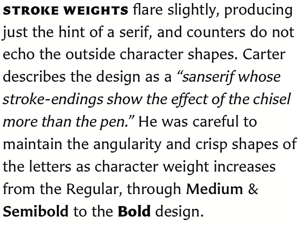
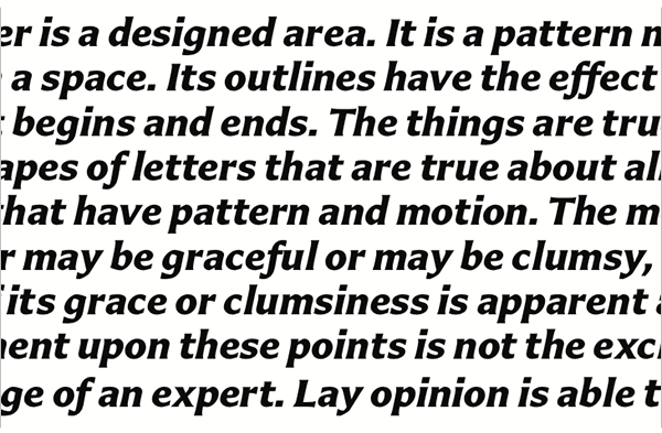
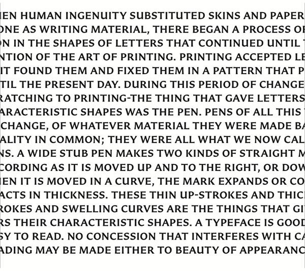
Settings of Carter Sans bold italic and semibold. Texts from an old Dwiggins passage published in the Linotype Matrix during the 1950s
More information
www.cartersans.com
www.fonts.com
www.itcfonts.com
www.linotype.com
Fonts from the Carter Sans family may be licensed at Fonts.com, ITCFonts.com, or Linotype.com
Carter Sans™ is a trademark of International Typeface Corporation and may be registered in certain jurisdictions.
