The fourth International Conference on Typography and Graphic Communication took place in during the middle of June 2010, under the theme “lending grace to language.” For the first time, the ICTVC to place in Nicosia, Cyprus; previous ICTVC conferences took place in Thessaloniki, Greece, in 2002, 2004, and 2007. The reason for the change of venue from the University of Macedonia to the University of Nicosia is organic: Dr. Klimis Mastoridis, the prime mover behind the event, now lives and works in Cyprus. I suspect that the fourth ICTVC is the first international typographic conference ever to take place in Cyprus.
Cyprus is a beautiful mediterranean island. Nicosia, the capital, is more or less in the center of the landmass. The city itself is divided; the northern half, like the northeast of the island, is Turkish. Otherwise, Cyprus is a Greek-speaking republic.
I attended this year’s conference as a speaker; it was my second ICTVC, as I also spoke at Thessaloniki in 2007. Back then, Greece was experiencing its warmest June to date, or at least it certainly felt that way at the time. This year’s weather was similar—daytime temperatures in Nicosia hovered around 40°C during the conference, although the air was not so humid.
Most of the ICTVC 2010 activities took place either in Nicosia’s Hilton Park hotel or on the campus of the University of Nicosia. The Hilton was located southwest of the historical city center; to get into town, a taxi ride of about 20 minutes was necessary. The area surrounding the hotel was typical suburban strip mall land. Across the street from the hotel was a Bennigan’s restaurant. A McDonalds was also nearby, as was a Gloria Jean coffee joint. This is probably enough detail to paint a good picture.
I traveled to the event together with Lorenz Schirmer, Linotype’s marketing director. Lorenz and I arrived in Cyprus on Wednesday, June 16th, and remained through Sunday the 20th. The main conference ran from the 17th through 19th, although there were a few pre-events that we did not attend. It took me some time to get to Cyprus from Berlin; I flew via Zürich, which took about eight hours. Lorenz and I flew in separately, as he was coming in from Frankfurt. Although he arrived at the hotel before I did, I only saw him the morning of the conference itself. After checking into the Hilton, I rode into town in time for dinner with several MATD Reading alumni. A few Greek designers and educators not associated with the University of Reading were with us as well. Tidbits about University of Reading staff and alumni are a common element of much of this report, so brace yourselves…
Thursday, June 17
For a summertime event on a warm island, the conference’s talks began rather early in the mornings, either at 9:00 or 9:30, depending on the day. Two tracks ran parallel, and one hall was larger than the other. The smaller hall changed its location on the third day of the conference. Several of my own highlights of the conference took place on the first day, including excellent papers presented by Jasso Lamburg, Jamie Mahoney, and Santosh Kshirsagar.
Jasso, a 2007 graduate of the University of Reading’s MA Theory and History of Typography & Graphic Communication course, spent a decade as an info-graphics designer for several Finnish newspapers. In the image above, Jasso explains how to simplify data for fast newspaper reading. This slide of his inspired me to add similarly sized circles into my own presentation, for a slide where I compare newspaper circulation and readership figures.
Jamie Mahoney is a graphic design professor at the Virginia Commonwealth University in Richmond. Since moving to Europe, I often feel that I have lost touch with the US graphic design community. As such, I particularly enjoyed Jamie’s paper—“Letterpress, a revival.” As many TypeOff. readers are surely aware, American graphic design is characterized in large part at the moment by several hand-made directions. This seems evidenced in part by books like Ellent Lupton’s DIY. Many young designers are discovering older, analog practices, including silkscreen printing and letterpress work. According to Jamie’s slides, the letterpress courses seem to be such a highlight of the VCU graphic design curriculum that many graduates go on to found their own letterpress studios, which serve either as a creative outlet, hobby, or even in some cases, the primary focus of their profession.
Santosh Kshirsagar serves on the faculty at the Sir J.J. Institute of Applied Arts in Mumbai, India. A calligrapher with decades worth of experience, he is behind the new Aksharaya website, a collective of letter conscious people. He presented a short paper entitled “The language of children’s writing.” In this paper, he showed a model of how children are taught to write the Devanagari script in primary school. Afterwards, he showed results from workshops, in which children were permit to explore letterform writing in a different manner. The results were visually stunning.
After the day’s presentations were over, conference attendees walked or drove a short distance to the University of Nicosia campus. How short was this difference? Cypriot estimates ranged from 200 meters to two kilometers! I think that it was about a 20 minute walk. Once we had all arrived on campus, we settled into a concrete amphitheater built onto one of the campus buildings. Here, as the sun set, we enjoyed a low-key wine reception, which included some local beverages, as well as small appetizers. Once it became dark, the conference crowd dispersed, with attendees heading back to their hotels or to the old city for dinner. I am sure that many exciting things happened on the first official evening of the conference, but I did not experience any of them. Instead, I went back to my hotel room and worked further on my presentation, which I gave the next day.
Friday, June 18
I presented my paper early on the afternoon of Friday, June 18th. Entitled “Some of India’s most-read newspapers and their typefaces,” my talk was an update of my MA research at Reading, as well as a similar lecture that I gave at Typecon 2009. Here is how I described my topic in the program:
This presentation is concerned with the typography of Hindi newspapers, relevant both to India’s English-language dailies, as well as to each other. Spoken by over 400 million individuals, Hindi is India’s most widely used language. India has a vibrant newspaper landscape, and Hindi-language publications are the dominant player in the marketplace. In a competitive field, design can help lift a newspaper above the fray. A determining factor in the way Indian newspapers’ appearances are the tools used to set them, yet contemporary Hindi newspaper layouts draw from a pool of relatively few typefaces. Illustrating this state of affairs, Dan Reynolds will discuss his analysis of the typographic situation, as well as the challenges and opportunities involved in developing new typefaces for Indic scripts in general, and Hindi newspaper design in particular.
Titus Nemeth comparing a North African Arabic typeface made in France during the 19th century with a North African manuscript hand of the same period. Photo by Rob Keller.
The conference’s second day was filled with many excellent presentations. Here are the details of some of my favorites:
- Udaya D. Kumar, a PhD candidate at the Industrial Design Centre, IIT Bombay, discussed the “Influences of palm leaf manuscripts on the Tamil script.” Using images from his catalog of letterforms in Tamil manuscripts over the past 2000 years, Udaya tracked the evolution of certain stroke movements. Shapes that were in written use around the time of the introduction of printing in Tamil Nadu represent what are most-often seen in typefaces, but other versions of these letters may have longer histories.
- Girish Dalvi, another IIT Bombay PhD candidate, spoke on the topic “Visual literacy of Devanagari typography: Issues arising due to the application of Latin typographic terms to Devanagari typography.” It was great to see several contemporary digital Devanagari fonts in Girish’s slides. He also had some interesting things to say on the Devanagari typefaces that typeface design students at the University of Reading look at the most-often (e.g., Linotype Devanagari, Monotype Devanagari, Rohini). I hope to write more about these issues on TypeOff. at a later date, or at least lead readers to other viewpoints via links or references.
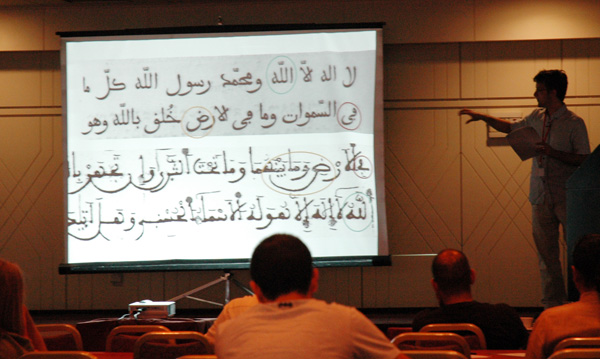
- There were a few talks that touched on the Arabic script at this year’s ICTVC, but Titus Nemeth’s paper was the most in depth on the topic, in my opinion. Entitled “Arabe maghrébin—reviving an Arabic metal typeface,” Titus used his half-hour to present the process that lead him to design his Aisha typeface, which was one of the typefaces awarded with a TDC² prize for 2010.
- Eric Kindel and Fred Smeijers looked back on their ten years of collaboration with the paper “Stencil letters: what are they good for? Assessing a decade of research, teaching, and practice.” I had the pleasure of hearing them present an earlier status update of their research at the ICTVC 2007, and while I was an MA student at Reading in 2008, I also had the opportunity to examine some of Eric Kindel’s collected artefacts first hand. So, for me, this presentation was akin to eating a great dish at my favorite restaurant.
- Last but not least, on non-Latin front, were Amélie Bonet and Irene Vlachou, who spoke on the topic of Greek type design. Or rather, they presented two approaches to drawing Greek extensions to Latin typefaces, which could perhaps be described as the non-native and the native approaches. Both Amélie and Irene are graduates of the MATD course at Reading, Irene hailing from the class of 2004, and Amélie from the class of 2009. Today, Irene is a freelance type designer in Athens, while Amélie is a new hire at Dalton Maag in London.
Of course, there were other presentations on Friday, June 18th. I wish that I could write something short about each of them! Or at least about all of the talks that I attended. With a two-track program, and your own presentation to prepare for, it is difficult to even hear 50 percent of the program’s offerings.
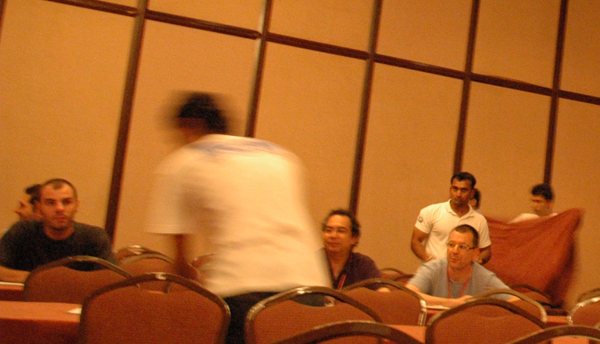
Due to a small delay in Friday afternoon’s schedule, David Březina’s presentation began about 30 minutes late. David’s was the final talk of the day, and the Hilton must had another event booked in the same hall later that evening. At one point near the end of the talk, the hotel staff turned on all of the lights, and then sent between one and two dozen helpers into to conference room. They quickly began folding up all of the tables, all while David attempted to yell out the text he had written to accompany his last few slides. On the above image’s right, Fred Smeijers and Eric Kindel look on as the room is dismantled around them.
On Friday evening, conference attendees traveled by bus from the Hilton Park hotel to a semi-underground gallery at the city’s Famagusta gate. The conference organizers hung several small exhibitions inside this space. After admiring the exhibition’s posters for about an hour, many of us walked a few blocks to an outdoor bar, where the England – Algeria game from the 2010 World Cup was projected. The bar had turned the sound off, perhaps because of the residential neighborhood location. But, as the play-by-play announcements would have been in Greek, the lack of sound did not disturb us. The match was a draw; neither England nor Algeria scored any goals.
Saturday, June 19
Since my own presentation was behind me, I was able to relax and enjoy the final day of the conference. Below are the day’s talks that stick out in my memory the most:
- Sofie Beier discussed studies that she had made into letterform recognition via her paper, “enhanced typeface legibility; how to improve the design of individual letters.” Two of the three typefaces that she designed for her tests—Pyke and Spencer—are available from T26. It was really a pleasure for me to meet Sofie after her talk. Before the conference, I had only known her as the designer of Engel, an immensely popular typeface among German graphic designers, which is distributed through Gestalten.
- Wolfgang Homola presented a new geometric sans serif family that he developed for the orientation system that Bohatsch und Partner designed for the Arbeiterkammer in Vienna. The Bohatsch und Partner website has a detailed write-up of the project, with several photographs. You may read it German, or in English. According to Wolfgang, an extended version of this typeface family will be released by TypeTogether later this year.
- Underware’s Bas Jacobs discussed two recent projects: the complex OpenType features under the hood of the Liza font family, as well as the process that lead to the Fakir typeface. In addition to this, Bas showed images of a new book set entirely in Fakir: the Book of war, mortification and love, by Ruud Linssen. The book is printed with ink made—in part—from the author’s own blood. The book was not available for general sale at the time of the conference, but Bas had picked up a few advance copies from the book’s binder, one of which I promptly purchased. As with previous Underware books, this one comes with a CD-ROM containing copies of all the Fakir fonts for graphic designers to try out on their own. Anyone who wants to use one of the fonts in an actual project is honor-bound to purchase the requiste license from Underware’s website.
- Petr van Blokland’s talk was a presentation that really required the audience to think. In “Designers update: the inevitable strategies for online publishing,” he asked designers to consider how their careers will appear in 2020 or 2050. From a type designer’s point of view, perhaps the most interesting part of the presentation were preview images of a new font design application that is currently in development. Programed by Frederik Berlaen, David Berlow and Erik van Blokland are also involved. The application will support the UFO format, making it the “missing link” that seemed apparent last year at Robothon 2009. With this application in their arsenal, many type designers could design, develop, and produce fonts on the Mac using an entire UFO workflow. Petr also discussed hinting, showing a slide with text hinted by this new program next to text hinted with VTT.
- EdenSpiekermann’s Susanna Dulkinys gave a presentation that made me very hungry: “How do you build a chocolate brand?” This was a nice and compact 30-minute case study, in which she told the story behind Tcho, a new chocolate company whose products you may want to order soon. Or now…
Neville Brody gave the conference’s final talk. Afterwards, the program moved once again to the University of Nicosia for a process screening of Making Faces in a theater setting. Richard showed a shorter cut of the file at TYPO Berlin, and I believe that Making Faces is also on the program for Typecon 2010.
There was an informal dinner on Saturday evening, attended by many of the conference speakers. Personally, this was one of the most enjoyable parts of the conference for me. I rode to the restaurant together with Girish Dalvi, Rob Keller, and a few others. This gave us a nice opportunity to discuss typeface design in Mumbai a bit further. Once we arrived at the restaurant, Girish and I sat at a table filled with many of the University of Nicosia students. These were the volunteers whose hard work made this ICTVC conference possible. It was great to meet them, and also to learn about the diversity their course’s student body.
Later in the evening, I got to know Fred Smeijers a bit better, and ask him some questions about Albert Kapr (1918–1995), a German typographer and type designer who taught at the HGB Leipzig decades ago. Fred Smeijers is a familiar face from many type conferences, but before this ICTVC, I’d never had the opportunity to speak with him. TypeOff. readers may remember a review of his Counterpuch that I wrote for I Love Typography in 2007. Counterpunch is still a book that I recommend to all of my own students, even though it is out of print at the moment.
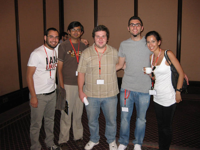
The event’s unsung heroes are Klimis’s students from the University of Nicosia, who performed all of the conferences heavy lifting. Thank you for everything! Photo: Klimis Mastoridis
Afterwards
On Sunday afternoon, after a morning spent catching up on e-mails and my Twitter feed, as well as a little time by the Hilton’s pool, I flew back to Berlin, changing planes in Frankfurt. I arrived at home around 11pm. The next morning, I woke up at 4am to make my way to the next conference: TypeTalks in Brno (CZ). To read about my experiences at that event, click here!
Looking for more information at this year’s ICTVC?
- Check out Rob Keller’s report on his blog, You Should Like Type Too. Rob, of course, is a principal at Mota Italic, which is another website worth visiting.
- You can also search for Flickr photos that contain info about the ICTVC. But be sure to search by date! There are photos from the 2007 conference on Flickr, too.