Do you know the old expression, “getting there is half the fun?” When it came time for me to travel to the first-ever TypeTalks symposium, getting there turned out to be half the conference. Fortunately, the seven and a half hour train ride was worth the effort, even though it fell on the heels of a day of cross-continental flying, and a four-hour night’s sleep. The following article recaps the second half of the TypeTalks symposium, as well as some of the things that I saw and did over a two-day visit to Brno.
What are the TypeTalks?
TypeTalks was a one-day symposium on June 21, 2010 in Brno, Czech Republic. Brno has been hosting an International Biennial of Graphic Design since 1963, and this year’s exhibitions opened on June 22nd. To take advantage of the international spotlight on their home town, students in the graphic design studio at Brno’s University of Technology organized a one-day series of typographic lectures. This effort was overseen by one of their instructors, David Březina.
For the premier TypeTalks symposium in Brno, six speakers were invited to present their work, or their research. As a last-minute, seventh speaker, attendee Dan Rhatigan was added onto the schedule in an early-morning burst of awesomeness. The day’s schedule unfolded as follows:
- Florian Hardwig: Localize! The dialects of handwriting in type design
- Rob Keller: Font technology is crazy!
- Michael Hochleitner: A contemporary view on the relationship of lettering and type
- [Lunch break]
- Tomáš Brousil: Tabac
- Dan Reynolds: The passion of the young, multi-script type designer
- Dan Rhatigan: How I learned to stop worrying & love bad type
- Veronika Burian: Typographic matchmaking
Since I was only present for the symposium’s second half, I won’t discuss talks that I did not personally see. At the end of the post, I have listed a few links to other TypeTalk wrap-ups. These each cover topics that I don’t reach toward below.
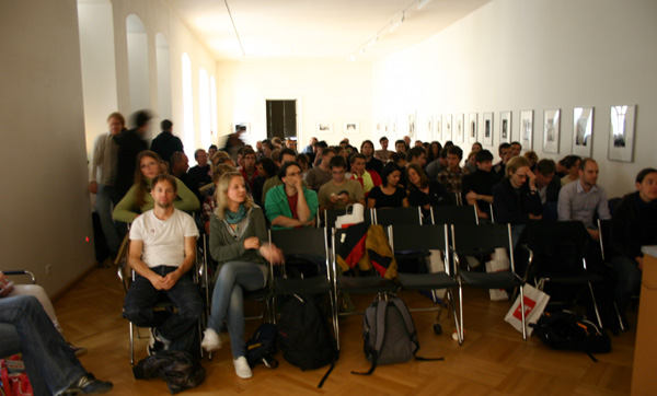
The TypeTalks audience, sitting inside the House of the Lords of Kunštát. It is difficult to count heads in an image, but there should be about 100 people visible here. Photo by Florian Hardwig.
How did I get to the TypeTalks?
From June 16–20, I was on Cyprus, attending the 4th ICTVC conference (read my report on that event). David Březina and Rob Keller were Cyprus attendees as well, but they must purchased their plane tickets later than I did. By the time the idea for TypeTalks was finalized, Linotype had already booked my Cyprus tickets; there was no possibility for me to change my flight details.
While David on Rob flew from Cyprus to Vienna on Sunday, June 20th, and then rode a bus to Brno, I flew back to Berlin, with a stopover in Frankfurt. I arrived back home around 11pm, and needed to wake up a 4am to catch my train to the Czech Republic. I was hoping to arrive in Brno by 12:30.
Instead, a Deutsche Bahn delay held my Prague-bound train at the station in Berlin for a half an hour, which caused me to miss my connection. I got on a later train to Brno in Prague, but this also had a 20-minute delay of its own, somewhere in the Czech countryside. So, instead of missing Florian, Rob, and Michi’s talks, I missed Florian, Rob, and Michi’s talks, and lunch as well.

A slide showing chess symbols for newspapers, from Tomáš Brousil’s Tabac typeface. Image courtesy of Florian Hardwig and the Suitcase Type Foundry.
At least I arrived in Brno in time for my own lecture. While I was on deck, I saw Tomáš Brousil’s presentation. Tomáš spoke in Czech, but since he was explaining the details of his upcoming Tabac type family release, all of his images were from the typeface’s specimen. Fortunately for me, I view type specimen as a universal language, or at least an arcane designer-dialect whose secrets I am privy to. Like the Czech attendees in the audience, I was able to enjoy the details of the Tabac family. Tomáš really did consider the little details, too. Tabac includes glyphs for the common elements often buried in the insides of newspapers, such as icons for weather reports and chess games. Tabac’s chess piece glyphs became something of a running joke during Tomáš’s talk… every time one of them would appear on a slide, the audience became quite enthusiastic.
This enthusiasm put me in just the mood I needed to be in to present afterwards. Unfortunately, all of my travel turned out to be too much stress for my MacBook Pro’s battery, which died just before I went on stage. By “died,” I do not mean that it just needed an extra charge. It was kaputt, and my computer was never going to start up from it again. Michi came to the rescue, lending me his battery, and saving me from having to talk freeform about non-Latin typeface design for 40 minutes.
I spoke on “the passion of the young, multi-script type designer.” At Type Talks, I presented in English instead of German, as had been the case at TYPO-Berlin 2010. I felt much more secure this time around, but the Typejockeys Michael Hochleitner and Anna Fahrmaier insisted afterwards that they preferred the German-language original, comparing my English version with a dubbed showing of a film. Here is the synopsis of my presentation:
Many young type designers work with multiple scripts. They choose this kind of work for its challenges; designers draw type because letters drive them. After close inspection, elements of other writing systems seem not so different from our own. Learning other sets of rules, customs and histories lead to more opportunities to better understand the essence of type. No matter if one fears the results, questions, or respects them, the multitude of non-Latin scripts acts as a mirror for the depth of a type designer’s passion for letters. Whether one draws Latin, Cyrillic, or Devanagari letters is unimportant; making type happen is the key.
I really enjoyed presenting to the TypeTalks audience. When I gave the first version of this talk at TYPO-Berlin, not very many people in the audience laughed at my jokes. Here, everyone laughed! It made me want to kiss each one of them.
There were coffee breaks during the TypeTalks, of course. After I left the stage, and a brief spell in the scenic courtyard, the audience reconvened to hear Dan Rhatigan speak. This last-minute addition to the program, “How I learned to stop worrying & love bad type,” was originally presented by Dan to students at Central St Martins in London. Dan has uploaded a fascinating post about this initial talk to his blog. He writes:
…when you do research about type design — particularly design for unfamiliar writing systems — you need to be incredibly objective and open to all possibilities and examples and things you can learn from them. Maybe you don’t have enough understanding to know whether or not your sources and examples are reliable, or maybe you’re letting your personal taste be your guide — either way, you probably need to stop and step back and ask yourself if what you’re doing is relevant, appropriate, or effective. There can actually be a lot of useful lessons in things that you might easily dismiss (for plenty of good reasons) as being “bad.”
If you visit his blog, you can also flip through all of his presentation slides—or at least the presentation slides from the Central St Martins version of this talk. You can also see this “film” on YouTube. It is silent, and runs for 2 minutes and 42 seconds. I highly recommend it.
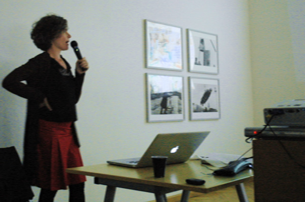
TypeTogether co-founder Veronika Burian explaining the in and out of matching typeface families. Her presentation was entitled, “Typographic matchmaking.” Photo by Rob Keller.
Veronika Burian was the symposium’s closing speaker. Like me, she reprised her presentation from TYPO-Berlin 2010, although her Berlin and Brno presentations were both in English. Veronika has a fascinating personal history. Born in Prague, she moved to Germany during her childhood. Her first degree was in Industrial Design, which she studied in Munich. After working in Austria and Vienna, she moved to England to study typeface design at Reading. She later worked for DaltonMaag in London. After founding the TypeTogether foundry with José Scaglione, she moved to Boulder, Colorado for three years. Now, she is back in Prague.
“Typographic matchmaking” illustrated many possibilities for combining typefaces with one another. Veronika showed some good examples, and many bad examples. Almost everything that she showed was from “real life;” most of her images where PDFs or photographs of newspapers. She did not limit herself to TypeTogether typefaces. If you’d like to read more information about her “Typographic matchmaking” talk, there are two good post-TYPO-Berlin write-ups available (in German). The first was published on TYPO-Berlin’s own blog, and the second may be found at Slanted.
How many people came to the TypeTalks? On the day before the event, pre-registration had reached 88 persons. Even if no additional guests came to pay at the door, the total audience figure would have been over 100, including the organization team and the invited speakers. There were plenty of foreign attendees at the TypeTalks, including several who made the trip from Vienna. A number of students from Poznań and Katowice in Poland were in attendance as well. Dan Rhatigan and Fernando Mello probably had the longest trips, having each come in from London.
It can be a difficult for Germans to visit the Czech Republic, I guess. Although the countries are neighbors, the Czech Republic often feels very far away. Yet, arriving in Prague’s central train station for the first time since 2004, I realized that Prague was only as far from Berlin as Frankfurt am Main; and I ride the train from Berlin to Frankfurt-and-back one day each week! After the symposium ended, Florian mentioned to me that more online promotion had been made in Germany than in any other country. Aside from three of the speakers, no German residents attended the symposium at all. Dear German readers, you missed out!
The other things I did in Brno
A dinner was organized for the evening after the TypeTalks, in the Starobruno brewery. This was a great opportunity for me to catch up on the half of the symposium that I had missed, as well as to hear some reactions to the day’s proceedings from attendees. A number of students who attended the symposium were at the dinner, and at least one of them used the opportunity to have some of the speakers critique a typeface she had designed for her degree project.
The conference’s foreign speakers, as well as some of the international guests, stayed at Hotel Jonathan, a delightful bed and breakfast run by the Březina family. This hotel was a great place to stay. Although it is outside of the city center, it was easily reachable by bus. A nighttime taxi-ride to the hotel from downtown Brno cost less than 10 euro. The highlight of the hotel is their breakfast, which is not served as a buffet, but is made to order.
In this photo—which looks very conspicuously like a snapshot from a German Typostammtisch—David Březina and Fernando Mello take time out from their dinner to critique a typeface designed by Viktoriya Gadomska for her degree project. Photo by Florian Hardwig.
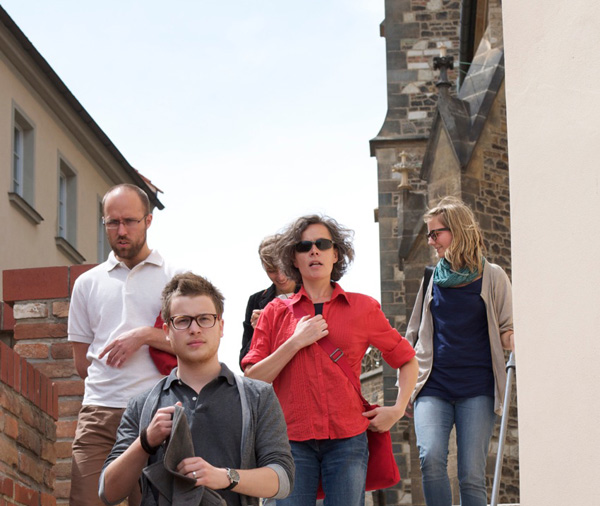
During the afternoon of Tuesday, June 22nd—the day after the TypeTalks symposium—David Březina took many of his foreign guests on a walking tour of Brno. We did all of the tourist things, visiting an old church, the city cathedral, and the Špilberk castle. We stopped for coffee outside a Franciscan monastery, and ate dinner in a restaurant that used to be a church building; the church itself had been built in some sort of second-half-of-the-20th-century concrete modernist style. David made sure to satisfy our type-designer-dork urges as well, and led us to a nice bookstore, located slightly off of the city’s main square. Here, Rob Keller purchased a thick six-langauge dictionary from the 1970s that listed out printing and typographic terms in Czech, Dutch, English, French, German, and Russian.
That same evening, the Brno International Graphic Design Biennial opened at the Moravian Gallery. Their main building displayed two floors full of galleries featuring posters submitted from graphic designers all over the world. The Biennial reminded me a bit of the international poster and graphic arts festival in Chaumont, France, whose opening I attended a few weekends ago.
Rick Poynor (left) opening the Uncanny: Surrealism and Graphic Design exhibition. Photo by Florian Hardwig.
A second Moravian Gallery building hosted an exhibition entitled, “Uncanny: Surrealism and Graphic Design,” curated by Rick Poynor. A number of additional exhibitions were scheduled to open in various locations in Brno throughout the week, but I could not stay long enough to see them. An official Biennial Symposium also took place after I left, which included speakers like Oded Ezer, Sato Koichi, Karel Martens, Paula Scher, and Alan Záruba.

Rob Keller and Oded Ezer during the opening of the Brno Biennial. Photo by Florian Hardwig.
The highlight of this second evening was running into Oded Ezer at the opening festivities. After having met Oded briefly at ATypI Helsinki 2005 and TYPO Berlin 2008, this was the first opportunity I’ve had to speak with him for a longer period of time. He came out for dinner and drinks with the “TypeTalks” crowd that evening, too.
Accent wonderland
Since I cannot read any Slavic languages, it is difficult for me to make heads or tails of Czech words. But Czech signage is fascinating nonetheless. Even non-type designers must be captivated by the quality of lettering and design in the Czech lands. I attended the 2004 ATypI conference in Prague, which gave me a first taste of the country’s creativity, and I was certainly not disappointed by the vernacular visuals on display throughout Brno. Czech is a language where diacritics play a central role; it seems as if every second word has at least one diacritic in it, if not two or three.
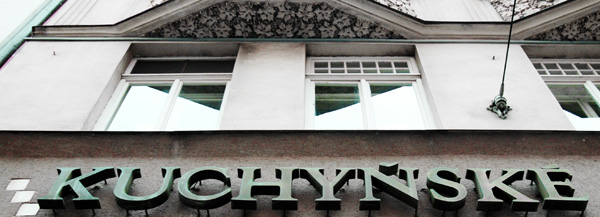
Two diacritics in this photo. Take a look at their shape, as well as their positioning. Photo by Rob Keller.
Czech designers do not seem to tolerate “standard” diacritics to the same extent that I feel other languages might. Even if the western type foundry approach has been to unify diacritics across all languages that use similar shapes, Czech calligraphy, lettering, and type design often wrestles these dull forms to the ground, exchanging them with accents more integrated with their base letters. As a typeface designer, strolling through Czech streets is like being a child in Disneyland. Everywhere you look, there is something new and delightful to captivate your attention. It is possible for any designer to draw quality diacritics without being familiar with the Czech approach? More information about diacritic design may be found in David Březina’s article on that theme for I Love Typography, or at Filip Blažek’s Diacritics Project wiki.
Conclusion
During the build-up to the symposium, as well as during my 46 hours in Brno, it was tempting to refer to the event not as “TypeTalks,” but as “TypeTalks One.” Will there be a “TypeTalks Two?” Only time can tell. But until that decision is made, I think that it is safe to say that the TypeTalks were successful. How can conference success be measured? Well, at the very least, one may consider organization, public relations, fiscal effectiveness, attendance, and attendee satisfaction.
The symposium’s logistics were very well thought-through. As Florian Hardwig writes at MyFonts.de:
Kudos to the organizers of the TypeTalks. They thought of everything. Handmade signs directed visitors to the conference location. At the entrance, every attendee received a little pin, which doubled as their admission ticket. On the veranda around the courtyard, you could find snacks and beverages. The TypeTalks team didn’t rest with that, they also distributed goodie bags, just like at larger conferences. In specially printed bags, they packed bilingual programs, as well as various posters, type specimen, and other information and advertisements. The bilingual Czech/English magazine Typo, as one of the event’s sponsors, placed free issues in the goodie bags as well [my translation].
The TypeTalks symposium was well advertised. Notices about the event appeared in several blogs, and the conference had its own website and twitter feed. For a design conference, TypeTalks was incredibly affordable. Early registration was €18 for professionals, and just €12 for students. At the door, the ticket prices went up by only 4–5 euros. All of the invited speakers have presented their work at larger conferences, some of which have admission fees ranging up to several hundred euros. Any way you look at it, this was good value. Considering the conference-attendee budget, Brno is an inexpensive place to stay. Easily reachable from both Prague and Vienna, the city’s hotel, transit, food, and beer costs are lower than in western Europe.
TypeTalks was virtually sold-out. The conference organizers surveyed attendees by e-mail afterwards about their satisfaction. While I am not privy to the results, I think that the number of conference attendees who came to the “speakers’ dinner” at the Starobrno brewery afterwards was evidence enough of their positive reaction. If they had been unsatisfied with the conference or the speakers, there were plenty of other things that they could have done in the city that night.
Postscript: It kept going after it was over
I left Brno on the morning of the 23rd, in order to get back home at a regular hour. After working from at home in Berlin on June 24th, I woke up at 3am on Friday the 25th to catch my weekly train to Linotype’s office in Bad Homburg.
Late in the afternoon of Friday, June 25, I drove to Mainz with Otmar Hoefer Atilla Korap, and Florian Wittig to attend a lecture at the Gutenberg Museum by Mahendra Patel. This year’s Gutenberg-prize recipient, Mahendra Patel is the first Indian designer honored this award, and only the 17th recipient to date. Previous winners have included Giovanni Mardensteig, Hermann Zapf, and Adrian Frutiger. I’ll be posting an article about his lecture on TypeOff. at a later date…
From left to right: David Březina, Michael Hochleitner, Anna Giedryś, Veronika Burian, and Anna Fahrmaier. Photo by Dan Rhatigan.
Links
- Florian Hardwig’s write-up of the TypeTalks symposium at MyFonts.de (German): Part 1, Part 2
- The Typejockeys’ write-up, on their own site: Typejockeys.com
- For photos from the TypeTalks symposium, click here to see images with this tag at Flickr
- Photos from the International Biennial of Graphic Design Brno 2010 may be found in this Flickr Group
- There is an official page for the Brno Biennial 2010, and another site for the items in its main exhibition.
- There is also a page for the Uncanny Surrealism and Graphic Design exhibition, curated by Rick Poynor.
- Back in 2004, I attended the ATypI conference in Prague. Here is my write-up about that.
- Also in 2004, I wrote a review of e-a-t, an exhibition of Czech and Slovak typeface design for Typotheque.
- For more information about Oded Ezer, check out these blog reports by Lucy Brown, a designer who worked with him briefly.