Most of the Christmas gifts that I give and receive, I am sad to admit, are not necessarily typographic or design-related in nature. But every now and then, something extraordinary does end up underneath the Christmas tree. This year, that was a copy of Ausgewählte Aufsätze über Fragen der Gestalt des Buches und der Typographie, by Jan Tschichold. This is the 1993 reprint of 1975 edition.
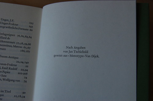
AAüFdGdBudT has been on my wish list for years, and Santa finally brought it this time around. Oh, am I happy! The sentence in the image above, «Nach Angaben von Jan Tschichold gesetzt aus ‹Monotype› Van Dijck» is enough to put me in typographic nirvana. In English, the translation only reads, “set after instructions from Jan Tschichold in ‘Monotype’ Van Dijck,” but so much more is hidden between the lines of a statement like that, since Tschichold’s typography was all about setting instructions for typesetting.
This book is a joy to read. It is just brilliant Tschicholdiness. I tell you truly that going through all the trouble of learning German is worth it just to be able to read Jan Tschichold’s texts in their original language. English-speakers can keep Stanley Morison; he is so darned dull anyway.
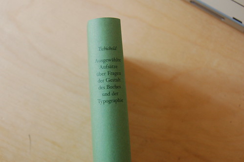
Here is another image from the book; this time just of the spine. Look at that! It is pure beauty. A normal book would have the title set in a line running up or down the spine. But this is not a normal book, it is a Jan Tschichold book. He had the title set this way because he knew it would be easier for you to read like this.

Of course, I did receive some other Christmas gifts that were particularly cool, like this cover for my iPhone: a SwitchEasy Colors Protective Solution, in crimson. Why, of all the possible iPhone covers, did I want this one? The answer lies in simple jealousy. At the last Berlin Typostammtisch, someone from FontShop International had this exact sort of iPhone thing in yellow. Corporate color matching for the iPhone! Oh, how I wanted. Fortunately, Linotype’s color is an easy-to-match red, making my search short and sweet.
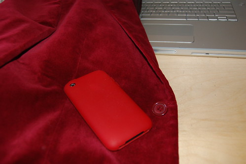
My SwitchEasy Colors Protective Solution matches more than just the Linotype logo. It also matches the sweet red jacket that I wore during my talk at Typo.Graphic.Beirut in 2005. Now I am totally geared up for future presentations. What better way to control the slides of the presentation on your MacBook Pro than with your iPhone? Unless you get a call while you are on stage, perhaps…