Hollywood, there’s a new font in town. Well, maybe not exactly new. No doubt, Trajan may still be the movie font. But it no longer reigns supreme. As Kirby points out in the first link above, Futura Bold has already taken over the comedy market. One more font is coming up through the ranks: Bank Gothic.
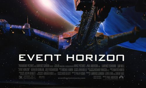
You all know this one; it was designed in 1930 by Morris Fuller Benton for ATF, and landed the 74th slot on the top 100 fonts of all time list put together by FontShop. Bank Gothic! Who knows when this first started showing up on film and television? The earliest back I can remember is the poster for the 1997 sci-fi/horror flick Event Horizon, which scared the beejeezus out of me in the movie theater.
Since I spent two years together with Bank Gothic while I was working on the Morris Sans project at Linotype, I’m very happy to see her finally get the success that she deserves. Nevertheless, it can be heart-breaking at the same time. Wouldn’t it be so great to see applications going forward use Morris Sans instead? Then, the poster designers could set lowercase letters, too, in addition to those great uppercase and small caps letters. And even Bank Gothic has more than one weight and width; how about a little variation or contrast?
Even with a modified N, Bank Gothic is still clearly visible.
We all know that the re-envisioned Battlestar Galactica series has set its opening titles in Bank Gothic since the beginning, but the science fiction television connection seems to be taking off. Since November, the BBC’s revived Doctor Who program has used Bank Gothic in commercials and trailers.

Four seasons, and it still looks great: Bank Gothic opens up Battlestar Galactica.
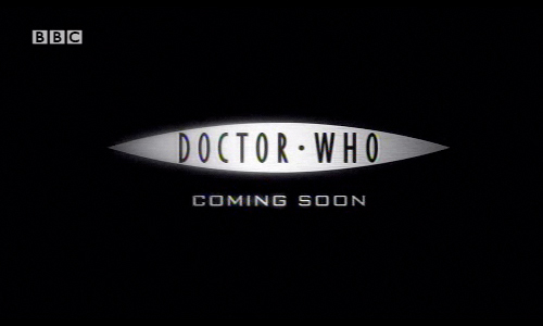
Doctor Who and Bank Gothic. Two of my favorite things, together at last.
As far as I’m concerned, these three uses alone would be enough to solidify Bank Gothic’s sci-fi credibility. But digging a little deeper shows that the typeface has been used in other sci-films over the past few years as well.
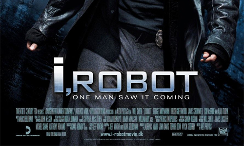
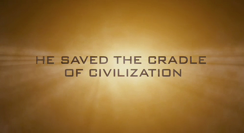
Bank Gothic even gets to star on a poster alongside Will Smith.
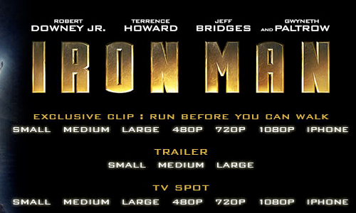
Could this be an iron typeface?
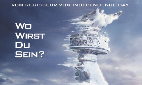
On The Day After Tomorrow, Bank Gothic may be the only movie font left.
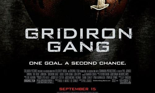
Now the lid is off of Pandora’s (err… Benton’s?) box. Everyone can use Bank Gothic now, not just sci-fi purveyors. The first image in this post looks like a run-of-the-mill drama to me. Even the next Indiana Jones film has cast the font in its trailers. And the Jones franchise already has a (better?) squared sans face on hand. Why switch?
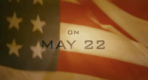
Heralding in the next Indiana Jones film. Like Harrison Ford, this font looks great years later.
No sci-fi here! Bank Gothic crosses over into the sport world.