FF Utility is a new typeface family from Lukas Schneider, released through FontShop International’s FontFont label. I’m not sure when the typeface was exactly brought to market, but it seems like it was sometime at the beginning of the year. It is difficult for me to write about this design, as I’ve anticipated its release for over four years now. Here goes…
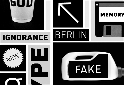
FF Utility imagery from Lukas Schneider’s website, snider-inc.de
Here’s a story: Back in the spring/summer of 2003, I was a graphic designer doing corporate work in Washington, DC. I had already graduated from RISD and spent a semester as an exchange student at the FH Wiesbaden in Germany. I wasn’t satisfied with my work, and wanted to go back to school to study typography more in depth. I had applied to a number of design schools in both Germany and Switzerland, and received a number of acceptance letters. All I had to do was pass my language exams, pick a new school, and I’d be good to go.
Although I was taking German lessons at the DC Goethe Institute, I would have to travel in order to take the test. The next available testing slot was open in Chicago, and I flew there for a few days in June. Waiting in the lobby of the Chicago Goethe Institute for the spoken portion of my exam to begin, I thumbed through a number of magazines from Germany. I came to an issue of the design periodical form. Inside was an article about a recently-completed graduation project by Lukas Schneider at the Hochschule für Gestaltung Offenbach am Main. The work was his Gazoline typeface, the forerunner version of FF Utility. Since the HfG Offenbach was one of the schools I could choose to study at, seeing this project made my decision for me. I was going to study there—where you could learn to make typefaces.
I didn’t do my homework well enough; you can’t really spend all of your time at Offenbach making type, but I didn’t find that out until I had already been a student there for several semesters. Before I left Offenbach for Linotype and Reading, I had even met and gotten to know Lukas, who was a member of the TypeOff. collective back when we still thought of ourselves as some sort of group. He’s still an Offenbach Typostammtisch regular.
Speaking of that issue of form, you can read the article that inspired me in their online archive. Sometime in 2004, I bought a copy of this back issue. I’d include an image here, but the copy is in storage right now in Weinheim; I don’t have it with me in Berlin.
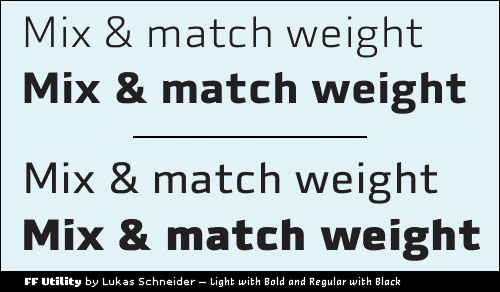
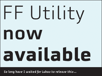
FF Utility is a creative, contemporary sans serif. It reads clear, and sets a mean line of text. You can use it for almost anything. The family includes five weights—light through black. There isn’t an italic, but I think that Lukas has a point implying that such a design doesn’t really need them (more from Lukas about this in a German PAGE magazine interview). The better typographic solution, in my opinion at least, would be to use weight for emphasis: bold with light, or black and regular, for instance.
Under the name Gazoline, the design that would become FF Utility won awards from the ADC and was featured in Output magazine. Let’s hope that next year, it receives an award from the TDC and mention in a Typographica review.
There has already been some nice web coverage of FF Utility, including on Lukas’s own site, iLoveTypography, Spatium-Magzin, and Yves Peters’s Unzipped column at the FontShop BeNeLux site. No word from Jürgen yet on the FontBlog, but I’m guessing that he must be cooking up something extra special.
Now go out and license this one! Visit FontShop now.