Print outs from 15–16 November 2007.
This is a draft for my practical brief. Well, it is actually the second draft; the first was turned in at the beginning of November, and since then, I’ve made some small changes to the text. “Practical brief” is sort of academic-speak for a document that describes what I am setting out to do in the typeface I am going to design here at Reading. The typeface is the “practical” component of the programme here. There are also other things that we do for which we will be assessed.
Dave Crossland has also posted a draft of his brief online over here. That seems to be it for online briefs at the moment.
Proposal
I suggest to develop a typeface family for use in contemporary Hindi newspapers. As media respond to the 21st century’s changes in news and information distribution, I believe that onscreen content viewing will become more important with each passing year. While the display choice for newspapers may remain true to their name, pdfs and other web applications that embed fonts are likely to continue to find more readers.
Relevance
In recent years, several newspapers have emphasized custom typefaces as part of their overall branding. If a newspaper is interested in capturing the appearance and feeling of its print edition in another medium, consistency may call for the embedding of the same typefaces into any new media applications. This was the case, e.g., with the New York Times’s Times Reader programme.
Description
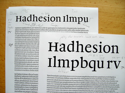
While appearance and feeling may be vague terms as far as aesthetics descriptors go, I believe that they play an intangible role the way clients and readers decide on which typefaces are desirable. My typeface family will consist of a text weight design including a seriffed roman, roman small caps, and Devanagari. Additionally, the roman character set will be complimented by an italic and bold design. A caption weight for the setting of smaller point sizes will also be submitted.
Evaluation
Although my intended goal is to create a typeface family for Hindi-speaking newspaper readers in Northern India, where the Devanagari script is native, my work may more specifically be suited to international publishers of bi-lingual publications, due to the Latin component. Among other factors, the success of this typeface family will be evaluated through its appearance in narrow-column text settings. Even colour must be achieved between paragraphs of text set in the Latin and in the Devanagari scripts, as well as in cases where single words of one script appear within paragraphs of the other. Other necessary factors include the structures of both scripts harmonizing with one another, as well as their both being legible and readable when set in small sizes—9 point in text and 6 point in captions. Lastly, documents set in both scripts must maintain a certain sparkle, and offer users a sound degree of typographic sophistication.